[Abandoned] - Treasure Map
Moderator: Cartographers
Re: Treasure Map v12 pgs. 1&5 [¡¡new poll!!] please vote/comment
![]() by el-presidente on Sat Jan 03, 2009 11:19 pm
by el-presidente on Sat Jan 03, 2009 11:19 pm
Use the ones with the names.
-
 el-presidente
- Posts: 158
- Joined: Fri Sep 19, 2008 2:14 pm


Re: Treasure Map v12 pgs. 1&5 [¡¡new poll!!] please vote/comment
![]() by LED ZEPPELINER on Sun Jan 04, 2009 9:25 am
by LED ZEPPELINER on Sun Jan 04, 2009 9:25 am
tlane wrote:i did not read the whole thing so i don't know if any one said this already but i think the just number one would be great if you add letters before them
like
b1, b2, r1, r2
i have prepared a draft like that, for after this poll has ended, i will either create a new poll, or just have that as the new draft
sailorseal wrote:My big boy banana was out the whole time
AndyDufresne wrote:Forever linked at the hip's-banana! (That sounds strange, don't quote me.)AndyDufresne wrote:Many Happy Bananas to everyone, lets party...with Bananas.
--Andy
-
LED ZEPPELINER
- Posts: 1088
- Joined: Tue Nov 25, 2008 10:09 pm


Re: Treasure Map v12 pgs. 1&5 [¡¡new poll!!] please vote/comment
![]() by bryguy on Sun Jan 04, 2009 2:41 pm
by bryguy on Sun Jan 04, 2009 2:41 pm
LED ZEPPELINER wrote:i don't really know where to go from here. nobody seems to be commenting, so um, what now
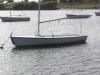
bryguy wrote:Ugh... sorry to put this to you at point blank, but this map needs serious work...
1) The parchment background hurts my eyes. Looks more to me like u to a piece of paper and ran a gardening tool on it to get a texture...
2) The mountains are to small and blur together
3) The skull in the lower left looks more like a lion
4) The boats dont look like u made them, more like u copied them and put them in
5) Some colors are to similar
6) Are the skulls in there for a reason?
7) Why 2 arrows from open to Defender? Why not on large curving arrow?You probably will want to have the X start out as a large neutral
9) Its hard to see the different colors for the bonuses
10) The bottom legend doesnt really fit in in my opinion
11) The borders are really rough
12) The docks are blurry
13) Why is there a dock connecting W haven and E haven?
Sorry if im putting it rather bluntly. Plz dont take any offense, Im just stating what i see wrong with it.
If you tell me what program your using though, i may or may not be able to be of some help

still waiting for u to see that...
-
bryguy
- Posts: 4381
- Joined: Tue Aug 07, 2007 8:50 am
- Location: Lost in a Jigsaw


Re: Treasure Map v12 pgs. 1&5 [¡¡new poll!!] please vote/comment
![]() by LED ZEPPELINER on Sun Jan 04, 2009 2:55 pm
by LED ZEPPELINER on Sun Jan 04, 2009 2:55 pm
bryguy wrote:LED ZEPPELINER wrote:i don't really know where to go from here. nobody seems to be commenting, so um, what nowbryguy wrote:Ugh... sorry to put this to you at point blank, but this map needs serious work...
1) The parchment background hurts my eyes. Looks more to me like u to a piece of paper and ran a gardening tool on it to get a texture...
2) The mountains are to small and blur together
3) The skull in the lower left looks more like a lion
4) The boats dont look like u made them, more like u copied them and put them in
5) Some colors are to similar
6) Are the skulls in there for a reason?
7) Why 2 arrows from open to Defender? Why not on large curving arrow?
9) Its hard to see the different colors for the bonuses
10) The bottom legend doesnt really fit in in my opinion
11) The borders are really rough
12) The docks are blurry
13) Why is there a dock connecting W haven and E haven?
Sorry if im putting it rather bluntly. Plz dont take any offense, Im just stating what i see wrong with it.
If you tell me what program your using though, i may or may not be able to be of some help
still waiting for u to see that...
In my newer versions...
1. i have changed the one way border,
2. i made the mountains bigger, and tried to make them less blurerd,
3. changed that skull
4. fixed the background
5. i tried to make the boats blend in a little more
6. the skulls are in there becuase some people told me to for artistic perposes
7. i made the colors stand out more
8. made the colors in the legend more visible
9. is 10 a large enough neutral, or 15?
10. i took a shot at making the bottome legend fit in more
11. tried to fix borders
12. that dock is just cus i feel like it would make things interesting, maybe i could make them one way borders in opposite directions or something?
i will try to post the two new options some time today once this poll is finished
LZ
sailorseal wrote:My big boy banana was out the whole time
AndyDufresne wrote:Forever linked at the hip's-banana! (That sounds strange, don't quote me.)AndyDufresne wrote:Many Happy Bananas to everyone, lets party...with Bananas.
--Andy
-
LED ZEPPELINER
- Posts: 1088
- Joined: Tue Nov 25, 2008 10:09 pm
Re: Treasure Map v12 pgs. 1&5 [¡¡new poll!!] please vote/comment
![]() by LED ZEPPELINER on Sun Jan 04, 2009 5:29 pm
by LED ZEPPELINER on Sun Jan 04, 2009 5:29 pm
Treasure Map v12
INFO
Name: Treasure Map
Cartographer: LED ZEPPELINER
Territories: 49
Continents: 7
Special Features: Boats can bombard any territory on Grendelia except X. x starts with 10 neutral units, other territories on Grendelia start with 7 neutral units, and are killing neutrals
Objective: hold X for two turns to win
v13 with names/numbers
v13 with names
v1
http://i395.photobucket.com/albums/pp31/LED_ZEPPELINER/treasuremap.jpg\
to do:
whatever you peeps advise me to do
changes:
1.burnt background
2. borders
3. one way borders
4. colors on the legend
5. mountains
Feedback?
INFO
Name: Treasure Map
Cartographer: LED ZEPPELINER
Territories: 49
Continents: 7
Special Features: Boats can bombard any territory on Grendelia except X. x starts with 10 neutral units, other territories on Grendelia start with 7 neutral units, and are killing neutrals
Objective: hold X for two turns to win
v13 with names/numbers
- Click image to enlarge.

v13 with names
- Click image to enlarge.

v1
http://i395.photobucket.com/albums/pp31/LED_ZEPPELINER/treasuremap.jpg\
to do:
whatever you peeps advise me to do
changes:
1.burnt background
2. borders
3. one way borders
4. colors on the legend
5. mountains
Feedback?
Last edited by LED ZEPPELINER on Sun Jan 04, 2009 5:35 pm, edited 2 times in total.
sailorseal wrote:My big boy banana was out the whole time
AndyDufresne wrote:Forever linked at the hip's-banana! (That sounds strange, don't quote me.)AndyDufresne wrote:Many Happy Bananas to everyone, lets party...with Bananas.
--Andy
-
LED ZEPPELINER
- Posts: 1088
- Joined: Tue Nov 25, 2008 10:09 pm
Re: Treasure Map v12 pgs. 1&5 [¡¡new poll!!] please vote/comment
![]() by the.killing.44 on Sun Jan 04, 2009 5:32 pm
by the.killing.44 on Sun Jan 04, 2009 5:32 pm
- You don't need to post all the other versions in the last post, just the first one. I've explained this like 5 times to you

- With a better font, I like the names. But please, (a) NO CAPS and (b) NEW FONT
.44
-

the.killing.44
- Posts: 4724
- Joined: Thu Oct 23, 2008 7:43 pm
- Location: now tell me what got two gums and knows how to spit rhymes


Re: Treasure Map v12 pgs.1&7 [¡¡new poll!!] please vote/comment
![]() by LED ZEPPELINER on Sun Jan 04, 2009 5:35 pm
by LED ZEPPELINER on Sun Jan 04, 2009 5:35 pm
is this better
sailorseal wrote:My big boy banana was out the whole time
AndyDufresne wrote:Forever linked at the hip's-banana! (That sounds strange, don't quote me.)AndyDufresne wrote:Many Happy Bananas to everyone, lets party...with Bananas.
--Andy
-
LED ZEPPELINER
- Posts: 1088
- Joined: Tue Nov 25, 2008 10:09 pm
Re: Treasure Map v12 pgs.1&7 [¡¡new poll!!] please vote/comment
![]() by the.killing.44 on Sun Jan 04, 2009 5:38 pm
by the.killing.44 on Sun Jan 04, 2009 5:38 pm
You still have v1 on there, but better.
Anyway, you have each option in the poll twice. Later I will post something close to massive as critique
.44
Anyway, you have each option in the poll twice. Later I will post something close to massive as critique
.44
-
the.killing.44
- Posts: 4724
- Joined: Thu Oct 23, 2008 7:43 pm
- Location: now tell me what got two gums and knows how to spit rhymes
Re: Treasure Map v12 pgs.1&7 [¡¡new poll!!] please vote/comment
![]() by LED ZEPPELINER on Sun Jan 04, 2009 5:44 pm
by LED ZEPPELINER on Sun Jan 04, 2009 5:44 pm
the.killing.44 wrote:You still have v1 on there, but better.
Anyway, you have each option in the poll twice. Later I will post something close to massive as critique
.44
ya the poll is just not really working for me, everything is doebled, if you post, it will say that two people voted and stuff
-
LED ZEPPELINER
- Posts: 1088
- Joined: Tue Nov 25, 2008 10:09 pm
Re: Treasure Map v12 pgs.1&7 [¡¡new poll!!] please vote/comment
![]() by the.killing.44 on Sun Jan 04, 2009 5:50 pm
by the.killing.44 on Sun Jan 04, 2009 5:50 pm

That's what you should do.
.44
-
the.killing.44
- Posts: 4724
- Joined: Thu Oct 23, 2008 7:43 pm
- Location: now tell me what got two gums and knows how to spit rhymes
Re: Treasure Map v12 pgs.1&7 [¡¡new poll!!] please vote/comment
![]() by LED ZEPPELINER on Sun Jan 04, 2009 5:57 pm
by LED ZEPPELINER on Sun Jan 04, 2009 5:57 pm
does anybody have any help for me with the poll, i tried ur way jake, and it didn't work, as you can see
sailorseal wrote:My big boy banana was out the whole time
AndyDufresne wrote:Forever linked at the hip's-banana! (That sounds strange, don't quote me.)AndyDufresne wrote:Many Happy Bananas to everyone, lets party...with Bananas.
--Andy
-
LED ZEPPELINER
- Posts: 1088
- Joined: Tue Nov 25, 2008 10:09 pm
Re: Treasure Map v12 pgs. 1&5 [¡¡new poll!!] please vote/comment
![]() by bryguy on Mon Jan 05, 2009 9:13 am
by bryguy on Mon Jan 05, 2009 9:13 am
LED ZEPPELINER wrote:bryguy wrote:LED ZEPPELINER wrote:i don't really know where to go from here. nobody seems to be commenting, so um, what nowbryguy wrote:Ugh... sorry to put this to you at point blank, but this map needs serious work...
1) The parchment background hurts my eyes. Looks more to me like u to a piece of paper and ran a gardening tool on it to get a texture...
2) The mountains are to small and blur together
3) The skull in the lower left looks more like a lion
4) The boats dont look like u made them, more like u copied them and put them in
5) Some colors are to similar
6) Are the skulls in there for a reason?
7) Why 2 arrows from open to Defender? Why not on large curving arrow?
9) Its hard to see the different colors for the bonuses
10) The bottom legend doesnt really fit in in my opinion
11) The borders are really rough
12) The docks are blurry
13) Why is there a dock connecting W haven and E haven?
Sorry if im putting it rather bluntly. Plz dont take any offense, Im just stating what i see wrong with it.
If you tell me what program your using though, i may or may not be able to be of some help
still waiting for u to see that...
In my newer versions...
1. i have changed the one way border,
2. i made the mountains bigger, and tried to make them less blurerd, I dont see much difference, except that they are bigger. Seems like your trying to make them ISO Mountains? Try looking up some tutorials, or go to Cartographers Guild at http://www.cartographersguild.com/forums and getting an account so you can see their tutorials. They have a lot of good ones that would help for your mountains.
3. changed that skull
4. fixed the background still doesnt seem to have the feel of parchment to me... idk why..
5. i tried to make the boats blend in a little more
6. the skulls are in there becuase some people told me to for artistic perposes
7. i made the colors stand out more
8. made the colors in the legend more visible
9. is 10 a large enough neutral, or 15? 10 sounds good. If you want it can be 15, but 10 sounds good. Although you could have it a higher number like 100 or 31,502,342 just to throw people off

10. i took a shot at making the bottome legend fit in more
11. tried to fix borders looks better
12. that dock is just cus i feel like it would make things interesting, maybe i could make them one way borders in opposite directions or something? sure, looks better now
i will try to post the two new options some time today once this poll is finished

LZ
[New Comments, made some comments on your comments on old comments
1) Is the title there for any purpose other than just to have the title there? If so, It really shouldnt be on top of some connecting dot lines. Maybe try shrinking it slightly and moving it up a bit.
2) For the legend: Have you tried looking at old parchment maps? usually all they do for a map legend is like box with fancy lining and fancy corners that has the info for the map on it.
3) Love the burn on the map
4) What I like to do for parchment maps is have all layers (except for parchment and such) at 50% opacity. Maybe you could try it (after saving of course!) to see how that looks to you? I know that I always like the look of it on my parchment maps, but u might not, and if thats the case then thats okay
5) For the names version: I dont care for the glow on the names. Maybe make all the text white or black, and give it a glow of its continents/regions color?
6) Some of the attack lines could get confusing. Like from New Port to Grendelian Peninsula, it looks like it doesnt go there, but instead to Eatern Peninsula. Also, from Old Port to ???? It doesnt go to any dock, it just goes off behind some text and disapears, whys that?
7) If you could, maybe try making it look more like a map on a table, kinda like foregones Romania map?
Looks better, but still needs some work
Like I said before, if you could tell me what program your using, then I could find some tutorials that might help
-
bryguy
- Posts: 4381
- Joined: Tue Aug 07, 2007 8:50 am
- Location: Lost in a Jigsaw
Re: Treasure Map v12 pgs.1&7 [¡¡new poll!!] please vote/comment
![]() by the.killing.44 on Mon Jan 05, 2009 4:58 pm
by the.killing.44 on Mon Jan 05, 2009 4:58 pm
e's using cs3. I still need to find time for a rant, julien
.44
.44
-
the.killing.44
- Posts: 4724
- Joined: Thu Oct 23, 2008 7:43 pm
- Location: now tell me what got two gums and knows how to spit rhymes
Re: Treasure Map v12 pgs. 1&5 [¡¡new poll!!] please vote/comment
![]() by LED ZEPPELINER on Mon Jan 05, 2009 7:55 pm
by LED ZEPPELINER on Mon Jan 05, 2009 7:55 pm
bryguy wrote:LED ZEPPELINER wrote:bryguy wrote:LED ZEPPELINER wrote:i don't really know where to go from here. nobody seems to be commenting, so um, what nowbryguy wrote:Ugh... sorry to put this to you at point blank, but this map needs serious work...
1) The parchment background hurts my eyes. Looks more to me like u to a piece of paper and ran a gardening tool on it to get a texture...
2) The mountains are to small and blur together
3) The skull in the lower left looks more like a lion
4) The boats dont look like u made them, more like u copied them and put them in
5) Some colors are to similar
6) Are the skulls in there for a reason?
7) Why 2 arrows from open to Defender? Why not on large curving arrow?
9) Its hard to see the different colors for the bonuses
10) The bottom legend doesnt really fit in in my opinion
11) The borders are really rough
12) The docks are blurry
13) Why is there a dock connecting W haven and E haven?
Sorry if im putting it rather bluntly. Plz dont take any offense, Im just stating what i see wrong with it.
If you tell me what program your using though, i may or may not be able to be of some help
still waiting for u to see that...
In my newer versions...
1. i have changed the one way border,
2. i made the mountains bigger, and tried to make them less blurerd, I dont see much difference, except that they are bigger. Seems like your trying to make them ISO Mountains? Try looking up some tutorials, or go to Cartographers Guild at http://www.cartographersguild.com/forums and getting an account so you can see their tutorials. They have a lot of good ones that would help for your mountains.
3. changed that skull
4. fixed the background still doesnt seem to have the feel of parchment to me... idk why..
5. i tried to make the boats blend in a little more
6. the skulls are in there becuase some people told me to for artistic perposes
7. i made the colors stand out more
8. made the colors in the legend more visible
9. is 10 a large enough neutral, or 15? 10 sounds good. If you want it can be 15, but 10 sounds good. Although you could have it a higher number like 100 or 31,502,342 just to throw people off
10. i took a shot at making the bottome legend fit in more
11. tried to fix borders looks better
12. that dock is just cus i feel like it would make things interesting, maybe i could make them one way borders in opposite directions or something? sure, looks better now
i will try to post the two new options some time today once this poll is finished
LZ
[New Comments, made some comments on your comments on old comments
1) Is the title there for any purpose other than just to have the title there? If so, It really shouldnt be on top of some connecting dot lines. Maybe try shrinking it slightly and moving it up a bit.
2) For the legend: Have you tried looking at old parchment maps? usually all they do for a map legend is like box with fancy lining and fancy corners that has the info for the map on it.
3) Love the burn on the map
4) What I like to do for parchment maps is have all layers (except for parchment and such) at 50% opacity. Maybe you could try it (after saving of course!) to see how that looks to you? I know that I always like the look of it on my parchment maps, but u might not, and if thats the case then thats okay
5) For the names version: I dont care for the glow on the names. Maybe make all the text white or black, and give it a glow of its continents/regions color?
6) Some of the attack lines could get confusing. Like from New Port to Grendelian Peninsula, it looks like it doesnt go there, but instead to Eatern Peninsula. Also, from Old Port to ???? It doesnt go to any dock, it just goes off behind some text and disapears, whys that?
7) If you could, maybe try making it look more like a map on a table, kinda like foregones Romania map?
Looks better, but still needs some work
Like I said before, if you could tell me what program your using, then I could find some tutorials that might help
alrighty i'll get right to it (after i finish hw) thanx for your input
sailorseal wrote:My big boy banana was out the whole time
AndyDufresne wrote:Forever linked at the hip's-banana! (That sounds strange, don't quote me.)AndyDufresne wrote:Many Happy Bananas to everyone, lets party...with Bananas.
--Andy
-
LED ZEPPELINER
- Posts: 1088
- Joined: Tue Nov 25, 2008 10:09 pm
Re: Treasure Map v12 pgs.1&7 [¡¡new poll!!] please vote/comment
![]() by MrBenn on Tue Jan 06, 2009 5:35 am
by MrBenn on Tue Jan 06, 2009 5:35 am
LED ZEPPELINER wrote:does anybody have any help for me with the poll
I have deleted the poll for you - if you change options after people have voted, the poll gets messed up and it looks like you can continue to edit it, when you can't

PB: 2661 | He's blue... If he were green he would die | No mod would be stupid enough to do that
-

MrBenn
- Posts: 6880
- Joined: Wed Nov 21, 2007 9:32 am
- Location: Off Duty


Re: Treasure Map v12 pgs.1&7 [¡¡new poll!!] please vote/comment
![]() by LED ZEPPELINER on Tue Jan 06, 2009 7:49 am
by LED ZEPPELINER on Tue Jan 06, 2009 7:49 am
MrBenn wrote:LED ZEPPELINER wrote:does anybody have any help for me with the poll
I have deleted the poll for you - if you change options after people have voted, the poll gets messed up and it looks like you can continue to edit it, when you can't
so can i create a new poll now, or will it still get messed up
sailorseal wrote:My big boy banana was out the whole time
AndyDufresne wrote:Forever linked at the hip's-banana! (That sounds strange, don't quote me.)AndyDufresne wrote:Many Happy Bananas to everyone, lets party...with Bananas.
--Andy
-
LED ZEPPELINER
- Posts: 1088
- Joined: Tue Nov 25, 2008 10:09 pm
Re: Treasure Map v12 pgs.1&7 [¡¡new poll!!] please vote/comment
![]() by sailorseal on Tue Jan 06, 2009 9:06 am
by sailorseal on Tue Jan 06, 2009 9:06 am
I like the version with names better but try and move the names to better locations
-
sailorseal
- Posts: 2735
- Joined: Sun May 25, 2008 1:49 pm
- Location: conquerclub.com


Re: Treasure Map v12 pgs.1&7 [¡¡new poll!!] please vote/comment
![]() by LED ZEPPELINER on Tue Jan 06, 2009 4:58 pm
by LED ZEPPELINER on Tue Jan 06, 2009 4:58 pm
sailorseal wrote:I like the version with names better but try and move the names to better locations
i'll try but i can't promise anything, the names might get too cluttered and stuff
sailorseal wrote:My big boy banana was out the whole time
AndyDufresne wrote:Forever linked at the hip's-banana! (That sounds strange, don't quote me.)AndyDufresne wrote:Many Happy Bananas to everyone, lets party...with Bananas.
--Andy
-
LED ZEPPELINER
- Posts: 1088
- Joined: Tue Nov 25, 2008 10:09 pm
Re: Treasure Map v12 pgs. 1&5 [¡¡new poll!!] please vote/comment
![]() by LED ZEPPELINER on Tue Jan 06, 2009 6:14 pm
by LED ZEPPELINER on Tue Jan 06, 2009 6:14 pm
bryguy wrote:2) For the legend: Have you tried looking at old parchment maps? usually all they do for a map legend is like box with fancy lining and fancy corners that has the info for the map on it.
does anybody know how to do that without actually drawing it (on photoshop)
sailorseal wrote:My big boy banana was out the whole time
AndyDufresne wrote:Forever linked at the hip's-banana! (That sounds strange, don't quote me.)AndyDufresne wrote:Many Happy Bananas to everyone, lets party...with Bananas.
--Andy
-
LED ZEPPELINER
- Posts: 1088
- Joined: Tue Nov 25, 2008 10:09 pm
Re: Treasure Map v12 pgs.1&7 [¡¡new poll!!] please vote/comment
![]() by MrBenn on Tue Jan 06, 2009 6:47 pm
by MrBenn on Tue Jan 06, 2009 6:47 pm
The whole thing would look a lot better if you drew everything yourself
PB: 2661 | He's blue... If he were green he would die | No mod would be stupid enough to do that
-
MrBenn
- Posts: 6880
- Joined: Wed Nov 21, 2007 9:32 am
- Location: Off Duty
Re: Treasure Map v12 pgs.1&7 [¡¡new poll!!] please vote/comment
![]() by LED ZEPPELINER on Tue Jan 06, 2009 7:07 pm
by LED ZEPPELINER on Tue Jan 06, 2009 7:07 pm
MrBenn wrote:The whole thing would look a lot better if you drew everything yourself
what exactly do you mean y everyting just the dock thing or EVERYTHING?
-
LED ZEPPELINER
- Posts: 1088
- Joined: Tue Nov 25, 2008 10:09 pm
Re: Treasure Map v12 pgs.1&7 [¡¡new poll!!] please vote/comment
![]() by bryguy on Wed Jan 07, 2009 11:01 am
by bryguy on Wed Jan 07, 2009 11:01 am
LED ZEPPELINER wrote:MrBenn wrote:The whole thing would look a lot better if you drew everything yourself
what exactly do you mean y everyting just the dock thing or EVERYTHING?
I think he means EVERYTHING.
Btw, here are some links for some good tutlets for mountains:
http://forum.cartographersguild.com/sho ... =mountains
http://forum.cartographersguild.com/sho ... =mountains
http://forum.cartographersguild.com/sho ... =mountains
http://forum.cartographersguild.com/sho ... =mountains
u may need to get an account to see them.
Heres some for parchment:
http://www.tutorial9.net/photoshop/crea ... m-scratch/
http://www.lunacore.com/photoshop/tutorials/tut024.htm
http://www.fox3d.com/tut1.htm
And here are some that are good in general (on the movie one, try looking at all the movies, they might all be helpful:
http://www.youtube.com/ZombieNirvana
http://www.jezelf.co.uk/tutorials.htm
Hope those help
-
bryguy
- Posts: 4381
- Joined: Tue Aug 07, 2007 8:50 am
- Location: Lost in a Jigsaw
Re: Treasure Map v12 pgs.1&7 [¡¡new poll!!] please vote/comment
![]() by LED ZEPPELINER on Wed Jan 07, 2009 9:57 pm
by LED ZEPPELINER on Wed Jan 07, 2009 9:57 pm
bryguy wrote:LED ZEPPELINER wrote:MrBenn wrote:The whole thing would look a lot better if you drew everything yourself
what exactly do you mean y everyting just the dock thing or EVERYTHING?
I think he means EVERYTHING.
Btw, here are some links for some good tutlets for mountains:
http://forum.cartographersguild.com/sho ... =mountains
http://forum.cartographersguild.com/sho ... =mountains
http://forum.cartographersguild.com/sho ... =mountains
http://forum.cartographersguild.com/sho ... =mountains
u may need to get an account to see them.
Heres some for parchment:
http://www.tutorial9.net/photoshop/crea ... m-scratch/
http://www.lunacore.com/photoshop/tutorials/tut024.htm
http://www.fox3d.com/tut1.htm
And here are some that are good in general (on the movie one, try looking at all the movies, they might all be helpful:
http://www.youtube.com/ZombieNirvana
http://www.jezelf.co.uk/tutorials.htm
Hope those help
thank you bryguy these have been very helpful
sailorseal wrote:My big boy banana was out the whole time
AndyDufresne wrote:Forever linked at the hip's-banana! (That sounds strange, don't quote me.)AndyDufresne wrote:Many Happy Bananas to everyone, lets party...with Bananas.
--Andy
-
LED ZEPPELINER
- Posts: 1088
- Joined: Tue Nov 25, 2008 10:09 pm
Re: Treasure Map v14 pgs.1&9 [¡¡new poll!!] please vote/comment
![]() by LED ZEPPELINER on Sat Jan 10, 2009 9:30 am
by LED ZEPPELINER on Sat Jan 10, 2009 9:30 am
Treasure Map v14
v14 with letters/numbers
v14 with names
to do:
whatever you peeps advise me to do ( i have to see the results of my poll first
changes:
1. Changed background
2. changed dock on the bottom
3. changed glow of things
4. changed look of mountians
Feedback?
v14 with letters/numbers
- Click image to enlarge.

v14 with names
- Click image to enlarge.

to do:
whatever you peeps advise me to do ( i have to see the results of my poll first
changes:
1. Changed background
2. changed dock on the bottom
3. changed glow of things
4. changed look of mountians
Feedback?
sailorseal wrote:My big boy banana was out the whole time
AndyDufresne wrote:Forever linked at the hip's-banana! (That sounds strange, don't quote me.)AndyDufresne wrote:Many Happy Bananas to everyone, lets party...with Bananas.
--Andy
-
LED ZEPPELINER
- Posts: 1088
- Joined: Tue Nov 25, 2008 10:09 pm
Re: Treasure Map v14 pgs.1&9 [¡¡new poll!!] please vote/comment
![]() by LED ZEPPELINER on Sun Jan 11, 2009 10:38 pm
by LED ZEPPELINER on Sun Jan 11, 2009 10:38 pm
anybody (maybe those of you who don't like this map) have comments that could halp me????
sailorseal wrote:My big boy banana was out the whole time
AndyDufresne wrote:Forever linked at the hip's-banana! (That sounds strange, don't quote me.)AndyDufresne wrote:Many Happy Bananas to everyone, lets party...with Bananas.
--Andy
-
LED ZEPPELINER
- Posts: 1088
- Joined: Tue Nov 25, 2008 10:09 pm
Who is online
Users browsing this forum: No registered users
|
|||||||
| Conquer Club is not associated with RISK online in any way. Copyright © 2006-2025 by Big Wham LLC | |||||||