Conquer Club

[Abandoned] - New Denmark Map

Abandoned and Vacationed maps. The final resting place, unless you recycle.

Moderator: Cartographers

Forum rules
Please read the Community Guidelines before posting.

[Abandoned] - New Denmark Map

Postby The1exile on Sat Apr 21, 2007 6:57 am

Mod note: similar map developed --> viewtopic.php?f=64&t=151728

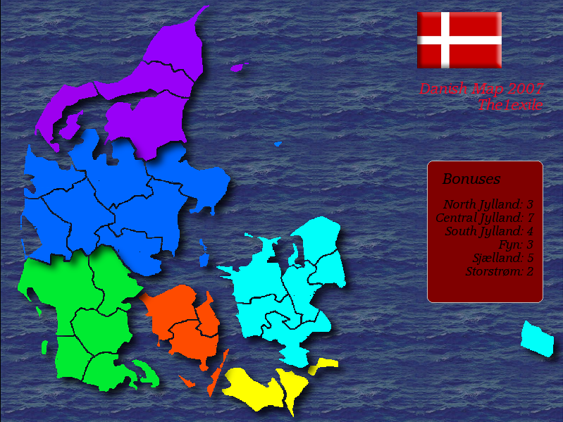
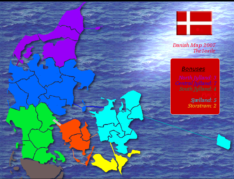
I know there's already been a Denmark map in early development, but as it seems to have died down I thought I'd have a crack at making my own improved version based on the comments there.

Image

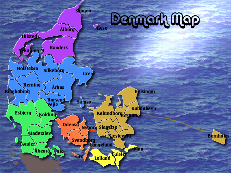
Nr. of regions: I believe 36 though I haven't defined them yet.

Possibilities for expansion: there's regional capitals that could be added for extra bonuses if people think that's appropriate, sea routes through the islands that should range from north to south when I next work on this, etc etc.

I used GIMP to design it with a bit of botching in MS Paint for the legend.

Let me know what you think - improvements, should I continue, do you like the idea...

ORIGINAL VERSION:
Image
Last edited by The1exile on Sat Nov 24, 2007 3:40 pm, edited 2 times in total.
Image
User avatar
Lieutenant The1exile
 
Posts: 7140
Joined: Tue Aug 15, 2006 7:01 pm
Location: Devastation

Postby DiM on Sat Apr 21, 2007 7:02 am

because of the shadows the regions seem to be on top of eachother. like blue is in top of green.
“In the beginning God said, the four-dimensional divergence of an antisymmetric, second rank tensor equals zero, and there was light, and it was good. And on the seventh day he rested.”- Michio Kaku
User avatar
Major DiM
 
Posts: 10415
Joined: Wed Feb 14, 2007 6:20 pm
Location: making maps for scooby snacks

Postby jnd94 on Sat Apr 21, 2007 7:20 am

DiM wrote:because of the shadows the regions seem to be on top of eachother. like blue is in top of green.


yes and the water seems a little too dark.
Captain jnd94
 
Posts: 7177
Joined: Sun Mar 11, 2007 4:22 pm

Postby The1exile on Sat Apr 21, 2007 7:23 am

Shadows: I can lessen them, though without them the map is a bit bleh and 2D. I'll also try and lighten the sea (though later today probably, expect an update this evening).
Image
User avatar
Lieutenant The1exile
 
Posts: 7140
Joined: Tue Aug 15, 2006 7:01 pm
Location: Devastation

Postby DiM on Sat Apr 21, 2007 7:25 am

The1exile wrote:Shadows: I can lessen them, though without them the map is a bit bleh and 2D. I'll also try and lighten the sea (though later today probably, expect an update this evening).


put the shadows only on the land mass margins not on the inner continent parts to make it float on the water if you really want.

and put some names on the map, and colour the legend so we know what region is what. i have no idea where sjaeland is :?
“In the beginning God said, the four-dimensional divergence of an antisymmetric, second rank tensor equals zero, and there was light, and it was good. And on the seventh day he rested.”- Michio Kaku
User avatar
Major DiM
 
Posts: 10415
Joined: Wed Feb 14, 2007 6:20 pm
Location: making maps for scooby snacks

Postby boberz on Sat Apr 21, 2007 8:36 am

move the purple and blue continents away from each other theyw ill get me on a late night
User avatar
Corporal 1st Class boberz
 
Posts: 864
Joined: Sun Dec 03, 2006 12:21 pm

Postby darkmagus on Sat Apr 21, 2007 10:15 am

I think you should add a little bit of the continent down south.

no need to add sweden or norway since there is water inbetween but I personally would like something to indicate that Jylland isn´t an island.

The whole thing of taking a country and placing it on some ocean planet in an unknown galaxy remind me of "solaris" or marvel´s "secret wars".. I´m just assuming you aren´t really going for a sci-fi theme?
Private darkmagus
 
Posts: 18
Joined: Mon Dec 25, 2006 4:18 pm

Postby The1exile on Sat Apr 21, 2007 10:50 am

darkmagus wrote:I think you should add a little bit of the continent down south.

no need to add sweden or norway since there is water inbetween but I personally would like something to indicate that Jylland isn´t an island.

The whole thing of taking a country and placing it on some ocean planet in an unknown galaxy remind me of "solaris" or marvel´s "secret wars".. I´m just assuming you aren´t really going for a sci-fi theme?


Nah, it's just a maop of the country is all, and I'm not hugely experienced at mapmaking. I'll try and add Germany in the next update. Question - should it be incluuded with it's own continent, or just a greyed out area to indicate that Denmark is not an islland?
Image
User avatar
Lieutenant The1exile
 
Posts: 7140
Joined: Tue Aug 15, 2006 7:01 pm
Location: Devastation

Postby DiM on Sat Apr 21, 2007 11:03 am

include surrounding lands as non playable. just as neutral dead terits.
“In the beginning God said, the four-dimensional divergence of an antisymmetric, second rank tensor equals zero, and there was light, and it was good. And on the seventh day he rested.”- Michio Kaku
User avatar
Major DiM
 
Posts: 10415
Joined: Wed Feb 14, 2007 6:20 pm
Location: making maps for scooby snacks

Postby darkmagus on Sat Apr 21, 2007 11:07 am

Greyed-out or whatever so that it´s clear it´s not a part of the playable area.

As long as it doesn´t look like the european continent is submerged in water I will be happy.
Private darkmagus
 
Posts: 18
Joined: Mon Dec 25, 2006 4:18 pm

Postby Balsiefen on Sat Apr 21, 2007 12:08 pm

1. add the surrounding countries in gray
2.add sea routes
3.make the legend so that writing is the same couler as its continent

good map, this one looks like it will go through
User avatar
Sergeant 1st Class Balsiefen
 
Posts: 2299
Joined: Wed Aug 30, 2006 6:15 am
Location: The Ford of the Aldar in the East of the Kingdom of Lindissi

Postby KEYOGI on Sat Apr 21, 2007 4:17 pm

I'd love to see a Viking themed map if you think you can pull it off.
Sergeant 1st Class KEYOGI
 
Posts: 1632
Joined: Tue Oct 10, 2006 6:09 am

Postby The1exile on Sat Apr 21, 2007 4:42 pm

KEYOGI wrote:I'd love to see a Viking themed map if you think you can pull it off.


I don't think I can... since the vikings were a very spread out bunch, and didn't so much have an empire as just places they liked to loot, I'd be pretty stuck as to how to make a playable map for it.

Good idea, wrong cartographer :)
Image
User avatar
Lieutenant The1exile
 
Posts: 7140
Joined: Tue Aug 15, 2006 7:01 pm
Location: Devastation

Postby The1exile on Sun Apr 22, 2007 3:02 pm

New version:

Image

Improvements:
Lightened the whole thing and added and effect to make the sea nicer
Added the sea routes, though that definitely needs improvements - tips, please!
Legend colour coded
Lessened shadows to stop the overlap problem
Added German bit beneath the peninsula.

Comments, suggestions?

Edit: Excuse the black bit at the top, will trim that in next update.
Image
User avatar
Lieutenant The1exile
 
Posts: 7140
Joined: Tue Aug 15, 2006 7:01 pm
Location: Devastation

Postby Anarkistsdream on Sun Apr 22, 2007 3:53 pm

Change the color of the legend.... That Red does not look good. And maybe mess around with some different fonts, too.
virus90 wrote: I think Anarkist is a valuable asset to any game.
User avatar
Cook Anarkistsdream
 
Posts: 7567
Joined: Wed Jan 10, 2007 11:57 am

Postby The1exile on Sun Apr 22, 2007 3:57 pm

Will try the different fonts and change the background. Any suggestions as to what colour it should be, or better yet suggest an effect?

I'm thinking of putting Danish landmarks faded into the background, though I haven't yet figured how to actually do that.
Image
User avatar
Lieutenant The1exile
 
Posts: 7140
Joined: Tue Aug 15, 2006 7:01 pm
Location: Devastation

Postby KEYOGI on Sun Apr 22, 2007 4:04 pm

I'd try to get the basics sorted first before worrying too much about pictures in the background or anything.

Perhaps try a semi-transparent blue layer over your water texture to tone it done somewhat. Unless the colours have some significance, can I suggest playing around with some different continent colour options. Perhaps look at some typical geographical maps online and see what sort of colour they use.

You could probably make the title more obvious. It might not leave much room for the flag, but perhaps you can incorporate that into the title or the legend somehow.

What program are you using exile?
Sergeant 1st Class KEYOGI
 
Posts: 1632
Joined: Tue Oct 10, 2006 6:09 am

Postby DiM on Sun Apr 22, 2007 6:31 pm

you have various black dots around the map that look really weird. :shock:
“In the beginning God said, the four-dimensional divergence of an antisymmetric, second rank tensor equals zero, and there was light, and it was good. And on the seventh day he rested.”- Michio Kaku
User avatar
Major DiM
 
Posts: 10415
Joined: Wed Feb 14, 2007 6:20 pm
Location: making maps for scooby snacks

Postby edbeard on Sun Apr 22, 2007 6:36 pm

maybe just use one colour for water paths. or choose continent colours so the paths don't blend with the water.
User avatar
Lieutenant edbeard
 
Posts: 2501
Joined: Thu Mar 29, 2007 12:41 am

Postby The1exile on Sat Nov 24, 2007 3:39 pm

Major bumpage (not that anyone cared).

Sorry about abandoning the map. I was caught up in exams, and really forgot about this.

However, on the plus side - I've had much more practice with image creation now, and found some time to work on creating this:

Image

Obviously it still needs a bit more work (continent bonus thingy added, etc.) but what do people think of the graphics?

I based the waterway connections off the asia map this time.

Suggestions, please.
Image
User avatar
Lieutenant The1exile
 
Posts: 7140
Joined: Tue Aug 15, 2006 7:01 pm
Location: Devastation

Postby firth4eva on Sat Nov 24, 2007 3:43 pm

Some territories you can't see their names and I don't know where some of the number of armies would go. Maybe get rid of the grey bit at the bottom?
User avatar
Captain firth4eva
 
Posts: 6188
Joined: Sat Mar 03, 2007 7:20 am

Postby Bad Speler on Sat Nov 24, 2007 3:47 pm

The first think I notice about this map is that the borders are VERY pixelated.

A few other points:

- The background is very strong
- Move Bornholm closer so less space is used up.
- Font should be changed. It is also a bit large.
- Sea routes don't look that good, but that might be the contrast between the background.
- I personally like the title font, but I don't think it should be transparent.
- Playability looks good.

I think I have a Denmark rough draft floating around somewhere, but your already way past the point I was at.

Good luck with the map.
Highest Score: 2532
Highest Position: 69 (a long time ago)
User avatar
Sergeant 1st Class Bad Speler
 
Posts: 1027
Joined: Fri Jun 02, 2006 8:16 pm
Location: Ottawa

Postby The1exile on Sat Nov 24, 2007 3:58 pm

Bad Speler wrote:The first think I notice about this map is that the borders are VERY pixelated.


I'll blur them for the next draft and see if that helps.

Bad Speler wrote:A few other points:

- The background is very strong

I could change the opacity, but that doesn't look good, any idea on how else I could do it?

Bad Speler wrote:- Move Bornholm closer so less space is used up.

Will do.
Bad Speler wrote:- Font should be changed. It is also a bit large.

What should I change it to? I'm also concerned that if I make it smaller, the small version of the map (which I have yet to resize it to show) will be unreadable.
Bad Speler wrote:- Sea routes don't look that good, but that might be the contrast between the background.

Sea routes are my main concern - I don't really know a way to make them good, so I took them off the asia map - which has many of the same issues you listed here, but i think is a better map than, for example, the british isles map.
Bad Speler wrote:- I personally like the title font, but I don't think it should be transparent.

I can try and change that, but how would it look good if not transparent?
Bad Speler wrote:- Playability looks good.

I think I have a Denmark rough draft floating around somewhere, but your already way past the point I was at.

Good luck with the map.


thanks :)
Image
User avatar
Lieutenant The1exile
 
Posts: 7140
Joined: Tue Aug 15, 2006 7:01 pm
Location: Devastation

Postby cena-rules on Sat Nov 24, 2007 4:09 pm

nice map.

Other than the things mentioned move odense further away from kolding as on a small map they will be hard to see as different terrs
19:41:22 ‹jakewilliams› I was a pedo
User avatar
Lieutenant cena-rules
 
Posts: 9740
Joined: Sat Apr 28, 2007 2:27 am
Location: Chat

Postby The1exile on Sat Nov 24, 2007 4:13 pm

cena-rules wrote:nice map.

Other than the things mentioned move odense further away from kolding as on a small map they will be hard to see as different terrs


Even considering that one is green and the other orange?
Image
User avatar
Lieutenant The1exile
 
Posts: 7140
Joined: Tue Aug 15, 2006 7:01 pm
Location: Devastation

Next

Return to Recycling Box

Who is online

Users browsing this forum: No registered users