Page 1 of 1

[Abandoned] - Space Station Map

PostPosted: Mon Jun 04, 2007 8:03 pm
by JupitersKing
Let's see I had a couple map ideas posted for the XML thread that didn't go anywhere and died sad little deaths when none of the XML features needed for them got Lack's seal of approval. :cry:

Another map I posted was received with dirty names and rotten tomatoes hurled at me. :roll: Lastly, it also seems that my Norlan map (http://www.conquerclub.com/forum/viewtopic.php?t=18194) has next to, if not, zero interest.

But in the hope that eventually something will be liked I have attempted again. "To hell with the nay sayers."

This is a very rough first draft of the Star Base Trinity.

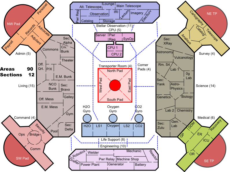
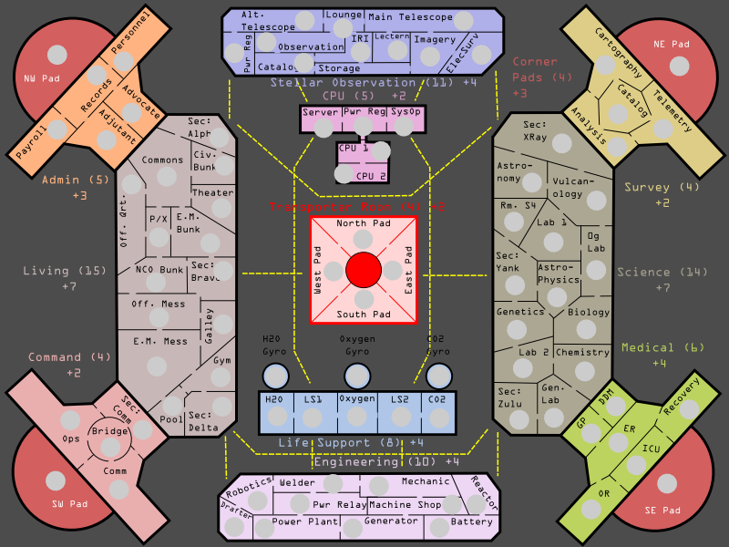
Third Draft v3.1 -- SEE POST BELOW
Image

v3.0
Image

v2.1
http://i142.photobucket.com/albums/r118/jupitersking/trinity7.png

Version 2.0
http://i142.photobucket.com/albums/r118/jupitersking/trinity6.png


First Draft: SB Trinity
It is divided into 78 SPACES in 10 SECTIONS.
http://i142.photobucket.com/albums/r118/jupitersking/trinity1.png


It looks symmetrical until you look at the divisions and see that no two Sections are the same.

I need feedback on bonuses and borders.

Also, if anyone with graphic skill is interested in helping out with a background template, basically the station, it would be a big help (On a graphic design scale of 1-10 I score a -3) and would let me finish the rest of the work but save me that headache. Having a crisper image would also help make the area of the map seem bigger.

Let me know what you think.

JK

PS To garner feedback I am now going to extremes.

Image


EDIT NOTE: I lightly edited and changed AREA into SECTION to be inline with naval jargon.

PostPosted: Mon Jun 04, 2007 8:23 pm
by dominationnation
It has a potential for interesting game play however even though It isnt perfectly semetrical it is semetrical enough to get easy build up games. I also dont like how all the territorys names are on the side of the continent. If you cant fit it just call it space 1, space 2, ect. obviosly graphics need work as does the color scheme and backround. of course you will also have to attach the key to the map.
Ill reserve judgement for now but overall i dont like it

ps. good bye ducky

PostPosted: Mon Jun 04, 2007 10:31 pm
by Vace Cooper
Im down with the space station..... Big time!

PostPosted: Tue Jun 05, 2007 7:00 pm
by d.gishman
I don't like it. Im personally not a fan of symmetric/abstract maps and gameplay. a bunch of boxes in the middle and four in the sides doesn't look like a fun map for me.

PostPosted: Tue Jun 05, 2007 7:04 pm
by lduke1990
it is inspired design, but it makes for uninspired gameplay, oh I will just put a shitload of guys on like 2 areas and hold my giant bonused continent, makes it hard to win and hard to play, there isn't really any strategy involved, in terms of Magic: The Gathering it is a Timmy map.

PostPosted: Wed Jun 06, 2007 11:19 pm
by JupitersKing
First, Thank You, for your feedback.

Vace Cooper wrote:Im down with the space station..... Big time!

Please, let Lack know immediatly. :wink:


d.gishman wrote:I don't like it. Im personally not a fan of symmetric/abstract maps and gameplay. a bunch of boxes in the middle and four in the sides doesn't look like a fun map for me.


Yeah I had a lot of trouble with the layout... I was moving a paper table spaceship game (with teleporters and special movement rules, i.e. only one movement per army per turn) into a CC game without the benefit of some XML features. ](*,)

dominationnation wrote:It has a potential for interesting game play however even though It isnt perfectly semetrical it is semetrical enough to get easy build up games. I also dont like how all the territorys names are on the side of the continent... also have to attach the key to the map.

lduke1990 wrote:it is inspired design, but it makes for uninspired gameplay, oh I will just put a shitload of guys on like 2 areas and hold my giant bonused continent, makes it hard to win and hard to play, there isn't really any strategy involved, in terms of Magic: The Gathering it is a Timmy map.


I agree with the statement you make about a build up game (though I'm not sure what a Timmy map is, maybe the easy/kid maps?). My biggest problem was trying to turn a paper towel roll into a playable map.
I was the first to be disappointed but I wanted to get the idea up and get some feedback.

I would like to try again on a layout... either a ship (I'll post the original) or a station design that is less 'tunneled' and more playable. I guess I want to know?

Station or Ship Design?

And thanks again for checking this out and especially for leaving feedback.

JK

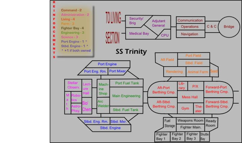
The Original SS Trinity (sort of)

PostPosted: Thu Jun 07, 2007 12:26 am
by JupitersKing
Here's the first-first draft (of the digital version) of the Space Conveyance Map Idea, catching ain't it? :-s

It wasn’t going to work with out teleports and movement restrictions; also there where Bonus Spaces and Grenadiers in the table game. The grenadier was a ‘one-per-player’ piece, represented by a green-plastic Army Man. It moved and defended normally but during the attack phase it could attack a neighboring space with a d6 roll. The defender rolled a d4 and the difference was men killed. This will never fly on CC but is maybe food for thought.

Again all of this was a table map with almost 100 spaces and it could never work in that form here on Conquer Club (although it would be a great 6-player map if it could).

Image

SECTION SPACES BONUS
Command Pod 5 - 2
Admin Pod 4 - 2
Farm Pod 6 - 3
Fighter Bay 8 - 4
Living Quarters 9 - 4
Engineering 5 - 3
Science Bay 6 - 3
Pt/St Engines 3 ea. 1 ea., 3 total if both owned

49 total spaces

NOTE: The Centeral Core is gone, it was created for the space station map. Although it could easily be incorporated.

**************

The one idea on this is to take the middle pods… Comm, Admin, Engineering and then use them as a central unit with two instead of one pods on the outside. I doodled a paint image of this.

http://i142.photobucket.com/albums/r118/jupitersking/SMALLSHIP.png


http://i142.photobucket.com/albums/r118/jupitersking/spaceship2.jpg

This layout allows for conical SECTIONS but still has enough borders to keep build-up to a, hopeful, minimum. It is also only a rough sketch, so no bitching about it as a map, only a concept. If you think it’ll work better that way I’ll continue in this direction. But in the meantime I’d like to start a second Space Station with a more balanced map. I'll work on that this morning and post it soon... It'll be more of a Sectional map as opposed to showing individual spaces.

Please keep the feedback coming.

JK

SS Trinity v2.0

PostPosted: Thu Jun 07, 2007 4:25 am
by JupitersKing
v2.0
http://i142.photobucket.com/albums/r118/jupitersking/trinity6.png

Just a outline as I said before.

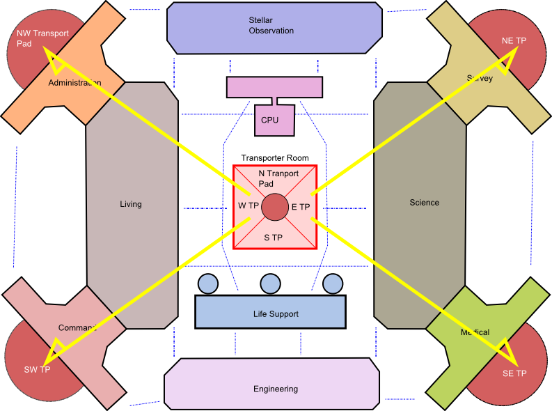
The transporter room will sort of work. Basically the idea is the center circle blocks the Transpoter Pads E/W & N/S. Thus you have to attack around the Section.

If you control the N, S, E, or W Transporter Pad (the Center Pads) you may attack the two Corner Pads sharing the same direction. Thus:

The North Transporter can attack the NW & NE Transporter Pads.
South the SE & SW T.P.
East the NE & SE T.P.
West the NW & SW T.P.

The map below shows an example of the East and West Transporter Rooms attack.

Image

Also, if a player controls all four Center Transpoter Pads in the Transporter Room s/he may attack any Corner Transporter Pad from the other Corner Pads. (See the example of the SE attacking the NW T.P.) [Not sure about XML]

A player who controls the Transpoter Room may also send troops back to the Transporter Room from the Corner Pads. (Not sure about the XML on this one. Andy?)

http://i142.photobucket.com/albums/r118/jupitersking/trinitytransport.png

If these restrictions can't be done then there should be a bonus for holding the entire Section, otherwise there should be no bonus (if the restrictions can be done).

Also all four Transporter Room Spaces should start nuetral with at least 6 armies...

JK

PostPosted: Thu Jun 07, 2007 9:30 am
by Vace Cooper
I think its looking good.... Keep working on it!

Re: SS Trinity v2.0

PostPosted: Thu Jun 07, 2007 2:20 pm
by Sparqs
JupitersKing wrote:Also, if a player controls all four Center Transpoter Pads in the Transporter Room s/he may attack any Corner Transporter Pad from the other Corner Pads. (See the example of the SE attacking the NW T.P.) [Not sure about XML]

A player who controls the Transpoter Room may also send troops back to the Transporter Room from the Corner Pads. (Not sure about the XML on this one. Andy?)

If these restrictions can't be done then there should be a bonus for holding the entire Section, otherwise there should be no bonus (if the restrictions can be done).

The current XML does not allow for dynamic borders (i.e. they can not change based on game status). I'm not clear on where that might be on the to-do list, so I'd suggest thinking about bonus levels.

I like the way the center pads have limited scope. You don't have to hold all transporters to secure your space - 2 pads secure your corner of the station and threaten your neighbors.

Perhaps the four corner pads could connect to the center circle. It does not appear to be a space now, but if you made it one-way out to the side pads, with a large neutral starting force, players would still be required to go around it to take the pads.

Re: SS Trinity v2.0

PostPosted: Thu Jun 07, 2007 10:06 pm
by JupitersKing
Sparqs wrote:The current XML does not allow for dynamic borders...

Perhaps the four corner pads could connect to the center circle. It does not appear to be a space now, but if you made it one-way out to the side pads, with a large neutral starting force, players would still be required to go around it to take the pads.


The XML was one of those things that I knew wouldn't really work when I was typing it. But at that point I was so tired I just wanted to finish up and go to bed.

Hopefully in the future it'll happen... when it does I'll change it. Till then I'm thinking of a +2 bonus for holding all four Corner Pads and a +3 bonus for the Transpoter Room. Maybe a +1 bonus for holding all 8 pads?


As for your Transpoter Room idea: It might work. I need to finish the compartmentalization before we know if it needs to be done.

My thoughts on the CORNER (NE, NW, SW, SE) pads....

This map was an attempt to open up the concept of the space station map and make it more playable. The Transporter Room was one of the ideas I thought up to help this along.

The main idea here though was the Transporter Room itself. The CORNER pads came along as a way to control the movememnt from the Transporter Room. The only alternantive would be to allow transport to any space in the station once a player controls the entire Transporter Room, which is way to "open" a map, as oppesed to before where it was too closed off.

The real question becomes: should the Corner pads be allowed to transport armies at all? And if so to what extent?

I answered Yes to the first question. And somewhat limited to the second. With the XML limits I think a Corner pad should, AT MOST, be able to attack the Transpoter Room and the neighboring Corner pads, if that.

Let me know how the Transporter Room and Corner Pads should work.

I'll also put up a newer map with Spaces included.

JK

PostPosted: Fri Jun 08, 2007 12:14 am
by Steel Panzer
motives why it wont work:

1. its too simetrical, most simetrical maps dont have appeal to the community(a.k.a. chinese checkers, 8 thoughts)
2. the idea is not very attractive

my suggestion: go for a solar system map, i bet you will get support there

PostPosted: Fri Jun 08, 2007 12:29 am
by JupitersKing
Steel Panzer wrote:...1. its too simetrical, most simetrical maps dont have appeal to the community
2. the idea is not very attractive...

...go for a solar system map...


Thanks for the time SP, to respond quickly,

1 & 2. You're right about appeal issues. But by sub-divideing properly you avoid repeating yourself, even if the map is a copy of itself.

The idea for a Solar System map is propsed, I believe. But even if it wasn't it doesn't, honestly have any appeal to me. (Edit: Until they come up with 'Changing Maps' to simulate the orbits of the planets and changing borders, etc.)

The one thing I'd like to say about community appeal as a whole is this: the poll for this is very evenly split. I think if I had better graphic skills those in support would be more vocal. As a whole however, I think the poll does show that there is at least interest in the idea.

I think also that once a map is started and gains some momentum that even members who where originally opposed accept that the map is popular and come on board in an attempt to make the map as good as possible.

JK

PostPosted: Sat Jun 09, 2007 1:42 pm
by JupitersKing
Version 2.1

http://i142.photobucket.com/albums/r118/jupitersking/trinity7.png

***

Added AREAS to all but the Science and Living SECTIONS and included initial divisions between them.

The Corner Transporter Pads (NW, NE, SE, & SW) connects to all neighboring Areas, thus the NW Pad connects to Payroll, Personel, and Records. Also, when added, all the sections in the Science and Living Sections will connect to their neighbors in the four pods (Command, Medical, Survey, & Administration).

The Transporter Room is attacked from Science and Living only. The CPU and Life Support Sections connect to each other but not the Transporter Room. Think of the map as showing different levels of the station, the Transporter Room is at the top, the CPU and Life Support at the bottom, and the rest in the middle.

I'll work on bonuses and a key when I'm done with the remaining Areas and divisions.

JK

SS Trinity v3.0

PostPosted: Sat Jun 09, 2007 5:07 pm
by JupitersKing
v3.0
Image


* Completed the division of the SECTIONS, there are 12.

There are also 90 AREAS. Six of these, the Transporter Room (4), and the Bravo and Yankee Security Stations start as neutral.

The numbers (#) are the numbers of AREAS in each Section.

* Also the connections are:

The four pods (Comm, Admin, Survey, Medical) connect to neighboring Areas in the Living and Science Sections. Thus--

Analysis connects only to Sec: XRay.
The dentist (DDM) connects to Chemistry and the General Lab. The General Practitioner (GP) connects only to the Gen. Lab.
Command Security connects to the Pool and the Enlisted Mess.
The Advocate connects to Sec: Alpha and the Commons. The Adjunct's Office connects to the Commons and the Officer's Bunk.

* As far as the blue connectors they are pretty self-explanatory (if not let me know). However, a few are less clear:

Sec: Alpha & XRay connect. As do Delta and Zulu.

The CPU Server and SysOp connect to Life Support 1 & 2. None of these connects to the Transporter Room.

* I wanted to keep fewer borders on the four corners of the map to make the Transporter Room more important.

Also, should the Corner Pads be a part of the four pods bonus? Or seperate? Or should there be a combination bonus? (say a +3 bonus for holding the Admin Pod and a +1 bonus for having the NW Pad also, for a +4 total)

* Still need feedback as to whether the Corner Pads can move troops back to the Transporter Room, or each other.

* The working bonus for the Transporter Room is +2, for the Corner Pads +3. There is a +2 bonus for, or +7 for holding all eight.

* I was also thinking that controling all 7 Security Stations would be some sort of bonus. There is one in the Command Pod Section and 6 in the Living and Science Sections. Maybe +2 for having three, +3 for having five, and +5 for all seven.


Bonuses and new font are next, then a new poll.

JK

PostPosted: Sat Jun 09, 2007 7:02 pm
by KEYOGI
What do you think of the general idea so far?

It'll look good, with some work.
42% [ 9 ]
I love the idea, hate the map (please explain below).
4% [ 1 ]
The gameplay is too uneven (please explain below).
0% [ 0 ]
The gameplay is too restricted (please explain below).
9% [ 2 ]
I have zero interest in this map as is (please explain below).
4% [ 1 ]
I have no interest in this map, or this idea in general.
38% [ 8 ]

Total Votes : 21

PostPosted: Sat Jun 09, 2007 7:27 pm
by JupitersKing
Image

Newest map.

I added bonuses, what do you think?

Added some very rough army circles to give a feel for them. A few of them don't fit.

Changed the fonts on the labels. A few of them don't fit either.

Changed the lines of attack.

Added a background to help contrast.

JK

PostPosted: Sun Jun 10, 2007 5:59 am
by Wisse
this should actually move to the map foundry (not in de map ideas)

PostPosted: Sun Jun 10, 2007 12:16 pm
by sfhbballnut
that's a pretty good start and looks likee it will play pretty well once finished. I would like to point out some things I see though, the overall presentation is a little cramped, the text is a little hard to distinguish at times you may want to change your font, you might also consider making a key for the bonuses, the overalll graphics could use some work both for border clarity and visual appeal. Try for a professional look to the map. just my first impressions keep working this should turn out pretty well

PostPosted: Sun Jun 10, 2007 4:07 pm
by JupitersKing
sfhbballnut wrote:that's a pretty good start and looks likee it will play pretty well once finished. I would like to point out some things I see though, the overall presentation is a little cramped, the text is a little hard to distinguish at times you may want to change your font, you might also consider making a key for the bonuses, the overalll graphics could use some work both for border clarity and visual appeal.Try for a professional look to the map. just my first impressions keep working this should turn out pretty well


It still needs lots of work....

I need to increase the Stellar Observation and Engineering Sections, as well as the CPU.

The font still isn't right and the key is last, because it is the least important component to the map. Also I need to finish the station so I know exactly where to put it.

Try for a professional look to the map.


:lol:

Would if I could.

Once I get the general layout I'd like to move it over from Inkscape and put it into Gimp or Photoshop (maybe). Any ideas on these programs and how I could use them to make this look better would be a big help as I don't really know how to use either.

Till then I want to get the basics done. Avenues of attack, Transporter rules, bonus...

JK

PostPosted: Mon Jun 18, 2007 2:32 pm
by Sargeant_Pepper
colours too flat, unattractive. White dotted lines are distracting. A little too symetrical. Try making the right side a lot different than the left.

I must play on this

PostPosted: Tue Jun 19, 2007 6:58 am
by Solus
This map is great for big games bad for small games for obvious reasons. If I could play it today I would. :)