Conquer Club

Netherlands [Quenched]

Care to peruse completed maps? Take a stroll through the Atlas.

Moderator: Cartographers

Forum rules
Please read the Community Guidelines before posting.

Postby yeti_c on Sun Jan 06, 2008 4:40 pm

gimil wrote:
yeti_c wrote:
gimil wrote:
lanyards wrote:When comparing the legend on your large and small map, I found that the circles with the value of the the continent bonus have a different shadow angle. On the large map, the shadow is on the north-west side on the circle, and on the small it is on the south-east side.


small/large consistancy isnt an issues on such trivial issues


Really?!

They do look completely different - the Light source has been completely flipped for both Army circles and Bonus Circles...

C.


have you seen british isles :P

not that that matters becasue that was before the foundry.

But they may be different but if there any need to have them identical in both images?


YES - both large and small maps should be as identical as possible to each other...

The only reason they shouldn't be is because there is a reason for them not to be (i.e. spacing etc)

If they can be identical I think they should be!!!

C.
Image
Highest score : 2297
User avatar
Lieutenant yeti_c
 
Posts: 9624
Joined: Thu Jan 04, 2007 9:02 am

Postby Lone.prophet on Sun Jan 06, 2008 4:42 pm

what are you argueing about look at the latest update
Image
Captain Lone.prophet
 
Posts: 1467
Joined: Thu Oct 12, 2006 4:37 pm
Location: Your basement Muahaha

Postby yeti_c on Sun Jan 06, 2008 4:42 pm

Lone.prophet wrote:what are you argueing about look at the latest update


It was the point of fact - not the map...

C.
Image
Highest score : 2297
User avatar
Lieutenant yeti_c
 
Posts: 9624
Joined: Thu Jan 04, 2007 9:02 am

Postby gimil on Sun Jan 06, 2008 4:45 pm

why shoul be identical? if it doesnt affecy gameplay?
What do you know about map making, bitch?

natty_dread wrote:I was wrong


Top Score:2403
User avatar
Corporal 1st Class gimil
 
Posts: 8599
Joined: Sat Mar 03, 2007 12:42 pm
Location: United Kingdom (Scotland)

Postby yeti_c on Sun Jan 06, 2008 4:46 pm

gimil wrote:why shoul be identical? if it doesnt affecy gameplay?


Because they are large and small "VERSION"s of the same map.

C.
Image
Highest score : 2297
User avatar
Lieutenant yeti_c
 
Posts: 9624
Joined: Thu Jan 04, 2007 9:02 am

Postby Coleman on Sun Jan 06, 2008 4:54 pm

The need for the large and small map to be identical in appearance if it doesn't effect gameplay is up to foundry members to argue for or against based on their own judgment.

So it's up to whoever cares the most I guess. :lol: Right now my opinion is that they can look different if they need to in order to fit. So I'm going to side with yeti here, they need the same light source since small wasn't given a different one to fit better.
Warning: You may be reading a really old topic.
User avatar
Sergeant Coleman
 
Posts: 5402
Joined: Tue Jan 02, 2007 10:36 pm
Location: Midwest

Postby edbeard on Sun Jan 06, 2008 5:19 pm

I quoted the maps so people don't have to go to the last page.

Lone.prophet wrote:here are the shades ok i hope

Image

Image


on the legend for the large map, the bonuses with the number 4 don't line up together. I'd say the yellow one should be moved up and to the left a bit.

on the legend for the small map, the teal (zeeland) and the blue (zuid-nederland) bonus numbers aren't lined up with the other ones. they are both, quite obviously, too far to the left.

I would recommend rechecking them all again just to be sure. It's quite easy to do this. Just draw a line on top of the area and make sure they all line up.


Another thing that Oaktown brought up quite a while ago that was never addressed. He is colourblind, and cannot distinguish the orange and yellow continents. I would recommend adding a thicker line to the outside of the continent areas so that it is easy to tell where the continents lie.


Finally, is there any reason you listed the yellow region in the legend before the green? It seems like it follows a top to bottom and left to right formula except for these two.
User avatar
Lieutenant edbeard
 
Posts: 2501
Joined: Thu Mar 29, 2007 12:41 am

Postby pepperonibread on Sun Jan 06, 2008 5:31 pm

The problem now is not that the two versions are different, it's that on both the large and small maps, the bevel on the army circles, and only the bevel, has lighting oriented in the opposite direction relative to the rest of the map.
Image
User avatar
Corporal pepperonibread
 
Posts: 954
Joined: Sun Jan 28, 2007 4:33 pm
Location: The Former Confederacy

Postby Kaplowitz on Sun Jan 06, 2008 5:54 pm

I think you need a minimap
Image
User avatar
Private 1st Class Kaplowitz
 
Posts: 3088
Joined: Tue May 01, 2007 5:11 pm

Postby Coleman on Sun Jan 06, 2008 6:07 pm

I disagree. There is nothing confusing enough here to warrant a mini-map and no where convenient to put it unless he does it over the current legend, and I like the current legend.
Warning: You may be reading a really old topic.
User avatar
Sergeant Coleman
 
Posts: 5402
Joined: Tue Jan 02, 2007 10:36 pm
Location: Midwest

Postby lanyards on Sun Jan 06, 2008 8:06 pm

pepperonibread wrote:The problem now is not that the two versions are different, it's that on both the large and small maps, the bevel on the army circles, and only the bevel, has lighting oriented in the opposite direction relative to the rest of the map.

I suggest just removing the bevel and emboss and just having the drop shadow. I think it will look better. If not, then atleast fix these:

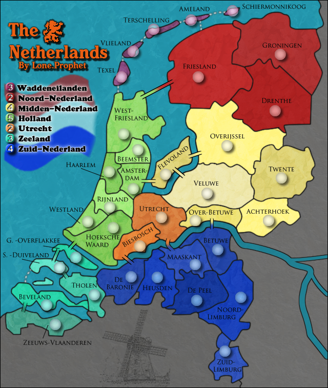
1)On small map, the Texel army circle has a little extra glob of circle on the bottom.
2)On small map, the Overijssel army circle has a little extra glob of circle on the top
3)On small map, the Biesbosch army circle has a little extra glob of circle on the bottom.

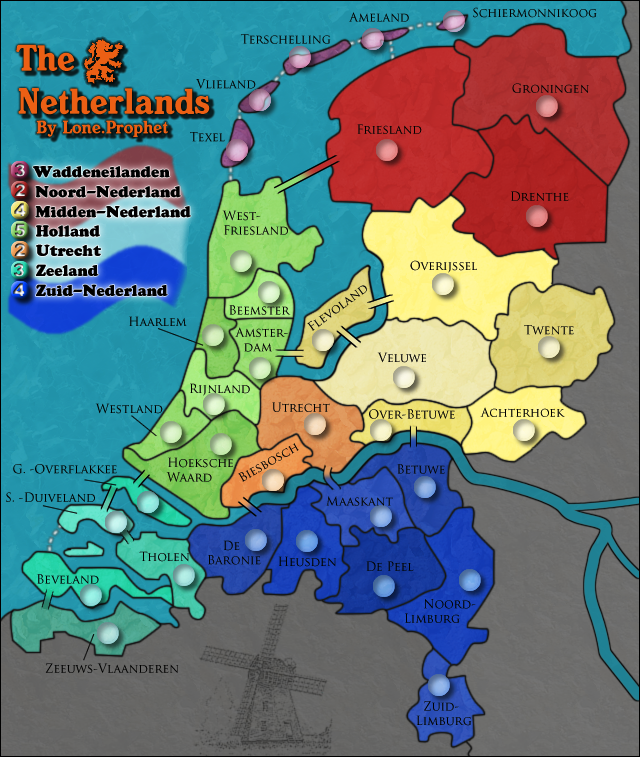
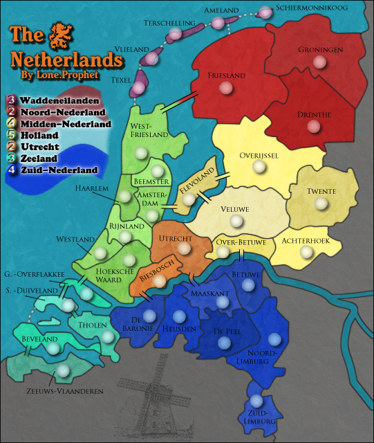
edbeard wrote:On the legend for the large map, the bonuses with the number 4 don't line up together. I'd say the yellow one should be moved up and to the left a bit.

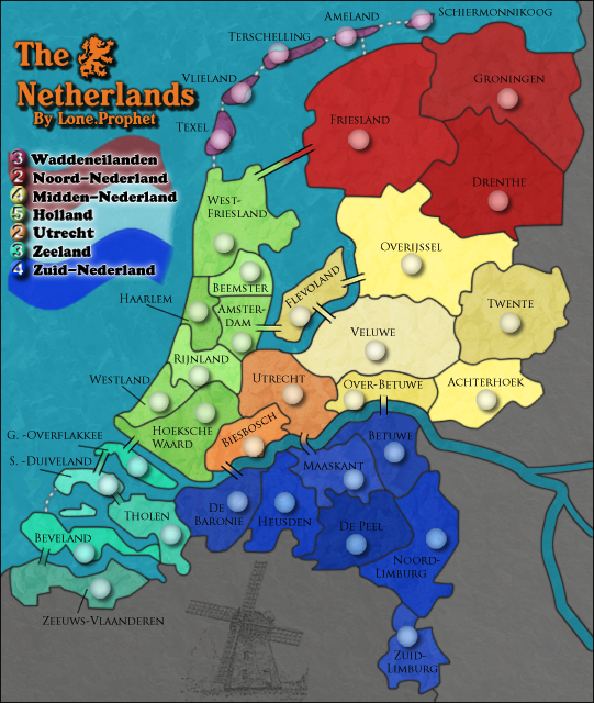
On the legend for the small map, the teal (Zeeland) and the blue (Zuid-Nederland) bonus numbers aren't lined up with the other ones. They are both, quite obviously, too far to the left.

I would recommend rechecking them all again just to be sure. It's quite easy to do this. Just draw a line on top of the area and make sure they all line up.

Actually, to me it looks like on the large and small map, they all are lined up except for the 3 bonus for Zeeland and the 4 bonus for Zuid-Nederland. They both need to be moved one pixel to the right on both maps.

On the large map, the naming for Tholen is too far to the right of the territory. Try moving a few pixels to the left.

XML spelling corrections I made:
Code: Select all
Line 11: "Wadden Eilanden" should be "Waddeneilanden".

Line 23: "Noord Nederland" should be "Noord-Nederland".

Line 33: "Midden Nederland" should be "Midden-Nederland".

Line 37: "Overijsel" should be "Overijssle".

Line 54: "Hoekse Waard" should be "Hoeksche Waard".

Line 81: "Zuid Nederland" should be "Zuid-Nederland".

Line 171: "Overijsel" should be "Overijssle".

Line 200: "Overijsel" should be "Overijssle".

Line 211: "Overijsel" should be "Overijssle".

Line 230: "Overijsel" should be "Overijssle".

Line 260: "Overijsel" should be "Overijssle".

Line 290: "Overijsel" should be "Overijssle".

Line 377: "Hoekse Waard" should be "Hoeksche Waard".

Line 391: "Hoekse Waard" should be "Hoeksche Waard".

Line 402: "Hoekse Waard" should be "Hoeksche Waard".

Line 423: "Hoekse Waard" should be "Hoeksche Waard".

Line 441: "Hoekse Waard" should be "Hoeksche Waard".

Line 455: "Hoekse Waard" should be "Hoeksche Waard".


XML coordinate coorections I made:
Code: Select all
Small map:

Texel: Down one pixel.

Achterhoek: Left one pixel.

Veluwe: Up one pixel.

Twente: Down one pixel.

Flevoland: Down one pixel.

Haarlem: Down one pixel.

Rijnland: Left one pixel.

Westland: Down one pixel.

Hoeksche Waard: Left one pixel and down one pixel.

Utrecht: Down one pixel and right one pixel.

Zeeuws Vlaanderen: Down one pixel.

Maaskant: Left one pixel and down one pixel.

Betuwe: Left one pixel.

De Peel: Left one pixel and down one pixel.

Noord-Limburg: Down one pixel and left one pixel.

Zuid-Limburg: Down one pixel.


Large map:

Terschelling: Left one pixel and up one pixel.

Texel: Down one pixel.

Overijssel: Left one pixel.

Achterhoek: Left one pixel.

Veluwe: Up one pixel.

Beemster: Left one pixel.

Rijnland: Left one pixel.

Hoeksche Waard: Left one pixel.

G. Overflakkee: Up one pixel.

S. Duiveland: Up one pixel.

Beveland: Up one pixel.

Maaskant: Left one pixel.

Betuwe: Left one pixel.

Noord-Limburg: Down one pixel and left one pixel.

Twente: Up one pixel.


Coleman wrote:Could we see text links to those images and the xml?

Link to the XML:
http://h1.ripway.com/lanyards/TheNetherlandsXML.xml

Link to the small map:
http://i150.photobucket.com/albums/s113/prophetlone/NLfinalsmallcopy-4.png

Link to large map:
http://i150.photobucket.com/albums/s113/prophetlone/NLfinalcopy-5.png

gimil wrote:Can we see another army test result?

Of course:


Small Test 88:
Image

Small Test 888:
Image

Large Test 88:
Image

Large Test 888:
Image


--lanyards
Image
WANT AN ADVANTAGE WHILE WORKING TOWARDS MEDALS?
https://www.conquerclub.com/forum/viewtopic.php?f=529&t=226714
User avatar
Major lanyards
 
Posts: 1378
Joined: Sat Feb 24, 2007 1:31 am
2

Postby gimil on Sun Jan 06, 2008 8:26 pm

Army circles on teh small still wont center. They need to be an EVEN number of pixels in diameter.
What do you know about map making, bitch?

natty_dread wrote:I was wrong


Top Score:2403
User avatar
Corporal 1st Class gimil
 
Posts: 8599
Joined: Sat Mar 03, 2007 12:42 pm
Location: United Kingdom (Scotland)

Postby fireedud on Sun Jan 06, 2008 8:31 pm

with the 3 numbers, it's hard to see the last digit with certain colors on certain territories.

I think the shadows should be enlarged to fit 3 digits, but if there isn't anybosy else with the problem, you can leave it.
me have no sig
Cook fireedud
 
Posts: 1704
Joined: Fri Mar 02, 2007 10:06 pm

Postby lanyards on Sun Jan 06, 2008 8:36 pm

gimil wrote:Army circles on teh small still wont center. They need to be an EVEN number of pixels in diameter.

I think they are even. It is just hard to tell that the coordinate numbers are centered because of the bevel and emboss. That is why I suggested that he remove it.

--lanyards
Image
WANT AN ADVANTAGE WHILE WORKING TOWARDS MEDALS?
https://www.conquerclub.com/forum/viewtopic.php?f=529&t=226714
User avatar
Major lanyards
 
Posts: 1378
Joined: Sat Feb 24, 2007 1:31 am
2

Postby pepperonibread on Sun Jan 06, 2008 8:37 pm

It looks like the circles were scaled with the rest of the map, making them uneven. That's why there are extra pixels sticking out of some of the circles.
Image
User avatar
Corporal pepperonibread
 
Posts: 954
Joined: Sun Jan 28, 2007 4:33 pm
Location: The Former Confederacy

Postby pepperonibread on Sun Jan 06, 2008 8:39 pm

lanyards wrote:
gimil wrote:Army circles on teh small still wont center. They need to be an EVEN number of pixels in diameter.

I think they are even. It is just hard to tell that the coordinate numbers are centered because of the bevel and emboss. That is why I suggested that he remove it.

--lanyards


They're not even. Zoom in on the small map circles on Photoshop, and you can see that some of them are off-center.
Image
User avatar
Corporal pepperonibread
 
Posts: 954
Joined: Sun Jan 28, 2007 4:33 pm
Location: The Former Confederacy

Postby gimil on Sun Jan 06, 2008 8:55 pm

pepperonibread wrote:
lanyards wrote:
gimil wrote:Army circles on teh small still wont center. They need to be an EVEN number of pixels in diameter.

I think they are even. It is just hard to tell that the coordinate numbers are centered because of the bevel and emboss. That is why I suggested that he remove it.

--lanyards


They're not even. Zoom in on the small map circles on Photoshop, and you can see that some of them are off-center.


They ARE off center, i have checked and can confirm this.
Last edited by gimil on Mon Jan 07, 2008 6:05 am, edited 1 time in total.
What do you know about map making, bitch?

natty_dread wrote:I was wrong


Top Score:2403
User avatar
Corporal 1st Class gimil
 
Posts: 8599
Joined: Sat Mar 03, 2007 12:42 pm
Location: United Kingdom (Scotland)

Postby lanyards on Sun Jan 06, 2008 9:38 pm

gimil wrote:
pepperonibread wrote:
lanyards wrote:
gimil wrote:Army circles on teh small still wont center. They need to be an EVEN number of pixels in diameter.

I think they are even. It is just hard to tell that the coordinate numbers are centered because of the bevel and emboss. That is why I suggested that he remove it.

--lanyards


They're not even. Zoom in on the small map circles on Photoshop, and you can see that some of them are off-center.


They ARE of center, i have checked and can confirm this.

Yes, you both are right. I have seen it myself.

--lanyards
Image
WANT AN ADVANTAGE WHILE WORKING TOWARDS MEDALS?
https://www.conquerclub.com/forum/viewtopic.php?f=529&t=226714
User avatar
Major lanyards
 
Posts: 1378
Joined: Sat Feb 24, 2007 1:31 am
2

Postby Lone.prophet on Mon Jan 07, 2008 3:39 am

Image

Image

Fixed texel army circle

removed the innershadow of army circles (now evenly spread)

alligned the lagend numbers


and laynard can you post the corrected XML in a codebox
Image
Captain Lone.prophet
 
Posts: 1467
Joined: Thu Oct 12, 2006 4:37 pm
Location: Your basement Muahaha

Postby gimil on Mon Jan 07, 2008 6:06 am

Can we hear feedback on the yellow/orange color blind issue that edberat mentioned? If oaktown cant differentiate them then is a seriuos color blind probelm.
What do you know about map making, bitch?

natty_dread wrote:I was wrong


Top Score:2403
User avatar
Corporal 1st Class gimil
 
Posts: 8599
Joined: Sat Mar 03, 2007 12:42 pm
Location: United Kingdom (Scotland)

Postby Lone.prophet on Mon Jan 07, 2008 6:44 am

ohh i cant really change the line or anything, dont know what to do
Image
Captain Lone.prophet
 
Posts: 1467
Joined: Thu Oct 12, 2006 4:37 pm
Location: Your basement Muahaha

Postby Lone.prophet on Mon Jan 07, 2008 6:49 am

ohh thats bad :(

i only dont know what to do about it
Image
Captain Lone.prophet
 
Posts: 1467
Joined: Thu Oct 12, 2006 4:37 pm
Location: Your basement Muahaha

Postby gimil on Mon Jan 07, 2008 7:06 am

Lone.prophet wrote:ohh thats bad :(

i only dont know what to do about it


jsut find an alternative unique color to replace either yellow or orange in one of those continents.
What do you know about map making, bitch?

natty_dread wrote:I was wrong


Top Score:2403
User avatar
Corporal 1st Class gimil
 
Posts: 8599
Joined: Sat Mar 03, 2007 12:42 pm
Location: United Kingdom (Scotland)

Postby rebelman on Mon Jan 07, 2008 7:17 am

gimil wrote:
Lone.prophet wrote:ohh thats bad :(

i only dont know what to do about it


jsut find an alternative unique color to replace either yellow or orange in one of those continents.


i would suggest replacing yellow as orange is acolour i very much associate with this country
Don't now why people on here don't like being cooks, remember under siege: A former SEAL, now cook, is the only person who can stop a gang of terrorists when they sieze control of a US Navy battleship.
User avatar
Private rebelman
 
Posts: 2968
Joined: Thu Aug 02, 2007 5:24 pm
Location: People's Republic of Cork

Postby Lone.prophet on Mon Jan 07, 2008 2:51 pm

i changed the contrast, i really wont change more

Image

Image
Image
Captain Lone.prophet
 
Posts: 1467
Joined: Thu Oct 12, 2006 4:37 pm
Location: Your basement Muahaha

PreviousNext

Return to The Atlas

Who is online

Users browsing this forum: No registered users