AndyDufresne wrote:Cairnswk, I think you are suffering from over saturation. You've just too many damn maps in production, people don't know where to go to post!
Appreciate your sentiments Andy. I don't think it is from over saturation. Afterall if you can find them once a week, so can others.
I think it's because we have such a variety and large number of maps, and now of course very different styles happening....people growing, foundary growing, Keyogi's role growing, skills being honed....perhaps it would be a good time do to some "menu marketing" for the foundary in the menu system of game play screen. Afterall, many new maps are being developed, but it's still only the marginally few same people that visit the foundary to comment, although sometimes there are many voters who don't comment.
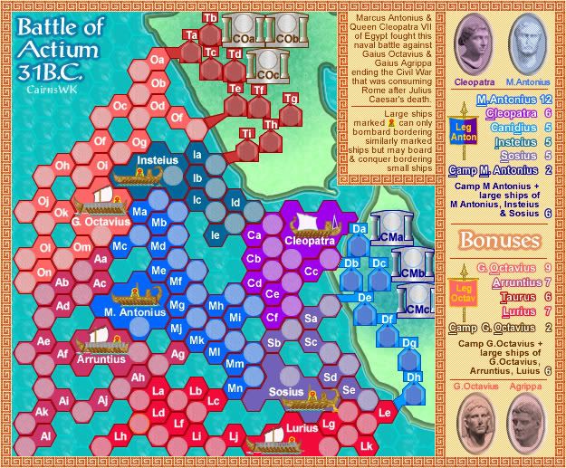
Yes the gold ade the borders clear.I actually like the dark red, instead of the gold...at least somewhat. The gold seemed to stand out tooooo much, (though that was partly the point of it, correct?)
However, if we use the dark red, it will mean altering Cleopatra's Royal Purple, and that's somewhere I really don't want to go....so I'll investigate another border colour instead of gold.
Oops, sorry about that, but those terts army shadows received coloured borders in that version. Fixed.And on the latest image, Mi and Sd army circles look smaller. I'm not sure if it's in your masterfile, as the map with the gold images doesn't suffer from the problem.
And just because I'm curious, would you mind posting an image with 3 digit army coordinates? I think the way the coordinates are set up, there shouldn't be any overlapping or interfering with each other, but do any overlap names?
--Andy
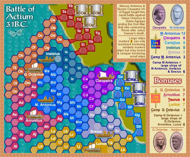
Will post something shortly in new version for 3 digit army coordinates