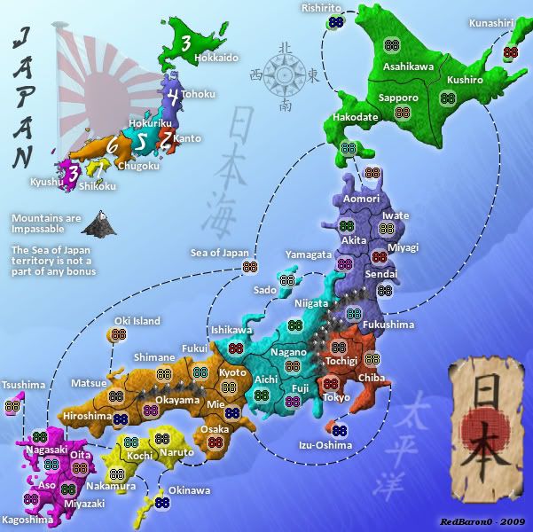
The bonus values generated by the spreadsheet seem pretty good too...
Moving along nicely... Keep up the good work
Moderator: Cartographers
![]() by MrBenn on Sun Aug 23, 2009 3:56 pm
by MrBenn on Sun Aug 23, 2009 3:56 pm


![]() by RedBaron0 on Sun Aug 23, 2009 9:19 pm
by RedBaron0 on Sun Aug 23, 2009 9:19 pm
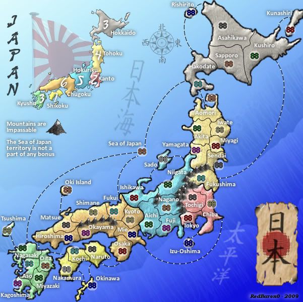
MrBenn wrote:I can;t see any issue with the drop probabilities - all the areas have substantially lower than 10% chance of being dropped.
The bonus values generated by the spreadsheet seem pretty good too...
Moving along nicely... Keep up the good work


![]() by Danyael on Sun Aug 23, 2009 9:40 pm
by Danyael on Sun Aug 23, 2009 9:40 pm


![]() by RedBaron0 on Sun Aug 23, 2009 10:13 pm
by RedBaron0 on Sun Aug 23, 2009 10:13 pm
![]() by Danyael on Sun Aug 23, 2009 10:19 pm
by Danyael on Sun Aug 23, 2009 10:19 pm
![]() by RedBaron0 on Sun Aug 23, 2009 10:35 pm
by RedBaron0 on Sun Aug 23, 2009 10:35 pm
Danyael wrote:i believe that in 1v1 the territs are split even
so it makes me wonder
how will the game engine know to give the neut the extra?
will this be a problem is there a solution?
![]() by MrBenn on Mon Aug 24, 2009 1:30 pm
by MrBenn on Mon Aug 24, 2009 1:30 pm
RedBaron0 wrote:MrBenn wrote:I can;t see any issue with the drop probabilities - all the areas have substantially lower than 10% chance of being dropped.
The bonus values generated by the spreadsheet seem pretty good too...
Moving along nicely... Keep up the good work
Thanks Mr. Benn! That kind of statement I was kinda hoping might have something... attached to it.
I guess my question is, am I still missing something gameplay wise?

![]() by RedBaron0 on Mon Aug 24, 2009 10:43 pm
by RedBaron0 on Mon Aug 24, 2009 10:43 pm
MrBenn wrote:RedBaron0 wrote:MrBenn wrote:I can;t see any issue with the drop probabilities - all the areas have substantially lower than 10% chance of being dropped.
The bonus values generated by the spreadsheet seem pretty good too...
Moving along nicely... Keep up the good work
Thanks Mr. Benn! That kind of statement I was kinda hoping might have something... attached to it.
That was remiss of me...

![]() by Industrial Helix on Tue Aug 25, 2009 7:02 am
by Industrial Helix on Tue Aug 25, 2009 7:02 am


![]() by RedBaron0 on Tue Aug 25, 2009 2:57 pm
by RedBaron0 on Tue Aug 25, 2009 2:57 pm
![]() by RedBaron0 on Wed Aug 26, 2009 3:29 am
by RedBaron0 on Wed Aug 26, 2009 3:29 am
![]() by ender516 on Wed Aug 26, 2009 9:33 am
by ender516 on Wed Aug 26, 2009 9:33 am


![]() by porkenbeans on Wed Aug 26, 2009 11:28 am
by porkenbeans on Wed Aug 26, 2009 11:28 am


![]() by RedBaron0 on Fri Aug 28, 2009 4:01 am
by RedBaron0 on Fri Aug 28, 2009 4:01 am
![]() by Industrial Helix on Fri Aug 28, 2009 10:52 am
by Industrial Helix on Fri Aug 28, 2009 10:52 am
![]() by porkenbeans on Fri Aug 28, 2009 11:37 am
by porkenbeans on Fri Aug 28, 2009 11:37 am
![]() by ender516 on Fri Aug 28, 2009 12:03 pm
by ender516 on Fri Aug 28, 2009 12:03 pm
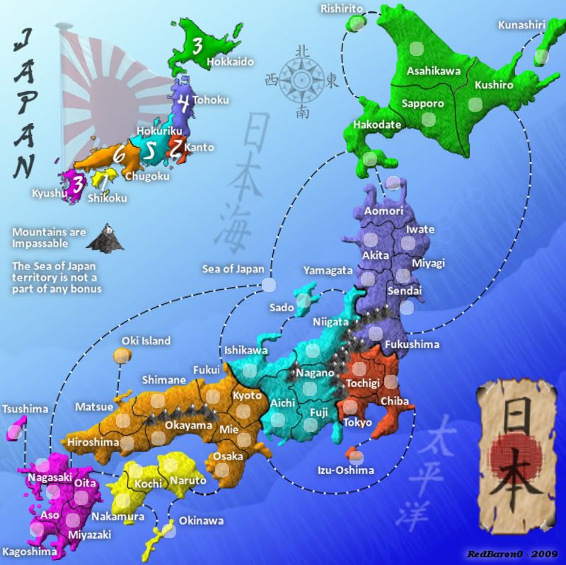
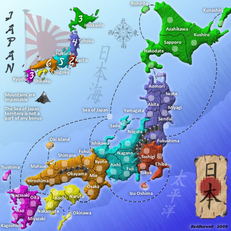
Industrial Helix wrote:Wow... brightness. I think you should desaturate the color some, though not to the levels they were before if you don't want. To be honest, I think the saturation levels were good the way it was two updates ago. As for removing the line around the whole map... I'm inclined to not like it, but i you think its a good idea then run with it. I think it just displaces the map on the blue background too much in the large map...
Industrial Helix wrote:Something is going on with your large version... like the darker tones that are in the small map loose their darkness when in the large map. Because the lack of line doesn't seem to affect the small map in my eyes, just the large one.
![]() by porkenbeans on Fri Aug 28, 2009 12:34 pm
by porkenbeans on Fri Aug 28, 2009 12:34 pm
![]() by RedBaron0 on Sat Aug 29, 2009 2:57 am
by RedBaron0 on Sat Aug 29, 2009 2:57 am
![]() by porkenbeans on Sat Aug 29, 2009 2:36 pm
by porkenbeans on Sat Aug 29, 2009 2:36 pm
![]() by Danyael on Sat Aug 29, 2009 2:40 pm
by Danyael on Sat Aug 29, 2009 2:40 pm
![]() by RedBaron0 on Sat Aug 29, 2009 10:20 pm
by RedBaron0 on Sat Aug 29, 2009 10:20 pm
porkenbeans wrote:check your transfer modes. Do you have any color burns set ? the richness of the color is still way to high. Photobucket has an editing room, that is very easy to use. you can go there and play with the contrast and saturation levels quickly and easily.
![]() by MrBenn on Mon Aug 31, 2009 4:55 pm
by MrBenn on Mon Aug 31, 2009 4:55 pm
![]() by porkenbeans on Mon Aug 31, 2009 5:01 pm
by porkenbeans on Mon Aug 31, 2009 5:01 pm
What exactly do you mean by, be wary ? and why.MrBenn wrote:I'd be wary about exporting an image to photobucket in order to make amendments to things - you'd be much better off sticking to whatever functionality is in your graphics software (be that GIMP, Photoshop, or whatever).
From here, I would suggest focusing development on your large image, and leaving the small one for a while (other than occasional checks for legibility etc). A large map scales down a lot better than a small one scales up - which is why your large image looks so blurry right now.
The land textures don't really do much for me at the moment - primarily because you've got a slight stylistic mish-mash going on... ie The map (textures and colours) doesn't blend well with the background - it doesn't look like they go together. I think you need to get some inspiration to direct your graphical vision - once you have in your mind what you hope to achieve, you'll find it easier to get there
In the meantime, you can do some work on your borders - I think the map would work better with an outline! RjBeals gave me some good advice - the premise of which is very transferable: viewtopic.php?f=127&t=73566&start=15#p1770213
Keep up the good work
![]() by MrBenn on Mon Aug 31, 2009 5:31 pm
by MrBenn on Mon Aug 31, 2009 5:31 pm
porkenbeans wrote:What exactly do you mean by, be wary ? and why.
Users browsing this forum: No registered users
|
|||||||
| Conquer Club is not associated with RISK online in any way. Copyright © 2006-2025 by Big Wham LLC | |||||||