Conquer Club

SteamWorks

Care to peruse completed maps? Take a stroll through the Atlas.

Moderator: Cartographers

Forum rules
Please read the Community Guidelines before posting.

Re: SteamWorks [09 Jul 2011] V13 pg.1&13 - The Island of Dr.

Postby thenobodies80 on Sat Jul 09, 2011 9:40 am

DiM wrote:
thenobodies80 wrote:I agree with shakeycat about the size of the map. I think that all that space is not really necessary, your current small map can be the big one without problems imo.
On your map you have lot of unused space that make me think you can develope this map staying within the standard sizes. I think you weren't here when they were announced, but it's supposed that mapmakers go with supersize only if it's really necessary.

By the way I'm searching for your request (and MrBenn approval - like explained here) but I can't find it anywhere.... :?


the current map still lacks some of the graphics so i'm pretty sure i could not create a perfectly visible 600*600 small map once i do everything that i have in mind. so i have to either cut things or make them cluttered and neither sounds good to me.

as for the supersize approval i had no idea i have to make a formal request and i still don't know how or where must i do it. do i send a pm? do i post in a thread?


If 600x600 is too small, 800x800 is too big. Try something halfway, 200 pixels are a good range to find an optimal solution to fit everything. ;)
About the formal request, it was supposed to be done in the drafting room, but we're discussing about it right now, so it's fine in this way for me.
Just remember about it with your next map project. (I'll make sure to have this "requirement" clearly visible for everyone asap)
User avatar
Sergeant 1st Class thenobodies80
 
Posts: 5400
Joined: Wed Sep 05, 2007 4:30 am
Location: Milan

Re: SteamWorks [04 Jul 2011] V12 pg.1&11 - The Island of Dr.

Postby MrBenn on Sat Jul 09, 2011 3:14 pm

DiM wrote:
MrBenn wrote:I think the map would benefit from more territories.... .. ah, but what does my opinion count?

I think what he's saying here, is that there is the potential to do so much more with this map... I don;t see anything overly special about it to warrant the extra size, or the limited start positions? Personally I've been waiting for you to come back and finish the dungeon/quest map that you started back in the day (link)... There's no reason that you couldn;t take elements of this and apply it that concept - "Steampunk Labyrinth" sounds a hell of a lot more exciting than the map I see before me here.

You've been quite vocal in voicing your dissent since your return, and I'm simply returning the favour because I know that you can do better than this, and I think you probably know you can too.


yes i have been vocal and apparently everything i've said about how the foundry is not working or that the map quality has dropped, you've taken as a personal insult and now you trying your best to piss on my map.
1. i never even bothered to check who was in charge of the foundry when i made all those comments and i never intended them as an insult for you or the CAs. i was just voicing my opinions and concerns. those who know me well enough can attest to the fact that i'm a blunt but well intended person.
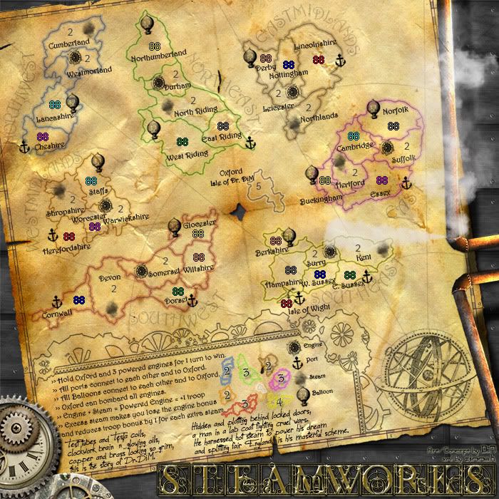
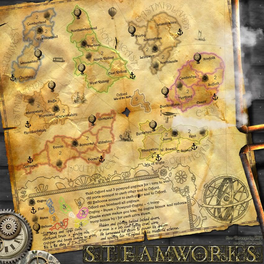
2. you're so blinded by your rage against this map that you don't even follow on it's evolution or bother to read my updates. you just come from time to time to say that: theme sucks, new england is bad, old england would be better or that more terits are needed. not once have you provided a thoughtful feedback as to why the map sucks or why more terits are needed. i have systematically addressed all your issues. you did not like the theme, ok i do, and others also support it, so it stays. you didn't like new england so i did what i had to change it to old. now you want more terits, why? how would that benefit the map? also as further proof that you don't actually bother to pay attention to the map is that you still think this map requires limited positions for just 6 players. sorry mate but that changed in v3. the whole gameplay kinda changed. but hey, you have no idea how the gameplay of this map works but insist on getting more terits.

basically, i'm really sorry that you took everything personally and that you've decided to act like this but if you have nothing constructive to say about this map and if your only goal is to hinder its development then i'll kindly ask you to stop visiting this thread. i honestly don't need you to tell me "this sucks" or that the map needs more terits when in fact you haven't even bothered to check on the gameplay.

however if you're willing to give me proper constructive feedback i'd be more than willing to accept it and try and apply it. it's up to you.


edit// just out of curiosity. i mean, you said your entire post is because i voiced my dissent. if i hadn't done that you wouldn't have posted this, right?

You totally missed the point of my post... :roll:

I started off by stating that I agreed with most of what Tacktix said in the post previous to mine. I made an error by assuming that you had stuck with 6 starting positions; however I think others have agree with my sentiment that there isn't a real necessity to supersize the map in its current guise.

My constructive criticism was that adding more territories would help to address the issues about closeness etc that Tacktix raised, and I then went on to sduggest that you could develop the steampunk theme a bit more with some sort of labyrinthine feel: "Steampunk Labyrinth"

For the record, I have not taken any of your complaints or criticisms about the foundry personally. No amount of brown-nosing will expedite a map through the process, and I have not posted in this thread out of vengeance or spite... I have always wanted mapmakers to push themselves to produce the very best that they can. The comment you underlined was meant in jest (I should have added a :P smiley) - but it was suffixed by the following comment which you appear to have ignored:
MrBenn wrote: I know that you can do better than this, and I think you probably know you can too.

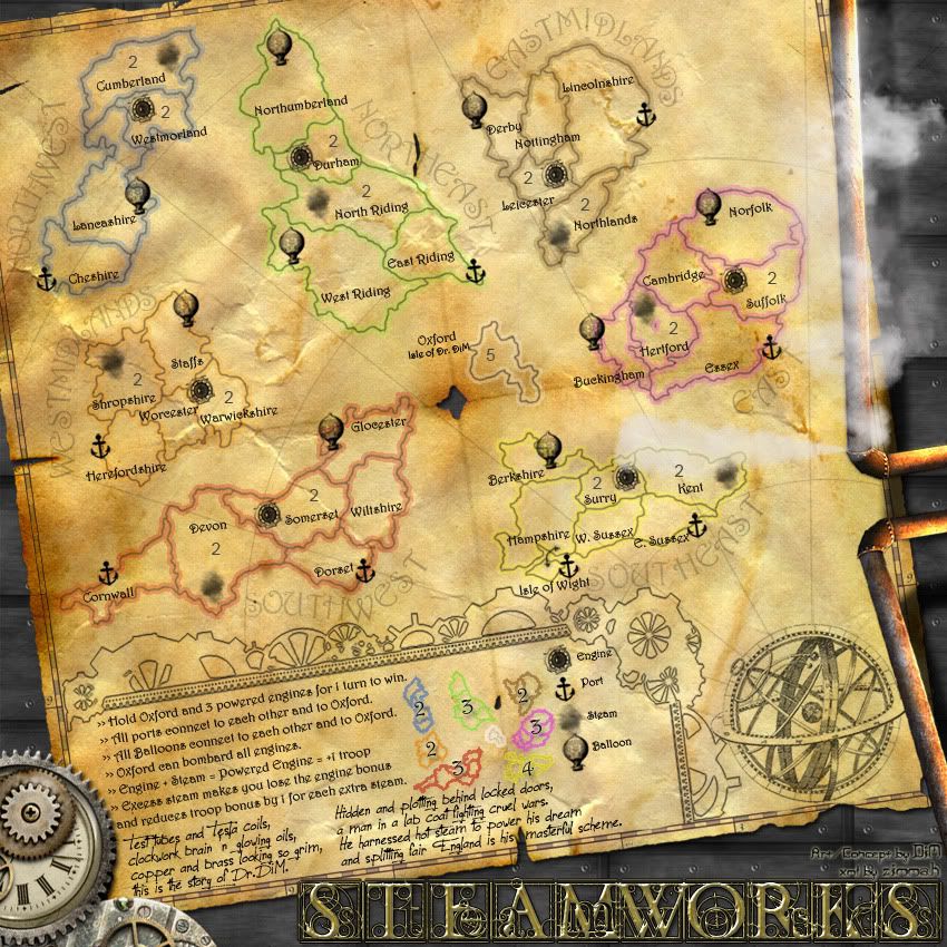
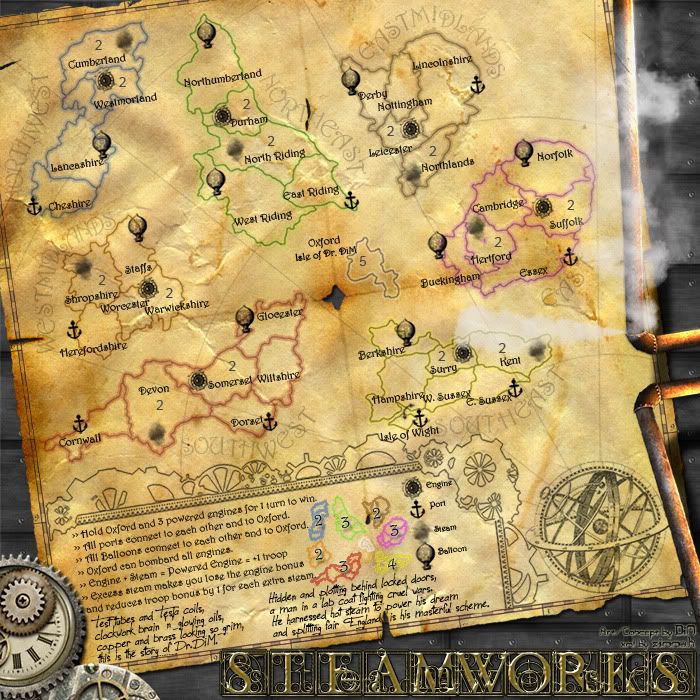
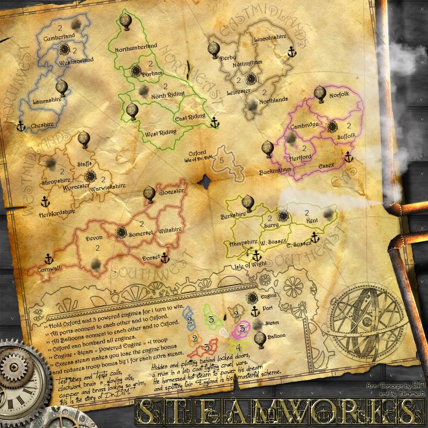
This is a testament to the fact that your maps are renowned for the thought that has gone into them and the strategy that they demand from players. At 39 territories the map is relatively small, and in comparison to Age of Merchants this map pales into comparison.
Image
PB: 2661 | He's blue... If he were green he would die | No mod would be stupid enough to do that
User avatar
Lieutenant MrBenn
 
Posts: 6880
Joined: Wed Nov 21, 2007 9:32 am
Location: Off Duty

Re: SteamWorks [09 Jul 2011] V13 pg.1&13 - The Island of Dr.

Postby DiM on Sat Jul 09, 2011 9:18 pm

the relative smallness of the map is totally intended. i have repeated many times that i want a quick game map with a non classic gameplay that's easy to understand without being unnecessary complicated. adding more non important terits just for the sake of having a bigger number would simply slow down the gameplay and i don't want that. adding more important terits with various bonuses, one way attacks, decay and all kinds of crazy stuff would unnecessarily complicate the map. and i don;t want this either.

thenobodies80 suggested i should go for something around 700*700 for small.i think that is achievable. also a 900*900 (or even 850*850) for the large would probably be possible.
i will try and fit the current map within those limits. anything lower than this can only lead to clutter, poor legibility or removal of various parts to make room for the rest.

i still don't feel like you're being constructive since you're basically asking me to scratch everything i've done so far and go for a different map with a totally different layout and different gameplay. basically delete all my work and keep only the intangible part, the theme. i'm sorry but that's not constructive.
also the comparison with AoM or the strategy used on my other maps is kind of useless. if i make conquer style fantasy large maps doesn't mean that i can't follow with a realistic geographical based small map with classic gameplay. yes my previous maps are considered as difficult, that doesn;t mean everything i do should be like this. i want to make an easy to understand fast paced small to medium sized map. and that's exactly what i have here.
the rules are pretty simple, the games should not take too many turns and the total number of terits is 39 which fits in the small-medium range.

anyway i'm glad you haven;t taken my comments on the foundry on a personal level. as i said before i never meant them that way. the fact that you came here and told me the map sucks, or i don't like it made me take your comments personally when i saw that your position towards my map was completely different than your position towards quad cities where you defended a map that could clearly become much much better.

anyway, we both probably overreacted on this whole thing. i am willing to change things and i'm even open to making big changes. you can check all my maps and see how sometimes they take a totally different direction depending on the feedback received. but i surely won't scrap everything and start a steampunk labyrinth map that has absolutely nothing to do with this one. i can alter terits, bonuses, rules, routes, neutrals, names as long as they are part of a well thought feedback and they serve the main purpose of creating a fast paced easy to understand small-medium sized map.
i'm tired. i'll go to sleep.
cheers all.
i'll try to present later a new version with reduced sizes for small and large (but still a bit over the limit)
“In the beginning God said, the four-dimensional divergence of an antisymmetric, second rank tensor equals zero, and there was light, and it was good. And on the seventh day he rested.”- Michio Kaku
User avatar
Major DiM
 
Posts: 10415
Joined: Wed Feb 14, 2007 6:20 pm
Location: making maps for scooby snacks

Re: SteamWorks [09 Jul 2011] V13 pg.1&13 - The Island of Dr.

Postby isaiah40 on Sat Jul 09, 2011 10:01 pm

Here's a suggestion to maybe help with achieving some extra room. Can you for instance take Northwest and angle it so that (from left to right) it is going from top left to bottom right? Then possibly rotate Northeast so that it is going West to East? So on and so forth. That would give you some extra room for the legend and your poem. It would mean bring the bonus regions a little closer together, at the same time you might solve the problem of the territory text fitting in the territories. Just a suggestion, but I think it could work.
Lieutenant isaiah40
 
Posts: 3990
Joined: Mon Aug 27, 2007 7:14 pm

Re: SteamWorks [09 Jul 2011] V13 pg.1&13 - The Island of Dr.

Postby DiM on Sun Jul 10, 2011 11:20 am

you're right isaiah40, it did save some space and allowed me to make a more clear legend as well as making the poem fit in the small version. also it made it easier to reduce the size of both large and small to 850*850 and 700*700. it's still larger than standard but with only 50-100px.

so here is v14:
*reduced size for both large and small
*moved around icons and names
*shifted and rotated continents for a tighter fit
*increased the legend space to include the poem in small version
*split the poem in 2 halves for easier reading
Large:
Click image to enlarge.
image

Small:
Click image to enlarge.
image
“In the beginning God said, the four-dimensional divergence of an antisymmetric, second rank tensor equals zero, and there was light, and it was good. And on the seventh day he rested.”- Michio Kaku
User avatar
Major DiM
 
Posts: 10415
Joined: Wed Feb 14, 2007 6:20 pm
Location: making maps for scooby snacks

Re: SteamWorks [10 Jul 2011] V14 pg.1&14 - The Island of Dr.

Postby cairnswk on Sun Jul 10, 2011 12:00 pm

DiM, you could probably save more space by reducing the size of the globe bottom right. It serves no purpose other that being a graphic and starting point for the lines, yet it takes up nearly 1/16th of the map.
I'd reduce it to half and move it right, then flesh out your legend ever further so that it isn't so squashed. :)
Also, apart from title, i think i count 4 different fonts on the map now. shouldn't 2 be the max to tie everything together.
Image
* Pearl Harbour * Waterloo * Forbidden City * Jamaica * Pot Mosbi
User avatar
Private cairnswk
 
Posts: 11510
Joined: Sat Feb 03, 2007 8:32 pm
Location: Australia

Re: SteamWorks [10 Jul 2011] V14 pg.1&14 - The Island of Dr.

Postby DiM on Sun Jul 10, 2011 1:53 pm

cairnswk wrote:DiM, you could probably save more space by reducing the size of the globe bottom right. It serves no purpose other that being a graphic and starting point for the lines, yet it takes up nearly 1/16th of the map.
I'd reduce it to half and move it right, then flesh out your legend ever further so that it isn't so squashed. :)


i like it how it is now. if i reduce its size then the details would be lost and it wouldn't look the same. plus i think the legend fits ok as it is.

cairnswk wrote:Also, apart from title, i think i count 4 different fonts on the map now. shouldn't 2 be the max to tie everything together.


i don't have 4 fonts.
the terit names, continent names and the instructions in the legend use 1 font. and i have a second font for the poem to make it stand apart.
that's all.
“In the beginning God said, the four-dimensional divergence of an antisymmetric, second rank tensor equals zero, and there was light, and it was good. And on the seventh day he rested.”- Michio Kaku
User avatar
Major DiM
 
Posts: 10415
Joined: Wed Feb 14, 2007 6:20 pm
Location: making maps for scooby snacks

Re: SteamWorks [10 Jul 2011] V14 pg.1&14 - The Island of Dr.

Postby zimmah on Sun Jul 10, 2011 2:47 pm

is isle of wight big enough to fit armies on it?
Click image to enlarge.
image
User avatar
Major zimmah
 
Posts: 1652
Joined: Fri Jun 01, 2007 12:43 pm
Location: VDLL

Re: SteamWorks [10 Jul 2011] V14 pg.1&14 - The Island of Dr.

Postby natty dread on Sun Jul 10, 2011 2:52 pm

The label of wight might be better moved to the right side of the island, at least on the small.

Also, it looks a bit odd when the land borders show through the balloons... I don't think they had translucent balloons in steam age.
Image
User avatar
Sergeant 1st Class natty dread
 
Posts: 12877
Joined: Fri Feb 08, 2008 8:58 pm
Location: just plain fucked

Re: SteamWorks [10 Jul 2011] V14 pg.1&14 - The Island of Dr.

Postby DiM on Sun Jul 10, 2011 3:11 pm

zimmah wrote:is isle of wight big enough to fit armies on it?


i think it is. here's the small version with army numbers. i think it fits ok.
yes, some areas are rather tight but that's the price for reducing it from 800*800 to 700*700. on the large version everything is much better

Click image to enlarge.
image
“In the beginning God said, the four-dimensional divergence of an antisymmetric, second rank tensor equals zero, and there was light, and it was good. And on the seventh day he rested.”- Michio Kaku
User avatar
Major DiM
 
Posts: 10415
Joined: Wed Feb 14, 2007 6:20 pm
Location: making maps for scooby snacks

Re: SteamWorks [10 Jul 2011] V14 pg.1&14 - The Island of Dr.

Postby DiM on Sun Jul 10, 2011 3:13 pm

natty_dread wrote:The label of wight might be better moved to the right side of the island, at least on the small.


moved it. see image above

natty_dread wrote:Also, it looks a bit odd when the land borders show through the balloons... I don't think they had translucent balloons in steam age.


the balloons are simply drawn on the map so it's ok that the border is visible.
“In the beginning God said, the four-dimensional divergence of an antisymmetric, second rank tensor equals zero, and there was light, and it was good. And on the seventh day he rested.”- Michio Kaku
User avatar
Major DiM
 
Posts: 10415
Joined: Wed Feb 14, 2007 6:20 pm
Location: making maps for scooby snacks

Re: SteamWorks [10 Jul 2011] V14 pg.1&14 - The Island of Dr.

Postby natty dread on Sun Jul 10, 2011 4:52 pm

DiM wrote:the balloons are simply drawn on the map so it's ok that the border is visible.


I know they are... I'm just saying it looks weird, and maybe it would look better if the border didn't show through them. I mean, even if you draw the balloons on the map, why would you draw the borders to go through them? If the hypothetical mapmaker who drew this map (wow, we're getting metaphysical here) has any artistic skill, he would know not to draw the borders in the places where he intends to draw a balloon...

Anyway, your choice, that's just the way I see it.
Image
User avatar
Sergeant 1st Class natty dread
 
Posts: 12877
Joined: Fri Feb 08, 2008 8:58 pm
Location: just plain fucked

Re: SteamWorks [10 Jul 2011] V14 pg.1&14 - The Island of Dr.

Postby DiM on Sun Jul 10, 2011 5:13 pm

natty_dread wrote:
DiM wrote:the balloons are simply drawn on the map so it's ok that the border is visible.


I know they are... I'm just saying it looks weird, and maybe it would look better if the border didn't show through them. I mean, even if you draw the balloons on the map, why would you draw the borders to go through them? If the hypothetical mapmaker who drew this map (wow, we're getting metaphysical here) has any artistic skill, he would know not to draw the borders in the places where he intends to draw a balloon...

Anyway, your choice, that's just the way I see it.


if you take a map of your town and then you start drawing symbols for your house, your girlfriend's house, your work/school place, your favourite locations and so on you'll end up with a bunch of icons that overlap what was previously drawn on the map. that's how i envisioned this. 8-[ :mrgreen:

i guess i could work something out seeing that i don't have anything else to do on the map.

here it is. all nice and cozy thanks to clipping masks :P

Click image to enlarge.
image
Last edited by DiM on Sun Jul 10, 2011 5:30 pm, edited 1 time in total.
“In the beginning God said, the four-dimensional divergence of an antisymmetric, second rank tensor equals zero, and there was light, and it was good. And on the seventh day he rested.”- Michio Kaku
User avatar
Major DiM
 
Posts: 10415
Joined: Wed Feb 14, 2007 6:20 pm
Location: making maps for scooby snacks

Re: SteamWorks [10 Jul 2011] V14 pg.1&14 - The Island of Dr.

Postby natty dread on Sun Jul 10, 2011 5:27 pm

DiM wrote:if you take a map of your town and then you start drawing symbols for your house, your girlfriend's house, your work/school place, your favourite locations and so on you'll end up with a bunch of icons that overlap what was previously drawn on the map. that's how i envisioned this. 8-[ :mrgreen:


Well if you seriously want to go that way, then you could make all the icons look like they were scribbled on the map: make them a bit imperfect, not all uniform, etc. Like a more drawn, sketch-like look... Although I'm not sure how well that would turn out, especially on the small map. Also, I do like the current icons.

Also, one other thing comes to mind... since this map is meant to look old(ish), you might want to tweak the colours of Northeast and maybe Southeast. The neon-green of Northeast seems like it doesn't quite belong on an old map (they didn't have colours like that in the olden days) and the bright yellow also kinda seems like it's a bit too bright...
Image
User avatar
Sergeant 1st Class natty dread
 
Posts: 12877
Joined: Fri Feb 08, 2008 8:58 pm
Location: just plain fucked

Re: SteamWorks [10 Jul 2011] V14 pg.1&14 - The Island of Dr.

Postby cairnswk on Sun Jul 10, 2011 5:38 pm

DiM wrote:...
i don't have 4 fonts.
the terit names, continent names and the instructions in the legend use 1 font. and i have a second font for the poem to make it stand apart.
that's all.

Apologies, but they looked different to me, obviously i didn't look hard enough. :oops:
Image
* Pearl Harbour * Waterloo * Forbidden City * Jamaica * Pot Mosbi
User avatar
Private cairnswk
 
Posts: 11510
Joined: Sat Feb 03, 2007 8:32 pm
Location: Australia

Re: SteamWorks [10 Jul 2011] V14 pg.1&14 - The Island of Dr.

Postby DiM on Sun Jul 10, 2011 5:47 pm

cairnswk wrote:
DiM wrote:...
i don't have 4 fonts.
the terit names, continent names and the instructions in the legend use 1 font. and i have a second font for the poem to make it stand apart.
that's all.

Apologies, but they looked different to me, obviously i didn't look hard enough. :oops:


no need to apologise mate. and if you're interested, the fonts used are Harrington and Jellyka
“In the beginning God said, the four-dimensional divergence of an antisymmetric, second rank tensor equals zero, and there was light, and it was good. And on the seventh day he rested.”- Michio Kaku
User avatar
Major DiM
 
Posts: 10415
Joined: Wed Feb 14, 2007 6:20 pm
Location: making maps for scooby snacks

Re: SteamWorks [10 Jul 2011] V14 pg.1&14 - The Island of Dr.

Postby gimil on Sun Jul 10, 2011 6:10 pm

Hi DiM,

This is looking pretty tidy. I like where it is going, however I do have a couple of issues.

Firstly I do not feel there is enough focus on the icons (for steam, engine etc) in the legends. This could be because my eyes get pulled to the brighter colours of the mini map which take focus away from those icons. Although not a big issue I would suggest moving these icons to the left of the legend text. This way you break up the two sets of images (mini-map and map icons). Get what I mean?

Also to me the playable map area doesn't really pop. This is because the territory colours are the same as the dead space around them. I don't know if this is a style you desire but I strongly suggest that you darken the territory colours to make them pop. Wouldn't have to be much just enough to differentiate, probably just a few shades darker would do it.

Click image to enlarge.
image
What do you know about map making, bitch?

natty_dread wrote:I was wrong


Top Score:2403
User avatar
Corporal 1st Class gimil
 
Posts: 8599
Joined: Sat Mar 03, 2007 12:42 pm
Location: United Kingdom (Scotland)

Re: SteamWorks [10 Jul 2011] V14 pg.1&14 - The Island of Dr.

Postby DiM on Sun Jul 10, 2011 6:54 pm

gimil wrote:Hi DiM,

This is looking pretty tidy. I like where it is going, however I do have a couple of issues.

it's good to hear :)

gimil wrote:Firstly I do not feel there is enough focus on the icons (for steam, engine etc) in the legends. This could be because my eyes get pulled to the brighter colours of the mini map which take focus away from those icons. Although not a big issue I would suggest moving these icons to the left of the legend text. This way you break up the two sets of images (mini-map and map icons). Get what I mean?


did exactly what you wanted, plus i centered the poem a bit better. see latest version bellow.

gimil wrote:Also to me the playable map area doesn't really pop. This is because the territory colours are the same as the dead space around them. I don't know if this is a style you desire but I strongly suggest that you darken the territory colours to make them pop. Wouldn't have to be much just enough to differentiate, probably just a few shades darker would do it.


actually the colours were much more visible in the earlier versions but upon request i had to darken them to better blend with the rest of the dead space. so i'm afraid that if i do what you ask the people that initially led to this change will be upset.
also if you think about it colours aren't really that important because the islands are clearly delimited.

V15:
*rearranged the legend.
*made the borders hide behind the icons.
*added ships and flying machines around the map
*darker more visible continents

Click image to enlarge.
image
Last edited by DiM on Sun Jul 10, 2011 7:35 pm, edited 1 time in total.
“In the beginning God said, the four-dimensional divergence of an antisymmetric, second rank tensor equals zero, and there was light, and it was good. And on the seventh day he rested.”- Michio Kaku
User avatar
Major DiM
 
Posts: 10415
Joined: Wed Feb 14, 2007 6:20 pm
Location: making maps for scooby snacks

Re: SteamWorks [11 Jul 2011] V15 pg.1&15 - The Island of Dr.

Postby gimil on Sun Jul 10, 2011 7:09 pm

Sorry DiM,

I don't think I made myself clear or either point :P.

I was suggesting splitting up the mini map and the icons (steam, engine, port & bloon). Putting the mini map to the right of the text while putting the icons to the left.

And on the territories, I was suggesting that you make the territories SLIGHTLY darker just to give a little contrast. Just like in this image:

Click image to enlarge.
image


I would like to see something that has the land darker like England with the lighter sea surrounding the territories. So your actual playable territories are a slightly darker paper tone than the non-territory paper. Similar to what you have done in Age of Merchants.

Does that make sense, or am I rambling incoherently?
What do you know about map making, bitch?

natty_dread wrote:I was wrong


Top Score:2403
User avatar
Corporal 1st Class gimil
 
Posts: 8599
Joined: Sat Mar 03, 2007 12:42 pm
Location: United Kingdom (Scotland)

Re: SteamWorks [11 Jul 2011] V15 pg.1&15 - The Island of Dr.

Postby DiM on Sun Jul 10, 2011 7:24 pm

gimil wrote:Sorry DiM,

I don't think I made myself clear or either point :P.

I was suggesting splitting up the mini map and the icons (steam, engine, port & bloon). Putting the mini map to the right of the text while putting the icons to the left.


so basically you want to see from left to right: instructions, minimap, icon names, icons. am i right?

gimil wrote:And on the territories, I was suggesting that you make the territories SLIGHTLY darker just to give a little contrast. Just like in this image:

I would like to see something that has the land darker like England with the lighter sea surrounding the territories. So your actual playable territories are a slightly darker paper tone than the non-territory paper. Similar to what you have done in Age of Merchants.

Does that make sense, or am I rambling incoherently?


ok this i understood this part and i'll see what i can do about it.

changed it. i edited the post with v15. take a look there. you might have to hit ctrl+F5 to clear cache if image still looks the same as before.
“In the beginning God said, the four-dimensional divergence of an antisymmetric, second rank tensor equals zero, and there was light, and it was good. And on the seventh day he rested.”- Michio Kaku
User avatar
Major DiM
 
Posts: 10415
Joined: Wed Feb 14, 2007 6:20 pm
Location: making maps for scooby snacks

Re: SteamWorks [11 Jul 2011] V15 pg.1&15 - The Island of Dr.

Postby TaCktiX on Mon Jul 11, 2011 12:19 am

I did get stupendously misunderstood. I'm coming from a purely gameplay perspective and I see every game on this map boiling down to the same set of "engine/steam, engine/steam" with the occasional grab for Oxford to eliminate or setback someone else, with counterbalancing only in the form of forcing excess steam or removing bonus pairs entirely. You'll certainly accomplish the "quick and dirty" you're aiming for, but it's not a gameplay I find interesting, nor of the flavor you normally create with a few simple concepts.

Consider AoR (which you mentioned). Other than the Conquer aspect, it's a few set bonuses and lots of varying ways to accomplish those bonuses. And with virtually the same territories you managed to change the rules three times and make them all fresh, including your crown jewel AoR 2: Magic. Now look at CC City Mogul. Other than the deliberately inflated troop counts, it's a few simple rules and a myriad of ways to accomplish them. Or how about AoM that I keep on comparing SteamWorks to? You've only got three different bonus types on that entire thing, and yet the depth of those three simple bonuses assures that not a single game plays the same.

Let's look back at SteamWorks compared to those absolute masters of gameplay depth, where the sum is far greater than the parts (what I consider your hallmark). There are two bonus structures, interlocked (engine/steam, excess steam), and one powerful gimmick (Oxford), boiling down to a few predictable paths to victory. It's a severe reduction compared to what I'm expecting, and while I'm sure it has the potential to be a just fine map by CC standards, it's a merely alright map by what I viewed as DiM standards. Perhaps that's ingrained in the size of the map, or perhaps it's a direction you haven't considered fully yet. I'm not saying "zomg go gimmick happy" at all, I'm saying broaden the gameplay just a tad. It might mean one more mechanic, it might mean a tad more space, that's your call.
User avatar
Corporal 1st Class TaCktiX
 
Posts: 2392
Joined: Mon Dec 17, 2007 8:24 pm
Location: Rapid City, SD

Re: SteamWorks [11 Jul 2011] V15 pg.1&15 - The Island of Dr.

Postby gimil on Mon Jul 11, 2011 2:38 am

DiM wrote:so basically you want to see from left to right: instructions, minimap, icon names, icons. am i right?


No, from left to right I mean: Icons, Icon names, Instructions, minimap. The new colours on the territories is much better. Makes your map pop a little more.
What do you know about map making, bitch?

natty_dread wrote:I was wrong


Top Score:2403
User avatar
Corporal 1st Class gimil
 
Posts: 8599
Joined: Sat Mar 03, 2007 12:42 pm
Location: United Kingdom (Scotland)

Re: SteamWorks [11 Jul 2011] V15 pg.1&15 - The Island of Dr.

Postby gimil on Mon Jul 11, 2011 2:40 am

I have to disagree with taktix, I do not think this map is not up to DiM standards, but rather it feels more like a 'DiM lite'. It has all signs of a good map by DiM but designed with the intention for smaller games.
What do you know about map making, bitch?

natty_dread wrote:I was wrong


Top Score:2403
User avatar
Corporal 1st Class gimil
 
Posts: 8599
Joined: Sat Mar 03, 2007 12:42 pm
Location: United Kingdom (Scotland)

Re: SteamWorks [11 Jul 2011] V15 pg.1&15 - The Island of Dr.

Postby DiM on Mon Jul 11, 2011 10:13 am

TaCktiX wrote:You'll certainly accomplish the "quick and dirty" you're aiming for, but it's not a gameplay I find interesting, nor of the flavor you normally create with a few simple concepts.


ok i understand what you say. the thing is i don't want to create a map like my previous ones. i was gone for a long time and when i came back i had an inbox flooded with PMs. a lot of them were about my maps. people asking how to play, how does a bonus work, why is that route one way or things like that. even after all these years my maps are considered by many as complicated maps and a lot of people play them once and then never do it again. of course there are those that enjoy my maps and play them over and over again especially because of the non-classic gameplay. but after all those maps i want to do something that will also attract other people. all i want is to make a straightforward map that 90% of the players would understand right from the first game and do all this without resorting to a classic gameplay. so indeed steamworks might look like a lite version as gimil said but this is completely on purpose.

i wonder what you would say if i came up with a simple geographical classic style map :)
“In the beginning God said, the four-dimensional divergence of an antisymmetric, second rank tensor equals zero, and there was light, and it was good. And on the seventh day he rested.”- Michio Kaku
User avatar
Major DiM
 
Posts: 10415
Joined: Wed Feb 14, 2007 6:20 pm
Location: making maps for scooby snacks

Re: SteamWorks [11 Jul 2011] V15 pg.1&15 - The Island of Dr.

Postby DiM on Mon Jul 11, 2011 10:15 am

gimil wrote:
DiM wrote:so basically you want to see from left to right: instructions, minimap, icon names, icons. am i right?


No, from left to right I mean: Icons, Icon names, Instructions, minimap. The new colours on the territories is much better. Makes your map pop a little more.


the minimap doesn't quite fit in the right corner because of the cogs in the design. so some text has to be there. either the icon names as it was the first time or the instructions as it is now.
“In the beginning God said, the four-dimensional divergence of an antisymmetric, second rank tensor equals zero, and there was light, and it was good. And on the seventh day he rested.”- Michio Kaku
User avatar
Major DiM
 
Posts: 10415
Joined: Wed Feb 14, 2007 6:20 pm
Location: making maps for scooby snacks

PreviousNext

Return to The Atlas

Who is online

Users browsing this forum: No registered users