Conquer Club

Atlantis - v43 - BETA - P32[D,Gp,Gr,FF,XML,BETA]

Care to peruse completed maps? Take a stroll through the Atlas.

Moderator: Cartographers

Forum rules
Please read the Community Guidelines before posting.

Re: Atlantis v17 with GAMEPLAY UPDATE p13 [D]

Postby The Neon Peon on Tue Feb 24, 2009 8:35 am

Premier2k wrote:
The Neon Peon wrote:No, you only reduce the number of territories people start out with in 2 player games.


As I figured I cannot alter the number of territories based on the number of starting players. Which means if I reduce it then if an 8 player game starts everybody would potentially end up with 1 territory! It's gonna have to stay as it is. As this is a larger map then I think the majority of ganes will be 5-8 players anyway and probably team games.

Premier2k

I suggest you go ask someone in the foundry discussion.

There is a way to make it 1/3 neutral in 2 player games, and not for any other type, where there are less neutrals.

Also, if you have ever played a 2 man game and a game with more people on the same map, you would notice that almost every map does this, except conquest.
User avatar
Lieutenant The Neon Peon
 
Posts: 2342
Joined: Sat Jun 14, 2008 12:49 pm

Re: Atlantis v17 with GAMEPLAY UPDATE p13 [D]

Postby Premier2k on Tue Feb 24, 2009 10:28 am

I already have posted in the foundry discussion. You can find the information here. As I thought I can give starting positions using the 'position' tag but not define number of starting positions based on number of players.

http://www.conquerclub.com/forum/viewtopic.php?f=127&t=78511

Besides I disagree, I don't think it is unbalanced. As I stated before I think the average number of players starting this map is going to be larger than 2 players.. I'm thinking more like 4/5-8 starting.

Thanks for your comments.

Premier2k
User avatar
Cadet Premier2k
 
Posts: 492
Joined: Tue Oct 02, 2007 5:53 am

Re: Atlantis v17 with GAMEPLAY UPDATE p13 [D]

Postby Premier2k on Thu Feb 26, 2009 5:19 am

Hi all!

We have 3 copies of the map for you to have a look at.

Version 17 is the current version.
Version 18 and 19 have different sea textures, see which you prefer out of the 3.
Also 18 and 19 have a different land texture to 17. This texture we like, see what you think.

Version 17 - Current Version
Click image to enlarge.
image


Version 18
Click image to enlarge.
image


Version 19
Click image to enlarge.
image


We need comments on;

Sea textures, which do you prefer?
Land textures, Do you prefer v17 or v18 & v19?


Premier2k
User avatar
Cadet Premier2k
 
Posts: 492
Joined: Tue Oct 02, 2007 5:53 am

Re: Atlantis v17 with GAMEPLAY UPDATE p13 [D]

Postby RjBeals on Thu Feb 26, 2009 8:14 am

I think Version 18 looks much better.
Image
User avatar
Private RjBeals
 
Posts: 2506
Joined: Mon Nov 20, 2006 5:17 pm
Location: South Carolina, USA

Re: Atlantis v17 with GAMEPLAY UPDATE p13 [D]

Postby the.killing.44 on Thu Feb 26, 2009 7:16 pm

RjBeals wrote:I think Version 18 looks much better.

I agree. The background color makes it look very calm and nice.

.44
User avatar
Captain the.killing.44
 
Posts: 4724
Joined: Thu Oct 23, 2008 7:43 pm
Location: now tell me what got two gums and knows how to spit rhymes

Re: Atlantis v17 with GAMEPLAY UPDATE p13 [D]

Postby NemesisChild on Thu Feb 26, 2009 8:08 pm

the.killing.44 wrote:
RjBeals wrote:I think Version 18 looks much better.

I agree. The background color makes it look very calm and nice.

.44


Do you not think it all looks a bit contrived, sort of unnatural like the islands are just plonked there rather than looking like they have always been there ?
I dunno its ok I guess ....
its just to plain I think!
Blackadder: Awh, God, God, God. What on earth was I drinking last night? My head feels like there's a Frenchman living in it. Where am I?

Click here to discover the lost islands of Atlantis...
Image
User avatar
Cook NemesisChild
 
Posts: 147
Joined: Tue Oct 02, 2007 7:39 am
Location: Wiltshire

Re: Atlantis v17 with GAMEPLAY UPDATE p13 [D]

Postby the.killing.44 on Thu Feb 26, 2009 8:13 pm

NemesisChild wrote:
the.killing.44 wrote:
RjBeals wrote:I think Version 18 looks much better.

I agree. The background color makes it look very calm and nice.

.44


Do you not think it all looks a bit contrived, sort of unnatural like the islands are just plonked there rather than looking like they have always been there ?
I dunno its ok I guess ....
its just to plain I think!

Try an outer glow of powder blue (Tar Heels, baby!) around the islands, and see how that looks. Keep making the glow color lighter and lighter if it doesn't look great. And if not that, then maybe even look at a dark blue glow. That should spruce things up a bit.

.44
User avatar
Captain the.killing.44
 
Posts: 4724
Joined: Thu Oct 23, 2008 7:43 pm
Location: now tell me what got two gums and knows how to spit rhymes

Re: Atlantis v17 with GAMEPLAY UPDATE p13 [D]

Postby Teflon Kris on Sun Mar 01, 2009 6:46 am

Nice map.

I like the centre area - a bit like Valley of the Kings - gives a different kind of gameplay.

Good graphics and excellent theme to.

Hope this one progresses quickly, will be good to play.
User avatar
Sergeant 1st Class Teflon Kris
 
Posts: 4236
Joined: Sun Jul 13, 2008 4:39 pm
Location: Lancashire, United Kingdom

Re: Atlantis v17 with GAMEPLAY UPDATE p13 [D]

Postby Premier2k on Mon Mar 02, 2009 5:30 am

Hi all!

Yes it's that time again! Version 20 is here!

Change List
    1. Sea texture changed from Version 16.
    2. New land textures
    3. New light blue outline for the islands
    4. Updated bonus structure


Version 20
Click image to enlarge.
image

Image


Comments please everyone!

Premier2k
User avatar
Cadet Premier2k
 
Posts: 492
Joined: Tue Oct 02, 2007 5:53 am

Re: Atlantis v20 NEW SEA p14 [D]

Postby NemesisChild on Mon Mar 02, 2009 5:39 am

Ermm

There seems to be a rogue Dock!!!
Please ignore the random Dock in the middle of Ys Territory 2...
I have no idea where that has come from!!

I will remove it As soon as I can
Blackadder: Awh, God, God, God. What on earth was I drinking last night? My head feels like there's a Frenchman living in it. Where am I?

Click here to discover the lost islands of Atlantis...
Image
User avatar
Cook NemesisChild
 
Posts: 147
Joined: Tue Oct 02, 2007 7:39 am
Location: Wiltshire

Re: Atlantis v20 NEW SEA p14 [D]

Postby bryguy on Mon Mar 02, 2009 8:54 am

NemesisChild wrote:Ermm

There seems to be a rogue Dock!!!
Please ignore the random Dock in the middle of Ys Territory 2...
I have no idea where that has come from!!

I will remove it As soon as I can


:lol:


Wow this looks a lot better than last time I checked in! I dont have time to really comment, but although the sea is better than the others, whenever I look at it it seems really blurry, and hurts my eyes if I stare at it to long
Corporal bryguy
 
Posts: 4381
Joined: Tue Aug 07, 2007 8:50 am
Location: Lost in a Jigsaw

Re: Atlantis v20 NEW SEA p14 [D]

Postby Premier2k on Tue Mar 03, 2009 5:33 am

bryguy wrote:
NemesisChild wrote:Ermm

There seems to be a rogue Dock!!!
Please ignore the random Dock in the middle of Ys Territory 2...
I have no idea where that has come from!!

I will remove it As soon as I can


:lol:


Wow this looks a lot better than last time I checked in! I dont have time to really comment, but although the sea is better than the others


LOL! Nice one Nem!

Thanks for the comments Bryguy. We're really trying to please everyone with the sea, some liked the old one some didn't. So we've tried to come up with something different.
I love the new land textures, simple but effective.

bryguy wrote:whenever I look at it it seems really blurry, and hurts my eyes if I stare at it to long

There is a solution for that! Don't stare at it! :lol:
If people don't like the new sea then it will have to be reverted back to the Version 17 and we really don't wanna have to do that! :?

Glad your liking what we have though. We are particulary pleased with how the map is developing!

Premier2k
User avatar
Cadet Premier2k
 
Posts: 492
Joined: Tue Oct 02, 2007 5:53 am

Re: Atlantis v21 - Minor Tweaks : p15 [D]

Postby Premier2k on Tue Mar 03, 2009 9:22 am

Version 21

Changes made
    1. Sea texture tweaked further
    2. Newer island outlines
    3.Removed rogue Dock and a few smaller bug fixes
    4. changed docks to allow thenm to be more visible


The XML!
http://www.fileden.com/files/2009/1/10/2261497/Atlantis.xml


The map
Click image to enlarge.
image

Image


The Opinions

Gameplay
    - What Next?
    - Having discussed the possibility of changing the number of nuetrals for 2 player games (both here and in a seperate forum topic : XML Territory allocation) and discovering that it cannot be done we decided that it will continue as described in Page 1 does everybody agree that the GP is balanced and interesting?
    - Is there anything else we could look at ?
    - how close do people think we are to getting a GP Stamp?

Graphics
    - What next?
    - The Sea?
    - Are there any glaring mistakes or ommissions?
    - How close do people think we are to getting a Graphics stamp?
User avatar
Cadet Premier2k
 
Posts: 492
Joined: Tue Oct 02, 2007 5:53 am

Re: Atlantis v21 - Minor Tweaks : p15 [D]

Postby jesterhawk on Tue Mar 03, 2009 1:55 pm

Just curious. What font did you use to make the title "Atlantis" on the maps. I love that font and it looks cool.

As for the rest of the map, I am ready to play :)

JH
P.R.Aquilone
pra.aquilone.me
User avatar
Private 1st Class jesterhawk
 
Posts: 79
Joined: Sun Aug 10, 2008 3:10 pm
Location: DFW, TX, USA

Re: Atlantis v21 - Minor Tweaks : p15 [D]

Postby NemesisChild on Tue Mar 03, 2009 2:01 pm

Jester

Thank you for you comment, we are hopefully nearing the final forge on this
the font in the title is Lithos Pro (it is also the font used on the Scrolls)

Nem
Blackadder: Awh, God, God, God. What on earth was I drinking last night? My head feels like there's a Frenchman living in it. Where am I?

Click here to discover the lost islands of Atlantis...
Image
User avatar
Cook NemesisChild
 
Posts: 147
Joined: Tue Oct 02, 2007 7:39 am
Location: Wiltshire

Re: Atlantis v21 - Minor Tweaks : p15 [D]

Postby Sardauk on Tue Mar 03, 2009 2:10 pm

Thule is... to the south? Ahem. Sorry for barging in so late, but great map. Verrry clear in colour, and nicely laid out. Like what I can discern from the gameplay. This is a map I'd like to try out. Loads of love for reading up on Plato and other sources! Looks ready to continue to the next stage to my humble eyes.
User avatar
Cook Sardauk
 
Posts: 27
Joined: Thu Feb 19, 2009 4:13 am
Location: Sweden

Re: Atlantis v21 - Minor Tweaks : p15 [D]

Postby Premier2k on Wed Mar 04, 2009 2:50 am

Sardauk wrote:Thule is... to the south? Ahem. Sorry for barging in so late, but great map. Verrry clear in colour, and nicely laid out. Like what I can discern from the gameplay. This is a map I'd like to try out. Loads of love for reading up on Plato and other sources! Looks ready to continue to the next stage to my humble eyes.

Thanks Sardauk! We're glad you like it and we ourselves can't wait to play it. I think we've pretty much got the graphics sorted, so we're pleased to hear that you like the colours and layout.

We're hoping the map will be popular for team games. We think most of the excitement will come on a 3 team doubles with chained forts and fog on. Time will tell for that one!

Keep checking back! Thanks again for your comments!

Premier2k & Nemesischild
User avatar
Cadet Premier2k
 
Posts: 492
Joined: Tue Oct 02, 2007 5:53 am

Re: Atlantis v21 - Minor Tweaks : p15 [D]

Postby jesterhawk on Wed Mar 04, 2009 1:46 pm

NemesisChild wrote:Jester

Thank you for you comment, we are hopefully nearing the final forge on this
the font in the title is Lithos Pro (it is also the font used on the Scrolls)

Nem
Cool Thanks!

Also, didn't have another font some time ago used on the Title? That font was really cool too.

JH
P.R.Aquilone
pra.aquilone.me
User avatar
Private 1st Class jesterhawk
 
Posts: 79
Joined: Sun Aug 10, 2008 3:10 pm
Location: DFW, TX, USA

Re: Atlantis v21 - Minor Tweaks : p15 [D]

Postby NemesisChild on Thu Mar 05, 2009 4:33 am

jesterhawk wrote:
NemesisChild wrote:Jester

Thank you for you comment, we are hopefully nearing the final forge on this
the font in the title is Lithos Pro (it is also the font used on the Scrolls)

Nem
Cool Thanks!

Also, didn't have another font some time ago used on the Title? That font was really cool too.

JH


Hey Jester

The orignal Title was a ripped image (with some editing), rather than a font, It was only ever meant to be a place holder until I got time to do something better,
So I'm afraid I don't know what the font was.

Nem
Blackadder: Awh, God, God, God. What on earth was I drinking last night? My head feels like there's a Frenchman living in it. Where am I?

Click here to discover the lost islands of Atlantis...
Image
User avatar
Cook NemesisChild
 
Posts: 147
Joined: Tue Oct 02, 2007 7:39 am
Location: Wiltshire

Re: Atlantis v21 - Minor Tweaks : p15 [D]

Postby gimil on Thu Mar 05, 2009 6:22 am

Hi 2k,

This has come on something wonderful since I last walked in.

I still have concerns with the minimap and the scrolls, but we will come to them later.

Right now how your map has been drawn is pretty good and the textures are a large improvment from the old. What I still don't like is the colour scheme. it doesn't really pull your map together.

I searched atlantis on google and got these inspirational images which show a colour scheme I believe would suit your map better.

Click image to enlarge.
image

Click image to enlarge.
image

Click image to enlarge.
image
What do you know about map making, bitch?

natty_dread wrote:I was wrong


Top Score:2403
User avatar
Corporal 1st Class gimil
 
Posts: 8599
Joined: Sat Mar 03, 2007 12:42 pm
Location: United Kingdom (Scotland)

Re: Atlantis v21 - Minor Tweaks : p15 [D]

Postby Premier2k on Thu Mar 05, 2009 6:39 am

gimil wrote:Hi 2k,

This has come on something wonderful since I last walked in.

I still have concerns with the minimap and the scrolls, but we will come to them later.

Right now how your map has been drawn is pretty good and the textures are a large improvment from the old. What I still don't like is the colour scheme. it doesn't really pull your map together.

I searched atlantis on google and got these inspirational images which show a colour scheme I believe would suit your map better

Hi Gimil,

Thank you for the great feedback. There are a few things I would like to address.

gimil wrote:I still have concerns with the minimap and the scrolls, but we will come to them later.

Firstly, You never did come to the scroll and minimap.
Secondly, the scroll has been changed numerous times and following a lot of discussion with members we have found the scroll that we like. The minimap has not changed since the beginning, we have had no negative feedback on this and we quite like it. Did you have something else in mind?

gimil wrote:What I still don't like is the colour scheme. it doesn't really pull your map together.

We're not quite sure what you mean, Atlantis is not underwater. The colours are meant to be bright and colourful not represent an underwater theme. Looking at the images you have given, whilst they are great looking images. I think adding that colour scheme to our map is going to make it look drab and dreary. We do not want this.

Premier2k
User avatar
Cadet Premier2k
 
Posts: 492
Joined: Tue Oct 02, 2007 5:53 am

Re: Atlantis v21 - Minor Tweaks : p15 [D]

Postby gimil on Thu Mar 05, 2009 11:04 am

On my points about scrolls and minimaps, I would rather go into later (not go to much time for now so I will stick with the colours first)

Obviously then I search atlantis I didn't search the right thing. Could you give me a few links to what this map is suppose to represent so that I can make a better judgement befoer I comment further? Cheers.
What do you know about map making, bitch?

natty_dread wrote:I was wrong


Top Score:2403
User avatar
Corporal 1st Class gimil
 
Posts: 8599
Joined: Sat Mar 03, 2007 12:42 pm
Location: United Kingdom (Scotland)

Re: Atlantis v21 - Minor Tweaks : p15 [D]

Postby NemesisChild on Thu Mar 05, 2009 11:55 am

gimil wrote:On my points about scrolls and minimaps, I would rather go into later (not go to much time for now so I will stick with the colours first)


Thats fair enough Gimil


gimil wrote:Obviously then I search atlantis I didn't search the right thing. Could you give me a few links to what this map is suppose to represent so that I can make a better judgement befoer I comment further? Cheers.


It's not that you searched the wrong thing it is just that Atlantis is represented more as a sunken land and not often represented visually before its disastrous end, it is becuase of this that there are few visual representations of what Atlantis (at least none that can be taken as fact) looked like before it allegedly sunk into the sea
In fact the main documented description of it is from a dialogue written by Plato, called "Timaeus and Critias" and even that is only a slight reference to it. It is this Dialogue that is deemed to be the historical location where the myth of Atlantis began.
There is a link to in the first post to the whole dialogue, but here is the direct quote to save you time. It is this mystical land mass before the sinking that we wanted to use rather than a sunken city.

Many great and wonderful deeds are recorded of your state in our histories. But one of them exceeds all the rest in greatness and valour. For these histories tell of a mighty power which unprovoked made an expedition against the whole of Europe and Asia, and to which your city put an end. This power came forth out of the Atlantic Ocean, for in those days the Atlantic was navigable; and there was an island situated in front of the straits which are by you called the Pillars of Heracles; the island was larger than Libya and Asia put together, and was the way to other islands, and from these you might pass to the whole of the opposite continent which surrounded the true ocean; for this sea which is within the Straits of Heracles is only a harbour, having a narrow entrance, but that other is a real sea, and the surrounding land may be most truly called a boundless continent.

Now in this island of Atlantis there was a great and wonderful empire which had rule over the whole island and several others, and over parts of the continent, and, furthermore, the men of Atlantis had subjected the parts of Libya within the columns of Heracles as far as Egypt, and of Europe as far as Tyrrhenia. This vast power, gathered into one, endeavoured to subdue at a blow our country and yours and the whole of the region within the straits; and then, Solon, your country shone forth, in the excellence of her virtue and strength, among all mankind. She was pre-eminent in courage and military skill, and was the leader of the Hellenes. And when the rest fell off from her, being compelled to stand alone, after having undergone the very extremity of danger, she defeated and triumphed over the invaders, and preserved from slavery those who were not yet subjugated, and generously liberated all the rest of us who dwell within the pillars.

But afterwards there occurred violent earthquakes and floods; and in a single day and night of misfortune all your warlike men in a body sank into the earth, and the island of Atlantis in like manner disappeared in the depths of the sea. For which reason the sea in those parts is impassable and impenetrable, because there is a shoal of mud in the way; and this was caused by the subsidence of the island.


It is this vague description on which we based our idea and from there allowed both artistic license and community guidance to adapt that idea into a playable map that allowed for the gameplay we want to use.
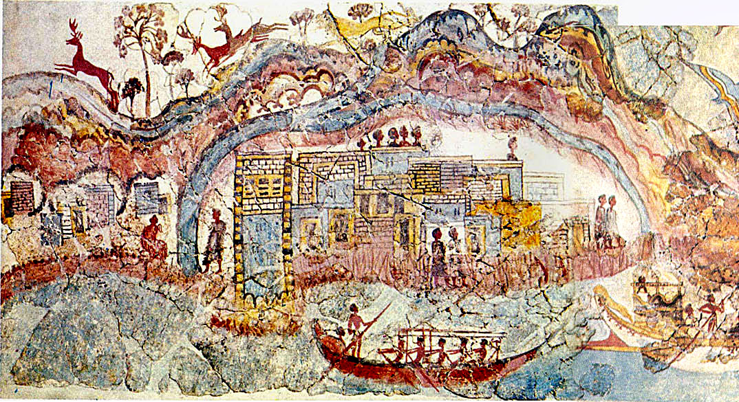
The color scheme used is no more than what I felt was appealing within the feel of the map I was creating from a graphical point of view, there area few images that people have claimed to represent Atlantis at this time, although I did take guidance(or inspiration if you wish) to a degree from the one below as it is considered the most famous possible representation and is from the Marine Festival fresco in Akrotiri. As you can see the color scheme there is similar in tone to what I have applied using deep browns, reds and golds,

Click image to enlarge.
image


We have taken an idea and applied it to the concept of CC it is the ability to use artistic license that interests me most about what can be done in CC and do not believe that maps need to be guided by hard facts and representations outside of CC.
I also aggree (before you raise the point) that not everyone will know quite as much about the myth of Atlantis or the classics dialogue of Plato, but the game play and general feel of the map is enough to enjoy playing it with an added bonus of understanding for those that do know of the ' alleged' history rather than the myth. I play some of of the maps here based on fantasy lands or just plain brilliant ideas of cartographers and enjoy them just as much whether I know what they represent or mean.
Blackadder: Awh, God, God, God. What on earth was I drinking last night? My head feels like there's a Frenchman living in it. Where am I?

Click here to discover the lost islands of Atlantis...
Image
User avatar
Cook NemesisChild
 
Posts: 147
Joined: Tue Oct 02, 2007 7:39 am
Location: Wiltshire

Re: Atlantis v21 - Minor Tweaks : p15 [D]

Postby the.killing.44 on Thu Mar 05, 2009 7:31 pm

Silly Rj posted in the wrong thread :P

Here — just a small thing, but I'd like to see the anchors either all half on water, half on land, or all on land. The random and uneven way you have them now is a bit unnerving to the eyes, but that isn't really evry important. The one thing about your graphics I don't like are the names of the islands written there. Maybe if you curved them alont the path of the islands and reduced their opacity somewhat they would look better and not so … out of place? And as a note, even if you don't do what I suggested above — the names look better when they don't sit atop the waveline, disrupting that.

Great job on this,
.44
User avatar
Captain the.killing.44
 
Posts: 4724
Joined: Thu Oct 23, 2008 7:43 pm
Location: now tell me what got two gums and knows how to spit rhymes

Re: Atlantis v21 - Minor Tweaks : p15 [D]

Postby oaktown on Fri Mar 06, 2009 1:12 am

hey guys, I don't think I've dropped in here in some time. So let me start by saying you've found a great idea for a map, and you are running a fantastic thread - the information at the beginning is impressively complete. And I think you've got a good basic look your working with.

Since you're working toward a gameplay stamp, I'll focus on play. My first concern is that there are a lot of elements of the gameplay that depend on the legend. Without the legend you don't know how to use the boats, docks, ports, Zeus, Life, nor Poseidon; and the legend contains bonus info other than that on the bonus small map. You have four different non-standard attack types - bridges, dock to dock, boat to port, port to boat, - as well as three different kinds of symbol to symbol bombardments. I'm sure this will be easier to follow in-game, but at first that is a lot to take in.

Personally, the maps that i chose to play repeatedly are those that I can size up just from the playing area - if i have to be constantly referring to the legend to know who can attack me from where I tend not to come back to the map. But that's me. I like maps to be elegant in their simplicity and playability, and the more I have to read the less elegant the play.

Boats and ports... seems like with every boat attacking every port and vice-versa things will get a bit messy. I haven't thought through exactly how it could be better, but I'm thinking that if I'm on, say, boat 4 I have to watch out for attacks from way across the board... and I'm probably going to attack the wrong territory at some point because I can hit two territories with #5 and two with #3.

On that note, if you've played Feudal you've probably run into the problem of having similarly numbered/named territories near each other. If I'm on Mu 2 I border Mu 4 and Mariny 4 - yeah, it's a dumb mistake to make, but I'm the guy who will reinforce Mu 4 when I meant to reinforce Mariny 4 at least once per game. 8-[

Bonuses... I see that you ran them through the calculators, but given +4 for a three teritory region which on such a large map you could easily get on the drop rubs me the wrong way. Meanwhile the 12 territory region next door gets +5. It may be your intention that most games will be won on the inner isles, but you don't want the big outer islands to be dead areas.

Since that's probably more than you wanted to hear about play, I won't go into visuals much, other than to suggest that as you proceed think about how elements work with each other. For instance, I like the fun colors of the map, and I like the idea of using scrolls for the legend, but the fun colors and the brown scrolls don't belong on the same map.
User avatar
Captain oaktown
 
Posts: 4451
Joined: Sun Dec 03, 2006 9:24 pm
Location: majorcommand

PreviousNext

Return to The Atlas

Who is online

Users browsing this forum: No registered users