koontz1973 wrote:I will look at those places, as for the names, I changed them as instructed. If I could ask you to give me a list of names that need changing then I can do it. I thought these where better than last times.
Thanks for all the help guys. Lets deal with things one at a time. Territ names. The image posted by snelliugmj is very similar to the one I have with only a couple of differences. Without going to Madrid, I am going to have to take someone's word over others or we will be here all day argueing over which territ is named what. I know and as it is posted on both mine and his, the central 6 are named correctly. I have taken some artistic licence with Madrid and moved the odd thing around and made others larger or smaller like Fuencarrel. On both images I have, this is huge but as it is stuck on the outskirts, it needs to be a lot smaller for the bonuses sake. The same with territ lines. These cannot strictly go acording to boundries within the city as it would make for a poor map. Madrid is made up, like most cities of small in the middle and large on the outskirts, so a rough equalling of territ sizes has to be made. Sorry if you are from Madrid but it needs to be done. Buildings. These are easier to deal with. Name a building, post a picture and tell me where it should go, it will go on. I am going to try and fill the map with as many as I can get in as long as it does not impede game play. The original ones will stay (may go smaller) as they are the fillers between the ones requested and the ones I find and draw. The one that snelliugmj did not recognise was the Royal Palace.
I want this back on (taken of for now) so where does it go. Things changed. Certain buildings have been replaced. Territ lines have been redrawn. (the last time for now until game play gets sorted). Madrid coat of arms (bottom right). New border taken from the coat. Corners now have the filigree from the coat as well.
Click image to enlarge.
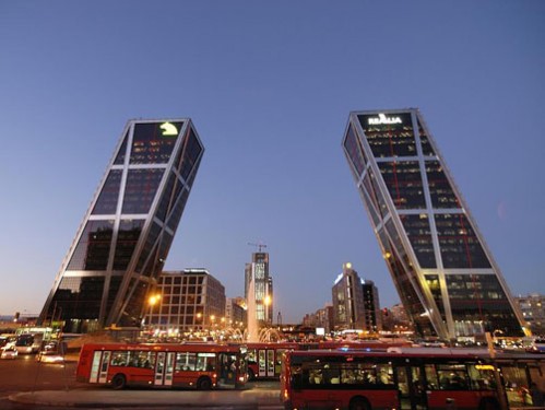
Last but not least for tonight, here is my inspiration for this map. First one shows detail and colour stylings and the second, what I hope to end up with at the end (to a point).
Am liking all the changes... Just some graphical comments. Do you think you could provide an example where the generic buildings are mixed up. So you'll have a few different building types and colours in each impassable group. Could you put a border between the river and the 'west' region. Maybe use the 'centre' green colour. If not, maybe change the colour of the whole river border so it doesn't match the current cyan, green or red colours in the regions it passes through. The buildings up the top (Fuencarral) shouldn't be going over the edge of the map (the rectangle part).
Do you think you could provide an example where the generic buildings are mixed up. So you'll have a few different building types and colours in each impassable group.
Will happen, just waiting for more of the one of buildings to go on then I can move those ones around
Could you put a border between the river and the 'west' region. Maybe use the 'centre' green colour.
The buildings will take care of this.
If not, maybe change the colour of the whole river border so it doesn't match the current cyan, green or red colours in the regions it passes through.
Colours will be tweaked later when the design is set in stone. Right now, it is getting there but am not to sure on how many buildings to add without it looking over crowded and confusing.
The buildings up the top (Fuencarral) shouldn't be going over the edge of the map (the rectangle part).
These will always go over the border. Designed it that way.
No comments since last version so I will take that as the names are some what correct but I have changed the bonus names to further eliminate the need for accuracy. Do not get me wrong, the names are correct, but they may not be at the correct orientation. Also, did not like the crest of Madrid so changed back to the guitar. Removed the last border and have gone back to paisley. Added a few more buildings as well. Still need buildings of Madrid though so await on those. Let the filigree in the corners though.
Click image to enlarge.
I tried to put the crest in different places but it just did not meld with the map.
As you say, the placement is not correct. My suggestion is: Yellow (From north to south) Ciudad Lineal. Moratalaz, Vicálvaro. Cyan (From north to south) Villa de Vallecas, Puente de Vallecas) Blue (South east corner) Villaverde
Thanks for the pictures, will add those buildings in.. Will see about getting them in. Also, thanks for the names. Will go by you and send everyone after you forever more if they say they are wrong.
Keep trying with the crest and have even taken the bull and tree out for a different placement. Nothing to now works but I will keep trying and it will go in. It might take time so please give it such.
The one you could not recognise is this statue, so please let me know where it goes.
Where is this statue, it might go on the map as the buildings if I can drawn it right.
The first picture in in Retiro Park. My suggestion is to either just get the monument (without the lake) or get the lake rectangular. I like more the first option... Place it in the middle of Retiro.
The second picture is Puerta del Sol, which is the "city center", therefore should go in Centro
On the names, There is no optimal solution as you have reshaped the "distritos" a bit, however they are somehow better with my proposal.. Or at least that's my opinion.
There are other wonderful places, like "Plaza Mayor", "Neptuno", "Museo del Prado" but as I said all go to Centro, and I don't see enough space. If you want I can share some pictures and place them...
Bloody hell snelliugmj, still trying to draw and fit ion the last lot. Thanks for the info and will make sure things are changed or moved to the way you have guided me. Lets leave the photos for now as there is more than enough for the next draft. I know you have posted the territ name changes and expect them on the next draft. Should be this weekend.
Next one. Territ names as suggested by snelliugmj. Moved buildings as directed, removed the water from the statue and added some of the suggested buildings. Some are not in the correct position as directed like the two sloping buildings. The colours match the roads too much and blended in so have moved them to behinf the buildings in the correct territ. Now at the bottom, not the top.
Click image to enlarge.
These buildings added.
Do not think any more can be added as the small one will not show the same detail as the large version. But if a building is unique enough then why not add it.
Thanks isaiah. Game play time then. This is what I came up with early on in the ideas and isaiah40 also gave me the final concept for it as well.
Standard 1 for 3 reinforcements. 8 coded starting positions with a max of 1 given out. All will have an underlying neutral of 2. This will guarantee all players will not get a bonus drop ever.
16 territs start as random drop with the other 8 being deployed at one per person.
2 player games - 6 territs 3 player games - 6territs 4 player games - 5 territs 5 player games - 4 territs 6 player games - 3 territs 7 player games - 3 territs 8 player games - 3 territs
i have to say that i'm a bit disappointed with this one, koontz. i like the artwork a lot, with the buildings forming impassables and the citizens dotted around the map providing some life. however, the theme, that of amorphous administrative districts of the city, is only marginally more interesting than the london boroughs map that we have.
how feasible is it to keep the look of the map, but zoom in a bit, so that many more of the major landmarks become visible (and perhaps playable)? i'm talking about a map in the style of copenhagen sightseeing, but simpler and not necessarily to scale, with the boundaries being the bernabeu stadium in the north, the ventas bullring in the east, the zoo in the west and atocha station in the south.
ian, your opinion is noted, and I agree that it is similar to a lot of maps we have that are small. That is the thing, small maps are not interesting. They never have been and never will. This is the reason I hate copies and have tried to always do things that are different from a previous map of mine. But I really like the idea of a map that is zoomed in a lot. Let me have a play with it today and see if I can get some of the major buildings to really stand up without becoming obstructive.
How about we give the map a winning condition like Copenhagen then. Again like that map (this is starting to sound a lot like this map is a copy of others so lets make it a copy of different ones).
How about a good Samaritan theme then. I just change it from buildings to people. There are 12 people on the map, hold any 7 to win. A bit lame and not very interesting, and again, it has been done at least 10 times before.
Moved the buildings are impassable up to go with the rules at the top. Shrunk the text a tad so everything fits. Brought the people back as the last two versions they where missing. Added the wining condition to the bottom.
nolefan5311 wrote:I don't like the objective koontz...I'd remove it. I can't really even tell which people I would need to hold.
Yep, I do not like it either. I have spent the last few hours trying different combos for the buildings but cannot get anything that looks even half way decent. The buildings need to be a lot bigger to fit army numbers and names on so they just look out of scale. Putting them into postcards at the side destroys the overall look as well. Zooming in to the map seems to work the best but destroys the overall feel.There are a lot of things in the centre that can go over the map and then the territs become street names, but then you need to have a combo of street names and objective names. Looks wrong and feels wrong. Buildings placed in the middle of the territs for the WC confuses there purpose. Sorry ian but if you and nole both do not like the objective on the map now, I will remove it and keep it as it was. A very simple map with simple gameplay. I know it is nothing special and game play wise I am embarrassed to have my name on it, but graphically I think now it is more than a breath of fresh air. Please forgive me but can I have it as is now (with or without the WC). I promise to make more complicated maps in future, Escape is pretty complicated and considering that this is my first map that is completely normal, it is not that bad.
koontz1973 wrote:Sorry ian but if you and nole both do not like the objective on the map now, I will remove it and keep it as it was. A very simple map with simple gameplay. I know it is nothing special and game play wise I am embarrassed to have my name on it, but graphically I think now it is more than a breath of fresh air.
no need to be embarrassed at all! this is a small map of 24 regions, so doodle-style gameplay is perfectly suitable. i actually thought that u were pulling my leg when u mentioned the objective in the latest version.
it's my fault for not expressing myself clearly and i apologise for any time wasted: i had in mind a map with regions like those in copenhagen sightseeing, in other words regions representing landmarks or well-known neighbourhoods instead of the bland administrative districts that u have, but u wrongly assumed i didn't like the gameplay instead (understandable because my main remit is to discuss gameplay).
my vision is a zoomed-in version made up of buildings, squares, markets, museums and other public areas (though not streets, which are the wrong shape), losing all of the outer districts and the boring administrative names. this type of map does not work well if u draw it to scale because many of the interesting places are clustered together, with big gaps to one or two others, so u have to draw it out of scale, in the same way that the traditional london underground map is out of scale. troop counts actually on the buildings themselves will obscure the artwork, which isn't really what we want.
do try to keep the overall look of the map in some form. we have nothing that resembles it.


