Page 4 of 50

Posted:
Tue Mar 13, 2007 4:44 pmby boberz
unfortuantly the essay in the top right hand corner puts me off also i like the style of the font but could it be slightly less elaborate to keep th appeal
Posted:
Tue Mar 13, 2007 4:47 pmby DiM
boberz wrote:unfortuantly the essay in the top right hand corner puts me off also i like the style of the font but could it be slightly less elaborate to keep th appeal
yes that part also bothers me but i could not find another way to make the text shorter

i'm open for any suggestions

Posted:
Tue Mar 13, 2007 4:50 pmby boberz
how about put a background around it, have small but elaborate bullet points and write the points in note form.
Posted:
Tue Mar 13, 2007 4:53 pmby DiM
boberz wrote:how about put a background around it, have small but elaborate bullet points and write the points in note form.
i told you i can't think of another way of expressing the same ideas but in fewer words
if you know hot to say the same thing in fewer words post the text here and i'll also add a background or a frame or something.
Posted:
Tue Mar 13, 2007 4:59 pmby boberz
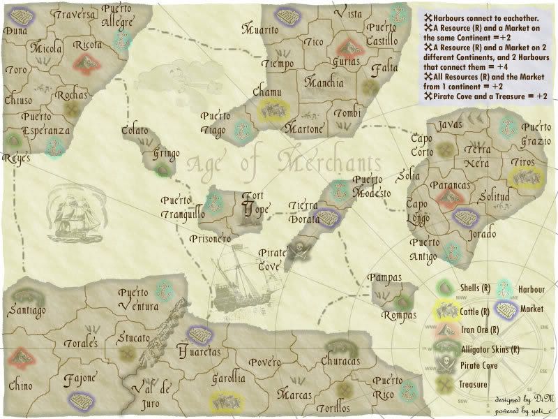
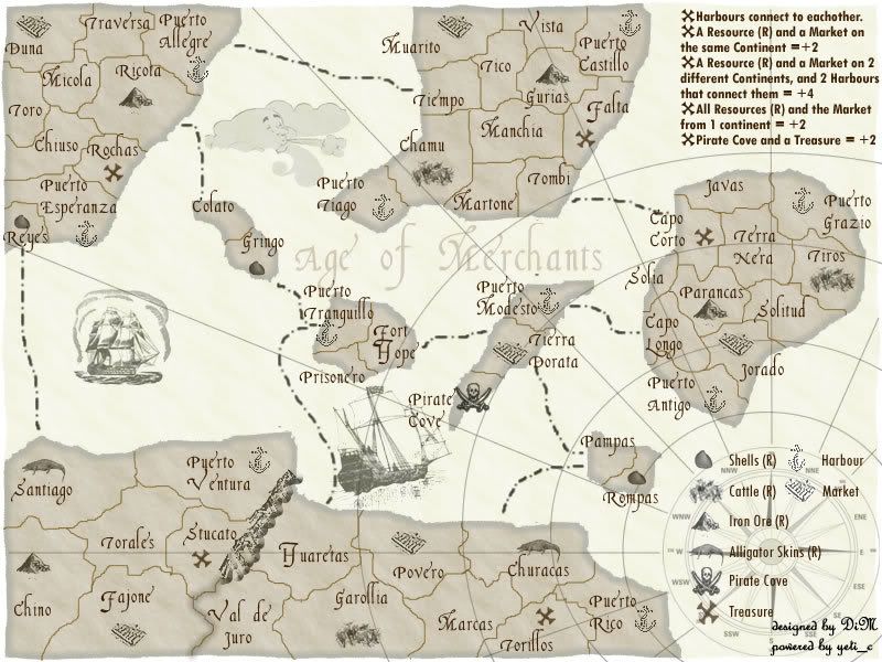
kk rather than saying "all harbours connect to each other" say harbours connect with each other rather than "owning a resource and market in same continent gives a bonus of two" say "a resource and a market in same continent gives bonus of 2" something along these lines (not a major change) throw in a plain background with fancy bullet points becomes more readable, just a suggestion though
Posted:
Tue Mar 13, 2007 5:13 pmby DiM
here you go:
Posted:
Tue Mar 13, 2007 5:15 pmby boberz
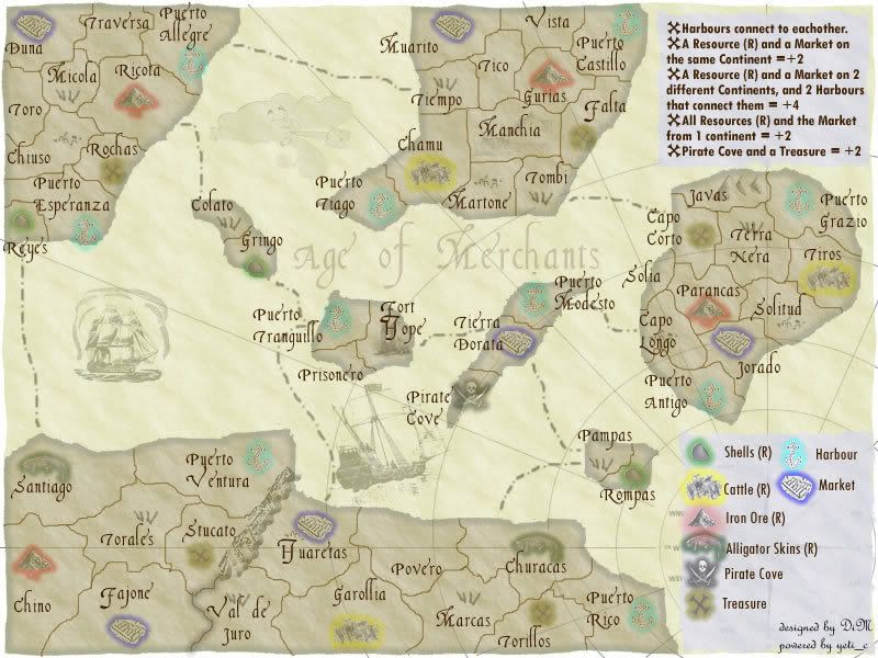
beautiful why not put the same backgorund on the key at the bottom then that is more clear as well thanx for the quick responses and updates
Posted:
Tue Mar 13, 2007 5:22 pmby DiM
boberz wrote:beautiful why not put the same backgorund on the key at the bottom then that is more clear as well thanx for the quick responses and updates
here is the new one. and thanks for the feedback. i think the resource icons in the legend are very clear now.
Posted:
Tue Mar 13, 2007 5:29 pmby boberz
bbbbrrrriiiillliiiiaaaannntttt i love u
maybe that is too far but i think its great
Posted:
Tue Mar 13, 2007 5:32 pmby DiM
i'll be upt for 1 or 2 more hours then i'll go to bed. post anything else you want modified.
Posted:
Tue Mar 13, 2007 6:24 pmby Bad Speler
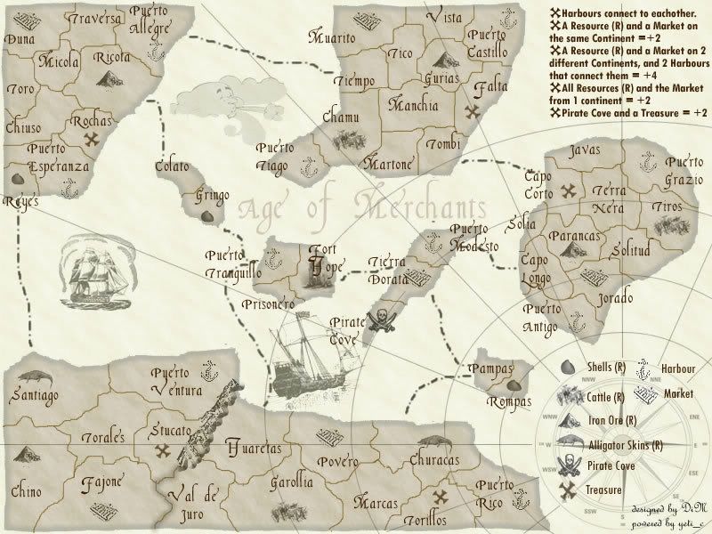
in my opinion, the grey background doesnt fit in with the rest of the map.
Posted:
Tue Mar 13, 2007 6:33 pmby DiM
here is a new version. i think this one looks much cleaner and it should be very visible.

Posted:
Tue Mar 13, 2007 6:37 pmby DiM
and here's a version without grass and rocks and hillls and any other fancy graphics. the only symbols are those that are important (resources harbours, etc.)
Posted:
Tue Mar 13, 2007 6:38 pmby Bad Speler
wow, never would of thought about removing the colours but it looks good. Because of the removal of colours, i think you should remove any decorative mountain or grass (or whatever the graphic is) such as the one in Javas, from blank territories so no one gets confused. Also, space out the items in the legend evenly.
Posted:
Tue Mar 13, 2007 6:41 pmby DiM
Bad Speler wrote:wow, never would of thought about removing the colours but it looks good. Because of the removal of colours, i think you should remove any decorative mountain or grass (or whatever the graphic is) such as the one in Javas, from blank territories so no one gets confused. Also, space out the items in the legend evenly.
i was one minute ahead of you

check out the previous message

Posted:
Tue Mar 13, 2007 6:45 pmby joystickgenie
could be an interesting map. I'll play it at least once to see how the gameplay comes together with the unique bonus system.
Posted:
Tue Mar 13, 2007 6:46 pmby Bad Speler
lol, your quick, you manged to fix it before i told you to
. But the legend still needs to be evenly spaced
Posted:
Tue Mar 13, 2007 6:47 pmby DiM
Bad Speler wrote:lol, your quick, you manged to fix it before i told you to
. But the legend still needs to be evenly spaced
i'll do it now.
edit// here. also moved some teritory names that bothered me.
Posted:
Tue Mar 13, 2007 6:57 pmby DiM
joystickgenie wrote:could be an interesting map. I'll play it at least once to see how the gameplay comes together with the unique bonus system.
if this ever gets quenched i hope you'll play it many times mainly because of the bonus system but also because of the feeling.
Posted:
Tue Mar 13, 2007 7:15 pmby Bad Speler
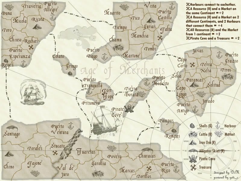
Make your signature at the bottom right a bit more readable. Also you still have to find a way to specify that the islands are a single continent. Perhaps also extend the land to the edge of the map., it looks a bit cut off, especially when the lines of latitude and longitude go between the edge of the map and the edge of the land. One more thing to do, move the Puerto Modesto name so its not on the sea route. Just wanted to bring up a point on playability, there would be many bonuses awarded, for example the first round the first person to go if he got a lucky deployment might get 10 bonus armies to do a lot of damage. Maybe halve the bonuses.
Posted:
Tue Mar 13, 2007 7:26 pmby DiM
Bad Speler wrote:Make your signature at the bottom right a bit more readable. Also you still have to find a way to specify that the islands are a single continent. Perhaps also extend the land to the edge of the map., it looks a bit cut off, especially when the lines of latitude and longitude go between the edge of the map and the edge of the land. One more thing to do, move the Puerto Modesto name so its not on the sea route. Just wanted to bring up a point on playability, there would be many bonuses awarded, for example the first round the first person to go if he got a lucky deployment might get 10 bonus armies to do a lot of damage. Maybe halve the bonuses.
the islands as a single continent problem seems rather difficult to solved. i've even thought to draw a circle around it but it does not look right.
the land problem is because i took out the edge effect from the background. i'll replace that.
about the bonuses i don't know what to say. if i half them then they might be too low. but if more people consider this i'll do it.
Posted:
Tue Mar 13, 2007 7:36 pmby hulmey
great idea here d i m but i feel the map is very blend...i like your other other wooden maps on the other thread
Posted:
Tue Mar 13, 2007 7:40 pmby DiM
here is the revised version.
Posted:
Tue Mar 13, 2007 7:44 pmby Enigma
its looking better but still the wrong font. with the large letters and all the different symbols the map is way to busy.
i still personally think this concept would work better on a more colourful map. but i really like the idea- itll make for a very strategically interesting game!
Posted:
Tue Mar 13, 2007 7:51 pmby Bad Speler
in the south of the map, try getting the borders and latitude lines to not go beyond the land.