Conquer Club

Thailand

Care to peruse completed maps? Take a stroll through the Atlas.

Moderator: Cartographers

Forum rules
Please read the Community Guidelines before posting.

Re: Thailand [GP]

Postby grifftron on Sat Feb 05, 2011 7:07 am

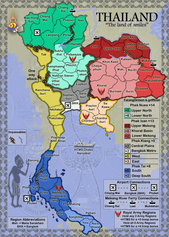
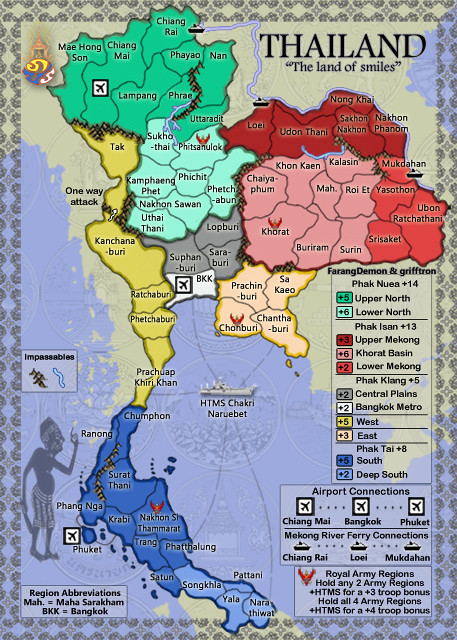
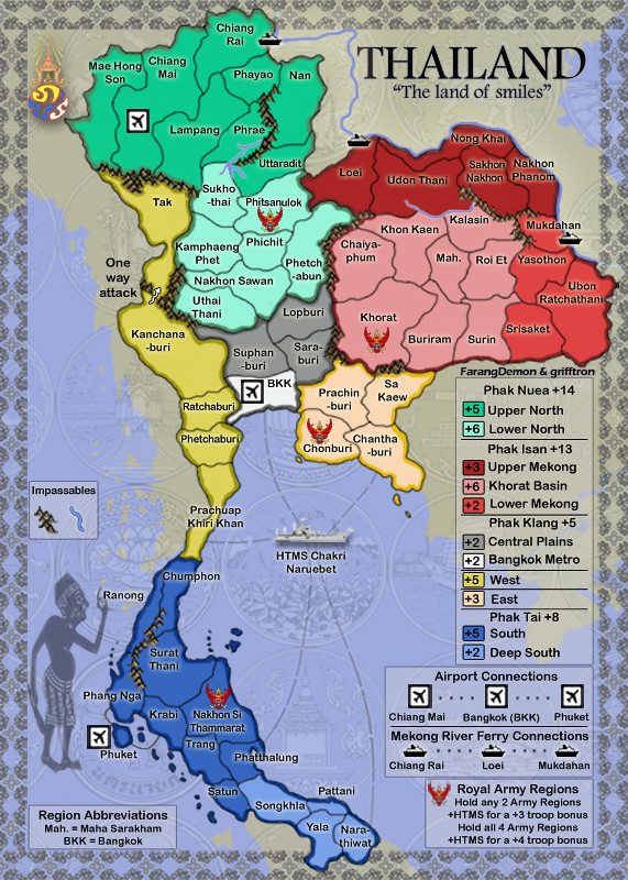
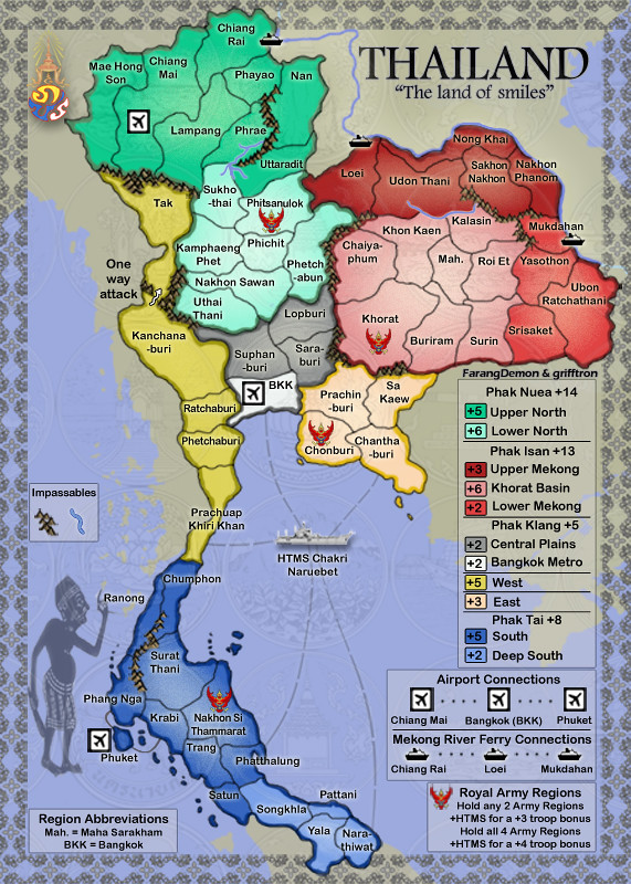
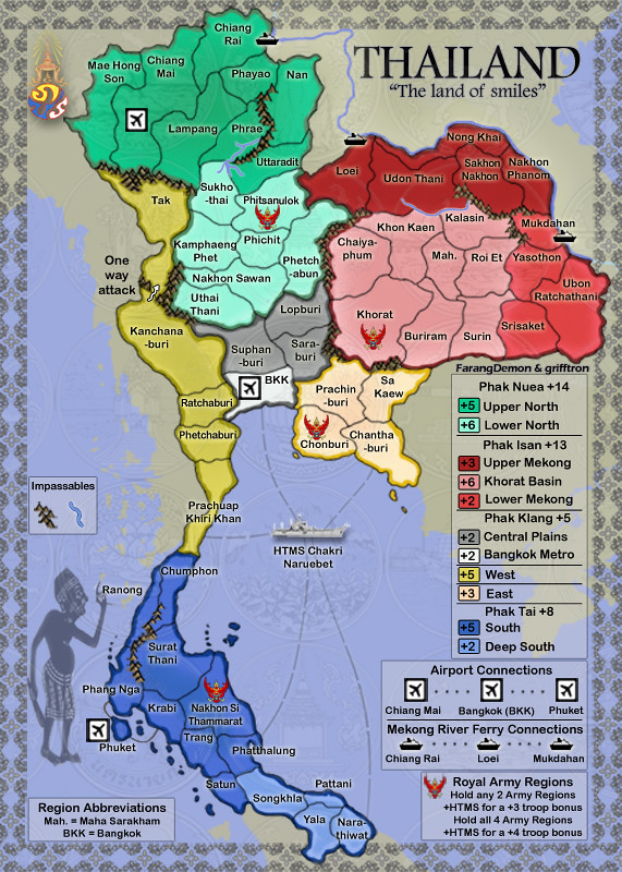
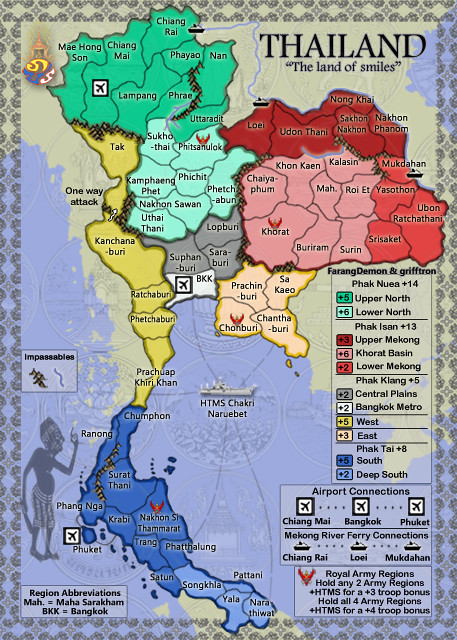
natty_dread wrote:The sea looks sort of lavender. IMO you could adjust the hue somewhat. Maybe it's just me, but I feel a sea colour should be on the green side of blue, rather than on the purple side...


That is so not purple looking natty, and i am not sure about a green looking sea... I had messed around with it a lot, it was too light before and i made it the color it is now, seemed fine, if more think its needs another color change ill do it i guess.

-griff
Image
User avatar
Major grifftron
SoC Training Adviser
 
Posts: 3280
Joined: Thu Jul 09, 2009 6:11 am

Re: Thailand [GP]

Postby natty dread on Sat Feb 05, 2011 7:10 am

I didn't say you should make it green. I said that when you choose a colour for sea, hues of blue that are more on the green-blue side work better than hues that are more on the red-blue side.

And your current sea colour is more on the red-blue side:

r = 154
g = 150
b = 247

I'm just asking, make it so that g > r.
Image
User avatar
Sergeant 1st Class natty dread
 
Posts: 12877
Joined: Fri Feb 08, 2008 8:58 pm
Location: just plain fucked

Re: Thailand [GP]

Postby isaiah40 on Sat Feb 05, 2011 8:45 am

On the large map the top river has a drop shadow, while the rest of the map doesn't or on the small map for that matter. If you fix this I'm thinking one of the mods might give you the graphics stamp! ;)
Lieutenant isaiah40
 
Posts: 3990
Joined: Mon Aug 27, 2007 7:14 pm

Re: Thailand [GP]

Postby grifftron on Sat Feb 05, 2011 10:33 am

isaiah40 wrote:On the large map the top river has a drop shadow, while the rest of the map doesn't or on the small map for that matter. If you fix this I'm thinking one of the mods might give you the graphics stamp! ;)


OK ill see what it looks like without that on,

natty_dread wrote:I didn't say you should make it green. I said that when you choose a colour for sea, hues of blue that are more on the green-blue side work better than hues that are more on the red-blue side.

And your current sea colour is more on the red-blue side:

r = 154
g = 150
b = 247

I'm just asking, make it so that g > r.


OK natty ill do that, sorry for the confusion, and looking at it again i think it would need a little color change.
Image
User avatar
Major grifftron
SoC Training Adviser
 
Posts: 3280
Joined: Thu Jul 09, 2009 6:11 am

Re: Thailand [GP]

Postby grifftron on Sat Feb 05, 2011 10:52 am

Click image to enlarge.
image


Click image to enlarge.
image


-griff
Image
User avatar
Major grifftron
SoC Training Adviser
 
Posts: 3280
Joined: Thu Jul 09, 2009 6:11 am

Re: Thailand [GP]

Postby RedBaron0 on Sat Feb 05, 2011 12:44 pm

Whatever the darker border you're using to make the "border" of the rivers is the source of the pixelly look of the rivers, smooth that out and the river all be the same color, and might just do it.
ImageImage
User avatar
Sergeant 1st Class RedBaron0
 
Posts: 2657
Joined: Sun Aug 19, 2007 12:59 pm
Location: Pennsylvania

Re: Thailand [GP]

Postby natty dread on Sat Feb 05, 2011 1:22 pm

Yes, the new sea is better.
Image
User avatar
Sergeant 1st Class natty dread
 
Posts: 12877
Joined: Fri Feb 08, 2008 8:58 pm
Location: just plain fucked

Re: Thailand [GP]

Postby isaiah40 on Sat Feb 05, 2011 5:46 pm

Looks better! Now it doesn't look the river is above everything and then goes down under the border.

RedBaron0 wrote:Whatever the darker border you're using to make the "border" of the rivers is the source of the pixelly look of the rivers, smooth that out and the river all be the same color, and might just do it.


Hmmm ... I'm wondering if the pixelly look would go away if there wasn't a "border" on the rivers? Just a wild thought.
Lieutenant isaiah40
 
Posts: 3990
Joined: Mon Aug 27, 2007 7:14 pm

Re: Thailand [GP]

Postby FarangDemon on Sun Feb 06, 2011 1:07 am

Chonburi digits ok?

Image
Click image to enlarge.
image

"He came dancin across the water.... FarangDemon, FarangDemon.... mmmhh....what a killer..."
User avatar
Brigadier FarangDemon
 
Posts: 700
Joined: Wed Apr 23, 2008 1:36 am

Re: Thailand [GP]

Postby grifftron on Sun Feb 06, 2011 4:36 am

Another shot at the rivers...

Click image to enlarge.
image
Image
User avatar
Major grifftron
SoC Training Adviser
 
Posts: 3280
Joined: Thu Jul 09, 2009 6:11 am

Re: Thailand [GP]

Postby MrBenn on Sun Feb 06, 2011 4:21 pm

This is looking great - I think you only need to make a few minor tweaks ;-)

I'd suggest trying to make the coloured areas less uniform; you could try to add an inner glow to each coloured region (this example is slighty over-egged, but should show you what I mean):
Image

It would also be nice to have the background pattern (the circle design motif) overlaid on top of the region areas but at a really low opacity - you want it to be barely noticeable.

I think those tweaks should help lift the graphics a bit, without adding any clutter.
Image
PB: 2661 | He's blue... If he were green he would die | No mod would be stupid enough to do that
User avatar
Lieutenant MrBenn
 
Posts: 6880
Joined: Wed Nov 21, 2007 9:32 am
Location: Off Duty

Re: Thailand [GP]

Postby grifftron on Sun Feb 06, 2011 8:14 pm

Thanks MB.

Ill mess with it later when i get the chance, as for putting the circle background on top of the map at a low op. That might be kinda tricky because i did not have those in back of the map, i added each of those region logos myself and they are all diff layers, but behind Thailand itself there are none :oops: But i will see what i can do...

-griff
Image
User avatar
Major grifftron
SoC Training Adviser
 
Posts: 3280
Joined: Thu Jul 09, 2009 6:11 am

Re: Thailand [GP]

Postby grifftron on Mon Feb 07, 2011 12:59 am

I went light in dark outside on the terts instead of light out, dark in like you did in your example.

Click image to enlarge.
image
Image
User avatar
Major grifftron
SoC Training Adviser
 
Posts: 3280
Joined: Thu Jul 09, 2009 6:11 am

Re: Thailand [GP]

Postby isaiah40 on Mon Feb 07, 2011 8:39 am

Looking good Griff!!

One little nitpick (which I don't believe will hold you up), there is a little color bleed on the bottom of the Khorat Basin. Do you think you can fix that up please?
Lieutenant isaiah40
 
Posts: 3990
Joined: Mon Aug 27, 2007 7:14 pm

Re: Thailand [GP]

Postby grifftron on Mon Feb 07, 2011 8:59 am

isaiah40 wrote:Looking good Griff!!

One little nitpick (which I don't believe will hold you up), there is a little color bleed on the bottom of the Khorat Basin. Do you think you can fix that up please?


yep sure thing.
Image
User avatar
Major grifftron
SoC Training Adviser
 
Posts: 3280
Joined: Thu Jul 09, 2009 6:11 am

Re: Thailand [GP]

Postby grifftron on Mon Feb 07, 2011 9:30 am

OK here is what it looks like with dark (in) and light (out) as seen in MB example, let me know if you like the version in my post above or this one, i think they both look fine.

Click image to enlarge.
image


-griff
Image
User avatar
Major grifftron
SoC Training Adviser
 
Posts: 3280
Joined: Thu Jul 09, 2009 6:11 am

Re: Thailand [GP]

Postby AndyDufresne on Mon Feb 07, 2011 12:07 pm

I much prefer the light in the center. The dark red region is a good example---the text is easier to read with the light in the center.


--Andy
User avatar
Corporal 1st Class AndyDufresne
 
Posts: 24919
Joined: Fri Mar 03, 2006 8:22 pm
Location: A Banana Palm in Zihuatanejo

Re: Thailand [GP]

Postby Industrial Helix on Mon Feb 07, 2011 2:07 pm

I'm preferring light on the inside and dark on the outside.
Sketchblog [Update 07/25/11]: http://indyhelixsketch.blogspot.com/
Living in Japan [Update 07/17/11]: http://mirrorcountryih.blogspot.com/
Russian Revolution map for ConquerClub [07/20/11]: viewtopic.php?f=241&t=116575
User avatar
Cook Industrial Helix
 
Posts: 3462
Joined: Mon Jul 14, 2008 6:49 pm
Location: Ohio

Re: Thailand [GP]

Postby isaiah40 on Mon Feb 07, 2011 3:47 pm

I also prefer the first one, much easier on the eyes.
Lieutenant isaiah40
 
Posts: 3990
Joined: Mon Aug 27, 2007 7:14 pm

Re: Thailand [GP]

Postby MrBenn on Mon Feb 07, 2011 5:24 pm

Yep; your version with the light in the middle is much better.

For some reason, while adding the circles pattern/texture on top of the map, you've turned down the texture from the background too... what I emant to say was to leave it how it was in the background, but to add a very slightly visible version to the map area too (as is the map were slightly translucent)

Image
Image
PB: 2661 | He's blue... If he were green he would die | No mod would be stupid enough to do that
User avatar
Lieutenant MrBenn
 
Posts: 6880
Joined: Wed Nov 21, 2007 9:32 am
Location: Off Duty

Re: Thailand [GP]

Postby grifftron on Mon Feb 07, 2011 10:15 pm

MrBenn wrote:Yep; your version with the light in the middle is much better.

For some reason, while adding the circles pattern/texture on top of the map, you've turned down the texture from the background too... what I emant to say was to leave it how it was in the background, but to add a very slightly visible version to the map area too (as is the map were slightly translucent)

Image


I am not following you here MB... can you reword it for me please?
Image
User avatar
Major grifftron
SoC Training Adviser
 
Posts: 3280
Joined: Thu Jul 09, 2009 6:11 am

Re: Thailand [GP]

Postby isaiah40 on Mon Feb 07, 2011 10:33 pm

I think what MrBenn is saying is too put another copy of them on top of the map and then reduce the opacity down to where you can barely see them. In other words copy all those layers, and then paste them *on top* of the map layers. I hope this clears it for you griff! ;)
Lieutenant isaiah40
 
Posts: 3990
Joined: Mon Aug 27, 2007 7:14 pm

Re: Thailand [GP]

Postby grifftron on Mon Feb 07, 2011 11:54 pm

isaiah40 wrote:I think what MrBenn is saying is too put another copy of them on top of the map and then reduce the opacity down to where you can barely see them. In other words copy all those layers, and then paste them *on top* of the map layers. I hope this clears it for you griff! ;)

You mean put it back to how I hAd it and then put a layer of them over the map of thailand itself? how would that. Look any diff from what I have now
Image
User avatar
Major grifftron
SoC Training Adviser
 
Posts: 3280
Joined: Thu Jul 09, 2009 6:11 am

Re: Thailand [GP]

Postby isaiah40 on Tue Feb 08, 2011 7:23 am

I dunno! I think I'll let MrBenn clear it up for us. I do see the background circles in the map area and it looks good!
Lieutenant isaiah40
 
Posts: 3990
Joined: Mon Aug 27, 2007 7:14 pm

Re: Thailand [GP]

Postby grifftron on Tue Feb 08, 2011 9:24 am

I am pretty sure this is what you meant MB. I like it.

Click image to enlarge.
image


Click image to enlarge.
image


-griff
Image
User avatar
Major grifftron
SoC Training Adviser
 
Posts: 3280
Joined: Thu Jul 09, 2009 6:11 am

PreviousNext

Return to The Atlas

Who is online

Users browsing this forum: No registered users