Although looks like people didnt like the idea too much
Iberia [Quenched]
Moderator: Cartographers


![]() by Bad Speler on Tue Jan 02, 2007 11:42 am
by Bad Speler on Tue Jan 02, 2007 11:42 am
i will once i get enough votes in for the city bonuses
Highest Score: 2532
Highest Position: 69 (a long time ago)
Highest Position: 69 (a long time ago)
-
 Bad Speler
- Posts: 1027
- Joined: Fri Jun 02, 2006 8:16 pm
- Location: Ottawa


![]() by btownmeggy on Tue Jan 16, 2007 7:13 pm
by btownmeggy on Tue Jan 16, 2007 7:13 pm
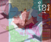
Just the other day I was saying that I wanted a map of Iberia--and here it is!
-

btownmeggy
- Posts: 2042
- Joined: Thu Jan 04, 2007 1:43 am


![]() by btownmeggy on Tue Jan 16, 2007 7:16 pm
by btownmeggy on Tue Jan 16, 2007 7:16 pm
Indeed, if you're going to have most of the territories listed under their non-anglicized names, Sevilla and Navarra need to be as well.
Also, I don't really like any of the textures (maybe they're too bold and too uniform) and the contrast between the bright oceans and the dark continents is quite unpleasant.
EDIT: Speaking of non-anglicized names, what about non-hispanicized names? Maybe Viscaya should be Bizkaia?
Also, I don't really like any of the textures (maybe they're too bold and too uniform) and the contrast between the bright oceans and the dark continents is quite unpleasant.
EDIT: Speaking of non-anglicized names, what about non-hispanicized names? Maybe Viscaya should be Bizkaia?
-
btownmeggy
- Posts: 2042
- Joined: Thu Jan 04, 2007 1:43 am
![]() by Bad Speler on Sun Jan 21, 2007 4:15 pm
by Bad Speler on Sun Jan 21, 2007 4:15 pm
I've resumed work on this map (dont worry arctic is still my priority, and for those who missed it i have put the picture with armies). Ive put a gradiant on the ocean, brightened it up, changed those anglicized names, added army shadows, changed the bridges, changed font, and removed important cities. I have also changed some of the moutains, check at the bottom of the mao. I didnt want to put more moutains in case they dont look right.

Highest Score: 2532
Highest Position: 69 (a long time ago)
Highest Position: 69 (a long time ago)
-
Bad Speler
- Posts: 1027
- Joined: Fri Jun 02, 2006 8:16 pm
- Location: Ottawa
![]() by Sargentgeneral on Sun Jan 21, 2007 7:01 pm
by Sargentgeneral on Sun Jan 21, 2007 7:01 pm
The army shadows look awkward in some colors like the purple.
Highest score: 1910
Highest rank: 188
Battle of the bands #1 champion: ACDC
Highest rank: 188
Battle of the bands #1 champion: ACDC
-

Sargentgeneral
- Posts: 379
- Joined: Thu Nov 16, 2006 11:55 pm
- Location: On Conquerclub, duh!


![]() by Ruben Cassar on Sun Jan 21, 2007 7:24 pm
by Ruben Cassar on Sun Jan 21, 2007 7:24 pm
Bad Speler wrote:I've resumed work on this map (dont worry arctic is still my priority, and for those who missed it i have put the picture with armies). Ive put a gradiant on the ocean, brightened it up, changed those anglicized names, added army shadows, changed the bridges, changed font, and removed important cities. I have also changed some of the moutains, check at the bottom of the mao. I didnt want to put more moutains in case they dont look right.
Okay I think these things need to be improved:
1. Fonts - not very legible
2. Army Shadows - they make the map ugly. Try some transparent ones.
3. Changes graphics for mountains and bridges, make them more realistic and try to give them a 3D effect.
Good luck!


-
Ruben Cassar
- Posts: 2160
- Joined: Thu Nov 16, 2006 6:04 am
- Location: Civitas Invicta, Melita, Evropa


![]() by johloh on Sun Jan 21, 2007 7:27 pm
by johloh on Sun Jan 21, 2007 7:27 pm
I would....
-add a stronger texture to the water (with a darker texture)
-dark fonts on a dark background are bad i think, either lighten the continents and keep the font, or give the font some sort of border or shadow to distinguish it.
-I would change the font from the 'cursive' type font to a more straight forward one, its kinda hard to read because its so small (has to be because of space)
-drop shadows on legend
-make the walls stand out more
-give the rivers some texture
-lighten your army circles
just some quick ideas... good look though
-

johloh
- Posts: 472
- Joined: Mon Dec 04, 2006 12:58 pm
- Location: San Francisco


![]() by reverend_kyle on Mon Jan 22, 2007 2:57 am
by reverend_kyle on Mon Jan 22, 2007 2:57 am
Go with like 75 transparency on the shadows.
DANCING MUSTARD FOR POOP IN '08!
-

reverend_kyle
- Posts: 9250
- Joined: Tue Mar 21, 2006 4:08 pm
- Location: 1000 post club


![]() by insertnamehere on Mon Jan 22, 2007 12:24 pm
by insertnamehere on Mon Jan 22, 2007 12:24 pm
its castelo branco , not castle branco .
list of people who i hate , any deadbeats . and lord buckback.
-

insertnamehere
- Posts: 99
- Joined: Sun Nov 05, 2006 12:56 pm
- Location: Stoke Holy Cross, east anglia , UK

![]() by spinwizard on Mon Jan 22, 2007 12:46 pm
by spinwizard on Mon Jan 22, 2007 12:46 pm
Woah i was in the middle of makeing a spain map! u got there 1st...good job but u have 2 add the islands to the left of valencea- ibiza!

-
spinwizard
- Posts: 5016
- Joined: Sun Dec 10, 2006 9:52 am

![]() by Bad Speler on Mon Jan 22, 2007 4:08 pm
by Bad Speler on Mon Jan 22, 2007 4:08 pm
im not 100% sure but i think iberia refers to mailand spain and portugal, so I dont think i could add any islands. And i will fix the misspelled name.
Highest Score: 2532
Highest Position: 69 (a long time ago)
Highest Position: 69 (a long time ago)
-
Bad Speler
- Posts: 1027
- Joined: Fri Jun 02, 2006 8:16 pm
- Location: Ottawa
![]() by Guiscard on Mon Jan 22, 2007 5:27 pm
by Guiscard on Mon Jan 22, 2007 5:27 pm
You're correct its just the peninsula itself.
qwert wrote:Can i ask you something?What is porpose for you to open these Political topic in ConquerClub? Why you mix politic with Risk? Why you not open topic like HOT AND SEXY,or something like that.
-
Guiscard
- Posts: 4103
- Joined: Fri Dec 08, 2006 7:27 pm
- Location: In the bar... With my head on the bar
![]() by Bad Speler on Wed Jan 24, 2007 4:21 pm
by Bad Speler on Wed Jan 24, 2007 4:21 pm
Ok, heres the next update; many graphical change. Testing new mountains at the bottom of the map, like last time. I've also merged coimbra and viseu in portugal, because it still looked crowded.

Highest Score: 2532
Highest Position: 69 (a long time ago)
Highest Position: 69 (a long time ago)
-
Bad Speler
- Posts: 1027
- Joined: Fri Jun 02, 2006 8:16 pm
- Location: Ottawa
-
spinwizard
- Posts: 5016
- Joined: Sun Dec 10, 2006 9:52 am
![]() by Bad Speler on Thu Jan 25, 2007 7:55 am
by Bad Speler on Thu Jan 25, 2007 7:55 am
bump (I would like a few more comments before i get to work on the next version)
Highest Score: 2532
Highest Position: 69 (a long time ago)
Highest Position: 69 (a long time ago)
-
Bad Speler
- Posts: 1027
- Joined: Fri Jun 02, 2006 8:16 pm
- Location: Ottawa
![]() by Guiscard on Thu Jan 25, 2007 8:38 am
by Guiscard on Thu Jan 25, 2007 8:38 am
The mountains are OK but the other impassables probably need to be improved. Textures maybe need toning down a bit? Looking good though!
qwert wrote:Can i ask you something?What is porpose for you to open these Political topic in ConquerClub? Why you mix politic with Risk? Why you not open topic like HOT AND SEXY,or something like that.
-
Guiscard
- Posts: 4103
- Joined: Fri Dec 08, 2006 7:27 pm
- Location: In the bar... With my head on the bar
![]() by Lone.prophet on Thu Jan 25, 2007 8:49 am
by Lone.prophet on Thu Jan 25, 2007 8:49 am
it looks very crowdy, and the river are somewhat ugly though the mountains are very nice

-
Lone.prophet
- Posts: 1467
- Joined: Thu Oct 12, 2006 4:37 pm
- Location: Your basement Muahaha

![]() by Guiscard on Thu Jan 25, 2007 8:57 am
by Guiscard on Thu Jan 25, 2007 8:57 am
I think its the overbearing texture which makes it seem crowded.
qwert wrote:Can i ask you something?What is porpose for you to open these Political topic in ConquerClub? Why you mix politic with Risk? Why you not open topic like HOT AND SEXY,or something like that.
-
Guiscard
- Posts: 4103
- Joined: Fri Dec 08, 2006 7:27 pm
- Location: In the bar... With my head on the bar
![]() by Bad Speler on Thu Jan 25, 2007 2:44 pm
by Bad Speler on Thu Jan 25, 2007 2:44 pm
I've toned down the land textures a bit, replaced all the mountains and trying out new gradiant rivers. The new large mountains also made portugal look even more crowded, so I merged Castelo Branco and Guarda, and reduced the bonus to 4.

Highest Score: 2532
Highest Position: 69 (a long time ago)
Highest Position: 69 (a long time ago)
-
Bad Speler
- Posts: 1027
- Joined: Fri Jun 02, 2006 8:16 pm
- Location: Ottawa
Who is online
Users browsing this forum: No registered users
|
|||||||
| Conquer Club is not associated with RISK online in any way. Copyright © 2006-2024 by Big Wham LLC | |||||||