Chinese Checkers [Quenched] May '07 re-opener?
Moderator: Cartographers


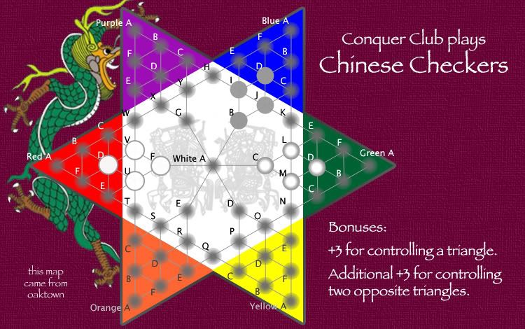
![]() by Fircoal on Sat Jan 06, 2007 11:10 pm
by Fircoal on Sat Jan 06, 2007 11:10 pm
2 things.
1) The triangles I think should be 3 per each.
2) An idea, how about if you own all of the B's you get a bonus.
1) The triangles I think should be 3 per each.
2) An idea, how about if you own all of the B's you get a bonus.
Vote: Mandy
Eddie35: hi everyone
Serbia: YOU IDIOT! What is THAT supposed to be? Are you even TRYING to play this game?! Kill the idiot NOW please!
Eddie35: hi everyone
Serbia: YOU IDIOT! What is THAT supposed to be? Are you even TRYING to play this game?! Kill the idiot NOW please!
Skoffin wrote: So um.. er... I'll be honest, I don't know what the f*ck to do from here. Goddamnit chu.
-

 Fircoal
- Posts: 19422
- Joined: Sat Sep 23, 2006 8:53 pm
- Location: Abusing Silleh Buizels


![]() by oaktown on Sun Jan 07, 2007 4:11 am
by oaktown on Sun Jan 07, 2007 4:11 am
Lone.prophet wrote:the "glow" from the armie shades annoy me u mind making them solid?
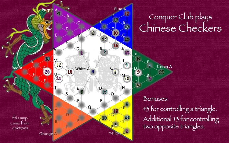
Try these on for size... got a favorite? I kind of like the white-to-grey circles on the right. Possibilities are limitless.
I threw on a radial gradiant border around the entire board... not sure it achieves the desired effect. I haven't used photoshop since 1993, so I'm re-learning as I go. More to come later.
Also dropped the bonuses back down to three, and removed the redundant bonus info.
-

oaktown
- Posts: 4451
- Joined: Sun Dec 03, 2006 9:24 pm
- Location: majorcommand


![]() by KEYOGI on Sun Jan 07, 2007 4:28 am
by KEYOGI on Sun Jan 07, 2007 4:28 am
I'm not sure about the army shadows. I think we're going to need to see how they look with numbers, which means the xml needs to be coded. I don't see this as a big problem for you though because it's not like your circles are going to move around.
-
KEYOGI
- Posts: 1632
- Joined: Tue Oct 10, 2006 6:09 am


![]() by reverend_kyle on Sun Jan 07, 2007 4:32 am
by reverend_kyle on Sun Jan 07, 2007 4:32 am
Yeah I like the original.
DANCING MUSTARD FOR POOP IN '08!
-

reverend_kyle
- Posts: 9250
- Joined: Tue Mar 21, 2006 4:08 pm
- Location: 1000 post club


![]() by Bad Speler on Sun Jan 07, 2007 4:58 pm
by Bad Speler on Sun Jan 07, 2007 4:58 pm
For me, i also think the original shadows are good, minus the the transparency effect.
Highest Score: 2532
Highest Position: 69 (a long time ago)
Highest Position: 69 (a long time ago)
-
Bad Speler
- Posts: 1027
- Joined: Fri Jun 02, 2006 8:16 pm
- Location: Ottawa


![]() by cowshrptrn on Sun Jan 07, 2007 5:55 pm
by cowshrptrn on Sun Jan 07, 2007 5:55 pm
white C if you could get the grey a bit more transparent that would be even better, and white D is a close second

-

cowshrptrn
- Posts: 838
- Joined: Thu Aug 17, 2006 1:15 pm
- Location: wouldn't YOU like to know....
![]() by AndyDufresne on Sun Jan 07, 2007 6:00 pm
by AndyDufresne on Sun Jan 07, 2007 6:00 pm
Is it possible to try the original ones, minus the large gray dot in center of them? I think a simple shadow like that might work, but otherwise I'm leaning toward the whiter ones.
--Andy
--Andy
-

AndyDufresne
- Posts: 24919
- Joined: Fri Mar 03, 2006 8:22 pm
- Location: A Banana Palm in Zihuatanejo


![]() by oaktown on Mon Jan 08, 2007 1:02 am
by oaktown on Mon Jan 08, 2007 1:02 am
Three options for the army cicles:
1. original shaded gradiant circle (blue and purple part of the board)
2. white circle with gradiant border (green and yellow triangles)
3. lightened version of original circle (orange and red)
My hope was to give the effect of a concave space as per old chinese checkers boards... I think the white circle is a nod to that effect, and is by far the easiest to read.
I still need to work on lining up the numbers a bit.
Last edited by oaktown on Mon Jan 08, 2007 1:10 am, edited 1 time in total.

-
oaktown
- Posts: 4451
- Joined: Sun Dec 03, 2006 9:24 pm
- Location: majorcommand
![]() by KEYOGI on Mon Jan 08, 2007 2:50 am
by KEYOGI on Mon Jan 08, 2007 2:50 am
oaktown wrote:Three options for the army cicles:
1. original shaded gradiant circle (blue and purple part of the board)
2. white circle with gradiant border (green and yellow triangles)
3. lightened version of original circle (orange and red)
My hope was to give the effect of a concave space as per old chinese checkers boards... I think the white circle is a nod to that effect, and is by far the easiest to read.
I still need to work on lining up the numbers a bit.
If that was your aim then definately 2. Making the board more 3D might help that effect also.
-
KEYOGI
- Posts: 1632
- Joined: Tue Oct 10, 2006 6:09 am
![]() by oaktown on Mon Jan 08, 2007 10:50 pm
by oaktown on Mon Jan 08, 2007 10:50 pm
Wisse wrote:i like the white ones if the numbers do fit in there exactly, they don't now...
I could make 'em a bit bigger - also, I haven't mastered settings the coordinates, so few of the numbers are correctly centered. That will work itself out over time.
Once I've settled on a circle I'll work on making the entire map seem more 3-D, as it is very flat right now.
-
oaktown
- Posts: 4451
- Joined: Sun Dec 03, 2006 9:24 pm
- Location: majorcommand
![]() by KEYOGI on Mon Jan 08, 2007 10:58 pm
by KEYOGI on Mon Jan 08, 2007 10:58 pm
What program are you using for making the map?
I came up with a way in Photoshop to get all my numbers centred the first time with the exception of the errors in the xml tester. That just required making all my x coordinates -2 and y coordinates +23.
I came up with a way in Photoshop to get all my numbers centred the first time with the exception of the errors in the xml tester. That just required making all my x coordinates -2 and y coordinates +23.
-
KEYOGI
- Posts: 1632
- Joined: Tue Oct 10, 2006 6:09 am
![]() by oaktown on Wed Jan 10, 2007 12:17 am
by oaktown on Wed Jan 10, 2007 12:17 am
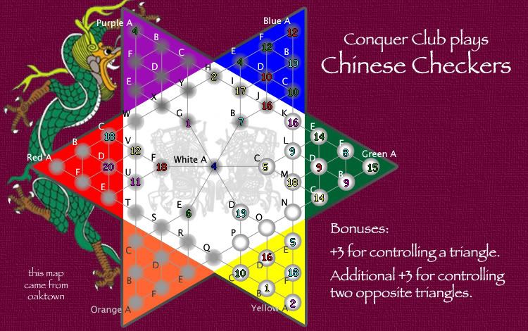
OK, here's the map with the popular white army circles. The circles are a bit larger, to fit the numbers fully.
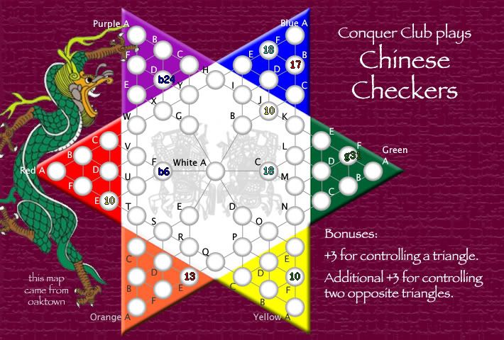
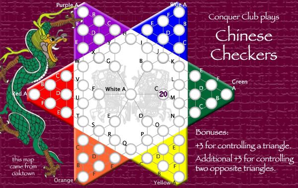
And here's what the small version could potentially look like:
Photoshop - which is a daily battle. The last time I used photoshop it was version 3.0 on my Mac IIx.
The map assist tool was fine for dropping coordinates in the XML - I just didn't know where the targets should be. I could certainly do it in photoshop, which gives x-y coordinates, but I'm not going to waste more time on that until I know I have the map right - there are still changes ahead.
And here's what the small version could potentially look like:
KEYOGI wrote:What program are you using for making the map? I came up with a way in Photoshop to get all my numbers centred the first time with the exception of the errors in the xml tester.
Photoshop - which is a daily battle. The last time I used photoshop it was version 3.0 on my Mac IIx.
The map assist tool was fine for dropping coordinates in the XML - I just didn't know where the targets should be. I could certainly do it in photoshop, which gives x-y coordinates, but I'm not going to waste more time on that until I know I have the map right - there are still changes ahead.
-
oaktown
- Posts: 4451
- Joined: Sun Dec 03, 2006 9:24 pm
- Location: majorcommand
![]() by oaktown on Sun Jan 14, 2007 9:40 pm
by oaktown on Sun Jan 14, 2007 9:40 pm
48 total posts since I started (some of which are by me) and nothing in the past week... I'm happy to continue working on this map and complete the XML, but I'm thinking there may not be enough interest to devote any more of my time to it. I have other ideas I want to float, so unless I'm convinced that anybody thinks that Chinese Checkers is a playable map idea I may turn my attention to something new.
So, Chinese Checkers: to be, or not to be??
And if you think I should continue, please give me some feedback on where to go next... I don't want this to be one of those maps that gets kicked around for months and never gets anywhere.
Thanks.
So, Chinese Checkers: to be, or not to be??
And if you think I should continue, please give me some feedback on where to go next... I don't want this to be one of those maps that gets kicked around for months and never gets anywhere.
Thanks.
-
oaktown
- Posts: 4451
- Joined: Sun Dec 03, 2006 9:24 pm
- Location: majorcommand
Who is online
Users browsing this forum: No registered users
|
|||||||
| Conquer Club is not associated with RISK online in any way. Copyright © 2006-2024 by Big Wham LLC | |||||||