Conquer Club

Chinese Checkers [Quenched] May '07 re-opener?

Care to peruse completed maps? Take a stroll through the Atlas.

Moderator: Cartographers

Forum rules
Please read the Community Guidelines before posting.

Postby Enigma on Fri Jan 19, 2007 4:26 pm

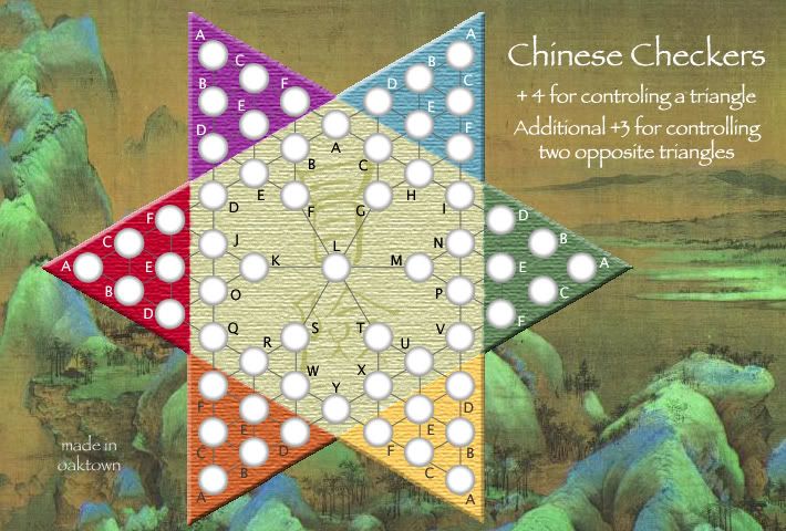
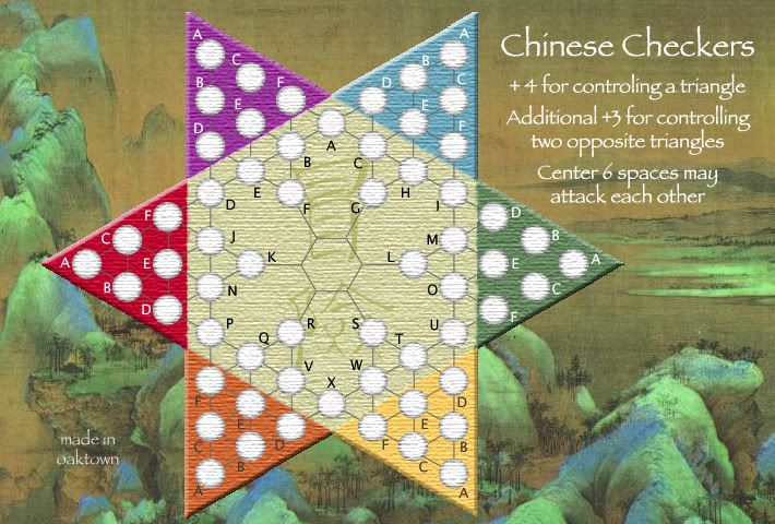
EvilOtto wrote:I like it, but agree the center white color stands out a bit; disconnected. The center should be the same texture to match the colored triangles.

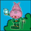
I like the background. Sometimes war games should be a bit serene. This is the game the generals play far from the battle field.

I think it would look funny without the center spot... all those lines crossing in the middle would be confusing.

ya- maybe you could make the center brown instead of white, playing on the old wooden board idea. that would also make the army circles and the kanji stand out more. not sure if it would look right though.

i agree bout the background- think sun tzu.
Do you need an excuse to have a war? I mean, who for? Can't you just say "You got lots of cash and land, but I've got a big sword, so divy up right now, chop chop."
Terry Pratchet
User avatar
Lieutenant Enigma
 
Posts: 367
Joined: Mon Jul 03, 2006 10:23 pm
Location: Classified

Postby Molacole on Fri Jan 19, 2007 9:37 pm

I like the background a lot! Problem is that the board doesn't blend in at all even since you've toned it down a shade. Maybe if you toned the board down a shade and toned the borders of the triangles down 2-3 shades it would help it fuse better.

Do you think you could make the symbols in the middle of the board the colour of green in the background and then change the shade of the white or go with a different colour all together? It might open up the option of an old wooden type texture and allow you to keep it looking clean.

It looks good, but it just seems like the triangles are hovering and not sunken into the picture.
User avatar
Lieutenant Molacole
 
Posts: 552
Joined: Fri Jun 23, 2006 8:19 am
Location: W 2.0 map by ZIM

Postby Guiscard on Fri Jan 19, 2007 9:42 pm

KEYOGI wrote:I like the new background and colours, but feel that red and purple don't really fit with the rest of the colours or background.


If you found alternatives for the red and purple I think it would actuall fit the background quite well. I also agree with Lone Prophet in that it maybe would benefit from being tilted slightly. Even if it did reduce playing area that isn;t neccessarily the end of the world, as its not like theres long territory names to fit in. Would make it look less regimented I think and more like a real board on a table.

Playability wise I think it could be a good idea to get rid of the centre space. Would encourage people to attack accross the board and make things much moe interesting.
qwert wrote:Can i ask you something?What is porpose for you to open these Political topic in ConquerClub? Why you mix politic with Risk? Why you not open topic like HOT AND SEXY,or something like that.
User avatar
Private 1st Class Guiscard
 
Posts: 4103
Joined: Fri Dec 08, 2006 7:27 pm
Location: In the bar... With my head on the bar

Postby Enigma on Fri Jan 19, 2007 9:44 pm

Molacole wrote:It looks good, but it just seems like the triangles are hovering and not sunken into the picture.

im not sure if it is supossed to look sunken into the picture
Do you need an excuse to have a war? I mean, who for? Can't you just say "You got lots of cash and land, but I've got a big sword, so divy up right now, chop chop."
Terry Pratchet
User avatar
Lieutenant Enigma
 
Posts: 367
Joined: Mon Jul 03, 2006 10:23 pm
Location: Classified

Postby oaktown on Fri Jan 19, 2007 11:44 pm

Image

changes to this version:

-white hexagon is no longer white
-made the red a bit warmer
-moved the bonus legend up below the title, which I think is both easier to read and restores the integrity of the background painting
-textured the entire hexagon a bit more, and softened the divisions between colors a bit

I absolutely appreciate all of the feedback on this map - it has come a long way and looks much better than the first attempt. However, in the immediate future I'm going to focus a bit more on how it plays rather than how it looks, because while there are some little details to work on (like the territory connections being hard to see now) I am rather pleased with how it's coming along. For instance, I think the particular blue and purple shades work - the blue in particular is actually lifted from the background image.

EvilOtto and I will be field testing this and Monopolonquer Cluboly tomorrow... we'll let you know how it goes.
Image
User avatar
Captain oaktown
 
Posts: 4451
Joined: Sun Dec 03, 2006 9:24 pm
Location: majorcommand

Postby KEYOGI on Sat Jan 20, 2007 2:50 am

I like the new update, my only real concern now with the graphics is the army shadows. I don't think they work as well with the new board colours, specifically the former white area in the middle. See what others say, but I feel they at least need the same texture as the rest of the board to retain that 3D look. At the moment they seem to sit on top of the board.
Sergeant 1st Class KEYOGI
 
Posts: 1632
Joined: Tue Oct 10, 2006 6:09 am

Postby oaktown on Sat Jan 20, 2007 3:23 am

KEYOGI wrote:I like the new update, my only real concern now with the graphics is the army shadows... at least need the same texture as the rest of the board to retain that 3D look. At the moment they seem to sit on top of the board.


Ugh, yeah you're absolutely right. I should never check in as I'm trying to go to bed, but this was an easy fix. Now it's the letters that look like they're sitting on top, but I'll deal with that another time.

Image
Last edited by oaktown on Sat Jan 20, 2007 2:24 pm, edited 1 time in total.
Image
User avatar
Captain oaktown
 
Posts: 4451
Joined: Sun Dec 03, 2006 9:24 pm
Location: majorcommand

Postby Lone.prophet on Sat Jan 20, 2007 5:10 am

i like it, not much more improvemend is needed
Image
Captain Lone.prophet
 
Posts: 1467
Joined: Thu Oct 12, 2006 4:37 pm
Location: Your basement Muahaha

Postby KEYOGI on Sat Jan 20, 2007 5:41 am

I'm still not so sure they look right. :?

What about making the shadows blend from black to white instead of grey to white? You could also use black for the connecting lines to solve the problem of them being hard to see in places.
Sergeant 1st Class KEYOGI
 
Posts: 1632
Joined: Tue Oct 10, 2006 6:09 am

Postby Guiscard on Sat Jan 20, 2007 8:05 am

Looks much better the colour for the centre is spot on now. Good work.
qwert wrote:Can i ask you something?What is porpose for you to open these Political topic in ConquerClub? Why you mix politic with Risk? Why you not open topic like HOT AND SEXY,or something like that.
User avatar
Private 1st Class Guiscard
 
Posts: 4103
Joined: Fri Dec 08, 2006 7:27 pm
Location: In the bar... With my head on the bar

Postby boberz on Sat Jan 20, 2007 8:49 am

im sorry if this was decided ages ago but i much prefer the black background with perhaps a gold dragon f it needs interest, looks more authentic.
User avatar
Corporal 1st Class boberz
 
Posts: 864
Joined: Sun Dec 03, 2006 12:21 pm

Postby Bad Speler on Sat Jan 20, 2007 9:04 am

I agree with keyogi, the army shadows look a bit off with your new version
Highest Score: 2532
Highest Position: 69 (a long time ago)
User avatar
Sergeant 1st Class Bad Speler
 
Posts: 1027
Joined: Fri Jun 02, 2006 8:16 pm
Location: Ottawa

Postby Marvaddin on Sat Jan 20, 2007 11:40 am

Wont you even try a battle image for background?? :cry:
Image
User avatar
Major Marvaddin
 
Posts: 2545
Joined: Thu Feb 09, 2006 5:06 pm
Location: Belo Horizonte, Brazil

Postby oaktown on Sat Jan 20, 2007 2:23 pm

Marvaddin wrote:Wont you even try a battle image for background?? :cry:

send me one a good one and I'll drop it in there.

KEYOGI wrote:What about making the shadows blend from black to white instead of grey to white? You could also use black for the connecting lines to solve the problem of them being hard to see in places.

I've tried black - it looks really heavy because there is no black anywhere on the board or in the background. Right now I think evn the black letters look too heavy, but for the sake of playability I'm leaving them as is... maybe I'll play with a dark brown or green, more in fitting with the background.

Connecting lines I'll fuss more with... it may mean a lighter connecting line over the dark color triangles.

boberz wrote:im sorry if this was decided ages ago but i much prefer the black background with perhaps a gold dragon f it needs interest, looks more authentic.

We could always go back to it, but the majority of the responses seem to favor this softer look, as do I.

Lone.prophet wrote: i like it, not much more improvemend is needed

Guiscard wrote:Looks much better the colour for the centre is spot on now. Good work.

Thanks... nice to hear somebody say. Today I field test.
Image
User avatar
Captain oaktown
 
Posts: 4451
Joined: Sun Dec 03, 2006 9:24 pm
Location: majorcommand

Postby oaktown on Sat Jan 20, 2007 4:33 pm

here's a glitch nobody caught: there are 61 territories, not 51 as originally reported. clearly nobody taught me how to add 36+25.

this is why we play test boards before they go to final forge. :(
Image
User avatar
Captain oaktown
 
Posts: 4451
Joined: Sun Dec 03, 2006 9:24 pm
Location: majorcommand

Postby Molacole on Sun Jan 21, 2007 10:34 am

the latest map texture looks blurry to me.
User avatar
Lieutenant Molacole
 
Posts: 552
Joined: Fri Jun 23, 2006 8:19 am
Location: W 2.0 map by ZIM

Postby wcaclimbing on Sun Jan 21, 2007 12:09 pm

could you put some shadows around the map to make it look more like it is on top of teh background?
right now it looks like the background doesnt really belong there.
Image
User avatar
Private 1st Class wcaclimbing
 
Posts: 5598
Joined: Fri May 12, 2006 10:09 pm
Location: In your quantum box....Maybe.

Postby Guidocks on Sun Jan 21, 2007 8:12 pm

that looks great i think u just need 2 add the finishing touches and it shud b ready 2 play :)
Private Guidocks
 
Posts: 625
Joined: Wed Dec 13, 2006 5:34 pm

Postby oaktown on Sun Jan 21, 2007 8:44 pm

Image

Played a quick game on the board yesterday, and made one change which improves playability, though may detract from clarity. We found that the center space was useless - it's the longest route between triangles, and with six border is not worth defending as it isn't part of a continent. So I've removed it and now all six center spaces have attack access to each other: F, G, K, L, R & S can all hit each other, making cross-board movement much easier. Is that clear enough from the map??

This has the added benefit of leaving the board with exactly 60 territories, which is evenly divisable by 2, 3, 4, 5, and 6. No more neutral armies!

The +4 bonus for a territory played as a bit high, but the masses have spoken through the poll (17 to 9) and I think it will work. The additional +3 for opposites is attractive, but it will be very difficult to defend two disparate regions; if anybody has the guns to make it happen, more power to them!

Some things still to do: shadow the board on the background, work on clarity of the territory links. Other than that I think most major suggestions have been addressed.
Last edited by oaktown on Mon Jan 22, 2007 12:56 am, edited 1 time in total.
Image
User avatar
Captain oaktown
 
Posts: 4451
Joined: Sun Dec 03, 2006 9:24 pm
Location: majorcommand

Postby johloh on Sun Jan 21, 2007 9:35 pm

looking better every round...

So I've removed it and now all six center spaces have attack access to each other: F, G, K, L, R & S can all hit each other, making cross-board movement much easier. Is that clear enough from the map??
this is not clear by looking at the map (kinda clear after reading legend). What about instead of having a hexagon in the middle having all the lines meet in the middle? i dunno. i just dont think its clear when looking at the board.

shadow the board on the background
good, but i think just be careful to not make it too drastic of a shadow...
User avatar
Major johloh
 
Posts: 472
Joined: Mon Dec 04, 2006 12:58 pm
Location: San Francisco

Postby Enigma on Sun Jan 21, 2007 10:30 pm

johloh wrote:looking better every round...

So I've removed it and now all six center spaces have attack access to each other: F, G, K, L, R & S can all hit each other, making cross-board movement much easier. Is that clear enough from the map??
this is not clear by looking at the map (kinda clear after reading legend). What about instead of having a hexagon in the middle having all the lines meet in the middle? i dunno. i just dont think its clear when looking at the board.

*nods* when i first looked at it i thought they could only attack the neighboring center circle. i hate to loose the hexagon though, it looks cool :P
Do you need an excuse to have a war? I mean, who for? Can't you just say "You got lots of cash and land, but I've got a big sword, so divy up right now, chop chop."
Terry Pratchet
User avatar
Lieutenant Enigma
 
Posts: 367
Joined: Mon Jul 03, 2006 10:23 pm
Location: Classified

Postby sully800 on Sun Jan 21, 2007 10:55 pm

I don't know how well its works but I quickly drew a version with a connecting line between each one of the circles and I think it looks kind of cool. If you wanted to go that route you could also draw each of the line from the same point on the circle which would give an even clearer image of a star in the center. (actually a star bounded by a larger hexagon)

Image
User avatar
Major sully800
 
Posts: 4978
Joined: Wed Jun 14, 2006 5:45 pm
Location: Bethlehem, Pennsylvania

Postby cowshrptrn on Sun Jan 21, 2007 10:58 pm

looks like a mess, sorry sully. Looking at it closer, it might look cool if it were more even, and the star and hexagon had thicker lines or something so they popped a bit.
Image
User avatar
Private cowshrptrn
 
Posts: 838
Joined: Thu Aug 17, 2006 1:15 pm
Location: wouldn't YOU like to know....

Postby AndyDufresne on Sun Jan 21, 2007 11:01 pm

Regarding the center...perhaps if you draw a small circle, fill it in, have all the points touch the circum. of it, you could state in the legend that you can attack from any point around the circle. Might be clearer than all the lines.


--Andy
User avatar
Corporal 1st Class AndyDufresne
 
Posts: 24919
Joined: Fri Mar 03, 2006 8:22 pm
Location: A Banana Palm in Zihuatanejo

Postby cowshrptrn on Sun Jan 21, 2007 11:02 pm

EDIT: never mind, my bad for not reading the rest of the thread
Last edited by cowshrptrn on Sun Jan 21, 2007 11:12 pm, edited 1 time in total.
Image
User avatar
Private cowshrptrn
 
Posts: 838
Joined: Thu Aug 17, 2006 1:15 pm
Location: wouldn't YOU like to know....

PreviousNext

Return to The Atlas

Who is online

Users browsing this forum: No registered users