Well lets see...
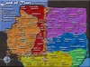
I like the general look of the map, it feels different compared to most others. I rather like your Impassable Legend. I'd suggest do something similar with the bonus legend in style...curvature wise. I think the soft edges feel better on the eye.
In regards to the rivers looking weird, I think it may be the fact that your ocean is 'below' the land, while the rivers seem to be 'above', popping out.
Also, I think it might be beneficial to play around the with ocean's color a little more, perhaps slightly darker (not too much).
Going with the rivers...the bridges, I'd play around with the look and style of that a little more...and not all bridges have to be north and south...they can be angled. Something to keep in mind. In regards to the sea routes, don't really like that either. Perhaps a sea route, if you change it all, would be better for the two bridge areas over the ocean.
Also, eh, I'm not so keen on the non-gameboard texture...or maybe it's the color? I'm not sure. Maybe more of a gray-brown?
Also not a fan of the impassable borders thus far. If you go with the raised mountains in the west, I'd make them even 'taller' and 'wider'. They don't feel like mountains...they look like hills. Also, the great wall graphic feels like a piece of sand paper.
I rather like the font, but I'm afraid for it in some places in the east. This is the problem that has always plagued the China Map idea...fitting the names in properly so they can be read easily. For the most part, you've done it, but maybe you could shrink the font slightly... I don't know.
Second to lastly, the White Stars aren't cutting it for me. They don't seem to stand out enough. Maybe you can find a better image or color. Have you considered....instead of using a star...using some sort of Chinese Language Character? Just to keep with the theme of the map.
Lastly, I thought I'd just point this out, I'm not sure if anyone else has...but I bet many people will love Shanxi and Shaanxi...just like people love Ireland and Iceland, and the Cagayan and Cayagan...

--Andy


 Children, this is what happens to hockey players, druggies, and Hillary Clinton.