Cairns Coral Coast [Quenched] - Loaded!
Moderator: Cartographers

![]() by cairnswk on Wed Mar 14, 2007 10:11 am
by cairnswk on Wed Mar 14, 2007 10:11 am
yes i had considered that in the last change Boberz, but I'll leave like that just for now unless someone else considers it an issue. 

* Pearl Harbour * Waterloo * Forbidden City * Jamaica * Pot Mosbi
-

 cairnswk
- Posts: 11510
- Joined: Sat Feb 03, 2007 8:32 pm
- Location: Australia


![]() by AndyDufresne on Wed Mar 14, 2007 3:04 pm
by AndyDufresne on Wed Mar 14, 2007 3:04 pm
Hm, well lets see!
Lets take a look at the legends. The Bonus Legend is interesting. One thing I'm afraid of is all the similar colors, and difficulty in being able to distinguish between them all. The highlight in the names may not help this cause, play around with it gone. Have you considered taking out one of the similar colors? Say either the Beaches' color or the far West light red? Perhaps replacing them with a more brown hue, would clear up the color problem.
Regarding the name Legend, it looks a little fuzzy or blurry, but maybe that is just me. But I think I like the font choice, it flows with the map.
As for the Passable and Unpassable legend, I think it gets the job done, though maybe instead of having a barrier between the name legend at it, you could have it all be one? Hm, that might make it look bad though. Hm Maybe that is not a good idea.
Also, I honestly think you should just get rid of the Compass. This map almost feels to cramped, and I don't think it's needed to begin with.
Regarding the rivers, perhaps when they go into the water, you could make them blend a little more? Also the Mitchell Swamps river, perhaps at the East end of it you could make a slight lake/pool just so it doesn't end in a straight line. Minor thing.
As for the bridges, maybe play with the color, and make them stand out just slightly more.
Once we can get the Bonus legend really clear, I'd like to comment further on the gameplay.
--Andy
-

AndyDufresne
- Posts: 24919
- Joined: Fri Mar 03, 2006 8:22 pm
- Location: A Banana Palm in Zihuatanejo


![]() by Samus on Thu Mar 15, 2007 12:54 am
by Samus on Thu Mar 15, 2007 12:54 am
I pretty much agree with everything Andy said. Especially the part where he changes his mind and disagrees with himself mid paragraph.
I think for the bonus legend, you seem to still have the radial gradian that you removed from the territories. I think you should remove it from the bonus box too. And would it be possible to make the letters slightly more bold/thicker so the color shows up a bit better?
I would also add something funky is going on in The Crater. Ditch that mountain and clean up that river a bit.
-

Samus
- Posts: 372
- Joined: Mon Jan 01, 2007 12:33 pm
![]() by cairnswk on Thu Mar 15, 2007 5:00 am
by cairnswk on Thu Mar 15, 2007 5:00 am
Andy....proud to have u viewing this map...hope it meets the standard for this site. And thanks again Samus.
Changes made this map:
* Tolga mountains along Rocky Creek removed
* The Crater removed
* Swamp added to eastern end of Mitchell River, and river curved more on western end
* Tinaroo Dam added
* Lake Eacham and Lake Barrine added in the The Lakes disctrict
* Legend names enhanced, enlarged, and radial color removed
* The Beaches changed to rose tone; Agate Hills darkened
* River estuaries color changed
* Arrows color changed - this was the best color I thought would not totally dominate the map but still stand out
* Haze/blur removed from the word Regions
Hope this tempts your appetite!
Looking forward to your input on the bonuses/gameplay, Andy....and thanks again.
BTW, army shadows here are 25px diam.
* Pearl Harbour * Waterloo * Forbidden City * Jamaica * Pot Mosbi
-
cairnswk
- Posts: 11510
- Joined: Sat Feb 03, 2007 8:32 pm
- Location: Australia

![]() by Samus on Thu Mar 15, 2007 1:32 pm
by Samus on Thu Mar 15, 2007 1:32 pm
Heh, you accidentally added Palmerston back to Bananaland.
The legend looks good now, but I agree with t.e.c, you should make the order:
The Swamps
The Beaches
Agate Hills
Fruit Pickers
Rainforest
City Estates
Maize Silos
Dairy Farmers
Sugarland
Bananaland
I'm not a big fan of the new bridge color, it just doesn't seem right for a bridge. Maybe find a bridge graphic with a wooden or stone bridge.
I'm pretty interested in what Andy will say about the gameplay, because it's so many leaps and bounds better than a lot of the stuff that has made it out of the Foundry recently that I didn't even realize he looked at that.
-
Samus
- Posts: 372
- Joined: Mon Jan 01, 2007 12:33 pm
![]() by EvilOtto on Thu Mar 15, 2007 4:05 pm
by EvilOtto on Thu Mar 15, 2007 4:05 pm
boberz wrote:that is better but i was wondering could the title box be the same height as the key next to it so it can look neater
I agree, it should be a solid bar across the bottom, maybe center the title with passable on one side and impassable on the other.
I'd also like to see something in the graphics that reflecs the area. I'm not sure what exacly: something aboriginal? crocodiles? sea life? coral? a bunch of Japanese tourists? fig trees? cane toads? Something.
I think the map would be more clear without the tableland rises... I have to keep reminding myself that they are "passable".
-

EvilOtto
- Posts: 132
- Joined: Wed Dec 06, 2006 9:39 pm
- Location: San Francisco
![]() by cairnswk on Thu Mar 15, 2007 4:09 pm
by cairnswk on Thu Mar 15, 2007 4:09 pm
Yes Samus...sorry that was an accident.
Changes on this map:
*Palmerston changed back to same colour as Dairy Farmers
* Regions put in order as siggested
I will attend to the bridges this evening. Think I know what you might be after.
EvilOtto: I'll look at your aspects alos this evening. Thanks for your feedback.
Changes on this map:
*Palmerston changed back to same colour as Dairy Farmers
* Regions put in order as siggested
I will attend to the bridges this evening. Think I know what you might be after.
EvilOtto: I'll look at your aspects alos this evening. Thanks for your feedback.
* Pearl Harbour * Waterloo * Forbidden City * Jamaica * Pot Mosbi
-
cairnswk
- Posts: 11510
- Joined: Sat Feb 03, 2007 8:32 pm
- Location: Australia
![]() by Bad Speler on Thu Mar 15, 2007 5:46 pm
by Bad Speler on Thu Mar 15, 2007 5:46 pm
Bananaland should be worth a 3, it has 3 borders and 6 countries
Highest Score: 2532
Highest Position: 69 (a long time ago)
Highest Position: 69 (a long time ago)
-
Bad Speler
- Posts: 1027
- Joined: Fri Jun 02, 2006 8:16 pm
- Location: Ottawa


![]() by Samus on Thu Mar 15, 2007 11:19 pm
by Samus on Thu Mar 15, 2007 11:19 pm
Bad Speler wrote:Bananaland should be worth a 3, it has 3 borders and 6 countries
Heh, that's what we were talking about, Palmerston should be part of Dairy Farmers, so it should only have 2 borders and 5 territories. He's fixing it back.
-
Samus
- Posts: 372
- Joined: Mon Jan 01, 2007 12:33 pm
![]() by cairnswk on Fri Mar 16, 2007 4:22 am
by cairnswk on Fri Mar 16, 2007 4:22 am
Hi Guys...another update!
Alterations made:
* Title area with background image and split on the Passable / Unpassable legend
* The bridges are a small problem. I kind of think that the original stytle images like those down in Bananaland, work best - like simple ones.
Then the on connecting Atherton - The Lakes works very well as straight lines bridges, but throw them on a curve, and they lose their appeal.
Don't know about the arrows still yet.
Opinions needed please.
* Pearl Harbour * Waterloo * Forbidden City * Jamaica * Pot Mosbi
-
cairnswk
- Posts: 11510
- Joined: Sat Feb 03, 2007 8:32 pm
- Location: Australia
![]() by Bad Speler on Fri Mar 16, 2007 10:22 am
by Bad Speler on Fri Mar 16, 2007 10:22 am
Samus wrote:Bad Speler wrote:Bananaland should be worth a 3, it has 3 borders and 6 countries
Heh, that's what we were talking about, Palmerston should be part of Dairy Farmers, so it should only have 2 borders and 5 territories. He's fixing it back.
hmmm, sorry missed that.
Anyways, the bridges in bananaland are the best, but they need a little tinkering to make it look a bit more realistic. New background image is great, just make sure it isnt copyright. A minor problem, but move the palm tree on Fitzroy Is a bit to the left, it overlaps a bit with the legend. The river at Mulgrave doesnt block anything and looks out of place anyways, so remove it. Im not sure if its just me, but to me the sea looks a bit bright.
Highest Score: 2532
Highest Position: 69 (a long time ago)
Highest Position: 69 (a long time ago)
-
Bad Speler
- Posts: 1027
- Joined: Fri Jun 02, 2006 8:16 pm
- Location: Ottawa
![]() by Anarkistsdream on Fri Mar 16, 2007 10:24 am
by Anarkistsdream on Fri Mar 16, 2007 10:24 am
This map looks very kickass! I love it.
virus90 wrote: I think Anarkist is a valuable asset to any game.
-

Anarkistsdream
- Posts: 7567
- Joined: Wed Jan 10, 2007 11:57 am


![]() by Ruben Cassar on Fri Mar 16, 2007 1:17 pm
by Ruben Cassar on Fri Mar 16, 2007 1:17 pm
Anarkistsdream wrote:This map looks very kickass! I love it.
Yes this map is looking good. Don't know how I missed this one. Good work!
Edit: The bridges in Banaland are definitely the best.


-
Ruben Cassar
- Posts: 2160
- Joined: Thu Nov 16, 2006 6:04 am
- Location: Civitas Invicta, Melita, Evropa


![]() by cairnswk on Fri Mar 16, 2007 4:32 pm
by cairnswk on Fri Mar 16, 2007 4:32 pm
OK...
* changed the bridges...to new style more consistent with stone bridges...
* altered the headlands of the Mulgrave River to make it more pronounced
* Tinaroo Dam is more actual shape now
* thinner rivers in a couple of places
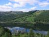
Things I would really like to keep, as i feel they enhance this map and give it some "graphic" & tropical flavour not evident in other maps:
Waterfalls, Coconut Trees, Tableland Rises, and the Mulgrave River - it is a very important river system in this region.
Enjoy!

* changed the bridges...to new style more consistent with stone bridges...
* altered the headlands of the Mulgrave River to make it more pronounced
* Tinaroo Dam is more actual shape now
* thinner rivers in a couple of places
Things I would really like to keep, as i feel they enhance this map and give it some "graphic" & tropical flavour not evident in other maps:
Waterfalls, Coconut Trees, Tableland Rises, and the Mulgrave River - it is a very important river system in this region.
Enjoy!
* Pearl Harbour * Waterloo * Forbidden City * Jamaica * Pot Mosbi
-
cairnswk
- Posts: 11510
- Joined: Sat Feb 03, 2007 8:32 pm
- Location: Australia
![]() by AndyDufresne on Fri Mar 16, 2007 6:27 pm
by AndyDufresne on Fri Mar 16, 2007 6:27 pm
Hm, it's looking rather nice!
I'm not sure what to think about the different color of bridges. It's different, and unique for this map, but I'm not entirely sold on it. But it also is only a minor issue.
As the Title Legend, I don't think the background works too well...at least if you want the title to stand out, along with the other information. I'd still play around with it a little more maybe.
As for the Bonus Legend, consider making it slightly longer, by extending it south a little (but not touching the army circle of the island). Then you could have a more space between 'Regions' and the actual text of the regions.
I also agree you should keep all the things you mentioned in the above post, that make your map a little different.
--Andy
-
AndyDufresne
- Posts: 24919
- Joined: Fri Mar 03, 2006 8:22 pm
- Location: A Banana Palm in Zihuatanejo
![]() by DiM on Fri Mar 16, 2007 6:31 pm
by DiM on Fri Mar 16, 2007 6:31 pm
yes the bridges must have the same colour try making something with a rock texture.
“In the beginning God said, the four-dimensional divergence of an antisymmetric, second rank tensor equals zero, and there was light, and it was good. And on the seventh day he rested.”- Michio Kaku
-

DiM
- Posts: 10415
- Joined: Wed Feb 14, 2007 6:20 pm
- Location: making maps for scooby snacks


![]() by cairnswk on Fri Mar 16, 2007 9:32 pm
by cairnswk on Fri Mar 16, 2007 9:32 pm
18Mar Updates II
Thanks Andy and DiM once again for yor input...pleased that u both like it.
This update:
* Legend lengthened as suggested by Andy
* Title background altered to show an alternative
* Stone coloured bridges with bright shadow for emphasis additioned...I felt without the bright shadow, they didn't stand out in some territories, tended to get lost in the background.
Once again...enjoy!
* Pearl Harbour * Waterloo * Forbidden City * Jamaica * Pot Mosbi
-
cairnswk
- Posts: 11510
- Joined: Sat Feb 03, 2007 8:32 pm
- Location: Australia
![]() by AndyDufresne on Fri Mar 16, 2007 9:42 pm
by AndyDufresne on Fri Mar 16, 2007 9:42 pm
Eeep, I think the out of the old bridges, the brown ones actually looked rather nice. The ones now...don't seem to flow with color and feel of the map.
--Andy
--Andy
-
AndyDufresne
- Posts: 24919
- Joined: Fri Mar 03, 2006 8:22 pm
- Location: A Banana Palm in Zihuatanejo
![]() by Bad Speler on Fri Mar 16, 2007 9:43 pm
by Bad Speler on Fri Mar 16, 2007 9:43 pm
I prefered the original title background. Also, army shadows look a bit large.
Highest Score: 2532
Highest Position: 69 (a long time ago)
Highest Position: 69 (a long time ago)
-
Bad Speler
- Posts: 1027
- Joined: Fri Jun 02, 2006 8:16 pm
- Location: Ottawa

Who is online
Users browsing this forum: No registered users
|
|||||||
| Conquer Club is not associated with RISK online in any way. Copyright © 2006-2024 by Big Wham LLC | |||||||