Page 5 of 18

PostPosted: Thu May 03, 2007 11:41 am
by cairnswk
DiM wrote:or do something like this.

Image


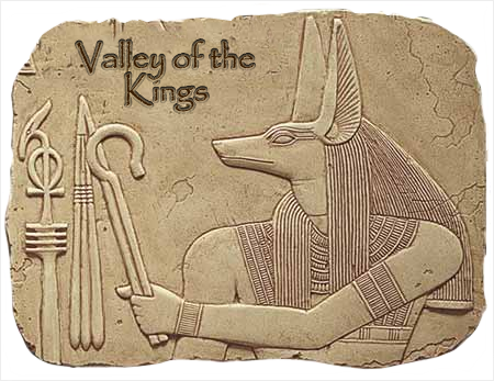
MMMmmm. OK. I see where you're coming from. I do kind of like the anubis holding the Afterlife since they are the guardians to/of the Underworld.
Your papyrus above suggests to me that the Anubis are the Kings holding that Flail and Crook given to royalty.

Let me think on it more.

PostPosted: Thu May 03, 2007 6:08 pm
by Gozar
Or you could use another Egyptian god, like Horus...is he the one with the bird head?

V10 Title Image

PostPosted: Fri May 04, 2007 2:56 pm
by cairnswk
Gozar wrote:Or you could use another Egyptian god, like Horus...is he the one with the bird head?


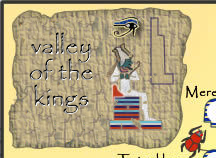
Well.....a tablet background with the glyph of Osiris - God of the Underworld. (Osiris is depicted almost everywhere as the bearded god with the green face, white crown with feathers each side, holding a crook and flail, with the Eye of Horus sitting above his head and the tri-shaped stone in front).

This is what is most appropriate for this title.

Hope you like! :) :wink:

Image

PostPosted: Fri May 04, 2007 3:23 pm
by Gozar
Very nice improvement!

PostPosted: Fri May 04, 2007 3:30 pm
by cairnswk
Gozar wrote:Very nice improvement!


:wink: Yaeeeee! Thanks Gozar. Maybe it needs to have some depth to it.

PostPosted: Fri May 04, 2007 5:04 pm
by Enigma
wow! this map has changed a lot since i was last on! its looks really good :)
i like the title- are the pictures the hyroglyphics that say the title? sorry if this was already explained X|. im not sure bout the striped effect of the letters though.

a couple of ideas-
thanx 4 putting the region letters on the legend- could you also include them on the regions on the actual map somehow? im not exactly sure where you would put them, but i think if would improve the clarity.

my eyes keep crossing whenever i look at the striped tomb heads on the dark background- the ones on the bottom right corner. is there anything which would help that? im not telling you to loose the striped background tho- that a nice effect. the only thing i can think of is to use 2 different colours but im not sure if that would look right. any1 else with ideas?

and could you make the eye of horus symbol darker and maybe larger to increase visibility? the hardest thing about this map is making the convoluted attack routes clear :P.

ur well on ur way to making another really nice map :) sorry for not keeping up better X|.

PostPosted: Fri May 04, 2007 5:11 pm
by cairnswk
Another darker version with more rock background to the stone on title.


Image

V12 Updates

PostPosted: Fri May 04, 2007 5:21 pm
by cairnswk
V12...All thos changes mentioned above Enigma...I believe.

Image

PostPosted: Sat May 05, 2007 2:10 am
by DiM
i like the title but remove the shadows from the text it should be sculpted in rock not floating on top.
so take out the shadows and put some inner bevel.


also take out the shadow from the eye of horus in the title. it also appears to be floating.

colourless font with high inset bevel and the images with very little bevel. this way the font will appear sculpted in the rock with visible inner shading but no colour and the 3 images will also be a little sculpted but very little as they have colour.

also one more fine detail would be if you could make all of them seem ancient. use the stamp to fill some spaces or the marquee to cut out some to obtain that old feeling, by making some edges less straight or by deleting parts of the text and the picture.

PostPosted: Sat May 05, 2007 2:24 am
by DiM
because i'm not sure i explained it right here is an image.

i made 2 modifications.

1. text is sculpted in the rock
2. osiris has been eaten by time. look at the picture you'll see in some areas the rock is visible underneath the painting. that's because in time painting tend to get old and decay.

i did not have the layered version so i'm sure you can do something better.


Image

V13 Title Bevel Changes

PostPosted: Sat May 05, 2007 4:54 am
by cairnswk
DiM wrote:1. text is sculpted in the rock
2. osiris has been eaten by time. look at the picture you'll see in some areas the rock is visible underneath the painting. that's because in time painting tend to get old and decay.


As below, Dim, I left the font the same, but increased size of things.

Image

PostPosted: Sat May 05, 2007 6:43 am
by DiM
i like it :D

PostPosted: Sat May 05, 2007 1:08 pm
by cairnswk
DiM wrote:i like it :D
Wunderbar!

PostPosted: Sat May 05, 2007 1:09 pm
by onbekende
I have no problems with latest version

in a month, you will have 3 maps ready and none quenched, sad, VERY SAD

PostPosted: Sat May 05, 2007 1:14 pm
by cairnswk
onbekende wrote:in a month, you will have 3 maps ready and none quenched, sad, VERY SAD

OH...do u know something that I don't?

Feedback required?

PostPosted: Mon May 07, 2007 2:13 pm
by cairnswk
Any more feedback on this map?

PostPosted: Mon May 07, 2007 2:30 pm
by bonobo`s son
grewat map, i really look forward to play his map cause you need as different strategy as in other games

PostPosted: Mon May 07, 2007 2:45 pm
by Wisse
i think you need a texture in this one too, just like your other map ;)
and i think the background doesn't fit with the map

PostPosted: Mon May 07, 2007 2:55 pm
by cairnswk
Wisse wrote:i think you need a texture in this one too, just like your other map ;)
and i think the background doesn't fit with the map


Wisse...there is going to be NO texture applied to this map, since it will only complicate an already busy map. Textures are NOT needed on all maps. :wink:
And as for the background, i think it is very suitable....going to the Afterlife means going to the Heavens in Egyptian mythology, and the stars were painted on the tops of the tombs to indicate this. ON this map we have the sun God RA represented the bright yellow meaning life and the Afterlife represented by the stars and the dark indigo blue.
Very appropriate indeed!

PostPosted: Mon May 07, 2007 2:59 pm
by unriggable
Yeah this map is really cool, you're definitly adapting a cool style in your maps.

PostPosted: Tue May 08, 2007 12:34 am
by Wisse
cairnswk wrote:
Wisse wrote:i think you need a texture in this one too, just like your other map ;)
and i think the background doesn't fit with the map


Wisse...there is going to be NO texture applied to this map, since it will only complicate an already busy map. Textures are NOT needed on all maps. :wink:
And as for the background, i think it is very suitable....going to the Afterlife means going to the Heavens in Egyptian mythology, and the stars were painted on the tops of the tombs to indicate this. ON this map we have the sun God RA represented the bright yellow meaning life and the Afterlife represented by the stars and the dark indigo blue.
Very appropriate indeed!

it's your choice ;)

PostPosted: Tue May 08, 2007 3:06 am
by cairnswk
Wisse wrote:it's your choice ;)

Thanks Wisse...I appreciate your comments, even though I don't always follow them....you are welcome to come by anytime, and throw suggestions at me. :)

PostPosted: Tue May 08, 2007 11:10 am
by Enigma
cairnswk wrote:
Wisse wrote:i think you need a texture in this one too, just like your other map ;)
and i think the background doesn't fit with the map


Wisse...there is going to be NO texture applied to this map, since it will only complicate an already busy map. Textures are NOT needed on all maps. :wink:
And as for the background, i think it is very suitable....going to the Afterlife means going to the Heavens in Egyptian mythology, and the stars were painted on the tops of the tombs to indicate this. ON this map we have the sun God RA represented the bright yellow meaning life and the Afterlife represented by the stars and the dark indigo blue.
Very appropriate indeed!

*grins* ur such an artist :P

PostPosted: Tue May 08, 2007 11:46 am
by mibi
The back ground is the best part of this map, i love it.

not a fan of the title treatment tho, its pretty ugly.

PostPosted: Tue May 08, 2007 1:35 pm
by cairnswk
mibi wrote:The back ground is the best part of this map, i love it.

not a fan of the title treatment tho, its pretty ugly.


Mibi...what are your thoughts on how this should be....? Anyone?