Conquer Club

Conquer Man [Quenched]

Care to peruse completed maps? Take a stroll through the Atlas.

Moderator: Cartographers

Forum rules
Please read the Community Guidelines before posting.

Postby WidowMakers on Thu Nov 01, 2007 4:47 pm

Coleman wrote:That was all intentional so as not to obscure the graphics as much. Are you sure it needs to be changed?
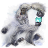
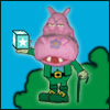
That is correct. The numbers under Conquer Man and the cupcake are purposefully lowered.

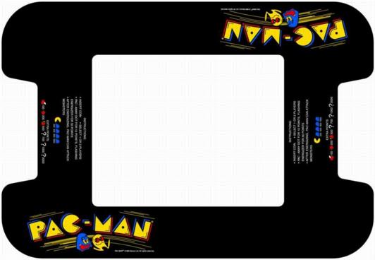
I should have an update this evening with the fixed numbers, aliens, and legend. Plus several choices for the title color combo.

WM
Image
Major WidowMakers
 
Posts: 2774
Joined: Mon Nov 20, 2006 9:25 am
Location: Detroit, MI

Postby WidowMakers on Fri Nov 02, 2007 5:43 am

OK here is version 8

Fixed legend
Fixed army shadows on aliens (now with white box)
This picture below is still my favorite for both the title colors and pellet outline colors.
-If I had to pick a pellet outline color besides red, it would be the orange. (see below)
-I I had to pick a different color combo for the title it would be Orange/Yellow(see below)
Image

Choices

Title Text Colors:
People were saying the title stood out too much. Here are 4 different color schemes. Links to individual colors are below. I did not do every combo because some just look bad. These 4 seemed to be OK and had good contrast between he colors.
Image

Blue/Cyan:http://img207.imageshack.us/img207/1231/cman08blcyspe6.gif
Blue/Orangehttp://img521.imageshack.us/img521/3088/cman08blorsok5.gif
Orange/Yellowhttp://img207.imageshack.us/img207/7299/cman08oryespl4.gif


Pellet Color:
Here are 5 different pellet colors.
Image
Image
Major WidowMakers
 
Posts: 2774
Joined: Mon Nov 20, 2006 9:25 am
Location: Detroit, MI

Postby yeti_c on Fri Nov 02, 2007 5:51 am

Red Yellow banner (as is) Orange pellet numbers...

Orange cos it's a bit nicer than Red ->maintains 80's feel.

C.
Image
Highest score : 2297
User avatar
Lieutenant yeti_c
 
Posts: 9624
Joined: Thu Jan 04, 2007 9:02 am

Postby WidowMakers on Fri Nov 02, 2007 5:54 am

yeti_c wrote:Red Yellow banner (as is) Orange pellet numbers...

Orange cos it's a bit nicer than Red ->maintains 80's feel.

C.
remember to vote :D
Image
Major WidowMakers
 
Posts: 2774
Joined: Mon Nov 20, 2006 9:25 am
Location: Detroit, MI

Postby yeti_c on Fri Nov 02, 2007 6:05 am

WidowMakers wrote:
yeti_c wrote:Red Yellow banner (as is) Orange pellet numbers...

Orange cos it's a bit nicer than Red ->maintains 80's feel.

C.
remember to vote :D


Done...

C>
Image
Highest score : 2297
User avatar
Lieutenant yeti_c
 
Posts: 9624
Joined: Thu Jan 04, 2007 9:02 am

Postby Coleman on Fri Nov 02, 2007 8:21 am

Can I assume if I do xml now I'll only have to do minor updates to it from here on out?
Warning: You may be reading a really old topic.
User avatar
Sergeant Coleman
 
Posts: 5402
Joined: Tue Jan 02, 2007 10:36 pm
Location: Midwest

Postby WidowMakers on Fri Nov 02, 2007 4:15 pm

Coleman wrote:Can I assume if I do xml now I'll only have to do minor updates to it from here on out?


I think that the map is pretty much finished as far as territory count and location.

Here are the areas I think there might be changes to:
-Location of Aliens (maybe. No one has said anything about this yet)
-# of Neutrals on Aliens, C-Man, Diamonds, and Cupcake
-Bonus Values

Out of these the only one that could really mess up the XML would be the Aliens locations.

WM
Image
Major WidowMakers
 
Posts: 2774
Joined: Mon Nov 20, 2006 9:25 am
Location: Detroit, MI

Postby MasterKujacnbsh on Fri Nov 02, 2007 7:17 pm

I think that i like the idea, because the gameplay stays similar to the original game, but i cant look at the map for more than 7 seconds without going temporarily blind...I understand that you want to make it look as much like the original game as possible, but maybe you could make it a...little...brighter.

btw: I like the original title. Its the most like Pacman.
User avatar
Private MasterKujacnbsh
 
Posts: 64
Joined: Fri Nov 02, 2007 6:47 pm
Location: In a land of magical unicorns and rapists who rip your eyes out and then like eat them and stuff....

Postby Coleman on Wed Nov 07, 2007 9:55 am

We should probably get this out of the way early rather than later.

I've talked to the higher ups and we have to have a large version. It can't be 606x600. I'm not sure where the limit is, I've been looking into it, but I've also been a bit busy.

When I find the smallest large map I'll let you know the dimensions and we can see where that gets us.
Warning: You may be reading a really old topic.
User avatar
Sergeant Coleman
 
Posts: 5402
Joined: Tue Jan 02, 2007 10:36 pm
Location: Midwest

Postby yeti_c on Wed Nov 07, 2007 10:04 am

Coleman wrote:We should probably get this out of the way early rather than later.

I've talked to the higher ups and we have to have a large version. It can't be 606x600. I'm not sure where the limit is, I've been looking into it, but I've also been a bit busy.

When I find the smallest large map I'll let you know the dimensions and we can see where that gets us.


488x609 -> Ireland...

C.
Image
Highest score : 2297
User avatar
Lieutenant yeti_c
 
Posts: 9624
Joined: Thu Jan 04, 2007 9:02 am

Postby Coleman on Wed Nov 07, 2007 10:07 am

yeti_c wrote:
Coleman wrote:We should probably get this out of the way early rather than later.

I've talked to the higher ups and we have to have a large version. It can't be 606x600. I'm not sure where the limit is, I've been looking into it, but I've also been a bit busy.

When I find the smallest large map I'll let you know the dimensions and we can see where that gets us.


488x609 -> Ireland...

C.

Or Mongol's Empire if you want to go for smallest height. We could say the minimum is a total square pixel count but than it would be 550x550 if we kept the same dimensions. #-o

Maybe this will change minds, or maybe we'll just try to make a larger Ireland like the smaller World 2.1 project. :lol:
Last edited by Coleman on Thu Nov 08, 2007 10:55 am, edited 1 time in total.
User avatar
Sergeant Coleman
 
Posts: 5402
Joined: Tue Jan 02, 2007 10:36 pm
Location: Midwest

Postby WidowMakers on Wed Nov 07, 2007 5:54 pm

Well since the size rules state that the small map cannot be bigger than 630x600 I am OK. And since the size rules state that the large map cannot be any bigger than 840x800 I am ok.

Case closed. I am at or under the small and under the large. Why do i need to have two sizes anyway.

The rules are there to ensure the small maps do not become to large. I don't see a problem with one size.

WM

P.S. The reason i need the maps to be the same size is that they are pixelated. There is not anti-aliasing. If I simply scale the map the text is unreadable and the lines are uneven. This graphical style of map cannot be enlarged in increments of under 100% without distortion.
Image
Major WidowMakers
 
Posts: 2774
Joined: Mon Nov 20, 2006 9:25 am
Location: Detroit, MI

Postby oaktown on Thu Nov 08, 2007 12:04 am

Join us as we spread the Foundry's good news to the world!

Post a description of your map at
http://www.conquerclub.com/forum/viewtopic.php?t=32474

:D
Image
User avatar
Captain oaktown
 
Posts: 4451
Joined: Sun Dec 03, 2006 9:24 pm
Location: majorcommand

Postby Coleman on Thu Nov 08, 2007 1:22 am

How about this?
Image
Last edited by Coleman on Thu Nov 08, 2007 10:55 am, edited 1 time in total.
User avatar
Sergeant Coleman
 
Posts: 5402
Joined: Tue Jan 02, 2007 10:36 pm
Location: Midwest

Postby WidowMakers on Thu Nov 08, 2007 6:13 am

Coleman wrote:How about this?
Image
Well all you did was spread the territories apart more. I really don't see the point, but if that makes people happy. Basically the big map looks worse than th esmal map just for the sake of having a big map.

What is the reasoning for needing a big (larger) map again? We need a small because of people with smaller monitors. If that i teh best looking map, why need a bigger one?

WM
Image
Major WidowMakers
 
Posts: 2774
Joined: Mon Nov 20, 2006 9:25 am
Location: Detroit, MI

Postby Coleman on Thu Nov 08, 2007 8:57 am

WidowMakers wrote:Basically the big map looks worse than th esmal map just for the sake of having a big map.

How about this one then?
Image
Last edited by Coleman on Thu Nov 08, 2007 10:55 am, edited 1 time in total.
User avatar
Sergeant Coleman
 
Posts: 5402
Joined: Tue Jan 02, 2007 10:36 pm
Location: Midwest

Postby yeti_c on Thu Nov 08, 2007 9:10 am

Coleman wrote:
WidowMakers wrote:Basically the big map looks worse than th esmal map just for the sake of having a big map.

How about this one then?
Image


If you're gonna make the space bigger then perhaps the territory names should be bigger? (Do you have enough pixels for that?)

C.
Image
Highest score : 2297
User avatar
Lieutenant yeti_c
 
Posts: 9624
Joined: Thu Jan 04, 2007 9:02 am

Postby amazzony on Thu Nov 08, 2007 9:41 am

I feel like I need to apologise for bumping in and cutting the dialogue that you seem to have and if it's even time to post something like that but... my 2 cents.
For me, this map is... don't know what's the correct word in english... dithering in front of my ideas. It seems like all the colours are trying to compete each other. The frame blue is too strong and the troops in the monsters are melting too much into them so it seems like the monsters have eaten the numbers.
User avatar
Lieutenant amazzony
 
Posts: 10406
Joined: Tue Nov 14, 2006 12:58 pm

Postby Aerial Attack on Thu Nov 08, 2007 10:13 am

amazzony wrote:The frame blue is too strong and the troops in the monsters are melting too much into them so it seems like the monsters have eaten the numbers.


I think that's EXACTLY the look and feel that WidowMakers is going for (1980s arcade game). If the aliens appear to be eating the numbers - so much the better.

As for the new larger version, it seems like a lot of black space was added. I am assuming Coleman kept it in ratio? If so - the small compact size made it seem more full. Maybe if you increase the size of each (non-special) terr 1 pixel higher and 2 pixels wider - and possibly moved them up 1 pixel from the army numbers?. I think that would do the trick? Or maybe just make them 1 pixel wider (but it would be tougher to center the names then)?
Image
My Conquer Club Scripts | Bests: 2133, #205
User avatar
Sergeant Aerial Attack
 
Posts: 1132
Joined: Mon Jun 04, 2007 7:59 pm
Location: Generation One: The Clan

Postby amazzony on Thu Nov 08, 2007 10:22 am

Aerial Attack wrote:
amazzony wrote:The frame blue is too strong and the troops in the monsters are melting too much into them so it seems like the monsters have eaten the numbers.


I think that's EXACTLY the look and feel that WidowMakers is going for (1980s arcade game). If the aliens appear to be eating the numbers - so much the better.


I know Pacman and love it :) But what I meant was that with "eaten" is that the numbers get "too eaten" and it makes them hard to see (for me). Maybe it's because of teal number inside a teal monster.
User avatar
Lieutenant amazzony
 
Posts: 10406
Joined: Tue Nov 14, 2006 12:58 pm

Postby Coleman on Thu Nov 08, 2007 10:35 am

I just tried increasing the pellet size and it looked terrible. :(

I know people used to the small map thinks this looks really awkward with the spaciness. But I think some players will like being able to 'burst' the map so to speak, it may be clearer to a great many people.
Last edited by Coleman on Thu Nov 08, 2007 10:58 am, edited 2 times in total.
User avatar
Sergeant Coleman
 
Posts: 5402
Joined: Tue Jan 02, 2007 10:36 pm
Location: Midwest

Postby Coleman on Thu Nov 08, 2007 10:54 am

Anyway, are we done deciding the title color choice? Can we move on to a pellet color poll? Is there going to be a pellet color poll?

As far as the large map goes. I think WidowMakers was going to be stressed trying to do a resize, so I just tried throwing one together, since we need to have one that is 100px wider and taller (at least) than the small map. Hoping he would just be willing to ignore the large map and let me handle it.

It's so awkward having this reverse problem, usually people insist on making their maps huge and their small map suffers, not the other way around. :lol:
User avatar
Sergeant Coleman
 
Posts: 5402
Joined: Tue Jan 02, 2007 10:36 pm
Location: Midwest

Postby yeti_c on Thu Nov 08, 2007 11:19 am

Coleman wrote:Anyway, are we done deciding the title color choice? Can we move on to a pellet color poll? Is there going to be a pellet color poll?

As far as the large map goes. I think WidowMakers was going to be stressed trying to do a resize, so I just tried throwing one together, since we need to have one that is 100px wider and taller (at least) than the small map. Hoping he would just be willing to ignore the large map and let me handle it.

It's so awkward having this reverse problem, usually people insist on making their maps huge and their small map suffers, not the other way around. :lol:


When me and Keyogi were discussing Conquer 4...

I suggested having a more verbose legend on the larger map - but keep the physical map the same size... it wasn't poopooed...

Also - the point is a bit superfluous - the army numbers don't increase in size on the large map...

C.
Image
Highest score : 2297
User avatar
Lieutenant yeti_c
 
Posts: 9624
Joined: Thu Jan 04, 2007 9:02 am

Postby oaktown on Fri Nov 09, 2007 12:57 am

Wid, I have an idea that may address the size thing. What if instead of changing the size of the playing area, you extended the map out to include the entire arcade game console? You know, curl the edges like an old monitor, sink it into a square space adorned with conquerman artwork, a red knobbed joystick at the bottom next to the yellow "1-up" button, maybe even a coin slot?

The small version would remain as is: a screenshot. The large version would be the same sized screen, but with fun crap around the outside.

or maybe go with a top-down view of a cocktail style arcade game... as below but with the joysticks.

Image
Image
User avatar
Captain oaktown
 
Posts: 4451
Joined: Sun Dec 03, 2006 9:24 pm
Location: majorcommand

Postby hulmey on Fri Nov 09, 2007 1:10 am

I prefer the larger version...Dont like small maps and dont see why the rules should be chnaged for one map...

Colours are very bright and hurt my eyes alot!!! Can you tone the colours.

Ps..i was brought up on pac-mand and bomberman (showing my age) but they were never this bright LOL
[img]http://img801.imageshack.us/img801/9761/41922610151374166770386.jpg[/mg]
User avatar
Lieutenant hulmey
 
Posts: 3742
Joined: Fri Nov 03, 2006 7:33 am
Location: Las Vegas

PreviousNext

Return to The Atlas

Who is online

Users browsing this forum: No registered users