Duck & Cover [Quenched]
Moderator: Cartographers
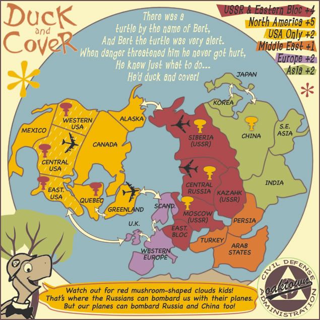
![]() by I GOT SERVED on Sun Nov 04, 2007 10:30 am
by I GOT SERVED on Sun Nov 04, 2007 10:30 am
I have to say, I love the progress this map's made. That said, Maybe you should switch the colors of Asia and Europe around. I like that Asia was purple. I wasn't a big fan of the grey. So I suppose by making Europe green, that'd (hopefully) make everybody happy.

Highest score: 2512
Highest rank: 424
-

 I GOT SERVED
- Posts: 1532
- Joined: Fri Jan 26, 2007 9:42 pm
- Location: Good 'ol New England


![]() by oaktown on Sun Nov 04, 2007 11:53 am
by oaktown on Sun Nov 04, 2007 11:53 am

Large and small. Here's what I've done:
• Made the large map smaller by losing some dead area on the globe itself... now 635x635; small is 575x575.
• Reworked the mushroom clouds, which did look like trees. A bit less cartoonish now though, so it's a toss-up.
• Tried Andy's idea of dashes on USA... honestly, each option has looked fine to me, so I'll bend to the will of the mob on this one.
• Cleaned up around Bert's cloudy eye - we don't want the public thinking that nobody is changing his water!
Re. colors... I think I'm hearing that the colors themselves are good, but there's a requet to swap the green and purple. I think the green on the right balances the map, esp. with the tree, but I'm open to suggestions.
Re. yellow talk bubble... yes, my original thought was that it's the same color as North America because Bert is on "our side" so to speak. Also, I like the offset fill and stroke, which we'd lose if I drop the color.
Re. the tree... good or bad? What if I stuck the monkey in there with his stick of dynamite?

-

oaktown
- Posts: 4451
- Joined: Sun Dec 03, 2006 9:24 pm
- Location: majorcommand


![]() by Gnome on Sun Nov 04, 2007 12:03 pm
by Gnome on Sun Nov 04, 2007 12:03 pm
first time to comment this map 
-colours are good, I like them now
-the tree is just fine, it indeed gives Bert a nice place in the map
-The lines you added in Usa Only S***(sorry for the expression ) it's like it's raining there, I liked the stars better
questions:
-are you going to put army circles or just projected on the map?
-is S.E Asia connected with Mexico?
(sorry if you already told this but I haven't had much time to follow everything)
Good job on everything, I like your maps oaktown!
-colours are good, I like them now
-the tree is just fine, it indeed gives Bert a nice place in the map
-The lines you added in Usa Only S***(sorry for the expression
questions:
-are you going to put army circles or just projected on the map?
-is S.E Asia connected with Mexico?
(sorry if you already told this but I haven't had much time to follow everything)
Good job on everything, I like your maps oaktown!

-

Gnome
- Posts: 388
- Joined: Wed Jul 18, 2007 4:15 am
- Location: Belgium


![]() by oaktown on Sun Nov 04, 2007 12:16 pm
by oaktown on Sun Nov 04, 2007 12:16 pm
Gnome wrote:questions:
-are you going to put army circles or just projected on the map?
-is S.E Asia connected with Mexico?
(sorry if you already told this but I haven't had much time to follow everything)
Good job on everything, I like your maps oaktown!
Thanks gnome. In answer to your questions:
1. Look back a few pages and you'll see examples of numbers w/o circles. I think it works.
2. Asia and Mexico connected? Somebody should buy you an atlas for christmas.
Raining in USA? Hmm... I'll put in something more fun... little squiggles maybe.
-
oaktown
- Posts: 4451
- Joined: Sun Dec 03, 2006 9:24 pm
- Location: majorcommand
![]() by ParadiceCity9 on Sun Nov 04, 2007 12:23 pm
by ParadiceCity9 on Sun Nov 04, 2007 12:23 pm
Were you high when you thought of this idea? But I like it anyways.
-
ParadiceCity9
- Posts: 4239
- Joined: Thu Feb 15, 2007 4:10 pm


![]() by Gnome on Sun Nov 04, 2007 1:10 pm
by Gnome on Sun Nov 04, 2007 1:10 pm
oaktown wrote:2. Asia and Mexico connected? Somebody should buy you an atlas for christmas.But seriously, I should probably clip the bottom of South East asia so nobody thinks there's a magical portal between Burma and Guatemala. Good catch.
hehe well I've always been bad in geography at school
But it was just because in world maps the world is round so the left edge of the page actually borders the right side of the page
So I thought you maybe had did the same in this map
-
Gnome
- Posts: 388
- Joined: Wed Jul 18, 2007 4:15 am
- Location: Belgium
One note
![]() by azdragon on Sun Nov 04, 2007 5:05 pm
by azdragon on Sun Nov 04, 2007 5:05 pm
Here is a note to make it more real. During the cold war most the US bombers were located in Alaska. I don't remember any located in greenland. It make much more Historic Logic if the airplane was moved from Greenland to Alaska.
Also I would divide western Europe into two nations. And reduce the number of mushroom clouds....this many makes it almost imposable to defend, there is no real internal space, but then my favorite map is World 2.0 so I love internal space.
Also I would divide western Europe into two nations. And reduce the number of mushroom clouds....this many makes it almost imposable to defend, there is no real internal space, but then my favorite map is World 2.0 so I love internal space.

-

azdragon
- Posts: 12
- Joined: Wed Aug 29, 2007 2:24 pm
- Location: Cebu Philippines
Re: One note
![]() by oaktown on Sun Nov 04, 2007 6:51 pm
by oaktown on Sun Nov 04, 2007 6:51 pm
azdragon wrote:Here is a note to make it more real. During the cold war most the US bombers were located in Alaska. I don't remember any located in greenland. It make much more Historic Logic if the airplane was moved from Greenland to Alaska.
Also I would divide western Europe into two nations. And reduce the number of mushroom clouds....this many makes it almost imposable to defend, there is no real internal space, but then my favorite map is World 2.0 so I love internal space.
All valid points...
If you go back a few pages we started with the bombers in Alaska, but there was a potential coding problem... when attacking from Alaska to Siberia, are you attacking or bombarding? it was either move the bombers or lose a russian nuclear strike target, and it made more sense to move the bomber.
Dividing western Europe would be fine, but I'd have to lose a territory someplace else. I'm open to suggestions that keep the terit count to 24.
Reducing the nuclear targets would indeed make bonuses easier to hold, but the theme of the map is global nuclear war... as Bert the Turtle tells us, the bomb can drop at any time, with warning or without warning. I'd like to see targets on everything, but that would be a mess. Again, I'm open to suggestions.
-
oaktown
- Posts: 4451
- Joined: Sun Dec 03, 2006 9:24 pm
- Location: majorcommand
![]() by AndyDufresne on Sun Nov 04, 2007 6:54 pm
by AndyDufresne on Sun Nov 04, 2007 6:54 pm
If you were going to add a territory to Europe, the only logical one to take away seems to be S.E. Asia.
--Andy
--Andy
-

AndyDufresne
- Posts: 24919
- Joined: Fri Mar 03, 2006 8:22 pm
- Location: A Banana Palm in Zihuatanejo


![]() by oaktown on Sun Nov 04, 2007 7:03 pm
by oaktown on Sun Nov 04, 2007 7:03 pm
AndyDufresne wrote:If you were going to add a territory to Europe, the only logical one to take away seems to be S.E. Asia.
--Andy
I think I would rather leave SE Asia and make Canada one big nuke-able territory... with the US-UK route it's no longer the bottleneck it was, and it makes North America more attainable.
That would make N. America a +4 total with 6 territories, and Europe a +3 with four territories: UK, Scan, France, Spain. Spain would be the only dead-end on the map. Thoughts?
-
oaktown
- Posts: 4451
- Joined: Sun Dec 03, 2006 9:24 pm
- Location: majorcommand
![]() by AndyDufresne on Sun Nov 04, 2007 7:06 pm
by AndyDufresne on Sun Nov 04, 2007 7:06 pm
Hm, could do that, though I particularly liked how North America was set up. But that could also work.
--Andy
--Andy
-
AndyDufresne
- Posts: 24919
- Joined: Fri Mar 03, 2006 8:22 pm
- Location: A Banana Palm in Zihuatanejo
![]() by oaktown on Sun Nov 04, 2007 8:11 pm
by oaktown on Sun Nov 04, 2007 8:11 pm
right... i actually think i like it best as is, with western europe left alone. Korea, India and South East Asia were all hot spots for conflicts in the 1950s, so I think they each deserve their own territories on this particular map. Meanwhile, Spain, France, and Italy were reeling and rebuilding from the previous two decades of war.
-
oaktown
- Posts: 4451
- Joined: Sun Dec 03, 2006 9:24 pm
- Location: majorcommand
![]() by asl80 on Sun Nov 04, 2007 8:31 pm
by asl80 on Sun Nov 04, 2007 8:31 pm
just a quickie - really not sure about the dashes oaktown, dots were much better - just needed to be sunken in or camoflauged a bit.
I've no preference to either mushroom cloud - both ok, who knows. maybe you'll find another one to try out as things move along.
Colour balance on the map is good, think your right, the green on the right balances the tree - which looks like with support it stays (liked the monkey call, but probably too much for that corner)
No. of territories and selection is good.
Don't think i'd like to see canada/alaska/greenland amlagamated, i think its good buffer between the russia/us bonuses.
-
asl80
- Posts: 208
- Joined: Wed Jun 27, 2007 10:07 am


![]() by I GOT SERVED on Sun Nov 04, 2007 9:35 pm
by I GOT SERVED on Sun Nov 04, 2007 9:35 pm
So here's what I think:
-Firstly, put the background for the USA bonus back to the stars. That looked nicer than the dashes.
-Scrap the tree all together.
-Swap the colors of Europe and Asia.
-Firstly, put the background for the USA bonus back to the stars. That looked nicer than the dashes.
-Scrap the tree all together.
-Swap the colors of Europe and Asia.
Highest score: 2512
Highest rank: 424
-
I GOT SERVED
- Posts: 1532
- Joined: Fri Jan 26, 2007 9:42 pm
- Location: Good 'ol New England

![]() by AndyDufresne on Mon Nov 05, 2007 12:20 am
by AndyDufresne on Mon Nov 05, 2007 12:20 am
Continuous diagonal lines might be something to consider...but I think the colors look perfect the way they are. And I don't see any real reason to get rid of the tree.
In regards to adding a territory or taking one away, I think should probably stay the way it is...though making Canada just one territory was an interesting idea.
--Andy
In regards to adding a territory or taking one away, I think should probably stay the way it is...though making Canada just one territory was an interesting idea.
--Andy
-
AndyDufresne
- Posts: 24919
- Joined: Fri Mar 03, 2006 8:22 pm
- Location: A Banana Palm in Zihuatanejo


![]() by yamahafazer on Mon Nov 05, 2007 3:02 am
by yamahafazer on Mon Nov 05, 2007 3:02 am
Ok here's what I think...
1. EVERYTHING is fine the way it is except the dashes in the US... I think you should go back to the small stars but put less in... maybe halfing or quortering the number you put in.
2. Please please please please don't change the colours. They look very nice to me and I think that it would be ruind by changing them.
3. I like the mushrooms very much. Nice work.
4. I like the tree. I think it would be nice to see what it would look like with the munkey in there and then we could see what everyone thinks about him. It could be a nice tuch... or it could ruin it. It's hard to tell with out seeing what it would be like.

-

yamahafazer
- Posts: 211
- Joined: Fri Aug 24, 2007 9:56 am
![]() by oaktown on Mon Nov 05, 2007 9:18 am
by oaktown on Mon Nov 05, 2007 9:18 am
what I'm hearing is that all of the issues in question are matters of personal taste, so I'm never going to make everybody happy about everything. I am leaning toward:
• leaving the color scheme as is
• leaving the territory arrangement as is
• changing the mushroom clouds
• leaving the tree, and maybe inserting the monkey on a trial basis
• keep plugging away at a winning USA background... I think the idea of a pattern over the yellow is correct, I just have to hit on one that I like. I haven't been in love with any option so far. Maybe I'll post samples of six or seven and run a poll.
-
oaktown
- Posts: 4451
- Joined: Sun Dec 03, 2006 9:24 pm
- Location: majorcommand
![]() by I GOT SERVED on Mon Nov 05, 2007 2:16 pm
by I GOT SERVED on Mon Nov 05, 2007 2:16 pm
oaktown wrote:what I'm hearing is that all of the issues in question are matters of personal taste, so I'm never going to make everybody happy about everything. I am leaning toward:
• leaving the color scheme as is
• leaving the territory arrangement as is
• changing the mushroom clouds
• leaving the tree, and maybe inserting the monkey on a trial basis
• keep plugging away at a winning USA background... I think the idea of a pattern over the yellow is correct, I just have to hit on one that I like. I haven't been in love with any option so far. Maybe I'll post samples of six or seven and run a poll.
The only question I have is what are the new mushroom clouds going to look like? I personally think that the current ones look fine as is.
Highest score: 2512
Highest rank: 424
-
I GOT SERVED
- Posts: 1532
- Joined: Fri Jan 26, 2007 9:42 pm
- Location: Good 'ol New England
![]() by yamahafazer on Tue Nov 06, 2007 4:17 am
by yamahafazer on Tue Nov 06, 2007 4:17 am
I like the mushroom clouds too. But I guess it depends on what others think.
Looking forward to seeing the samples of the US teretorys.
Looking forward to seeing the samples of the US teretorys.
-
yamahafazer
- Posts: 211
- Joined: Fri Aug 24, 2007 9:56 am
![]() by wcaclimbing on Tue Nov 06, 2007 3:32 pm
by wcaclimbing on Tue Nov 06, 2007 3:32 pm
Thank you oaktown.
The green looks MUCH better.
Everything else looks good to me
The green looks MUCH better.
Everything else looks good to me

-

wcaclimbing
- Posts: 5598
- Joined: Fri May 12, 2006 10:09 pm
- Location: In your quantum box....Maybe.


![]() by yamahafazer on Tue Nov 06, 2007 3:50 pm
by yamahafazer on Tue Nov 06, 2007 3:50 pm
Congrats on the quech by the way Oaktown... I've only just seen
-
yamahafazer
- Posts: 211
- Joined: Fri Aug 24, 2007 9:56 am
Who is online
Users browsing this forum: No registered users
|
|||||||
| Conquer Club is not associated with RISK online in any way. Copyright © 2006-2024 by Big Wham LLC | |||||||