Page 3 of 17

PostPosted: Fri Dec 14, 2007 9:48 pm
by MPL
were are the spies???

PostPosted: Fri Dec 14, 2007 10:18 pm
by Herakilla
MPL wrote:were are the spies???


the black circles that are named "Spy 1" and so on

PostPosted: Sat Dec 15, 2007 4:07 am
by yeti_c
Loving the new look Widow...

C.

PostPosted: Sat Dec 15, 2007 8:32 am
by Ogrecrusher
Yeah I probably should say I love the look, I tend to stick to short questions, but great map concept!

PostPosted: Sat Dec 15, 2007 12:20 pm
by duday53
I like the map. I think one more version to fix up gameplay, army circles, and any other things that will come by and we can quench it :D

Well Done

PostPosted: Sat Dec 15, 2007 2:04 pm
by WidowMakers
OK so here are the changes so far.
Missiles can bombard NAY foreign territory (including bunkers)

I need suggestions on:

1) Font (style and readability)
2) Bonuses
3) Attack routes
4) territory locations
5) Overall look

Thanks

WM

PostPosted: Sat Dec 15, 2007 2:53 pm
by Keredrex
Looks great but it seems the border glow on russia seems to blurry, maybe reduce the glow effect

Maybe adjust the letting on the fonts...(spread out the letters in each word just a little)

Title seems like it could use a little work...Maybe a slightly different font...more DIGITAL...font for the legend is good

PostPosted: Sat Dec 15, 2007 4:43 pm
by hecter
Font's difficult to read and you should change the silo territory... I looks like a witches hat, and it doesn't stand out all that much.
PostPosted: Sat Dec 15, 2007 4:49 pm
by MPL
hecter wrote:I looks like a witches hat


lol

PostPosted: Sat Dec 15, 2007 9:17 pm
by WidowMakers
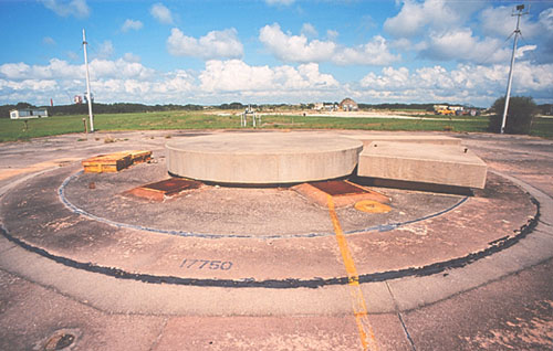
hecter wrote:Font's difficult to read and you should change the silo territory... I looks like a witches hat, and it doesn't stand out all that much.
What should I change it to? Here is what one really looks like

Image

How about just a white square?

WM

PostPosted: Sat Dec 15, 2007 11:05 pm
by WidowMakers
OK here is version 3

-I tried to adjust the legend text but the font got too big and hard to read.
-The glow on teh USSR border is better now
-The names are easier to read.
-Removed bunker exemption from missile bombardment in legend
-added armies
-added animation
-added grainy radar look

Still
Image
Image

Animated
Image
Image

So what do you think?

WM

PostPosted: Sat Dec 15, 2007 11:28 pm
by Herakilla
yay! animation! what happens if i press the fire button there? *presses it* "nuclear launch detected" aww crap

PostPosted: Sun Dec 16, 2007 10:25 am
by yeti_c
Put a longer wait at the end of the radar sweep to the beginning...

Think a 360 radar sweep... so the top half of the sweep (that you can't see) would take the same amount of time...

Also I'd like to see it less jerky and more smooth - but I assume that takes up too much disk space?

C.

PostPosted: Sun Dec 16, 2007 11:32 am
by unriggable
Here's what I thinks should happen. At the start of your turn, all armies are taken off the warhead, and 25 are put directly on (like queg). That way you can't 'save up' and crush everything.

PostPosted: Sun Dec 16, 2007 11:50 am
by mibi
yeti_c wrote:Put a longer wait at the end of the radar sweep to the beginning...

Think a 360 radar sweep... so the top half of the sweep (that you can't see) would take the same amount of time...

Also I'd like to see it less jerky and more smooth - but I assume that takes up too much disk space?

C.


i agree, the animation is awesome, but in its constant state of motion it kinda gives me a headache... makes it hard to focus. I agree a little smooth animation would help but its already at 870k although I suspect with a little compression and dithering you can take that down a bit. I can assist.

Some of the text is hard too read, especially the ussr text since the mind cant easily match up to more recognizable placenames like Miami... one thing you could do, if you haven't already is play with the anti alias settings of the text, this wouldnt increase the size but might increase the legibility. 'Strong' often helps.

The white ovals for the silos isn't happening. I think if you used the old silos and played withe the colors, maybe grey with a red missile or something it wouldnt look like a witches hat at all.

The citie circles could use some sort of styling as well, maybe a non-filled circle withe the same neon styling as the outline.. i dunno.

As for the connections and such, i am sure there are areas that need to be tweaked, we dont want to give any one side an advantage but refining balance via connections is much more difficult than just tweaking bonuses, i will have to give it some more thought.

The legend text is perfectly legible, no issue there, except the small 'ignition' word which is red on black.

The bonuses are fine except the bunkers could be +3, but maybe not.

The title could use a little pizazz.

Everything else is the pants, nice work.

PostPosted: Sun Dec 16, 2007 12:10 pm
by WidowMakers
unriggable wrote:Here's what I thinks should happen. At the start of your turn, all armies are taken off the warhead, and 25 are put directly on (like queg). That way you can't 'save up' and crush everything.
How about if we have a territory bonus of -1000 on teh missile launch territories. That way if someone is saving up, they lose all of them except 1 at teh start of their turn? It will keep people from building large numbers of armies and them bombarding without actually holding the entire missile.

I will update mibi's requests as well.

WM

PostPosted: Sun Dec 16, 2007 1:36 pm
by WidowMakers
OK here is version 4

I am not doing anymore animation until teh rest of teh layout is agreed upon. Then we can determine if it is even possible given the large file size.

Fixed:
-IGNITION in the legend increased for clarity
-added text used MISSILE LAUNCH that explains the armies will be rest to 1 at start of turn (that will eliminate a player stockpiling the armies there over multiple turns)
-Fixed cities to glow like the rest of the map
-Fixed cities names to "Strong" anti-aliasing (thanks mibi)
-Bonus to bunker is +3
-Cleaned up the missile text

Still needed:
-Missile silo graphic.- I don't' really like the oval either but there is not a lot of room. We don't have a symbol fo r the spy or president, why do we need one for the silo?
-Title-I have been trying to think of a better way to do this. I am coming up blank. I can get rid of the computer screen idea and just put up the name but I don't yet know what style or how to integrate it into the map.

-BONUS SUGGESTIONS!!!!
-Territory connection suggestion!!!!

Image

PostPosted: Sun Dec 16, 2007 2:33 pm
by duday53
The names are easier to read. That was the first thing I noticed.

In regards to the missile silo graphic I don't think you need something too amazing because not a lot of people will care. But thats just my two cents.

PostPosted: Sun Dec 16, 2007 3:20 pm
by fireedud
I say you shouldmake the fire button a territory with 200 neutrals and make that the objective.

PostPosted: Mon Dec 17, 2007 9:51 am
by Elijah S
Animation is currently in use in some other sites similar to CC...
and I think, when used subtly, it enhances the visuals and maybe adds a little excitement.
The problem with the GIF format is a serious lack of quality - grainy and a reduced color pallette.

Even slight effects, like the backlighting feature found in Paint Shop Pro, (this is the effect I used in my avatar) can add something, but can also be a little distracting.

I do like the "explosions" used in Risk II and one of CC's competitors sites.
-When the dice are rolled, the army circle being attacked explodes and then reveals the new number of armies in that territory. -Kinda cool. And I think this could be a "blanket affect" done by Lack which could be applied to all maps if it was decided upon.

For CC maps, animation is uncharted water, but I expect that more maps featuring some kind of animation will follow.

On this map I think the radar is well-done and very suiting.
Cool map. Great idea. Good luck with it!

PostPosted: Mon Dec 17, 2007 10:12 am
by MrBenn
I don't think there is any problem with the Silo Ovals... keep them how they are.

For the title, could you have it as a post-it-note stuck onto the monitor, or maybe as a scrap of old paper from a dot-matrix printer taped onto it?

I think the animations are good, but makes it a bit busy. Could it be made more subtle at all? Alternatively, you could have the sweeps originating from the centre of the screen; going round the top screen, and then the bottom; so that there is only one of them going round...

PostPosted: Mon Dec 17, 2007 5:03 pm
by gimil
Unfortunatly i dont like how the animation runs on my comp, its fairly annoying after a while. Also i dont like the way the GIF is making it grainy with hte lack of a decent color palette.

I would realy like to see the animation work on this map but to honest id rather it didnt happen looknig at the quality at the moment.

PostPosted: Mon Dec 17, 2007 5:22 pm
by pepperonibread
gimil wrote:Unfortunatly i dont like how the animation runs on my comp, its fairly annoying after a while. Also i dont like the way the GIF is making it grainy with hte lack of a decent color palette.

I would realy like to see the animation work on this map but to honest id rather it didnt happen looknig at the quality at the moment.


I agree, it gets annoying. Maybe you could make it not a loop, so it only goes around once. That way, it could sweep the board once after you make a move, and show your current position. Also, I don't mind the limited colors, it makes it look more radar-ish.

PostPosted: Mon Dec 17, 2007 5:28 pm
by Incandenza
gimil wrote:Unfortunatly i dont like how the animation runs on my comp, its fairly annoying after a while. Also i dont like the way the GIF is making it grainy with hte lack of a decent color palette.

I would realy like to see the animation work on this map but to honest id rather it didnt happen looknig at the quality at the moment.


Pretty much took the words right out of my mouth. Whereas the animations on conquer man are pretty unobtrusive, the radar sweep here will probably get annoying after awhile. I'd rather the control panel parts of the map look crisp (but keep the fuzziness of the screens).

But thematically this map is looking stunning. I don't think you need a special graphic for the missile silos... after all, they're just holes in the ground. :lol:

Hell, just looking at this map makes me want to bust out my best Dr. Strangelove impression.

PostPosted: Mon Dec 17, 2007 5:30 pm
by gimil
pepperonibread wrote:
gimil wrote:Unfortunatly i dont like how the animation runs on my comp, its fairly annoying after a while. Also i dont like the way the GIF is making it grainy with hte lack of a decent color palette.

I would realy like to see the animation work on this map but to honest id rather it didnt happen looknig at the quality at the moment.


I agree, it gets annoying. Maybe you could make it not a loop, so it only goes around once. That way, it could sweep the board once after you make a move, and show your current position. Also, I don't mind the limited colors, it makes it look more radar-ish.


the the limited color means that there is alot of pixalation. I agree that the limited colors make a more radar feel. but 256(i think that right) color palette is not enought, especially because of the gradient used to teh animation.