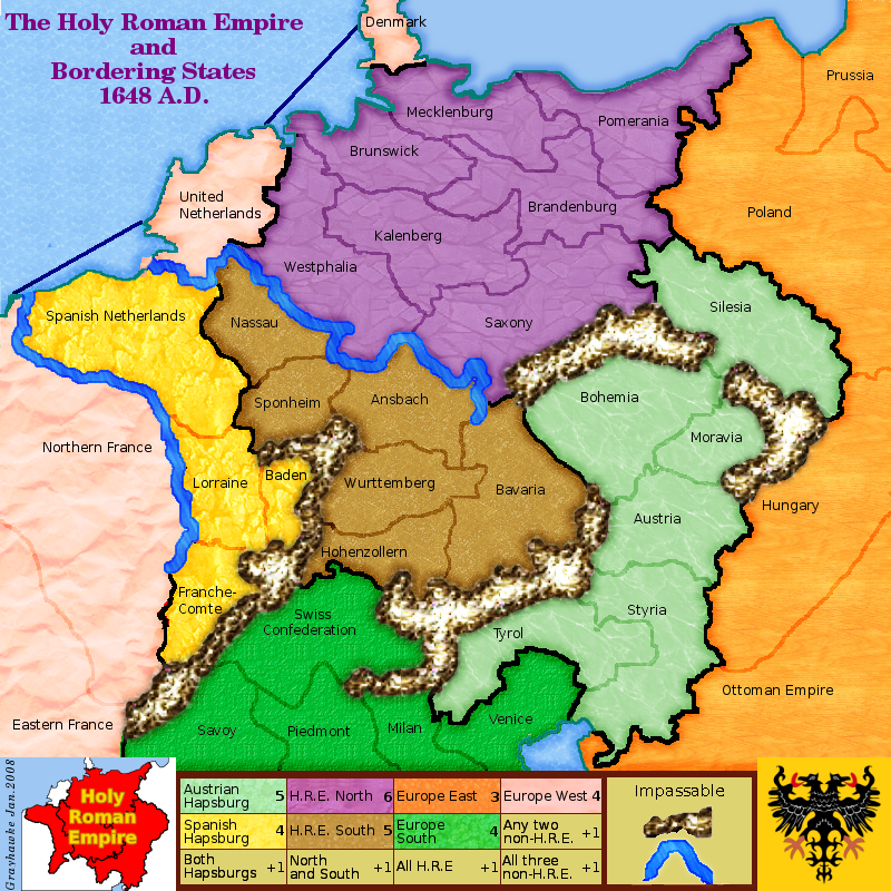
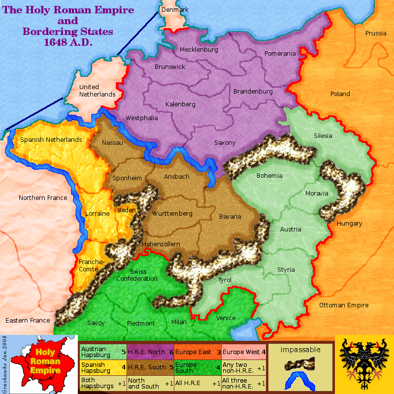
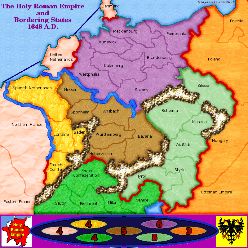
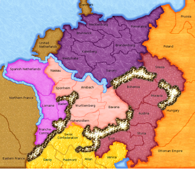
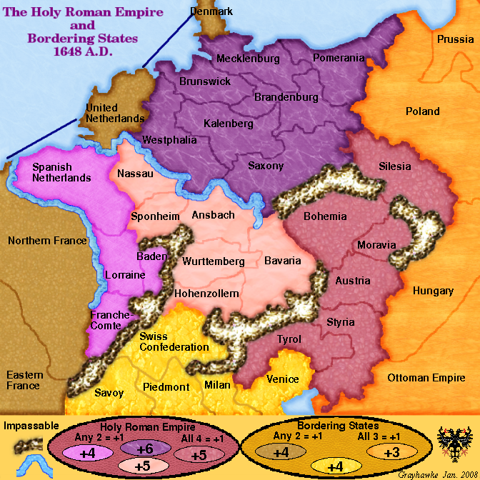
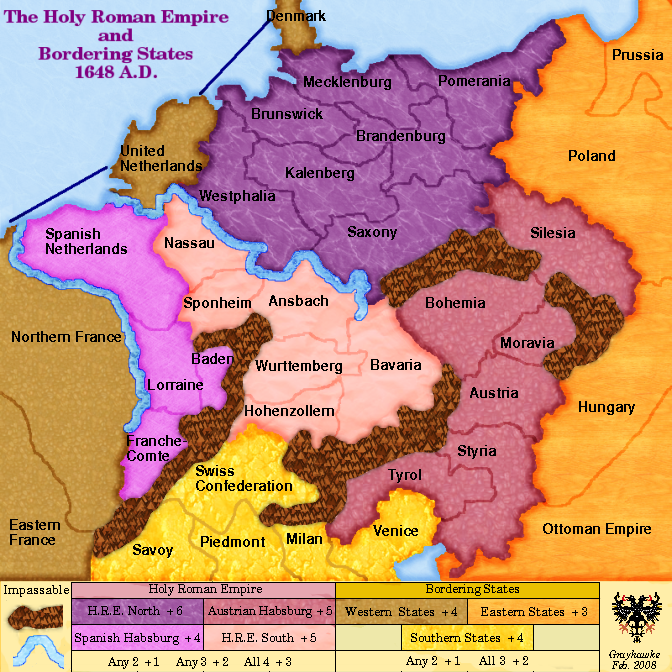
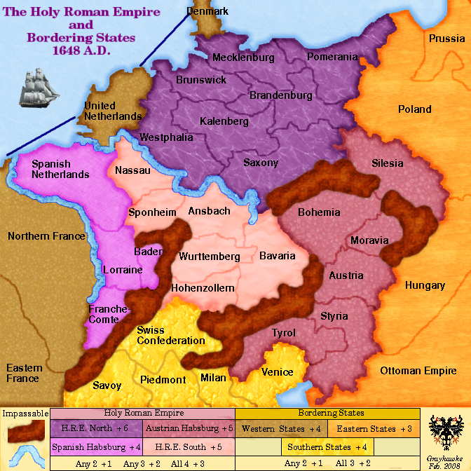
Page 2 of 17

PostPosted: Wed Jan 16, 2008 2:16 pm
by Balsiefen
Coleman wrote:
Balsiefen wrote:Looking a lot better but still needs a little graphics work.

-I would use only one background texture (possibly the crincled paper you have on france), the cofee beans just doesn't do it.
I disagree with this one, you do that you risk running into color blind issues. The combination of a different texture and color for each part helps solve that and is my favorite part of this right now.


Interesting. At the moment i absolutely can't stand the different textures.

PostPosted: Wed Jan 16, 2008 2:26 pm
by grayhawke
Balsiefen wrote:
Coleman wrote:
Balsiefen wrote:Looking a lot better but still needs a little graphics work.

-I would use only one background texture (possibly the crincled paper you have on france), the cofee beans just doesn't do it.
I disagree with this one, you do that you risk running into color blind issues. The combination of a different texture and color for each part helps solve that and is my favorite part of this right now.


Interesting. At the moment i absolutely can't stand the different textures.

Is it the difference per se you don't like or the actual textures used? i.e. if I tried different different textures would it help?

PostPosted: Wed Jan 16, 2008 2:39 pm
by Balsiefen
grayhawke wrote:
Balsiefen wrote:
Coleman wrote:
Balsiefen wrote:Looking a lot better but still needs a little graphics work.

-I would use only one background texture (possibly the crincled paper you have on france), the cofee beans just doesn't do it.
I disagree with this one, you do that you risk running into color blind issues. The combination of a different texture and color for each part helps solve that and is my favorite part of this right now.


Interesting. At the moment i absolutely can't stand the different textures.

Is it the difference per se you don't like or the actual textures used? i.e. if I tried different different textures would it help?


A bit of both but i had a look through the textures and the ones that i think look pretty good are:
Crinkled paper
leather
slate
Marble 1 (although, that looks best for seas)
Granate
3D green
paper
pink marble
wood

Version 8

PostPosted: Wed Jan 16, 2008 4:03 pm
by grayhawke
Image

trying different textures

PostPosted: Wed Jan 16, 2008 4:20 pm
by Lone.prophet
maybe no texture

PostPosted: Wed Jan 16, 2008 5:25 pm
by Coleman
I liked the first textures. :lol:

Version 9

PostPosted: Thu Jan 17, 2008 8:09 am
by grayhawke
Image

Set the textures to my taste - I guess I'm not going to please everyone.

Put in a red HRE border.

Legend needs updating - but I'll probably leave any further work until/if there's any support for playing this map.

PostPosted: Thu Jan 17, 2008 9:07 am
by Sir. Ricco
It coming along but the graphics need heavy updating.

Version 10

PostPosted: Sat Jan 19, 2008 1:27 am
by grayhawke
Image

PostPosted: Sat Jan 19, 2008 4:41 am
by Balsiefen
On a side note, How do you get the continent fill to be darker around the edges? i've never worked out how to do that.

PostPosted: Sat Jan 19, 2008 5:53 am
by grayhawke
Balsiefen wrote:On a side note, How do you get the continent fill to be darker around the edges? i've never worked out how to do that.

I use a a black overlay layer where I've selected and filled the whole area, then reduced the selection, and erased this reduced selection, leaving just the edges.

PostPosted: Sat Jan 19, 2008 6:09 am
by edbeard
you don't really need the large map to be so big

800x800 (the max) should be used with maps that need it

you have tons of space here. this could easily be 700x700 or smaller.


one problem with the look of the map is all the colours. I'd prefer there to be one texture for the land as it looks a bit messy at the moment. Maybe try out some new colours because they just don't mesh at the moment. It's a bit all over the place.


So in some spots you have these huge red borders between continents. I'd say get rid of that altogether. It doesn't look good and isn't really needed. At the very least, you need consistency. At the moment you have it in some areas, but not others. But, like I said, it doesn't serve any good purpose and you should do away with that as it only detracts from the map at the moment.

Your rivers should flow into the ocean. I'm talking colour-wise btw. Right now they totally clash.

I like those mountains. I'm assuming they are really in those spots.


edit: I guess those red borders are supposed to represent the empire borders? well, there has to be a better way to show this. Honestly, it's an eyesore at the moment. Maybe do something with the continent colours where the empire continents share some type of shade whilst being different colours. and, the ones outside share a different shade.

Colours

PostPosted: Sat Jan 19, 2008 12:48 pm
by grayhawke
Is this any better as regards colours?

Image

PostPosted: Sat Jan 19, 2008 2:34 pm
by Unit_2
that looks ALOT better :wink:

Version 11

PostPosted: Tue Jan 22, 2008 4:26 pm
by grayhawke
Image

Uses new colours
Large map now 672x672 px.
Changed the legend.
Different font.

PostPosted: Tue Jan 22, 2008 4:44 pm
by Unit_2
thats ever better, keep up the work;)

PostPosted: Wed Jan 23, 2008 6:31 am
by grayhawke
Sir. Ricco wrote:It coming along but the graphics need heavy updating.


Graphics have been updated following suggestions - more suggestions welcome.

Any comments on gameplay?

PostPosted: Sat Jan 26, 2008 9:48 am
by fireedud
I really like this map. I can't wait to play it already.

I think the mountains look too much like pyrite - perhaps make it less bright and more brownish.

I also think the bonuses need some improvement. You might have gotten it pretty accurate, but you have to make it more clear. I really don't understand the All 4= +1 and All 3=+1. I don't know if that's the way you want it, or you want it in addition to the other bonuses. If it's the latter, it'll make the HRE = +5 excluding the individual bonuses. And the Bordering states= +3 excluding individual bonuses.

PostPosted: Sun Jan 27, 2008 1:18 am
by Coleman
Not sure when you expect out of map ideas, but updating the first post with the latest image is very important. It will be invaluable within a couple of weeks to getting adequate comments.

Also good to have in the first post is some basic information, such as number of territories and continents, plus any nonstandard risk features you may be using.

Version 12

PostPosted: Sat Feb 16, 2008 10:26 pm
by grayhawke
The first post now shows version 12

The mountains now use a tileable pattern fill rather than the layering technique and the extra bonuses have been modified.

Version 13

PostPosted: Mon Feb 18, 2008 7:57 pm
by grayhawke
The first post now shows version 13

Presentation of bonuses has been modified.

PostPosted: Mon Feb 18, 2008 9:22 pm
by multiplayertim
looks a great map. Can't wait to play on it. How many support posts does a map need to be created?

PostPosted: Tue Feb 19, 2008 8:24 am
by bryguy
multiplayertim wrote:How many support posts does a map need to be created?


minimum of 2 or 3 i think 8)


and sorry to burst your bubble guys, but once this reaches map foundry and final forge (if it makes it there) than this is gonna get ridiculed very much.


so im gonna point some things out


The mountains look sloppy
the patterns arent the great looking
the water look mostly like wrinkled blue paper
the country backgrounds also do not look that pretty, and most of this map is not appealing to the eye


hope thats not sounding like im flaming this board, im just saying things the way i see them

Version 14

PostPosted: Wed Feb 20, 2008 7:07 am
by grayhawke
The first post now shows version 14

Mountains re-worked. Ship graphic added.

bryguy wrote:... sorry to burst your bubble guys, but once this reaches map foundry and final forge (if it makes it there) than this is gonna get ridiculed very much.
...
hope thats not sounding like im flaming this board, im just saying things the way i see them


Thanks for the opinion. I'm afraid we're not going to agree on this (with the exception of the mountains :roll: ) Guess our tastes differ.

multiplayertim wrote:looks a great map. Can't wait to play on it. ...

Thanks

Coleman wrote:Not sure when you expect out of map ideas..

Now? - :shock: - let the ridicule begin 8)

PostPosted: Wed Feb 20, 2008 3:15 pm
by multiplayertim
Just saw the comment about gameplay. I think +6 is a bit much for H.R.E. North, it seems to be that Austrian Habsburg is the most vurnerable province and therefore that sould be +6 and the H.R.E. North +5
and who cares what the mountains look like the borders between individual states is much more important. The mountains are fine as they are