Archipelago [Quenched]
Moderator: Cartographers
Re: Archipelago v5 (Pg. 1&9) - UPDATED May 2
![]() by jiminski on Fri May 02, 2008 5:49 pm
by jiminski on Fri May 02, 2008 5:49 pm
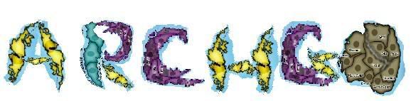
hehe i realise that this is most imperfect and not spelt correctly ('ARCHGO' in case you were wondering  ) but how about the working of the title made from the island shapes? I appologies if this is noobish behaviour but hehe your map inspires me.

-

 jiminski
- Posts: 5422
- Joined: Tue Feb 20, 2007 3:30 pm
- Location: London


Re: Archipelago v5 (Pg. 1&9) - UPDATED May 2
![]() by Kaplowitz on Fri May 02, 2008 5:56 pm
by Kaplowitz on Fri May 02, 2008 5:56 pm
jiminski wrote:hehe i realise that this is most imperfect and not spelt correctly ('ARCHGO' in case you were wondering
I love it! But dont use the actual continents, make new ones the shape of letter.

-

Kaplowitz
- Posts: 3088
- Joined: Tue May 01, 2007 5:11 pm


Re: Archipelago v3 (Pg. 1&5) - Updated 4/25/2008 - New Poll
![]() by wcaclimbing on Fri May 02, 2008 5:59 pm
by wcaclimbing on Fri May 02, 2008 5:59 pm
ZeakCytho wrote:
- Click image to enlarge.
Put that title back up. its perfect!

-
wcaclimbing
- Posts: 5598
- Joined: Fri May 12, 2006 10:09 pm
- Location: In your quantum box....Maybe.


Re: Archipelago v5 (Pg. 1&9) - UPDATED May 2
![]() by InkL0sed on Fri May 02, 2008 6:08 pm
by InkL0sed on Fri May 02, 2008 6:08 pm
Mjinga wrote:Ruben Cassar and wcaclimbing: Thanks!I'll work on it.
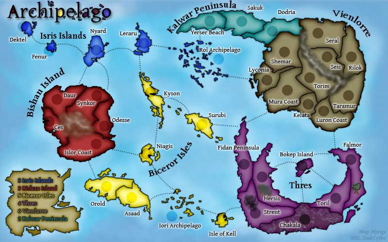
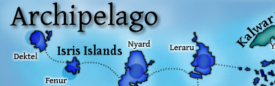
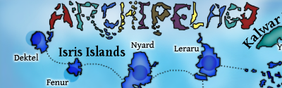
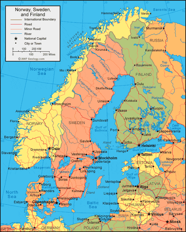
InkLOsed: I'm sorry, but I have to disagree. This real-life map of Norway, this satellite photo of Europe, this satellite photo of the island of Kahoolawe, and CC's own Scotland map all demonstrate very jagged coastlines.
It's not jaggedness that makes it look realistic -- but some of it looks like actual shapes. I'd say mostly the Rol Archipelago looks especially funky. It's hard to describe, but there is a difference.
Also, a note about that -- larger islands can be fine with the look you have now, but the small islands look pretty unbelievable (in the literal sense of the word).
-

InkL0sed
- Posts: 2370
- Joined: Sat Jun 23, 2007 4:06 pm
- Location: underwater


Re: Archipelago v5 (Pg. 1&9) - UPDATED May 2
![]() by Mjinga on Fri May 02, 2008 6:09 pm
by Mjinga on Fri May 02, 2008 6:09 pm
jiminski: Hehe! I løve it! I was going to do something like that, but I was too lazy to do it fast last night, so I kinda went middle roads for update 4.
Kaplowitz and wcaclimbing: I can do a version of each. There can be a poll once Zeak figures out how to get the options to work.
EDIT:
InkLOsed: How would you rather they looked? I can have a go at it if you've got a pic to demonstrate? Sorry but I'm not picking up the difference from the way you describe it.
Kaplowitz and wcaclimbing: I can do a version of each.
EDIT:
InkLOsed: How would you rather they looked? I can have a go at it if you've got a pic to demonstrate? Sorry but I'm not picking up the difference from the way you describe it.
Last edited by Mjinga on Fri May 02, 2008 6:11 pm, edited 1 time in total.
Reputation cleared. Never let it be said that Team CC don't investigate fairly.
Although they take bloody forever to do it...
Although they take bloody forever to do it...
-
Mjinga
- Posts: 251
- Joined: Fri Sep 14, 2007 2:36 pm


Re: Archipelago v5 (Pg. 1&9) - UPDATED May 2
![]() by ZeakCytho on Fri May 02, 2008 6:10 pm
by ZeakCytho on Fri May 02, 2008 6:10 pm
Jiminski + Kaplo - It's a good idea. I think I like it. But I agree that we shouldn't use the existing continents for it. What if we were to make the letters island-shaped but color them with the same style as the legend box/island?
Wcaclimbing - I see the appeal of that title. I myself don't happen to like the colored-in sections, but maybe we can work in a theme using regular text with small colored islands surrounding it like that, but slightly different. Unless the colored-in letters were the part you loved.
Here's what we'll do for the title. Version 6 will have multiple versions and, if all goes well, I'll be able to put up a poll and we'll vote on them. The options will be the original title from v1, the title from v4, the title from v5, the new island-letter idea of Jiminski/Kaplo, and a redone title in the style of the v4 title.
Any other title suggestions to work on for then?
Also, if everyone is happy with the attack lines, we'll curve them and make them pretty for v6.
Edit: Well, I didn't coordinate very well with Mjinga on that reply You guys will just have to put up with a set of redundant replies
InkL0sed - I think some of the jaggedness can be removed, but as a general style, I think some sharp bits are needed.
Wcaclimbing - I see the appeal of that title. I myself don't happen to like the colored-in sections, but maybe we can work in a theme using regular text with small colored islands surrounding it like that, but slightly different. Unless the colored-in letters were the part you loved.
Here's what we'll do for the title. Version 6 will have multiple versions and, if all goes well, I'll be able to put up a poll and we'll vote on them. The options will be the original title from v1, the title from v4, the title from v5, the new island-letter idea of Jiminski/Kaplo, and a redone title in the style of the v4 title.
Any other title suggestions to work on for then?
Also, if everyone is happy with the attack lines, we'll curve them and make them pretty for v6.
Edit: Well, I didn't coordinate very well with Mjinga on that reply
InkL0sed - I think some of the jaggedness can be removed, but as a general style, I think some sharp bits are needed.
-

ZeakCytho
- Posts: 1251
- Joined: Wed Sep 12, 2007 4:36 pm


Re: Archipelago v5 (Pg. 1&9) - UPDATED May 2
![]() by jiminski on Sat May 03, 2008 8:20 am
by jiminski on Sat May 03, 2008 8:20 am
ZeakCytho wrote:Jiminski + Kaplo - It's a good idea. I think I like it. But I agree that we shouldn't use the existing continents for it. What if we were to make the letters island-shaped but color them with the same style as the legend box/island?
Whatever works best! I just used what i had handy... so if you can create purpose-built letter-shaped-islands or island-shaped-letters, then grand!
As to the colours, i am not sure, It may be nice using the colours of the map(this could be distracting?) and i am sure the legend style would look good too.
Maybe try both ways and see?
-
jiminski
- Posts: 5422
- Joined: Tue Feb 20, 2007 3:30 pm
- Location: London
Re: Archipelago v5 (Pg. 1&9) - UPDATED May 2
![]() by Kaplowitz on Sat May 03, 2008 9:16 am
by Kaplowitz on Sat May 03, 2008 9:16 am
jiminski wrote:ZeakCytho wrote:Jiminski + Kaplo - It's a good idea. I think I like it. But I agree that we shouldn't use the existing continents for it. What if we were to make the letters island-shaped but color them with the same style as the legend box/island?
Whatever works best! I just used what i had handy... so if you can create purpose-built letter-shaped-islands or island-shaped-letters, then grand!
As to the colours, i am not sure, It may be nice using the colours of the map(this could be distracting?) and i am sure the legend style would look good too.
Maybe try both ways and see?
Im sure you know this, but if you make them black, then you can use a color overlay to easily change the color back and forth.
-
Kaplowitz
- Posts: 3088
- Joined: Tue May 01, 2007 5:11 pm
Re: Archipelago v5 (Pg. 1&9) - UPDATED May 2
![]() by fireedud on Sun May 04, 2008 10:24 am
by fireedud on Sun May 04, 2008 10:24 am
For the islands of dektel and Fenur, can you bring the army shadow completely off, like in Rol Archipelago and Iori Archipelago?
me have no sig
-
fireedud
- Posts: 1704
- Joined: Fri Mar 02, 2007 10:06 pm

Re: Archipelago v5 (Pg. 1&9) - UPDATED May 2
![]() by ZeakCytho on Sun May 04, 2008 11:41 am
by ZeakCytho on Sun May 04, 2008 11:41 am
fireedud wrote:For the islands of dektel and Fenur, can you bring the army shadow completely off, like in Rol Archipelago and Iori Archipelago?
Sure thing.
-------------------------------------------------------------------------------------------------------------------------------------------------------
The titles have all been made. They're posted in the first post, and I'll put them below. Due to technical problems (the forum software hates me
Poll Options
1) Version 1:
2) Version 4:
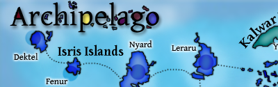
3) Version 5:
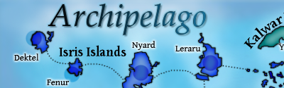
4) Continent shapes used for letters:
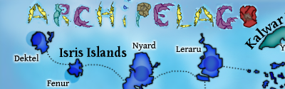
5) Islands used for letters with gray coloring:
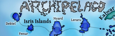
6) Islands used for letters with continent coloring:
Last edited by ZeakCytho on Sun May 04, 2008 1:33 pm, edited 1 time in total.
-
ZeakCytho
- Posts: 1251
- Joined: Wed Sep 12, 2007 4:36 pm
Re: Archipelago v5 (Pg. 1&9) - UPDATED May 2
![]() by Kaplowitz on Sun May 04, 2008 12:53 pm
by Kaplowitz on Sun May 04, 2008 12:53 pm
5 ftw, maybe 6, but i think i like five better.
-
Kaplowitz
- Posts: 3088
- Joined: Tue May 01, 2007 5:11 pm
Re: Archipelago v5 (Pg. 1&9) - UPDATED May 2
![]() by rocky mountain on Sun May 04, 2008 7:44 pm
by rocky mountain on Sun May 04, 2008 7:44 pm
i like 6 best

best: place 2349; points 1617; GP 216; GW 102(47%); Lieutenant
-
rocky mountain
- Posts: 415
- Joined: Thu Jul 12, 2007 7:08 pm
Re: Archipelago v5 (Pg. 1&9) - UPDATED May 2
![]() by Mr. Squirrel on Sun May 04, 2008 7:58 pm
by Mr. Squirrel on Sun May 04, 2008 7:58 pm
Here's my idea for the title:
Take the the title from version 5 and put the small islands around it that were in the version 4 title. Don't fill in the closed sections because that makes it hard to read.
Either that, or I would vote for the colored island-letters, but they need to be sharpened up. As they are now, it takes a little studying before you figure out what they say.
-

Mr. Squirrel
- Posts: 157
- Joined: Fri Nov 02, 2007 3:18 pm
- Location: up a tree
Re: Archipelago v5 (Pg. 1&9) - UPDATED May 2
![]() by jiminski on Mon May 05, 2008 5:44 pm
by jiminski on Mon May 05, 2008 5:44 pm
I have looked, gone away. looked again ... gone away again many times and i am pretty sure i like Option 4 best.. it's tough isn't it!
-
jiminski
- Posts: 5422
- Joined: Tue Feb 20, 2007 3:30 pm
- Location: London
Re: Archipelago v5 (Pg. 1&9) - UPDATED May 2
![]() by gimil on Mon May 05, 2008 9:56 pm
by gimil on Mon May 05, 2008 9:56 pm

Here you go.
Alothough I feel the current graphics you have are less than decent. There color scheme doesnt really run together well. Texture and other things don't looks so great. Im sorry but nothing pops out to me as exciting in this map
What do you know about map making, bitch?
Top Score:2403
natty_dread wrote:I was wrong
Top Score:2403
-

gimil
- Posts: 8599
- Joined: Sat Mar 03, 2007 12:42 pm
- Location: United Kingdom (Scotland)


Re: Archipelago v5 (Pg. 1&9) - UPDATED May 2
![]() by ZeakCytho on Mon May 05, 2008 10:17 pm
by ZeakCytho on Mon May 05, 2008 10:17 pm
gimil wrote:
Here you go.
gimil wrote:Alothough I feel the current graphics you have are less than decent. There color scheme doesnt really run together well. Texture and other things don't looks so great. Im sorry but nothing pops out to me as exciting in this map
Sorry
Once we finish messing around with titles, we can try alternate color/texture schemes.
In more positive news, something about the move to the foundry made the poll work! I figured it was worth a try, since it's a new forum and all, and it worked, so go vote!
-
ZeakCytho
- Posts: 1251
- Joined: Wed Sep 12, 2007 4:36 pm
Re: Archipelago v5 (Pg. 1&9) - UPDATED May 2
![]() by gimil on Mon May 05, 2008 10:20 pm
by gimil on Mon May 05, 2008 10:20 pm
ZeakCytho wrote:gimil wrote:
Here you go.
 gimil wrote:Alothough I feel the current graphics you have are less than decent. There color scheme doesnt really run together well. Texture and other things don't looks so great. Im sorry but nothing pops out to me as exciting in this map
Sorry
Once we finish messing around with titles, we can try alternate color/texture schemes.
In more positive news, something about the move to the foundry made the poll work! I figured it was worth a try, since it's a new forum and all, and it worked, so go vote!
It was only your thread that was doing it which was hte weird thing.
What do you know about map making, bitch?
Top Score:2403
natty_dread wrote:I was wrong
Top Score:2403
-
gimil
- Posts: 8599
- Joined: Sat Mar 03, 2007 12:42 pm
- Location: United Kingdom (Scotland)
Re: Archipelago v5 (Pg. 1&9) - Title Poll [I]
![]() by rocky mountain on Mon May 05, 2008 10:29 pm
by rocky mountain on Mon May 05, 2008 10:29 pm
i was the first vote caster
i actually do agree with gimil about the colours...
good job on the stamp, and good luck for future!
i actually do agree with gimil about the colours...
good job on the stamp, and good luck for future!
best: place 2349; points 1617; GP 216; GW 102(47%); Lieutenant
-
rocky mountain
- Posts: 415
- Joined: Thu Jul 12, 2007 7:08 pm
Re: Archipelago v5 (Pg. 1&9) - UPDATED May 2
![]() by jiminski on Tue May 06, 2008 1:24 am
by jiminski on Tue May 06, 2008 1:24 am
gimil wrote:
Here you go.
Alothough I feel the current graphics you have are less than decent. There color scheme doesnt really run together well. Texture and other things don't looks so great. Im sorry but nothing pops out to me as exciting in this map
congratulations on getting the stamp.
Taste is, by its very definition, subjective and i could not disagree with gimil more.
The Colours are vibrant; contrasting beautifully and the shape and simple toning of the islands go to form a visually exciting, high impact work of art.
i do not say that to be in opposition to gim for its own sake but to reiterate that the graphics and colouring are very popular with at least one user.
well done chaps
-
jiminski
- Posts: 5422
- Joined: Tue Feb 20, 2007 3:30 pm
- Location: London
Re: Archipelago v5 (Pg. 1&9) - Title Poll [I]
![]() by bryguy on Tue May 06, 2008 8:07 am
by bryguy on Tue May 06, 2008 8:07 am
wow, im amazed this got moved... oh well maybe ill come to like this map
Congratz on getting to the main foundry!
and heres some things i think ya need
1) New colors
2) a volcano
3) hurry up with the poll
4) btw u can take the poll down anytime by going under the poll options on the first post and clearing everything
5) new bonuses
Congratz on getting to the main foundry!
and heres some things i think ya need
1) New colors
2) a volcano
3) hurry up with the poll
4) btw u can take the poll down anytime by going under the poll options on the first post and clearing everything
5) new bonuses
-
bryguy
- Posts: 4381
- Joined: Tue Aug 07, 2007 8:50 am
- Location: Lost in a Jigsaw

Re: Archipelago v5 (Pg. 1&9) - Title Poll [I]
![]() by jiminski on Tue May 06, 2008 9:02 am
by jiminski on Tue May 06, 2008 9:02 am
sheese .. tough crowd
-
jiminski
- Posts: 5422
- Joined: Tue Feb 20, 2007 3:30 pm
- Location: London
Re: Archipelago v5 (Pg. 1&9) - Title Poll [I]
![]() by bryguy on Tue May 06, 2008 10:18 am
by bryguy on Tue May 06, 2008 10:18 am
jiminski wrote:sheese .. tough crowd
nah im just trying to be helpful, anyways also i noted another thing
6) modify the attack lines/delete some
-
bryguy
- Posts: 4381
- Joined: Tue Aug 07, 2007 8:50 am
- Location: Lost in a Jigsaw


Re: Archipelago v5 (Pg. 1&9) - Title Poll [I]
![]() by Mjinga on Tue May 06, 2008 12:09 pm
by Mjinga on Tue May 06, 2008 12:09 pm
Yay! We got idea-passed! Thanks gimil.
Thanks, t-o-m and jiminski!
bryguy:
1) Which do you suggest?
2) We did a poll on that and the winner was "No volcano" in terms of something that actually affected gameplay. Did you mean that you just want the mountain to be a volcano graphically?
3) Zeak fixed it.
4) Yeah, we tried, but it wasn't working for some reason before.
5) What would you suggest?
6) Which ones?
Reputation cleared. Never let it be said that Team CC don't investigate fairly.
Although they take bloody forever to do it...
Although they take bloody forever to do it...
-
Mjinga
- Posts: 251
- Joined: Fri Sep 14, 2007 2:36 pm
Re: Archipelago v5 (Pg. 1&9) - UPDATED May 2
![]() by Mr. Squirrel on Tue May 06, 2008 3:21 pm
by Mr. Squirrel on Tue May 06, 2008 3:21 pm
jiminski wrote:gimil wrote:
Here you go.
Alothough I feel the current graphics you have are less than decent. There color scheme doesnt really run together well. Texture and other things don't looks so great. Im sorry but nothing pops out to me as exciting in this map
congratulations on getting the stamp.
Taste is, by its very definition, subjective and i could not disagree with gimil more.
The Colours are vibrant; contrasting beautifully and the shape and simple toning of the islands go to form a visually exciting, high impact work of art.
i do not say that to be in opposition to gim for its own sake but to reiterate that the graphics and colouring are very popular with at least one user.
well done chaps
I agree with you on everything you just said. This map looks good even without lots of textures and blended colors.
As for the poll, could you quickly make a version of the title that I suggested before, just to see how it looked? I would vote for Version 4, but I dislike how you filled in the spaces in the letters completely full of color.
-
Mr. Squirrel
- Posts: 157
- Joined: Fri Nov 02, 2007 3:18 pm
- Location: up a tree
Who is online
Users browsing this forum: No registered users
|
|||||||
| Conquer Club is not associated with RISK online in any way. Copyright © 2006-2024 by Big Wham LLC | |||||||