Wow, has it been a month (almost) already? I've fiddled with the legend, trying to make it out of stone. Not sure exactly how to do the text that way though. I could make the jpeg of the Sacsayhuaman fortress a framed pic... Will try to get an update out, if only with a few more of the camps drawn individually.
Re: Ziggurat [23/Dec/2013] v12 (p8)
Posted: Fri Jan 31, 2014 11:10 pm
by RedBaron0
[moved]
Seems the progress of this map has stalled. Should the mapmaker choose to continue the production of this map, all they need do is contact any CA and ask it be moved back to the Foundry, once an update has been made. Be aware that the vacation this map will be put on will be for a period of no longer than 6 months. Should that time period pass without update this map will be consided abandoned, meaning its various gameplay elements will be free to used by any other mapmaker. Even if this map returns to the Foundry it may be reevaluated for gameplay worthyness due to possible changes in Foundry standards that may occur in the meantime. At that time the gameplay stamp may be recinded temperarily to denote its status.
Ziggurat [4/Mar/2016] v13 (p6)
Posted: Fri Mar 04, 2016 12:46 pm
by jonofperu
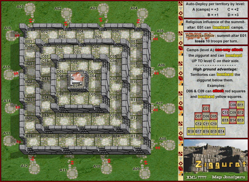
After a looong vacation, here is an update!
I've made a "stone" background for the legend and framed an image of the Inca fortress behind a redesigned title. Also re-positioned / centered the map. Would appreciate some feedback on the changes. I'm ready to see this thing through now!
Click image to enlarge.
Re: [Abandoned] Ziggurat [4/Mar/2016] v13 (p6)
Posted: Fri Mar 04, 2016 2:46 pm
by boberz
I miss the map foundry.
I like the look of the legend, nice and clear. Can the shadow on the coloured lettering be reduced a tad not a biggy though?
Do the troops look okay on that stone floor, I can imagine some of the more obscure colours being hard to read on the background?
I also think the High Ground advantage wording could be worded a tad more clearly. It is the 'within 90 degrees' bit that doesn't read well for me. But I just sat here for 5 minutes trying to think of better wording and haven't yet, so I will park that suggestion until I have a better idea.
boberz wrote:I also think the High Ground advantage wording could be worded a tad more clearly. It is the 'within 90 degrees' bit that doesn't read well for me.
the corner squares can actually bombard within 180 degrees.
actually, i wrote corner squares without thinking. all bombard-capable regions are square, while the camps, which cannot bombard, are not square. is it more appropriate to call the ziggurat regions squares rather than territories in the bombardment part of the legend?
does it make more sense to write each square can bombard the ziggurat directly downward and within 45° plus for corner squares, directly downward applies to two directions?
ian.
Re: Ziggurat [4/Mar/2016] v13 (p6)
Posted: Fri Mar 11, 2016 7:51 am
by t-o-m
Looks great! I want to play.
Re: Ziggurat [4/Mar/2016] v13.2 (p6)
Posted: Sat Mar 12, 2016 12:15 pm
by jonofperu
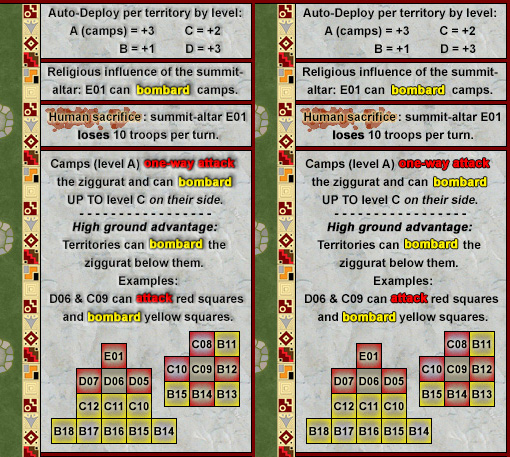
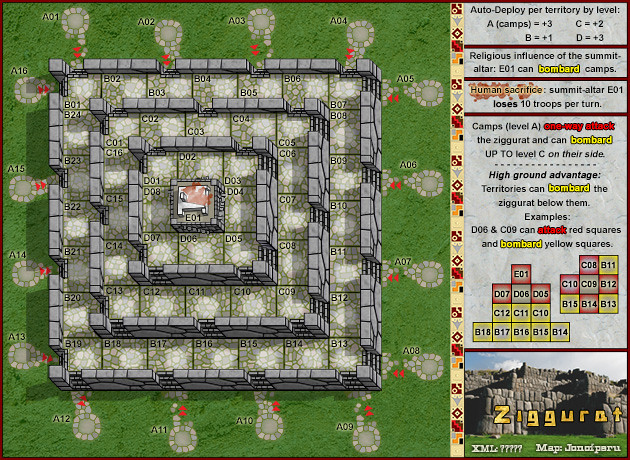
1. Reduced the darkness around colored text (better?) 2. I inadvertently turned off the neutral troop numbers and white glow behind them in the last version I posted. Here they are, back on again. I suppose it's time to do the colorblind/three numeral tests whatever they are called. I can tweak the glow if needed to offset the troop colors sufficiently. Might be nice to reduce the glow on E01 though... 3. Good call on the 90/180 inconsistency. This has been the hardest part of the legend wording. Trying to look at it with fresh eyes, I've decided to remove the 90º references entirely. I think we need to keep the legend as succinct as possible. I think the examples provide sufficient information to figure out the bombardment limitations. The map may be somewhat complex, but as long as the info is available (even if it's not spelled out in detail) I'm leaning toward keeping the legend simple. The camps do actually bombard the zuggurat, but are obviously lower. I'll stick with the "territory" terminology for now.
Click image to enlarge.
EDIT: Changed the name of this one to version 13.2. Posted v14 with more changes incorporated.
Re: Ziggurat [4/Mar/2016] v14 (p6)
Posted: Sat Mar 12, 2016 1:10 pm
by boberz
Much better, I like the little white glow behind the troop count. I prefer the reduced outline of the new lettering but think you could decrease it still, it looks a little like somebody has smudged the edge of the words. I prefer them crisp, but not a biggy at all. It is an interesting map, and I am interested to try it.
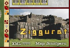
If I could completely change one thing, it would be the yellow title over that image on the bottom right hand side. I don't like it at all. It is the yellow writing that I don't like and the font. The image itself is fine.
Re: Ziggurat [4/Mar/2016] v14 (p6)
Posted: Sun Mar 13, 2016 7:17 pm
by ManBungalow
Hi jonofperu, really cool looking map and good progress happening here. I like the clarity of the graphics.
One quick think you could think about changing is the texture you have for the grass. It looks a little bit flat and dull, whereas you could have a nice, interesting, vibrant image (but not too distracting to the eye).
From a gameplay perspective, I'm just trying to imagine how it would pan out with several players in the game.
I think a 1vs1 game would be excellent, but if I were playing in a 6-player game, I feel like everybody would be inclined to stay put in their camps on level A, as there's not much incentive to head up the structure. Even with spoils, it's possible to bombard neutral regions each turn. Imagine you start moving towards the centre....your opponents can easily stop this by bombarding you from their safe camps.
Because of this, I can imagine some quite stale games. Ultimately we won't know until we can play it, but this is a strong vibe I get right now. My suggestion: remove the ability for camps to bombard regions upwards on their side of the structure. Encourage players to attack upwards and keep the game moving.
Re: Ziggurat [4/Mar/2016] v14 (p6)
Posted: Mon Mar 14, 2016 3:02 am
by jonofperu
On gameplay... I understand your point, ManBungalow, and there is usually a danger of stacking in escalating games. But with the autodeploy bonuses so easily within reach my feeling is that in multiplayer games people will move their stacks up the zuggurat. Rarely are players willing to waste troops hitting other's stacks. If you leave 1s of course they will get sniped, but if you move a stack or create small stacks to protect your spots I think there is enough incentive to move. I wanted to create a dynamic with the camps that potentially keeps people in the game longer. Also, as this map developed there was a lot of discussion of appropriate neutral troop levels and the current values were significantly reduced to encourage movement.
Re: Ziggurat [4/Mar/2016] v14 (p6)
Posted: Mon Mar 14, 2016 11:18 am
by ManBungalow
jonofperu wrote:On gameplay... I understand your point, ManBungalow, and there is usually a danger of stacking in escalating games. But with the autodeploy bonuses so easily within reach my feeling is that in multiplayer games people will move their stacks up the zuggurat. Rarely are players willing to waste troops hitting other's stacks. If you leave 1s of course they will get sniped, but if you move a stack or create small stacks to protect your spots I think there is enough incentive to move. I wanted to create a dynamic with the camps that potentially keeps people in the game longer. Also, as this map developed there was a lot of discussion of appropriate neutral troop levels and the current values were significantly reduced to encourage movement.
That's fine bud, it's your map and it's up to you!
I agree that the autodeploys are incentive to keep moving. Definitely interested to try this one.
Re: Ziggurat [4/Mar/2016] v14 (p6)
Posted: Mon Apr 11, 2016 6:15 pm
by jonofperu
Here's a new version of the title. Freshened up the grass in the picture a bit (it was rather dead). Created a custom font and gave it a gold texture.
Thoughts?
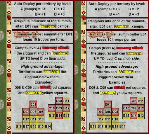
@boberz: The colored text in the legend has two things going on. There is an emboss effect on all the text to go with the stone background. There is also a 1px stroke to make the color readable - i.e. to offset it from the background. I tried a glow, but the stroke seemed to work best in order to reduce it as much as possible after your earlier observation. I think the effect you don't like comes from the combination of those two things, but I'm not sure how to improve it. This might be as good as it gets. Here is a side-by-side comparison of the legend with and without the emboss effect. I would like feedback from a couple different people if possible. I wouldn't be surprised if people prefer that I just eliminate the emboss.
@ManBungalow: The grass is as good as I've been able to make it, but if you have any samples of texture or something I would be happy to improve it.
Re: Ziggurat [11/Apr/2016] v14 (p6)
Posted: Tue Apr 12, 2016 3:16 pm
by CoolC
Definitely no emboss effect. Nice new gold title
Re: Ziggurat [11/Apr/2016] v14 (p6)
Posted: Tue Apr 12, 2016 7:58 pm
by dakky21
I like the map so far, though I'd put some eye-candy on the grass, like roads or buildings, all not important to the map, just eye-candy.
Re: Ziggurat [4/Mar/2016] v14 (p6)
Posted: Thu Apr 21, 2016 7:17 pm
by ManBungalow
jonofperu wrote:@ManBungalow: The grass is as good as I've been able to make it, but if you have any samples of texture or something I would be happy to improve it.
There are loads of websites with royalty-free images available. Here are a few neat textures that might break up the uniformity of the background grass you have:
You'll have to put the layer in just the right place and with just the right layer mode/opacity, but it can look really good.
Also agree with no emboss in the legend.
When you have XML for this we can try it on the beta site!
Re: Ziggurat [11/Apr/2016] v14 (p6)
Posted: Sat Apr 23, 2016 10:41 pm
by jonofperu
Those are some great textures. I'll have to bookmark that site. Let me know which of these looks best:
A
Click image to enlarge.
B
Click image to enlarge.
C
Click image to enlarge.
I like the last one.
Re: Ziggurat [4/Mar/2016] v14 (p6)
Posted: Sun Apr 24, 2016 12:09 pm
by boberz
jonofperu wrote:Here's a new version of the title. Freshened up the grass in the picture a bit (it was rather dead). Created a custom font and gave it a gold texture.
Thoughts?
@boberz: The colored text in the legend has two things going on. There is an emboss effect on all the text to go with the stone background. There is also a 1px stroke to make the color readable - i.e. to offset it from the background. I tried a glow, but the stroke seemed to work best in order to reduce it as much as possible after your earlier observation. I think the effect you don't like comes from the combination of those two things, but I'm not sure how to improve it. This might be as good as it gets. Here is a side-by-side comparison of the legend with and without the emboss effect. I would like feedback from a couple different people if possible. I wouldn't be surprised if people prefer that I just eliminate the emboss.
@ManBungalow: The grass is as good as I've been able to make it, but if you have any samples of texture or something I would be happy to improve it.
I prefer the one on the right so much!
Well done on this, still watching.
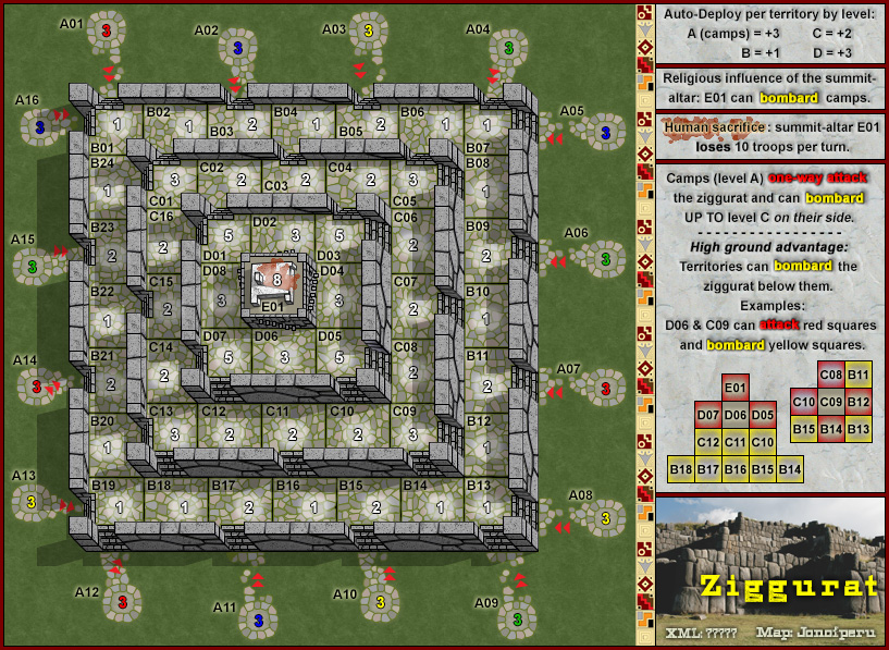
Ziggurat [27/Apr/2016] v14 (p6)
Posted: Wed Apr 27, 2016 8:04 pm
by jonofperu
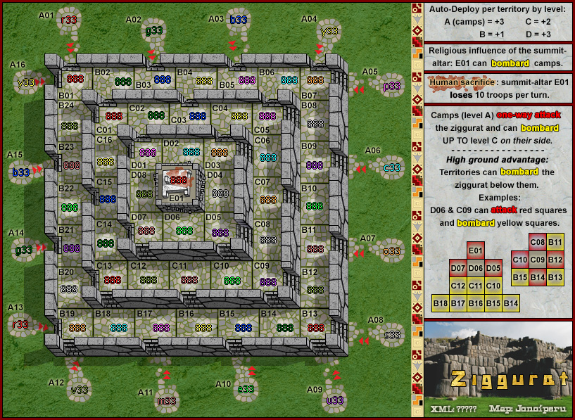
So here's the official version 14 incorporating the changes that have been developing. I'm also beginning to develop the other necessary test images: small map, colorblind, numbers etc. Unfortunately the 888 numbers don't seem to be available in the foundry post on numbers: http://www.conquerclub.com/forum/viewtopic.php?f=648&t=151232. I've created 88s, so maybe I'll just draw 888s. Are the number graphics tests supposed to be based on XML rendering, or do I draw them? What else do I need to provide for graphics stamp?
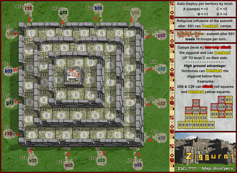
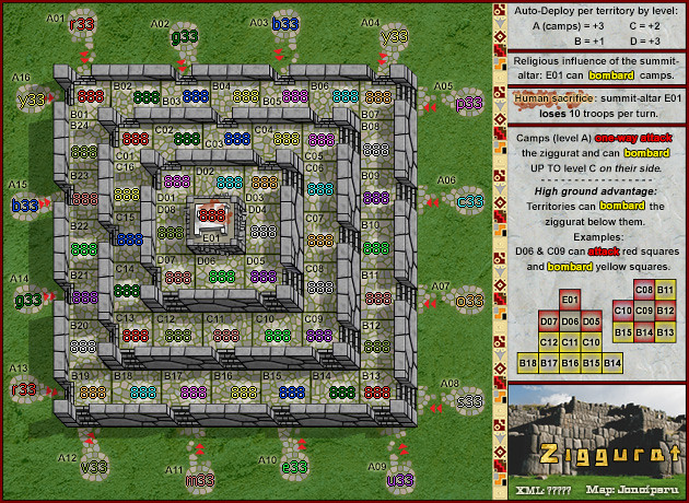
Large Size (817x597) v14 with neutral values and color code lettered starting positions.
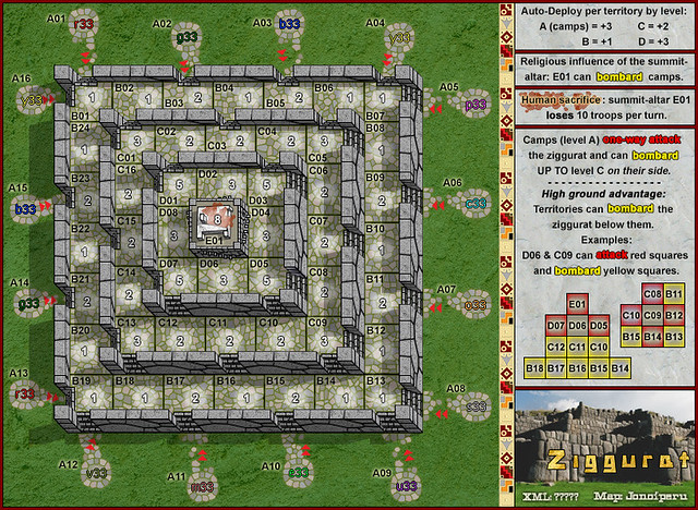
Small Size (630x460) v14 with color code lettered starting positions.
Click image to enlarge.
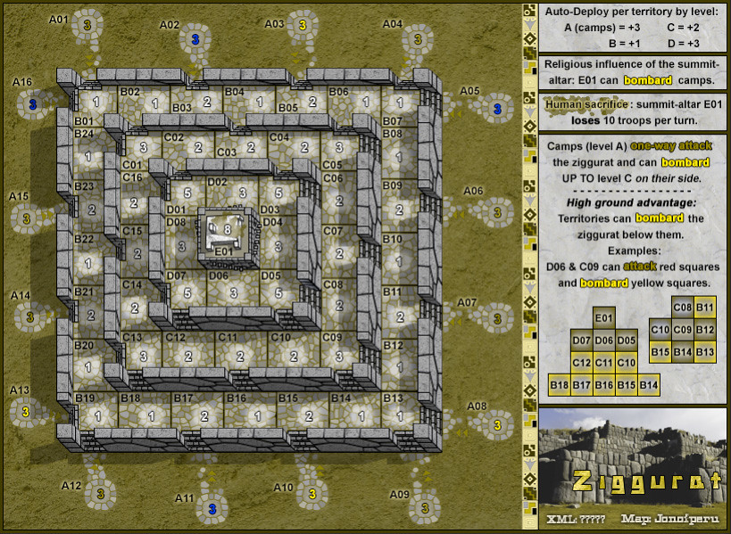
Colorblind - deuteranopia (v14)
Click image to enlarge.
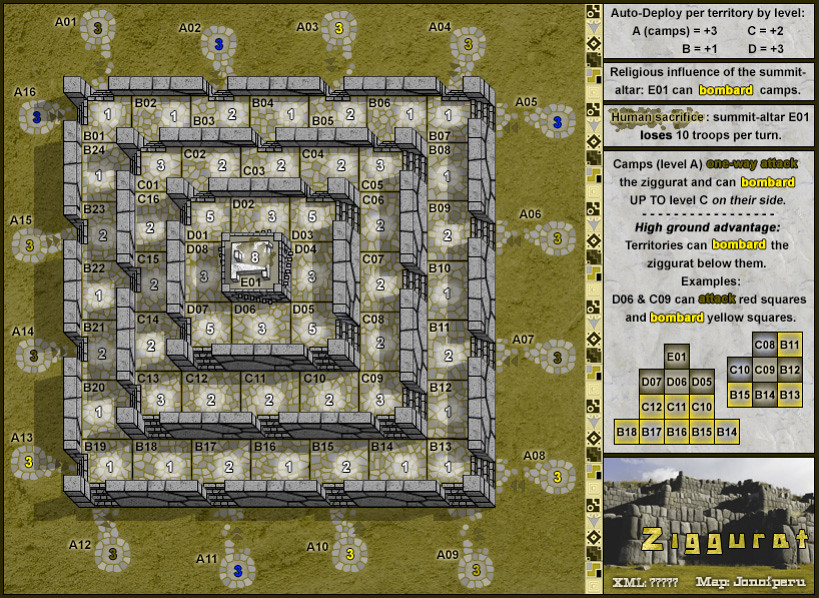
Colorblind - protanopia (v14)
Click image to enlarge.
Re: Ziggurat [SERIOUSLY?!!!] vWTF (pp)
Posted: Sun May 01, 2016 12:12 pm
by owenshooter
let the black jesus take his traditional seat in the foundry to shit all over this map... *cough* *cough*, *clearing his throat*... seriously, it is about time someone put some fucking love and effort into a map!! thank you... this is a wonderful breath of fresh air to a dead portion of the site/forum... love the progress... the black jesus has smiled...-Jésus noir
p.s.-i agree with the grass needing some punch... and i know you are working on it, so i'll zip it... maybe some sprinkles?!!
Re: Ziggurat [4/May/2016] v14 (p6)
Posted: Wed May 04, 2016 12:46 pm
by jonofperu
Updated the original post with a complete set of blank, nuetral values, 888s & colorblind maps.
I don't like that red arrows. It's pretty much self explanatory what goes where so I think they're useless and they don't follow the map design. Put them in yellow and some outside yellow glow and they might work. Also, be consistent so they are all on the right of the "track" (or left, but make sure all are on the same side)...
Re: Ziggurat [4/May/2016] v14 (p6)
Posted: Thu May 12, 2016 8:13 am
by jonofperu
I'll take a look at the arrows, but they are necessary as they indicate one-way attacks.
Re: Ziggurat [4/May/2016] v14 (p6)
Posted: Thu May 12, 2016 7:46 pm
by Dukasaur
jonofperu wrote:I'll take a look at the arrows, but they are necessary as they indicate one-way attacks.
Maybe the red arrows could be made out of the same cobblestone as the walkway itself. You know, like stones of pink granite among the shale.