Or if you have any suggestion on how to make the ocean better let us know. We both dont really like light colored oceans tho...
1st Ocean:

2nd Ocean:
Moderator: Cartographers
![]() by Hoff on Tue May 02, 2006 5:47 pm
by Hoff on Tue May 02, 2006 5:47 pm


![]() by kingwaffles on Tue May 02, 2006 5:53 pm
by kingwaffles on Tue May 02, 2006 5:53 pm


![]() by freakshow on Tue May 02, 2006 6:01 pm
by freakshow on Tue May 02, 2006 6:01 pm

![]() by kingwaffles on Tue May 02, 2006 6:21 pm
by kingwaffles on Tue May 02, 2006 6:21 pm
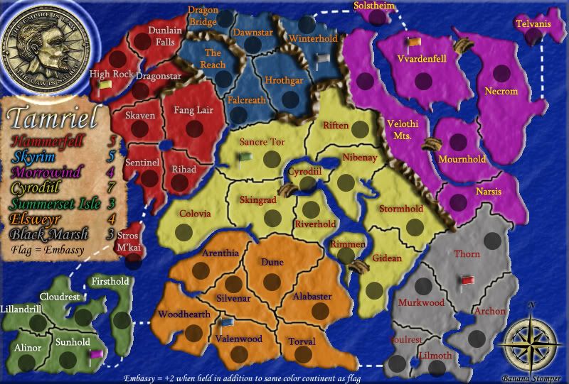
![]() by Banana Stomper on Tue May 02, 2006 6:23 pm
by Banana Stomper on Tue May 02, 2006 6:23 pm
![]() by rocksolid on Wed May 03, 2006 12:37 am
by rocksolid on Wed May 03, 2006 12:37 am


![]() by UTGreen on Wed May 03, 2006 1:19 pm
by UTGreen on Wed May 03, 2006 1:19 pm
![]() by thegrimsleeper on Wed May 03, 2006 2:16 pm
by thegrimsleeper on Wed May 03, 2006 2:16 pm
Return to Melting Pot: Map Ideas
Users browsing this forum: No registered users
|
|||||||
| Conquer Club is not associated with RISK online in any way. Copyright © 2006-2025 by Big Wham LLC | |||||||