Im sorry, but I do not understand. When I upload to photobucket, I am not uploading my work file. Only a copy in jpeg. Then I make a quick run through in their editing room, to quickly and easily, make a tweak or 2. Do not misunderstand me, I only know, what I do know, from experimenting. I am quit sure that I do not do things by the book, as I have never read it. lol.MrBenn wrote:porkenbeans wrote:What exactly do you mean by, be wary ? and why.
If you're exporting a file (as a jpg, for example), then your layers will be flattened and lost. If you want to make additional changes to anything, then you'll have to remember to repeat the process again, as well as remembering exactly what alterations you made.
If you can make the amendments in your working file, then alterations to brightness, contrast, (anything you can add in as an "adjustment layer") is entirely reversible and repeatable.
Japan - 日本 - Quenched
Moderator: Cartographers
Re: Japan - 日本 [D, Gp] V5.7- Graphical Dis. {Updated}8-29 pg13
![]() by porkenbeans on Mon Aug 31, 2009 6:27 pm
by porkenbeans on Mon Aug 31, 2009 6:27 pm

-

 porkenbeans
- Posts: 2546
- Joined: Mon Sep 10, 2007 4:06 pm


Re: Japan - 日本 [D, Gp] V5.7- Graphical Dis. {Updated}8-29 pg13
![]() by RedBaron0 on Mon Aug 31, 2009 10:11 pm
by RedBaron0 on Mon Aug 31, 2009 10:11 pm
MrBenn wrote:I'd be wary about exporting an image to photobucket in order to make amendments to things - you'd be much better off sticking to whatever functionality is in your graphics software (be that GIMP, Photoshop, or whatever).
From here, I would suggest focusing development on your large image, and leaving the small one for a while (other than occasional checks for legibility etc). A large map scales down a lot better than a small one scales up - which is why your large image looks so blurry right now.
The land textures don't really do much for me at the moment - primarily because you've got a slight stylistic mish-mash going on... ie The map (textures and colours) doesn't blend well with the background - it doesn't look like they go together. I think you need to get some inspiration to direct your graphical vision - once you have in your mind what you hope to achieve, you'll find it easier to get there
In the meantime, you can do some work on your borders - I think the map would work better with an outline! RjBeals gave me some good advice - the premise of which is very transferable: viewtopic.php?f=127&t=73566&start=15#p1770213
Keep up the good work
It's probably safe to say that it is easier to start with the large image and then work your way back... Oh well. I pretty much I've been just enlarging the small image then putting the circles back on the map at their correct size. I guess it might be best to just enlarge the basics of the map itself sans text, borders, etc. Then re-add stuff layer by layer and then redraw borders and rewrite text.
The stroke I can redraw, it got thicker and larger after being originally stretched to use more of the available space.
The underlying texture is sand grains, I can look to do something different... and the colors definitely need some work.
Some things about GIMP are starting to get to me... I may have to break down and get Photoshop.


-

RedBaron0
- Posts: 2657
- Joined: Sun Aug 19, 2007 12:59 pm
- Location: Pennsylvania


Re: Japan - 日本 [D, Gp] V5.7- Graphical Dis. {Updated}8-29 pg13
![]() by porkenbeans on Tue Sep 01, 2009 12:29 am
by porkenbeans on Tue Sep 01, 2009 12:29 am
I have seen this same issue raised in other threads. I may not know a lot about graphic arts, but I do know this.
Always, always, always start with the large version. It can be scaled down without loosing detail. If you go the other way, you will indeed loose detail. There are No ifs, ands, or buts about it. The program has a much easier task, when it comes to subtracting pixels than it does adding them.
Always, always, always start with the large version. It can be scaled down without loosing detail. If you go the other way, you will indeed loose detail. There are No ifs, ands, or buts about it. The program has a much easier task, when it comes to subtracting pixels than it does adding them.
-
porkenbeans
- Posts: 2546
- Joined: Mon Sep 10, 2007 4:06 pm
Re: Japan - 日本 [D, Gp] V5.5- Graphical Dis. {Updated}8-28 pg13
![]() by lt_oddball on Wed Sep 02, 2009 5:09 am
by lt_oddball on Wed Sep 02, 2009 5:09 am
RedBaron0 wrote:Version 5.5
Small - 601x600
- Click image to enlarge.
Large - 800x799
- Click image to enlarge.
I've once again revamped the colors of the bonus territories.
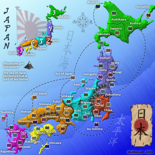
terrible colours !!
please revert to the version before this!
A colourblind person can deduct the bonusborders from the small bonus japan insert if he has troubles between the greyscales !!
No need to hurt the eyes of billions of non colourblind people !!
Barbarus hic ego sum, quia non intellegor ulli.
-

lt_oddball
- Posts: 364
- Joined: Mon Mar 05, 2007 11:17 am
- Location: Fortress Europe


Re: Japan - 日本 [D, Gp] V5.7- Graphical Dis. {Updated}8-29 pg13
![]() by captainwalrus on Thu Sep 03, 2009 9:07 am
by captainwalrus on Thu Sep 03, 2009 9:07 am
The large map looks oddly blurry. Maybe it is just my eyes, but the small one looks nice, clean and sharp, but then the large one just looks fuzzy a bit. Did you start with the small version and just enlarge it to make the bigger one?
Also, I agree that the old colors were better.
Also, I agree that the old colors were better.
~ CaptainWalrus
-
captainwalrus
- Posts: 1018
- Joined: Sun Nov 11, 2007 3:19 pm
- Location: Finnmark


Re: Japan - 日本 [D, Gp] V5.7- Graphical Dis. {Updated}8-29 pg13
![]() by porkenbeans on Thu Sep 03, 2009 12:46 pm
by porkenbeans on Thu Sep 03, 2009 12:46 pm
I like it much better without the stroke, but to be able to pull it off, you really need to address the contrast issue that I spoke of before. You need to either make the water light or dark. When I say light or dark, I mean almost white or almost black. You can experiment around to see which one you like the best. But, you really need to pick one or the other, or else go back to that ugly black stroke.
Also, It is very important that you just forget about the small version for now, and get the large map up and running. Once the large map is worked out, then you can work on scaling it down for the small version. This just will NOT work the other way around, and you will be wasting a shitload of your time.
Also, It is very important that you just forget about the small version for now, and get the large map up and running. Once the large map is worked out, then you can work on scaling it down for the small version. This just will NOT work the other way around, and you will be wasting a shitload of your time.
-
porkenbeans
- Posts: 2546
- Joined: Mon Sep 10, 2007 4:06 pm
Re: Japan - 日本 [D, Gp] V5.7- Graphical Dis. {Updated}8-29 pg13
![]() by RedBaron0 on Thu Sep 03, 2009 3:44 pm
by RedBaron0 on Thu Sep 03, 2009 3:44 pm
I'm working on the maps, just to let all those wondering know. I am at this point and I'm gonna have to live with it for the most part. Next map I'll start with the big map and save myself some grief. I've mostly redone much of the small map, that was my canvas the whole time and I'm stubborn. I'm in a good place with just a couple of things to finish up. I will then repeat the process on the large map, not just enlarge it. Hopefully this will create an even better clarity since I'm almost working on 2 maps, instead of 1.
Yeah I know I'll end up doing 2 times the work know, but in the end it's starting to look like it'll be worth it. Couple more day at the most, then prepare to quench.


Yeah I know I'll end up doing 2 times the work know, but in the end it's starting to look like it'll be worth it. Couple more day at the most, then prepare to quench.
-
RedBaron0
- Posts: 2657
- Joined: Sun Aug 19, 2007 12:59 pm
- Location: Pennsylvania
Re: Japan - 日本 [D, Gp] V5.7- Graphical Dis. {Updated}8-29 pg13
![]() by porkenbeans on Thu Sep 03, 2009 4:13 pm
by porkenbeans on Thu Sep 03, 2009 4:13 pm
-
porkenbeans
- Posts: 2546
- Joined: Mon Sep 10, 2007 4:06 pm
Re: Japan - 日本 [D, Gp] V5.7- Graphical Dis. {Updated}8-29 pg13
![]() by RedBaron0 on Thu Sep 03, 2009 9:50 pm
by RedBaron0 on Thu Sep 03, 2009 9:50 pm
aye laddie, aye.
-
RedBaron0
- Posts: 2657
- Joined: Sun Aug 19, 2007 12:59 pm
- Location: Pennsylvania
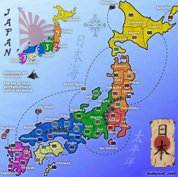
Re: Japan - 日本 [D, Gp] V6.0- Graphical Dis. {Updated 9-4} pg14
![]() by RedBaron0 on Fri Sep 04, 2009 3:57 pm
by RedBaron0 on Fri Sep 04, 2009 3:57 pm
Version 6.0
Small - 601x600
Large - 800x799
Here it is kids the latest update:
The colors have been changed again, the colors are more... primary, less blinding.
The background has several changes, the wave design is gone for a different wavish ocean texture which in conjunction with a bit more lighting of the background as a whole has given the map more contrast from land to sea.
The country outline has returned drawn using GIMP's ink tool which gives a much smother look than the old version.
The minimap outline has been redrawn using the same technique
The old sand grain land texture is gone, replaced by kanji text that has been given a "Xach" effect, one of GIMP's filters. With the opacity dropped pretty low give the land its unique texture design. Each region has its own text which is a translation of the region's name. All of these translations have been added to the translation section on the first page.
Renamed "Hokuriku" - Chubu, which actually more accurately names the region.
The big version should now appear much clearer since it was not blown up from the original. 90% of the layers were redone completely.
I may still have to think about some sort of edge enhancement for the colored regions, but otherwise, I think I've almost got this. Of course my opinion is biased...
Small - 601x600
- Click image to enlarge.
Large - 800x799
- Click image to enlarge.
Here it is kids the latest update:
The colors have been changed again, the colors are more... primary, less blinding.
The background has several changes, the wave design is gone for a different wavish ocean texture which in conjunction with a bit more lighting of the background as a whole has given the map more contrast from land to sea.
The country outline has returned drawn using GIMP's ink tool which gives a much smother look than the old version.
The minimap outline has been redrawn using the same technique
The old sand grain land texture is gone, replaced by kanji text that has been given a "Xach" effect, one of GIMP's filters. With the opacity dropped pretty low give the land its unique texture design. Each region has its own text which is a translation of the region's name. All of these translations have been added to the translation section on the first page.
Renamed "Hokuriku" - Chubu, which actually more accurately names the region.
The big version should now appear much clearer since it was not blown up from the original. 90% of the layers were redone completely.
I may still have to think about some sort of edge enhancement for the colored regions, but otherwise, I think I've almost got this. Of course my opinion is biased...
-
RedBaron0
- Posts: 2657
- Joined: Sun Aug 19, 2007 12:59 pm
- Location: Pennsylvania
Re: Japan - 日本 [D, Gp] V6.0- Graphical Dis. {Updated 9-4} pg14
![]() by porkenbeans on Fri Sep 04, 2009 5:13 pm
by porkenbeans on Fri Sep 04, 2009 5:13 pm
Sweet, 
Yes the black outline is helping greatly, although I think that it would be better if it was thinner, as it is on the inset. The colors and textures are looking very, very nice. The map is much more kind on the eyes, and is much more legible. This map has gone from "zero" to "hero" in a very short amount of time. Keep up the good work friend.
Something to think about, With the addition of the Japanese text/texture, combined with the Japanese text/banner, I think that the Japanese text in the ocean is maybe a little too much. Maybe you could just loose the water text.
-
porkenbeans
- Posts: 2546
- Joined: Mon Sep 10, 2007 4:06 pm
Re: Japan - 日本 [D, Gp] V6.0- Graphical Dis. {Updated 9-4} pg14
![]() by keiths31 on Fri Sep 04, 2009 6:21 pm
by keiths31 on Fri Sep 04, 2009 6:21 pm
Mao looks awseome Red!
My only comment is...why do I not see the Japanese letter? I only see a box with numbers inside them? I am sure this is an easy answer and I will look foolish for asking...but alas I do not know.
My only comment is...why do I not see the Japanese letter? I only see a box with numbers inside them? I am sure this is an easy answer and I will look foolish for asking...but alas I do not know.
-

keiths31
- Posts: 2202
- Joined: Fri Jan 26, 2007 6:41 pm
- Location: Thunder Bay, Ontario


Re: Japan - 日本 [D, Gp] V6.0- Graphical Dis. {Updated 9-4} pg14
![]() by RedBaron0 on Fri Sep 04, 2009 10:14 pm
by RedBaron0 on Fri Sep 04, 2009 10:14 pm
porkenbeans wrote:Sweet,
Yes the black outline is helping greatly, although I think that it would be better if it was thinner, as it is on the inset. The colors and textures are looking very, very nice. The map is much more kind on the eyes, and is much more legible. This map has gone from "zero" to "hero" in a very short amount of time. Keep up the good work friend.
Something to think about, With the addition of the Japanese text/texture, combined with the Japanese text/banner, I think that the Japanese text in the ocean is maybe a little too much. Maybe you could just loose the water text.
I can probably go a little bit thinner on the outline. I just want to make sure it is at least a little bit thinker than the territory boundaries. Do you think I should lose it the text altogether, or re-add in English, "Sea of Japan" and "Pacific Ocean" if anything just Pacific Ocean since there is a territory on the Sea of Japan, named... "Sea of Japan"
keiths31 wrote:Mao looks awseome Red!
My only comment is...why do I not see the Japanese letter? I only see a box with numbers inside them? I am sure this is an easy answer and I will look foolish for asking...but alas I do not know.
I'm not sure what your asking keiths... do you mean the translations on the bottom of my first post in a spoiler?
-
RedBaron0
- Posts: 2657
- Joined: Sun Aug 19, 2007 12:59 pm
- Location: Pennsylvania
Re: Japan - 日本 [D, Gp] V6.0- Graphical Dis. {Updated 9-4} pg14
![]() by porkenbeans on Fri Sep 04, 2009 11:58 pm
by porkenbeans on Fri Sep 04, 2009 11:58 pm
Oh, I did not know they were names. lol. I thought it was just decoration.
It might look better if you nixed them altogether. The empty space could be a plus, if you know what I mean.
It might look better if you nixed them altogether. The empty space could be a plus, if you know what I mean.
-
porkenbeans
- Posts: 2546
- Joined: Mon Sep 10, 2007 4:06 pm
Re: Japan - 日本 [D, Gp] V6.0- Graphical Dis. {Updated 9-4} pg14
![]() by ender516 on Sat Sep 05, 2009 12:17 am
by ender516 on Sat Sep 05, 2009 12:17 am
keiths31 wrote:Mao looks awseome Red!
My only comment is...why do I not see the Japanese letter? I only see a box with numbers inside them? I am sure this is an easy answer and I will look foolish for asking...but alas I do not know.
I suspect your system needs some Japanese fonts or other international support software installed. Without them, you see boxes with Unicode values.
-

ender516
- Posts: 4455
- Joined: Wed Dec 17, 2008 6:07 pm
- Location: Waterloo, Ontario


Re: Japan - 日本 [D, Gp] V6.0- Graphical Dis. {Updated 9-4} pg14
![]() by 00iCon on Sat Sep 05, 2009 4:04 am
by 00iCon on Sat Sep 05, 2009 4:04 am
Just  . I think you've finally cracked it.
-
00iCon
- Posts: 257
- Joined: Wed Apr 29, 2009 4:42 am
- Location: Sydney NSW


Re: Japan - 日本 [D, Gp] V6.0- Graphical Dis. {Updated 9-4} pg14
![]() by keiths31 on Sat Sep 05, 2009 9:36 am
by keiths31 on Sat Sep 05, 2009 9:36 am
ender516 wrote:keiths31 wrote:Mao looks awseome Red!
My only comment is...why do I not see the Japanese letter? I only see a box with numbers inside them? I am sure this is an easy answer and I will look foolish for asking...but alas I do not know.
I suspect your system needs some Japanese fonts or other international support software installed. Without them, you see boxes with Unicode values.
And...how do I do that?
-
keiths31
- Posts: 2202
- Joined: Fri Jan 26, 2007 6:41 pm
- Location: Thunder Bay, Ontario
Re: Japan - 日本 [D, Gp] V6.0- Graphical Dis. {Updated 9-4} pg14
![]() by Industrial Helix on Sat Sep 05, 2009 2:03 pm
by Industrial Helix on Sat Sep 05, 2009 2:03 pm
Hate to be a further pain, but you might want to alter the graphics of the mountains to fit the new texture style of the map. Before it was grainy mountains with grainy land... now there's kind of a clash. The paper icon to the lower right might need some touching up as well... I think its suffering from the transition to a larger scale.
Keep it up!
Sketchblog [Update 07/25/11]: http://indyhelixsketch.blogspot.com/
Living in Japan [Update 07/17/11]: http://mirrorcountryih.blogspot.com/
Russian Revolution map for ConquerClub [07/20/11]: viewtopic.php?f=241&t=116575
Living in Japan [Update 07/17/11]: http://mirrorcountryih.blogspot.com/
Russian Revolution map for ConquerClub [07/20/11]: viewtopic.php?f=241&t=116575
-

Industrial Helix
- Posts: 3462
- Joined: Mon Jul 14, 2008 6:49 pm
- Location: Ohio


Re: Japan - 日本 [D, Gp] V6.0- Graphical Dis. {Updated 9-4} pg14
![]() by captainwalrus on Sat Sep 05, 2009 7:00 pm
by captainwalrus on Sat Sep 05, 2009 7:00 pm
Nice! It is much clearer. One thing that has not really been changed around and I think is worth messing with is the font. A different font can really spice up a map and make it more unique. Currently the map is fairly boring and plain. Although the rest of the map is fairly plain, it is deffiently not boring. Perhaps try to find more of an Asian font or something that fits more with this map.
~ CaptainWalrus
-
captainwalrus
- Posts: 1018
- Joined: Sun Nov 11, 2007 3:19 pm
- Location: Finnmark
Re: Japan - 日本 [D, Gp] V6.0- Graphical Dis. {Updated 9-4} pg14
![]() by RedBaron0 on Sat Sep 05, 2009 10:58 pm
by RedBaron0 on Sat Sep 05, 2009 10:58 pm
captainwalrus wrote:Nice! It is much clearer. One thing that has not really been changed around and I think is worth messing with is the font. A different font can really spice up a map and make it more unique. Currently the map is fairly boring and plain. Although the rest of the map is fairly plain, it is deffiently not boring. Perhaps try to find more of an Asian font or something that fits more with this map.
I was hoping to do that at first, but the plainness, and more importantly, the readability of the font was the main reason I chose it. I'll look into some different fonts (I got a whole pack of Asian fonts that I haven't really used) and see if I can't find a middle ground.
Industrial Helix wrote::shock: Wow. That looks awesome! I'm really digging the texture change you made to this map, the Japanese character names are also really quite cool. Subtle, but enough to give it some life and character.
Hate to be a further pain, but you might want to alter the graphics of the mountains to fit the new texture style of the map. Before it was grainy mountains with grainy land... now there's kind of a clash. The paper icon to the lower right might need some touching up as well... I think its suffering from the transition to a larger scale.
Keep it up!
That's kinda funny since the only section of the map I left the sand grain texture behind was behind the mountains, easy fix there. The paper was one of the few layers I didn't redo... was hoping to slide it by, oh well.
keiths.... you'll need to look at your browser's help files, and/or you OS to add the support. The files are probably hiding on a operational disk somewhere...
-
RedBaron0
- Posts: 2657
- Joined: Sun Aug 19, 2007 12:59 pm
- Location: Pennsylvania
Re: Japan - 日本 [D, Gp] V6.0- Graphical Dis. {Updated 9-4} pg14
![]() by ender516 on Sat Sep 05, 2009 10:59 pm
by ender516 on Sat Sep 05, 2009 10:59 pm
captainwalrus wrote:Nice! It is much clearer. One thing that has not really been changed around and I think is worth messing with is the font. A different font can really spice up a map and make it more unique. Currently the map is fairly boring and plain. Although the rest of the map is fairly plain, it is deffiently not boring. Perhaps try to find more of an Asian font or something that fits more with this map.
A different font can be fun, so feel free to experiment, Red, but please, don't sacrifice clarity for artistic flair.
-
ender516
- Posts: 4455
- Joined: Wed Dec 17, 2008 6:07 pm
- Location: Waterloo, Ontario
Re: Japan - 日本 [D] - Gameplay Discussion - UPDATED 8-23 pg12
![]() by lt_oddball on Mon Sep 07, 2009 7:11 am
by lt_oddball on Mon Sep 07, 2009 7:11 am
Only about colours and blue sea background:
Honestly guys;
This:
most definitely looks better (with perhaps some small(!) colourblind adjustments) than this
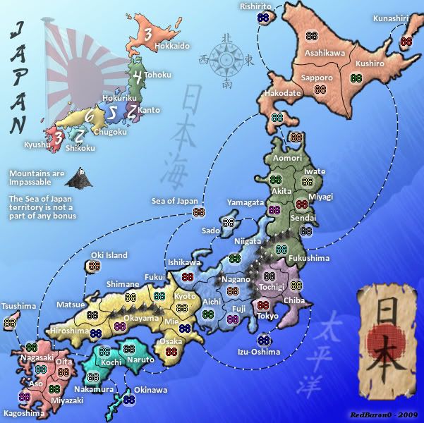
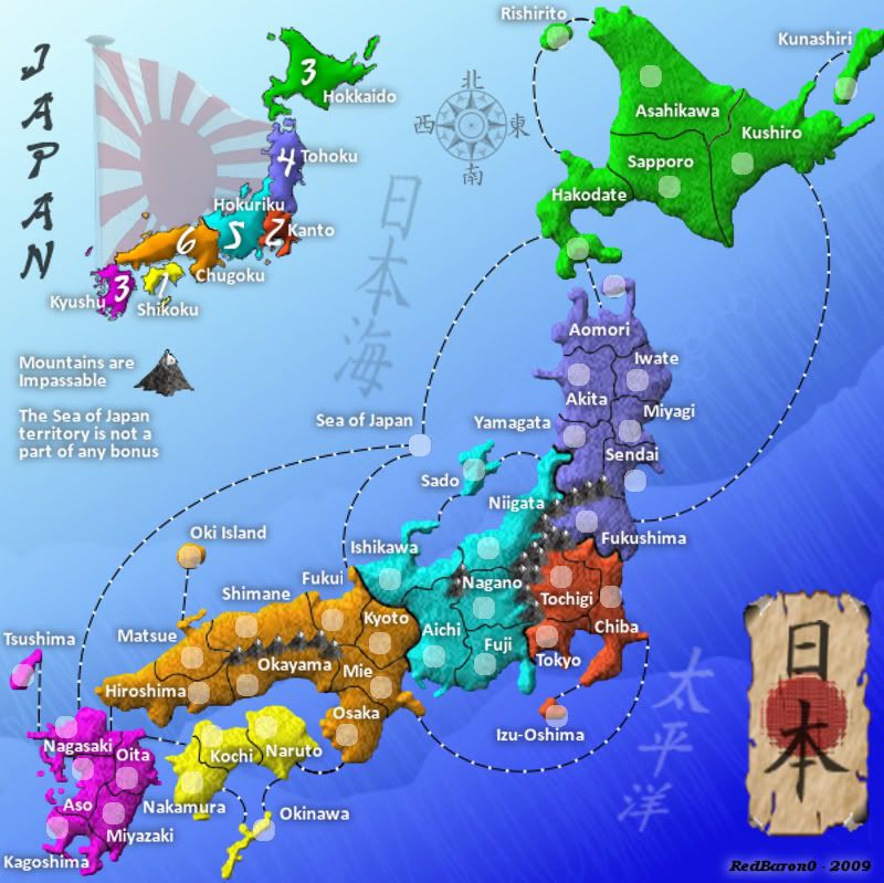
the first has a kind of a more realistic earthy pastelcolouring (like painted sand) with a stunning deep blue ocean azur with japanese style wave (why did it disappear ?).
the second is a japanese techno pokemon colour scheme.
(the one before had something like a poisonous sea creature idea over it... )
)
Maybe you could make a voting on the colourschemes ?
Anyway, the most important thing the gameplay, bonusses, concept is good. So I won't be unhappy with other colours.
Honestly guys;
This:
RedBaron0 wrote:Newest Image:
- Click image to enlarge.
most definitely looks better (with perhaps some small(!) colourblind adjustments) than this
- Click image to enlarge.
the first has a kind of a more realistic earthy pastelcolouring (like painted sand) with a stunning deep blue ocean azur with japanese style wave (why did it disappear ?).
the second is a japanese techno pokemon colour scheme.
(the one before had something like a poisonous sea creature idea over it...
- Click image to enlarge.
Maybe you could make a voting on the colourschemes ?
Anyway, the most important thing the gameplay, bonusses, concept is good. So I won't be unhappy with other colours.
Barbarus hic ego sum, quia non intellegor ulli.
-
lt_oddball
- Posts: 364
- Joined: Mon Mar 05, 2007 11:17 am
- Location: Fortress Europe
Re: Japan - 日本 [D, Gp] V6.0- Graphical Dis. {Updated 9-4} pg14
![]() by RedBaron0 on Tue Sep 08, 2009 12:45 am
by RedBaron0 on Tue Sep 08, 2009 12:45 am
The third one is out for sure... we all agree that is just blinding. When I was doing the newest version I looked at the version you like oddball and started from there. I said myself, "Okay, you've gotten this far with this, where am I going now?" And I thought the problem I'm having going forward is that little tweaks here and there add up over time and changing those myriad of changes is like polishing a turd. So I stepped back and erased a ton of stuff and started fresh. Going off a trying some different things brought me to this point. This point the new version is clearer and most are digging the changes. I liked the old version, but the sandy version is a little blurry, to go back and try make changes there and get the same clarity I have now is going to be very difficult since I'd have to restart the way I did, and then try and remember the steps I did to get me to the same point. Part of the process, the bevel, is technique that blurs and think that has added to loss of clarity as the map has progressed. I'm finding problems even now as I've been trying to clear up the parchment paper and 日本... in fact I've lost the steps to create the red circle the way I did, and for the life of me I can't figure it out.... but in these panic stricken minutes you try different things, and maybe I've got something better now. (or it's total crap)
One of the big differences between the 2 maps that does concern me a little is that the newer version is flatter than the old version and may have to be addressed.
So for now, if there is a major push by others to go back towards the old color scheme, the new version is the way the map is going to be going forward. I'm close to being done with an update to the big map, and will quickly facilitate the update of the small map. Hopefully the font I've picked is good on the smaller map, I'm already not too hot on it already, I like the look; just 2 of the letters are bothering me. I think I'm out of options font-wise; these Asian font types are just too squiggly or too thin to use on any maps. If this doesn't work, I may just stick with the plain font I have, or try some of the other Western fonts to add some zazz.
-
RedBaron0
- Posts: 2657
- Joined: Sun Aug 19, 2007 12:59 pm
- Location: Pennsylvania
Re: Japan - 日本 [D, Gp] V6.0- Graphical Dis. {Updated 9-4} pg14
![]() by 00iCon on Wed Sep 09, 2009 8:12 am
by 00iCon on Wed Sep 09, 2009 8:12 am
I prefer the new colour scheme to the old one. The sea routes no longer look out of place with their "modern" look. Tehcno pokemon colour scheme for the win!
Desipte that, the new sea looks empty, plain and cliche. The old sea was much better, and probably suits the new colours.
Desipte that, the new sea looks empty, plain and cliche. The old sea was much better, and probably suits the new colours.
-
00iCon
- Posts: 257
- Joined: Wed Apr 29, 2009 4:42 am
- Location: Sydney NSW
Re: Japan - 日本 [D, Gp] V6.0- Graphical Dis. {Updated 9-4} pg14
![]() by lt_oddball on Thu Sep 10, 2009 2:24 am
by lt_oddball on Thu Sep 10, 2009 2:24 am
00iCon wrote:The sea routes no longer look out of place with their "modern" look.
Instead of "led" lights it reminds me of the algae in the pacific that glow in the dark when you make turbulence in the water.
Barbarus hic ego sum, quia non intellegor ulli.
-
lt_oddball
- Posts: 364
- Joined: Mon Mar 05, 2007 11:17 am
- Location: Fortress Europe
Who is online
Users browsing this forum: No registered users
|
|||||||
| Conquer Club is not associated with RISK online in any way. Copyright © 2006-2025 by Big Wham LLC | |||||||