Conquer Club

SteamWorks

Care to peruse completed maps? Take a stroll through the Atlas.

Moderator: Cartographers

Forum rules
Please read the Community Guidelines before posting.

Re: SteamWorks [11 Jul 2011] V15 pg.1&15 - The Island of Dr.

Postby Victor Sullivan on Mon Jul 11, 2011 3:34 pm

TaCktiX wrote:You'll certainly accomplish the "quick and dirty" you're aiming for, but it's not a gameplay I find interesting, nor of the flavor you normally create with a few simple concepts.

It's interesting that you say this, because I got that exact "quick and dirty" feel from AoR 2: Magic when rds and I played a doubles. It lasted all of about a few rounds, and it would've been shorter, too, had I not screwed up a couple times :|

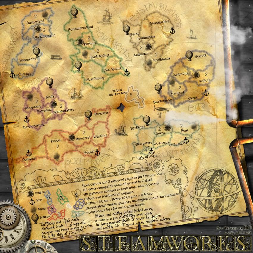
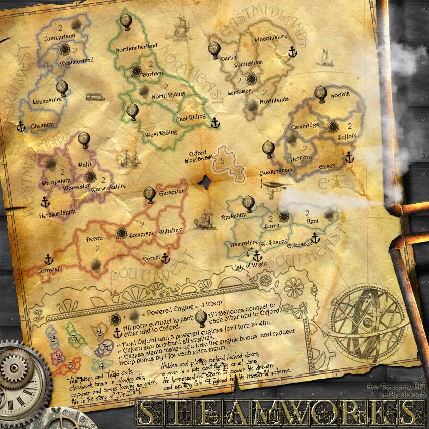
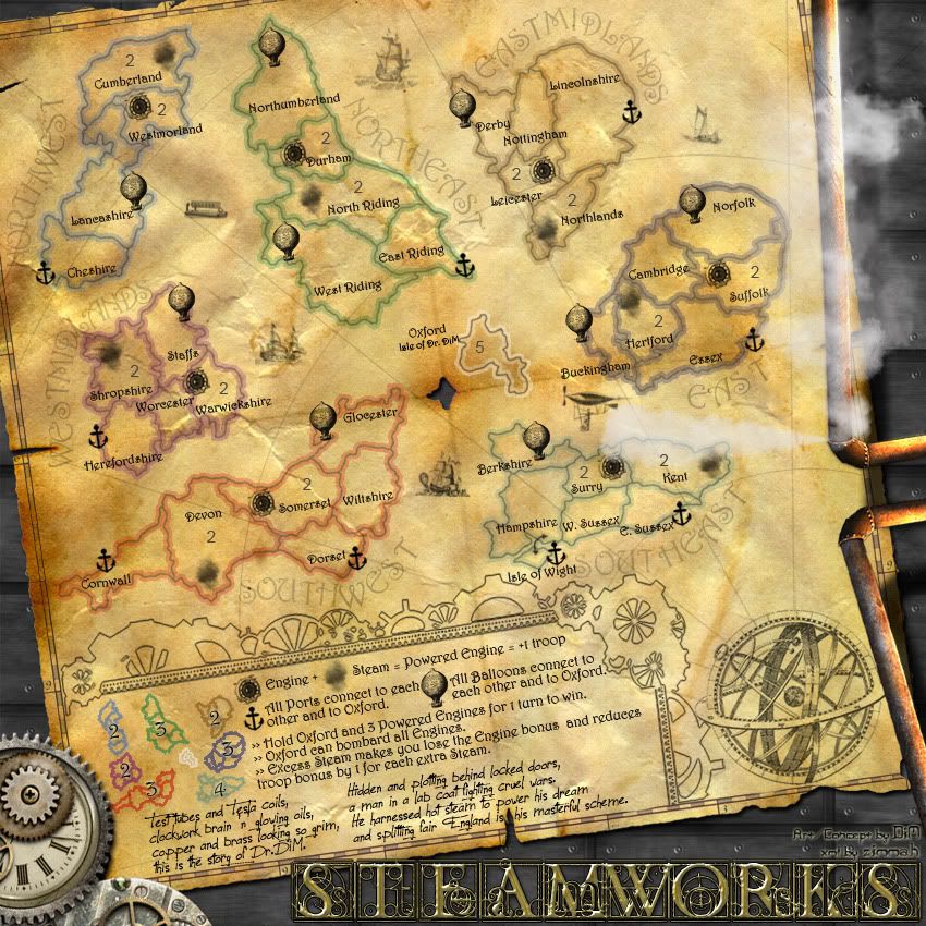
I think you may be looking at this map with the wrong perspective, TaCktiX. It seems you fail to see the beauty in simplicity. A map need not have several different kinds of territories, continents, bombardments, etc. etc. to make it fun. I think this map has a fair amount of gameplay squeezed into the few territories it has, though I'm not going to say there isn't room for improvement... If you have specific ideas, please, say them. I'll think on it as well...

Okay, so some graphics comments from me ol' DiM, in the meantime:
  1. The darker continents look strange; I think I liked them better before.
  2. Replace the decorative balloon near the top of the map with something else. It clashes with the other balloons, and could be cause for confusion.
  3. Get rid of Oxford's white fill in the legend, and increase the opacity a tad on the main map Oxford's border.
  4. In the legend, the continents' colored borders seem to have outlines themselves. I'd suggest getting rid of the outer outline.
  5. Move/Delete the holes in the paper between the T and H in NORTHEAST and the hole that covers up the h in "other" in the legend. The NORTHEAST one just looks weird how it's shaped, and the "other" one needs to be moved/deleted so players can more easily understand the legend text, without having to infer.
-Sully
User avatar
Corporal Victor Sullivan
 
Posts: 6010
Joined: Mon Feb 08, 2010 8:17 pm
Location: Columbus, OH

Re: SteamWorks [11 Jul 2011] V15 pg.1&15 - The Island of Dr.

Postby DiM on Mon Jul 11, 2011 4:13 pm

Victor Sullivan wrote:Okay, so some graphics comments from me ol' DiM, in the meantime:
  1. The darker continents look strange; I think I liked them better before. see bellow
  2. Replace the decorative balloon near the top of the map with something else. It clashes with the other balloons, and could be cause for confusion. fixed
  3. Get rid of Oxford's white fill in the legend, and increase the opacity a tad on the main map Oxford's border. fixed
  4. In the legend, the continents' colored borders seem to have outlines themselves. I'd suggest getting rid of the outer outline. they don't have an outer outline. it's just the continents reduced in size. they are simply brighter than the ones on the map so they could easily be spoted
  5. Move/Delete the holes in the paper between the T and H in NORTHEAST and the hole that covers up the h in "other" in the legend. The NORTHEAST one just looks weird how it's shaped, and the "other" one needs to be moved/deleted so players can more easily understand the legend text, without having to infer. fixed
-Sully


V16:
*to be honest i kinda like the new darker continents so maybe a compromise would work best. so i have lowered the opacity they're now not so dark but still visible.
*replaced the top decorative balloon with another ship
*the oxford in the minimap does not have a white fill. it has a white stroke but the terit is so small that the stroke actually fills it :) i reduced it by 1 px and hopefully it looks better now. if i reduce it more then it will disappear. as for the big oxford i increased the opacity.
*fixed the holes in the paper
*changed bright colours to muted ones.

Click image to enlarge.
image
Last edited by DiM on Mon Jul 11, 2011 7:13 pm, edited 2 times in total.
“In the beginning God said, the four-dimensional divergence of an antisymmetric, second rank tensor equals zero, and there was light, and it was good. And on the seventh day he rested.”- Michio Kaku
User avatar
Major DiM
 
Posts: 10415
Joined: Wed Feb 14, 2007 6:20 pm
Location: making maps for scooby snacks

Re: SteamWorks [11 Jul 2011] V15 pg.1&15 - The Island of Dr.

Postby zimmah on Mon Jul 11, 2011 4:26 pm

i still feel like the neon-like colors (green, yellow, bright purple) are a little bit out of place.

could you try changing them into more 'historical correct' olive green, ochre and dark purple,?
Click image to enlarge.
image
User avatar
Major zimmah
 
Posts: 1652
Joined: Fri Jun 01, 2007 12:43 pm
Location: VDLL

Re: SteamWorks [11 Jul 2011] V15 pg.1&15 - The Island of Dr.

Postby DiM on Mon Jul 11, 2011 4:45 pm

zimmah wrote:i still feel like the neon-like colors (green, yellow, bright purple) are a little bit out of place.

could you try changing them into more 'historical correct' olive green, ochre and dark purple,?


the olive green and dark purple are ok and i've changed them but the ochre is almost identical to the current orange in west-midlands. so i changed the yellow to a muted turquoise.

see v16 in the post above.
“In the beginning God said, the four-dimensional divergence of an antisymmetric, second rank tensor equals zero, and there was light, and it was good. And on the seventh day he rested.”- Michio Kaku
User avatar
Major DiM
 
Posts: 10415
Joined: Wed Feb 14, 2007 6:20 pm
Location: making maps for scooby snacks

Re: SteamWorks [11 Jul 2011] V15 pg.1&15 - The Island of Dr.

Postby zimmah on Mon Jul 11, 2011 4:54 pm

good job, much more realistic this way.
Click image to enlarge.
image
User avatar
Major zimmah
 
Posts: 1652
Joined: Fri Jun 01, 2007 12:43 pm
Location: VDLL

Re: SteamWorks [12 Jul 2011] V16 pg.1&16 - gameplay ready?

Postby DiM on Mon Jul 11, 2011 5:01 pm

it's definitely easier on the eyes and at the same time replacing the yellow made the southeastern continent much more visible on the minimap.

PS: i updated my sig :)
“In the beginning God said, the four-dimensional divergence of an antisymmetric, second rank tensor equals zero, and there was light, and it was good. And on the seventh day he rested.”- Michio Kaku
User avatar
Major DiM
 
Posts: 10415
Joined: Wed Feb 14, 2007 6:20 pm
Location: making maps for scooby snacks

Re: SteamWorks [12 Jul 2011] V16 pg.1&16 - gameplay ready?

Postby gimil on Mon Jul 11, 2011 6:53 pm

The latest shading on the territories is perfect. It is not noticeable but contrasts enough to make the terrs pop out on the paper. Excellent work sir. Perhaps west midlands could use an alternative colour choice. Practically the colour is fine, but aesthetically it sort feel a little washes out making the space feel a little empty.

Maybe you could fiddle with the colour to make it a little more contrasting, or even think of another colour entirely? Maybe.
What do you know about map making, bitch?

natty_dread wrote:I was wrong


Top Score:2403
User avatar
Corporal 1st Class gimil
 
Posts: 8599
Joined: Sat Mar 03, 2007 12:42 pm
Location: United Kingdom (Scotland)

Re: SteamWorks [12 Jul 2011] V16 pg.1&16 - gameplay ready?

Postby DiM on Mon Jul 11, 2011 7:12 pm

gimil wrote:The latest shading on the territories is perfect. It is not noticeable but contrasts enough to make the terrs pop out on the paper. Excellent work sir.


music to my ears :P

gimil wrote:Perhaps west midlands could use an alternative colour choice. Practically the colour is fine, but aesthetically it sort feel a little washes out making the space feel a little empty.

Maybe you could fiddle with the colour to make it a little more contrasting, or even think of another colour entirely? Maybe.


replaces the orange in west midlands with the dark purple from east that zimmah suggested and made east a dark blue with greyish accents.
i hope everything fits better now.

image replaced in v16 post above.

anything about the gameplay? any suggestions? is it ok ?
“In the beginning God said, the four-dimensional divergence of an antisymmetric, second rank tensor equals zero, and there was light, and it was good. And on the seventh day he rested.”- Michio Kaku
User avatar
Major DiM
 
Posts: 10415
Joined: Wed Feb 14, 2007 6:20 pm
Location: making maps for scooby snacks

Re: SteamWorks [12 Jul 2011] V16 pg.1&16 - gameplay ready?

Postby gimil on Mon Jul 11, 2011 7:22 pm

DiM wrote:replaces the orange in west midlands with the dark purple from east that zimmah suggested and made east a dark blue with greyish accents.
i hope everything fits better now.

Perfect.

anything about the gameplay? any suggestions? is it ok ?


Not really, the best I can come up with is circling back round to the legends. Now that I think about it you should incorporate the icons as part of the games play descriptions. Like I did in New Worlds and you did in the Age of realms maps.

I.e. '[port symbol] All ports connect to each other and Oxford.'

This should help people relate the instructions to symbols easier.
What do you know about map making, bitch?

natty_dread wrote:I was wrong


Top Score:2403
User avatar
Corporal 1st Class gimil
 
Posts: 8599
Joined: Sat Mar 03, 2007 12:42 pm
Location: United Kingdom (Scotland)

Re: SteamWorks [12 Jul 2011] V16 pg.1&16 - gameplay ready?

Postby DiM on Mon Jul 11, 2011 7:33 pm

gimil wrote:
anything about the gameplay? any suggestions? is it ok ?


Not really, the best I can come up with is circling back round to the legends. Now that I think about it you should incorporate the icons as part of the games play descriptions. Like I did in New Worlds and you did in the Age of realms maps.

I.e. '[port symbol] All ports connect to each other and Oxford.'

This should help people relate the instructions to symbols easier.


the problem with this is that it would take too much space vertically because the icons are pretty big. if i reduce them then they would look pretty ugly, especially on the small map.
“In the beginning God said, the four-dimensional divergence of an antisymmetric, second rank tensor equals zero, and there was light, and it was good. And on the seventh day he rested.”- Michio Kaku
User avatar
Major DiM
 
Posts: 10415
Joined: Wed Feb 14, 2007 6:20 pm
Location: making maps for scooby snacks

Re: SteamWorks [12 Jul 2011] V16 pg.1&16 - gameplay ready?

Postby gimil on Mon Jul 11, 2011 7:42 pm

DiM wrote:
gimil wrote:
anything about the gameplay? any suggestions? is it ok ?


Not really, the best I can come up with is circling back round to the legends. Now that I think about it you should incorporate the icons as part of the games play descriptions. Like I did in New Worlds and you did in the Age of realms maps.

I.e. '[port symbol] All ports connect to each other and Oxford.'

This should help people relate the instructions to symbols easier.


the problem with this is that it would take too much space vertically because the icons are pretty big. if i reduce them then they would look pretty ugly, especially on the small map.


Your a clever guy, you'll work something out ;).
What do you know about map making, bitch?

natty_dread wrote:I was wrong


Top Score:2403
User avatar
Corporal 1st Class gimil
 
Posts: 8599
Joined: Sat Mar 03, 2007 12:42 pm
Location: United Kingdom (Scotland)

Re: SteamWorks [12 Jul 2011] V16 pg.1&16 - gameplay ready?

Postby DiM on Mon Jul 11, 2011 9:04 pm

i hope this looks good and at the same time help people relate to the symbols better.

Click image to enlarge.
image
“In the beginning God said, the four-dimensional divergence of an antisymmetric, second rank tensor equals zero, and there was light, and it was good. And on the seventh day he rested.”- Michio Kaku
User avatar
Major DiM
 
Posts: 10415
Joined: Wed Feb 14, 2007 6:20 pm
Location: making maps for scooby snacks

Re: SteamWorks [12 Jul 2011] V16 pg.1&16 - gameplay ready?

Postby ender516 on Mon Jul 11, 2011 9:14 pm

That looks very good. In the legend, though, is there room to put the words "Engine" and "Steam" into that first line? That is,

{Engine symbol} Engine + {Steam symbol} Steam = Powered Engine = +1 troop

There is a bit of space at the end of that line, but I cannot tell if it is enough.

Also, capitalizing the key elements makes them more obvious. You have done it with "All Balloons...". I suggest:

"{Port symbol} All Ports connect to each other and to Oxford."

"Hold Oxford and 3 Powered Engines for 1 turn to win."

"Oxford can bombard all Engines."

"Excess Steam makes you lose the Engine bonus and reduces troop bonus by 1 for each extra Steam."

Extra capitalization is also a hallmark of older manuscripts, and would fit the theme well, I think.
User avatar
Sergeant 1st Class ender516
 
Posts: 4455
Joined: Wed Dec 17, 2008 6:07 pm
Location: Waterloo, Ontario

Re: SteamWorks [12 Jul 2011] V16 pg.1&16 - gameplay ready?

Postby DiM on Mon Jul 11, 2011 9:25 pm

ender516 wrote:That looks very good. In the legend, though, is there room to put the words "Engine" and "Steam" into that first line? That is,

{Engine symbol} Engine + {Steam symbol} Steam = Powered Engine = +1 troop

There is a bit of space at the end of that line, but I cannot tell if it is enough.

Also, capitalizing the key elements makes them more obvious. You have done it with "All Balloons...". I suggest:

"{Port symbol} All Ports connect to each other and to Oxford."

"Hold Oxford and 3 Powered Engines for 1 turn to win."

"Oxford can bombard all Engines."

"Excess Steam makes you lose the Engine bonus and reduces troop bonus by 1 for each extra Steam."

Extra capitalization is also a hallmark of older manuscripts, and would fit the theme well, I think.


very good point. everything is changed accordingly:

V16.4
Click image to enlarge.
image
“In the beginning God said, the four-dimensional divergence of an antisymmetric, second rank tensor equals zero, and there was light, and it was good. And on the seventh day he rested.”- Michio Kaku
User avatar
Major DiM
 
Posts: 10415
Joined: Wed Feb 14, 2007 6:20 pm
Location: making maps for scooby snacks

Re: SteamWorks [12 Jul 2011] V16 pg.1&16 - gameplay ready?

Postby Victor Sullivan on Mon Jul 11, 2011 10:35 pm

The color update is good, though I'm perplexed by the flecks of dark orange scattered across East Midlands down past East. It makes it look like someone just ate a whole bag of Cheetos then wiped their fingers on the map...

-Sully
User avatar
Corporal Victor Sullivan
 
Posts: 6010
Joined: Mon Feb 08, 2010 8:17 pm
Location: Columbus, OH

Re: SteamWorks [12 Jul 2011] V16 pg.1&16 - gameplay ready?

Postby DiM on Mon Jul 11, 2011 10:48 pm

Victor Sullivan wrote:The color update is good, though I'm perplexed by the flecks of dark orange scattered across East Midlands down past East. It makes it look like someone just ate a whole bag of Cheetos then wiped their fingers on the map...

-Sully


lol. i guess i could fix those but the beauty of an old paper is that it's not uniform. different parts age in different ways depending on what happened to those areas. even a simple greasy finger can leave a permanent mark, a drop of swat or a tear will dry up without any visible marks but through aging those spots come back to life as darker or brighter, not to mention creases or worn out areas.
if it's really bothering you i can remove them and even out that area but i need to mention i'm not too fond of the idea. 8-[
“In the beginning God said, the four-dimensional divergence of an antisymmetric, second rank tensor equals zero, and there was light, and it was good. And on the seventh day he rested.”- Michio Kaku
User avatar
Major DiM
 
Posts: 10415
Joined: Wed Feb 14, 2007 6:20 pm
Location: making maps for scooby snacks

Re: SteamWorks [12 Jul 2011] V16 pg.1&16 - gameplay ready?

Postby Victor Sullivan on Mon Jul 11, 2011 10:57 pm

Perhaps include a different type of "wear-and-tear" to the map?

-Sully
User avatar
Corporal Victor Sullivan
 
Posts: 6010
Joined: Mon Feb 08, 2010 8:17 pm
Location: Columbus, OH

Re: SteamWorks [12 Jul 2011] V16 pg.1&16 - gameplay ready?

Postby zimmah on Tue Jul 12, 2011 8:36 am

DiM wrote:it's definitely easier on the eyes and at the same time replacing the yellow made the southeastern continent much more visible on the minimap.

PS: i updated my sig :)


lol maiden (did you know im a male?) :lol:
Click image to enlarge.
image
User avatar
Major zimmah
 
Posts: 1652
Joined: Fri Jun 01, 2007 12:43 pm
Location: VDLL

Re: SteamWorks [12 Jul 2011] V16 pg.1&16 - gameplay ready?

Postby zimmah on Tue Jul 12, 2011 8:41 am

DiM wrote:
Victor Sullivan wrote:The color update is good, though I'm perplexed by the flecks of dark orange scattered across East Midlands down past East. It makes it look like someone just ate a whole bag of Cheetos then wiped their fingers on the map...

-Sully


lol. i guess i could fix those but the beauty of an old paper is that it's not uniform. different parts age in different ways depending on what happened to those areas. even a simple greasy finger can leave a permanent mark, a drop of swat or a tear will dry up without any visible marks but through aging those spots come back to life as darker or brighter, not to mention creases or worn out areas.
if it's really bothering you i can remove them and even out that area but i need to mention i'm not too fond of the idea. 8-[


talking about the paper, is it possible to make it look like it has been folded and unfolded several times (like fold lines etc.?) 'm not good with photoshop and don't know f such a thing s possible, but a little 'depth' change of thickness in the paper etc. t might be very hard/impossable or not even look good, but i'm just dropping t as a suggestion, maybe you can try it.

missing a few 'i's here and there. the i key s not working properly.
Click image to enlarge.
image
User avatar
Major zimmah
 
Posts: 1652
Joined: Fri Jun 01, 2007 12:43 pm
Location: VDLL

Re: SteamWorks [12 Jul 2011] V16 pg.1&16 - gameplay ready?

Postby DiM on Tue Jul 12, 2011 9:38 am

Victor Sullivan wrote:Perhaps include a different type of "wear-and-tear" to the map?

-Sully


fixed the "cheetos"

Click image to enlarge.
image
“In the beginning God said, the four-dimensional divergence of an antisymmetric, second rank tensor equals zero, and there was light, and it was good. And on the seventh day he rested.”- Michio Kaku
User avatar
Major DiM
 
Posts: 10415
Joined: Wed Feb 14, 2007 6:20 pm
Location: making maps for scooby snacks

Re: SteamWorks [12 Jul 2011] V16 pg.1&16 - gameplay ready?

Postby DiM on Tue Jul 12, 2011 9:40 am

zimmah wrote:
DiM wrote:
Victor Sullivan wrote:The color update is good, though I'm perplexed by the flecks of dark orange scattered across East Midlands down past East. It makes it look like someone just ate a whole bag of Cheetos then wiped their fingers on the map...

-Sully


lol. i guess i could fix those but the beauty of an old paper is that it's not uniform. different parts age in different ways depending on what happened to those areas. even a simple greasy finger can leave a permanent mark, a drop of swat or a tear will dry up without any visible marks but through aging those spots come back to life as darker or brighter, not to mention creases or worn out areas.
if it's really bothering you i can remove them and even out that area but i need to mention i'm not too fond of the idea. 8-[


talking about the paper, is it possible to make it look like it has been folded and unfolded several times (like fold lines etc.?) 'm not good with photoshop and don't know f such a thing s possible, but a little 'depth' change of thickness in the paper etc. t might be very hard/impossable or not even look good, but i'm just dropping t as a suggestion, maybe you can try it.

missing a few 'i's here and there. the i key s not working properly.


the paper has 2 main folding lines. a vertical and a horizontal one that go through the center. they work together with the center hole to suggest the paper was folded by those lines and so the center (which became a corner) was vulnerable to wear and tear, leading to the hole.
“In the beginning God said, the four-dimensional divergence of an antisymmetric, second rank tensor equals zero, and there was light, and it was good. And on the seventh day he rested.”- Michio Kaku
User avatar
Major DiM
 
Posts: 10415
Joined: Wed Feb 14, 2007 6:20 pm
Location: making maps for scooby snacks

Re: SteamWorks [12 Jul 2011] V16 pg.1&16 - gameplay ready?

Postby DiM on Tue Jul 12, 2011 9:42 am

zimmah wrote:
DiM wrote:it's definitely easier on the eyes and at the same time replacing the yellow made the southeastern continent much more visible on the minimap.

PS: i updated my sig :)


lol maiden (did you know im a male?) :lol:


sorry about that :oops:

somehow i was 100% sure you're a girl. if anybody asked me who are the only girls in the foundry i would have said zimmah and tisha. now i'll have to check tisha too :shock:
changing the sig asap. sorry :(

at first i wanted to write something like: "join DiM and zimmah in a steamy adventure..." but decided not to because it might have some sexual implications as i thought you were a girl. imagine what sort of implications it would have really had with us both being guys :lol:
“In the beginning God said, the four-dimensional divergence of an antisymmetric, second rank tensor equals zero, and there was light, and it was good. And on the seventh day he rested.”- Michio Kaku
User avatar
Major DiM
 
Posts: 10415
Joined: Wed Feb 14, 2007 6:20 pm
Location: making maps for scooby snacks

Re: SteamWorks [12 Jul 2011] V16 pg.1&16 - gameplay ready?

Postby grifftron on Tue Jul 12, 2011 9:59 am

What a beautiful map. The only thing that stuck out to me was the region bonuses in the key area, for some reason i don't like how the colors or should i say the regions are represented color wise in the key... could this change? other then that at the moment it is beautiful.

-griff
Image
User avatar
Major grifftron
SoC Training Adviser
 
Posts: 3280
Joined: Thu Jul 09, 2009 6:11 am

Re: SteamWorks [12 Jul 2011] V16 pg.1&16 - gameplay ready?

Postby zimmah on Tue Jul 12, 2011 10:01 am

DiM wrote:
zimmah wrote:
DiM wrote:it's definitely easier on the eyes and at the same time replacing the yellow made the southeastern continent much more visible on the minimap.

PS: i updated my sig :)


lol maiden (did you know im a male?) :lol:


sorry about that :oops:

somehow i was 100% sure you're a girl. if anybody asked me who are the only girls in the foundry i would have said zimmah and tisha. now i'll have to check tisha too :shock:
changing the sig asap. sorry :(

at first i wanted to write something like: "join DiM and zimmah in a steamy adventure..." but decided not to because it might have some sexual implications as i thought you were a girl. imagine what sort of implications it would have really had with us both being guys :lol:

:lol:
i had an avatar of my ex a few years ago, maybe that's what caused the confusion.
Click image to enlarge.
image
User avatar
Major zimmah
 
Posts: 1652
Joined: Fri Jun 01, 2007 12:43 pm
Location: VDLL

Re: SteamWorks [12 Jul 2011] V16 pg.1&16 - gameplay ready?

Postby natty dread on Tue Jul 12, 2011 10:09 am

DiM wrote: if anybody asked me who are the only girls in the foundry i would have said zimmah and tisha. now i'll have to check tisha too :shock:


Tisha & Shakeycat are the only girls in the Foundry, I think.
Image
User avatar
Sergeant 1st Class natty dread
 
Posts: 12877
Joined: Fri Feb 08, 2008 8:58 pm
Location: just plain fucked

PreviousNext

Return to The Atlas

Who is online

Users browsing this forum: No registered users