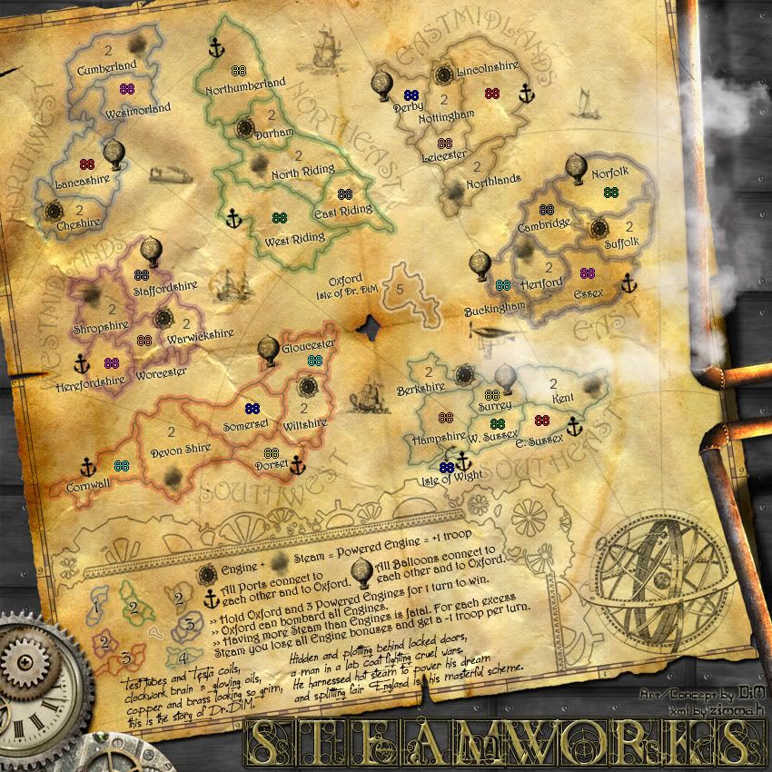
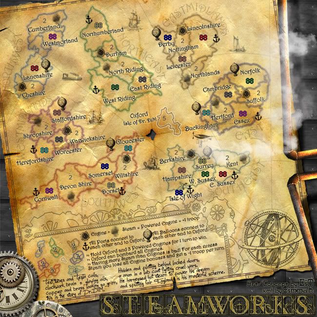
I'd just change the 'All ports connect each...' in the large map, taking that 'each' to the line below, like you did in the small map. Somehow that closeness to the balloon icon seems strange...
SteamWorks
Moderator: Cartographers
Re: SteamWorks [22 Jul 2011] V22 pg.1&23-graphic nitpicking
![]() by Kabanellas on Sun Jul 24, 2011 6:42 pm
by Kabanellas on Sun Jul 24, 2011 6:42 pm
Beautiful Artwork here DIM, and for what I see the game-play seems to flow pretty smoothly. Really liked the 'over-steam' feature 
I'd just change the 'All ports connect each...' in the large map, taking that 'each' to the line below, like you did in the small map. Somehow that closeness to the balloon icon seems strange...
I'd just change the 'All ports connect each...' in the large map, taking that 'each' to the line below, like you did in the small map. Somehow that closeness to the balloon icon seems strange...


-
 Kabanellas
- Posts: 1482
- Joined: Fri Feb 27, 2009 12:21 pm
- Location: Porto, Portugal


Re: SteamWorks [22 Jul 2011] V22 pg.1&23-graphic nitpicking
![]() by DiM on Sun Jul 24, 2011 7:08 pm
by DiM on Sun Jul 24, 2011 7:08 pm
Kabanellas wrote:Beautiful Artwork here DIM, and for what I see the game-play seems to flow pretty smoothly. Really liked the 'over-steam' feature
I'd just change the 'All ports connect each...' in the large map, taking that 'each' to the line below, like you did in the small map. Somehow that closeness to the balloon icon seems strange...
thanks for the appreciation as well as the feedback.
and here is
V23:
*changed Oxford Shire to just Oxford on the small map
*moved apart Derby and Nottingham on both small and large
*moved Surrey a bit to the right on the large map
*changed the "All ports connect each..." on the large map and made it like it is on the small map
Large:
- Click image to enlarge.
Small:
- Click image to enlarge.

“In the beginning God said, the four-dimensional divergence of an antisymmetric, second rank tensor equals zero, and there was light, and it was good. And on the seventh day he rested.”- Michio Kaku
-

DiM
- Posts: 10415
- Joined: Wed Feb 14, 2007 6:20 pm
- Location: making maps for scooby snacks


Re: SteamWorks [22 Jul 2011] V22 pg.1&23-graphic nitpicking
![]() by zimmah on Mon Jul 25, 2011 5:36 pm
by zimmah on Mon Jul 25, 2011 5:36 pm
is the ship east of eastmidlands supposed to be quite a bit smaller then the rest?
on the small map, the name isle of wight overlaps with the continent name, there's room to put the continent name more towards the northeast. (on the large map, it's also true, but much less)
on the small map, the name isle of wight overlaps with the continent name, there's room to put the continent name more towards the northeast. (on the large map, it's also true, but much less)
- Click image to enlarge.

-

zimmah
- Posts: 1652
- Joined: Fri Jun 01, 2007 12:43 pm
- Location: VDLL


Re: SteamWorks [25 Jul 2011] V23 pg.1&24-graphic nitpicking
![]() by DiM on Mon Jul 25, 2011 6:12 pm
by DiM on Mon Jul 25, 2011 6:12 pm
fixed
V23.1:
V23.1:
- Click image to enlarge.

- Click image to enlarge.

“In the beginning God said, the four-dimensional divergence of an antisymmetric, second rank tensor equals zero, and there was light, and it was good. And on the seventh day he rested.”- Michio Kaku
-
DiM
- Posts: 10415
- Joined: Wed Feb 14, 2007 6:20 pm
- Location: making maps for scooby snacks
Re: SteamWorks [25 Jul 2011] V23 pg.1&24-graphic nitpicking
![]() by isaiah40 on Mon Jul 25, 2011 7:02 pm
by isaiah40 on Mon Jul 25, 2011 7:02 pm
Back to the Isle of Wight, I think it would be best if the army number and the port symbol were reversed so that when a player uses the color code the anchor will still be visible
-
isaiah40
- Posts: 3990
- Joined: Mon Aug 27, 2007 7:14 pm


Re: SteamWorks [25 Jul 2011] V23 pg.1&24-graphic nitpicking
![]() by DiM on Mon Jul 25, 2011 8:19 pm
by DiM on Mon Jul 25, 2011 8:19 pm
isaiah40 wrote:Back to the Isle of Wight, I think it would be best if the army number and the port symbol were reversed so that when a player uses the color code the anchor will still be visible
instead of moving around the anchor which would then force the terit name to be moved around which would interfere with the continent name i just moved the army number to the left so there's enough room for the colour code.
V23.2:
- Click image to enlarge.

- Click image to enlarge.

“In the beginning God said, the four-dimensional divergence of an antisymmetric, second rank tensor equals zero, and there was light, and it was good. And on the seventh day he rested.”- Michio Kaku
-
DiM
- Posts: 10415
- Joined: Wed Feb 14, 2007 6:20 pm
- Location: making maps for scooby snacks
Re: SteamWorks [25 Jul 2011] V23 pg.1&24-graphic nitpicking
![]() by isaiah40 on Mon Jul 25, 2011 8:38 pm
by isaiah40 on Mon Jul 25, 2011 8:38 pm
DiM wrote:instead of moving around the anchor which would then force the terit name to be moved around which would interfere with the continent name i just moved the army number to the left so there's enough room for the colour code.
Or that!
-
isaiah40
- Posts: 3990
- Joined: Mon Aug 27, 2007 7:14 pm
Re: SteamWorks [25 Jul 2011] V23 pg.1&24-graphic nitpicking
![]() by DiM on Thu Jul 28, 2011 11:53 am
by DiM on Thu Jul 28, 2011 11:53 am
anything else regarding the graphics?
is this ready to go forward?
is this ready to go forward?
“In the beginning God said, the four-dimensional divergence of an antisymmetric, second rank tensor equals zero, and there was light, and it was good. And on the seventh day he rested.”- Michio Kaku
-
DiM
- Posts: 10415
- Joined: Wed Feb 14, 2007 6:20 pm
- Location: making maps for scooby snacks
Re: SteamWorks [25 Jul 2011] V23 pg.1&24-graphic nitpicking
![]() by zimmah on Thu Jul 28, 2011 1:45 pm
by zimmah on Thu Jul 28, 2011 1:45 pm
DiM wrote:anything else regarding the graphics?
is this ready to go forward?
if you hold 3 steam engines, oxford and 3 steams, then yes.
- Click image to enlarge.
-
zimmah
- Posts: 1652
- Joined: Fri Jun 01, 2007 12:43 pm
- Location: VDLL
Re: SteamWorks [25 Jul 2011] V23 pg.1&24-graphic nitpicking
![]() by DiM on Thu Jul 28, 2011 2:13 pm
by DiM on Thu Jul 28, 2011 2:13 pm
zimmah wrote:DiM wrote:anything else regarding the graphics?
is this ready to go forward?
if you hold 3 steam engines, oxford and 3 steams, then yes.
i do, i do. i just put my fingers on those terits and i still have some fingers left, plus the toes
“In the beginning God said, the four-dimensional divergence of an antisymmetric, second rank tensor equals zero, and there was light, and it was good. And on the seventh day he rested.”- Michio Kaku
-
DiM
- Posts: 10415
- Joined: Wed Feb 14, 2007 6:20 pm
- Location: making maps for scooby snacks
Re: SteamWorks [25 Jul 2011] V23 pg.1&24-graphic nitpicking
![]() by zimmah on Thu Jul 28, 2011 3:55 pm
by zimmah on Thu Jul 28, 2011 3:55 pm
DiM wrote:zimmah wrote:DiM wrote:anything else regarding the graphics?
is this ready to go forward?
if you hold 3 steam engines, oxford and 3 steams, then yes.
i do, i do. i just put my fingers on those terits and i still have some fingers left, plus the toes
i hope you didn't eat cheetos before you did that.
- Click image to enlarge.
-
zimmah
- Posts: 1652
- Joined: Fri Jun 01, 2007 12:43 pm
- Location: VDLL
Re: SteamWorks [25 Jul 2011] V23 pg.1&24-graphic nitpicking
![]() by isaiah40 on Thu Jul 28, 2011 6:30 pm
by isaiah40 on Thu Jul 28, 2011 6:30 pm
DiM wrote:anything else regarding the graphics?
is this ready to go forward?
Patience my son, patience! Just waiting on the other CA's opinions before I drag out the stamp.
-
isaiah40
- Posts: 3990
- Joined: Mon Aug 27, 2007 7:14 pm
Re: SteamWorks [25 Jul 2011] V23 pg.1&24-graphic nitpicking
![]() by DiM on Thu Jul 28, 2011 6:49 pm
by DiM on Thu Jul 28, 2011 6:49 pm
isaiah40 wrote:DiM wrote:anything else regarding the graphics?
is this ready to go forward?
Patience my son, patience! Just waiting on the other CA's opinions before I drag out the stamp.
“In the beginning God said, the four-dimensional divergence of an antisymmetric, second rank tensor equals zero, and there was light, and it was good. And on the seventh day he rested.”- Michio Kaku
-
DiM
- Posts: 10415
- Joined: Wed Feb 14, 2007 6:20 pm
- Location: making maps for scooby snacks
Re: SteamWorks [25 Jul 2011] V23 pg.1&24 - graphics ready?
![]() by The Bison King on Thu Jul 28, 2011 6:59 pm
by The Bison King on Thu Jul 28, 2011 6:59 pm
It all looks good to me. It looks like you've really captured the essence of steam punk. Personally I would of done it with more staggered spacing between the sections, but that's really your choice, and completely legit.

-

The Bison King
- Posts: 1957
- Joined: Thu Aug 27, 2009 5:06 pm
- Location: the Mid-Westeros


Re: SteamWorks [25 Jul 2011] V23 pg.1&24 - graphics ready?
![]() by DiM on Thu Jul 28, 2011 7:12 pm
by DiM on Thu Jul 28, 2011 7:12 pm
The Bison King wrote:It all looks good to me. It looks like you've really captured the essence of steam punk. Personally I would of done it with more staggered spacing between the sections, but that's really your choice, and completely legit.
could you explain what you meant in the bolded and underlined part?
i know what stagger means, i've even looked it up in the dictionary to see if it has meanings i don't know and i still have no idea what you want.
maybe make the space between continents more uneven? or larger?
“In the beginning God said, the four-dimensional divergence of an antisymmetric, second rank tensor equals zero, and there was light, and it was good. And on the seventh day he rested.”- Michio Kaku
-
DiM
- Posts: 10415
- Joined: Wed Feb 14, 2007 6:20 pm
- Location: making maps for scooby snacks
Re: SteamWorks [25 Jul 2011] V23 pg.1&24 - graphics ready?
![]() by Kabanellas on Thu Jul 28, 2011 7:34 pm
by Kabanellas on Thu Jul 28, 2011 7:34 pm
I think this one is ready in my opinion.
Just one small remark: I'm not a big fan of the font you've chose to the text part below the legend (I'm not feeling it mixes well with the other font) but that could be just probably me.
Just one small remark: I'm not a big fan of the font you've chose to the text part below the legend (I'm not feeling it mixes well with the other font) but that could be just probably me.
-
Kabanellas
- Posts: 1482
- Joined: Fri Feb 27, 2009 12:21 pm
- Location: Porto, Portugal
Re: SteamWorks [25 Jul 2011] V23 pg.1&24 - graphics ready?
![]() by isaiah40 on Fri Jul 29, 2011 1:26 pm
by isaiah40 on Fri Jul 29, 2011 1:26 pm
Kabanellas wrote:Just one small remark: I'm not a big fan of the font you've chose to the text part below the legend (I'm not feeling it mixes well with the other font) but that could be just probably me.
What he said. I think you can adjust the kerning a bit to help with the readability of the story. You have some room there to be able to get it done. So, that being said, I'll sticky this thing as long as you get this fixed. You might have to adjust the font size on the small to make it a little more readable.
-
isaiah40
- Posts: 3990
- Joined: Mon Aug 27, 2007 7:14 pm
Re: SteamWorks [25 Jul 2011] V23 pg.1&24 - graphics ready?
![]() by DiM on Fri Jul 29, 2011 2:54 pm
by DiM on Fri Jul 29, 2011 2:54 pm
thanks for the sticky.
V24:
*increased font size for the poem in both small and large versions.
*minor tweaks to army positions
V24:
*increased font size for the poem in both small and large versions.
*minor tweaks to army positions
- Click image to enlarge.

- Click image to enlarge.
“In the beginning God said, the four-dimensional divergence of an antisymmetric, second rank tensor equals zero, and there was light, and it was good. And on the seventh day he rested.”- Michio Kaku
-
DiM
- Posts: 10415
- Joined: Wed Feb 14, 2007 6:20 pm
- Location: making maps for scooby snacks
Re: SteamWorks [29 Jul 2011] V24 pg.1&25 - graphics ready?
![]() by DiM on Mon Aug 01, 2011 10:35 pm
by DiM on Mon Aug 01, 2011 10:35 pm
“In the beginning God said, the four-dimensional divergence of an antisymmetric, second rank tensor equals zero, and there was light, and it was good. And on the seventh day he rested.”- Michio Kaku
-
DiM
- Posts: 10415
- Joined: Wed Feb 14, 2007 6:20 pm
- Location: making maps for scooby snacks
Re: SteamWorks [29 Jul 2011] V24 pg.1&25 - graphics ready?
![]() by Tisha on Mon Aug 01, 2011 10:44 pm
by Tisha on Mon Aug 01, 2011 10:44 pm
can't fix the light source of the pipes?
-

Tisha
- Posts: 1065
- Joined: Sat Dec 23, 2006 12:41 am


Re: SteamWorks [29 Jul 2011] V24 pg.1&25 - graphics ready?
![]() by natty dread on Tue Aug 02, 2011 3:56 am
by natty dread on Tue Aug 02, 2011 3:56 am
Oooh... very good point Tisha. Can't believe I missed that! 
The light on the pipes seems to come from the right, but the drop shadow is cast as if the light was coming from the left... That's something that definitely should be fixed, imo.
The light on the pipes seems to come from the right, but the drop shadow is cast as if the light was coming from the left... That's something that definitely should be fixed, imo.

-

natty dread
- Posts: 12877
- Joined: Fri Feb 08, 2008 8:58 pm
- Location: just plain fucked


Re: SteamWorks [29 Jul 2011] V24 pg.1&25 - graphics ready?
![]() by isaiah40 on Tue Aug 02, 2011 8:07 am
by isaiah40 on Tue Aug 02, 2011 8:07 am
natty_dread wrote:The light on the pipes seems to come from the right, but the drop shadow is cast as if the light was coming from the left... That's something that definitely should be fixed, imo.
Hey I missed that too. But your wrong. The top pipe the light comes from the top right, while the bottom, it comes from the bottom right. With the drop shadow, it is showing that the light comes from the top left.
And here I was going to stamp it, I guess it'll have to wait a little longer!
-
isaiah40
- Posts: 3990
- Joined: Mon Aug 27, 2007 7:14 pm
Re: SteamWorks [29 Jul 2011] V24 pg.1&25 - graphics ready?
![]() by DiM on Tue Aug 02, 2011 8:46 am
by DiM on Tue Aug 02, 2011 8:46 am
isaiah40 wrote:And here I was going to stamp it, I guess it'll have to wait a little longer!
boo
V25:
*shadow now follows the direction of the light.
Large: http://i178.photobucket.com/albums/w250/DiM-topia/SteamWorksL-v25.jpg
- Click image to enlarge.
Small: http://i178.photobucket.com/albums/w250/DiM-topia/SteamWorksS-v25.jpg
- Click image to enlarge.

“In the beginning God said, the four-dimensional divergence of an antisymmetric, second rank tensor equals zero, and there was light, and it was good. And on the seventh day he rested.”- Michio Kaku
-
DiM
- Posts: 10415
- Joined: Wed Feb 14, 2007 6:20 pm
- Location: making maps for scooby snacks
Re: SteamWorks [02 Aug 2011] V25 pg.1&25 - graphics ready?
![]() by natty dread on Tue Aug 02, 2011 9:48 pm
by natty dread on Tue Aug 02, 2011 9:48 pm
Ok but how are those pipes lit from different directions? Looks a bit odd and artificial to me.
Wouldn't they be lit from the same direction, especially since the light seems to come from above at an angle? The lighting should be consistent on them.
Wouldn't they be lit from the same direction, especially since the light seems to come from above at an angle? The lighting should be consistent on them.
-
natty dread
- Posts: 12877
- Joined: Fri Feb 08, 2008 8:58 pm
- Location: just plain fucked
Re: SteamWorks [02 Aug 2011] V25 pg.1&25 - graphics ready?
![]() by ender516 on Tue Aug 02, 2011 10:26 pm
by ender516 on Tue Aug 02, 2011 10:26 pm
I have to agree with natty. The bottom pipe appears to be lit from below somewhat, while the upper is lit from above, and yet, these two light sources don't hit both pipes. Perhaps a good effect could be had with a single light source effectively aligned between the pipes, so that the shadows extend away from the centre (essentially the opposite of what is there now).
-

ender516
- Posts: 4455
- Joined: Wed Dec 17, 2008 6:07 pm
- Location: Waterloo, Ontario


Who is online
Users browsing this forum: No registered users
|
|||||||
| Conquer Club is not associated with RISK online in any way. Copyright © 2006-2025 by Big Wham LLC | |||||||