Moderator: Cartographers
koontz1973 wrote:Seamus, a few things for you.
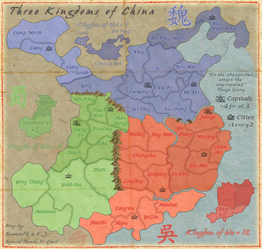
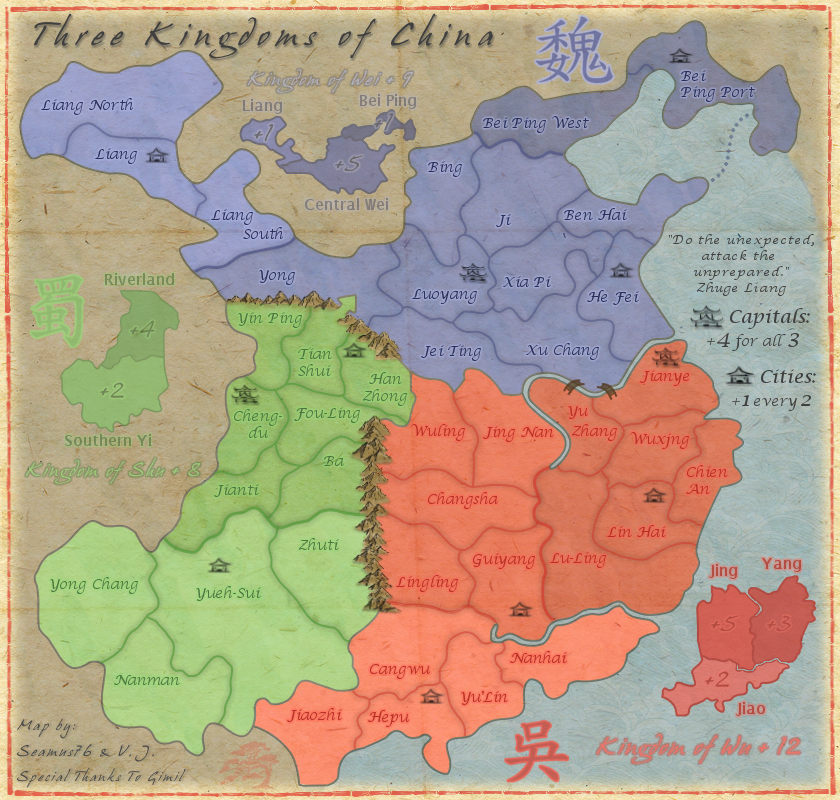
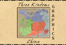
kingdom of Shu mini map is out of scale to the others. Out of all the mini maps Wei is the best. Copy that over to the other two and you have a winner.
One way arrow from Tian Shui to Yong, whilst clear, it will need a simple text put on the map to explain it to all the players that do not get it. Is their a historical reason for this one way attack or is it something Gimil made up? Try to give the text some flavour like the Army from Tain Shui holds the mountain pass stopping all attacks from Yong.
Why the change in font for the bonus regions in the mini map? The title font for each mini map works, give the regions the same effect so they do not jump of the page.
Lastly, try to distress your map a tad. It is looking , make it look .
koontz1973 wrote:Not sure if making the font smaller will help, it is just that is jumps of the map now. Make it smaller, lower the opacity or my best bet would be to make each bit of text the same colour as region it goes to. Getting the names of the mini map itself will allow you to do this. Have a play around and see what looks good to you.
As for distressing it, and this is my point, it looks too bloody nice. A few things for you to try out would be to put a roll effect on it (as if it had been unrolled), a crease in it (either one or two as if it had been folded up, 2 would be best). Last idea for now would be to put a subtle paper effect on it. Spent some time looking and Chinese paper (old ones) seem to have a very rough texture to it.
This one is good to use.
You see what I mean. The paper has all of these rough bits to it and this alone will give you that look.
koontz1973 wrote:Much better Seamus, well done, it has that feel to it now.
I still say to make the 3 legends the same in all aspects. Look at the blue mini map and copy that for the others. You lowered the title opacity (Kingdom of Shu etc), bring this back out.
Me too - because of the map graphics, the crease lines don't really give the illusion of paper folded map. They just look distracting. But I like the texture itself.generalhead wrote:The lines on the map look awkward to me
koontz1973 wrote:Seamus, here is your sticky. Stamping in two days as normal. But before I stamp this, I am going to ask if you want it stamped with the new rules now in place?
With the folds, they will need a lot more work done on them but you can do that as you go though game play and graphics. The lines that I think RJ is talking about and I do kind of agree with him is this, you territ lines and land/sea border are just too curvy. rough them up a bit. Not jagged but I can see every single point you have made. Look at Tian Shui - Han Zhong border. That is a nice line. Get the rest like this. It will mean a complete re do I am afraid but you have time.
by RjBeals Ā» Fri Jan 11, 2013 10:41 am
...because of the map graphics, the crease lines don't really give the illusion of paper folded map. They just look distracting. But I like the texture itself.
The Bison King wrote:Looking awesome! Why is this still in the drafting room?
koontz1973 wrote:Seamus, just posted this in GH Easter Island thread and it might help you to. With the mountains, try to change the colour of the smaller ones. Then place some in front of the larger mountains to add depth to them. Where you have the range going between red/green, add a few more going into red. Not as impassables but again to add depth to the range. Apart from that, the only other thing I can think of is adding some shadow to them.
EDIT:
Here you go Seamus. Use this wisely.
nolefan5311 wrote:Can you post a map in the OP with the starting neutrals? The cities will have to start neutral.
Users browsing this forum: No registered users