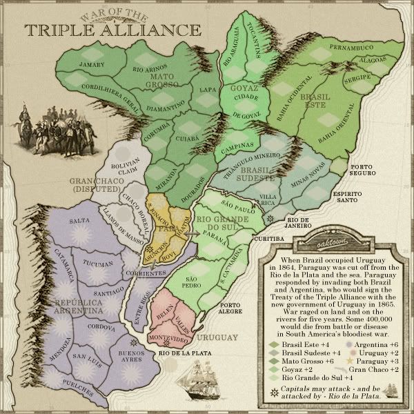
War of the Triple Alliance
Moderator: Cartographers
Re: War of the Triple Alliance; terit names pg. 12 [Final Forge]
![]() by The Neon Peon on Sun Nov 16, 2008 9:35 am
by The Neon Peon on Sun Nov 16, 2008 9:35 am
I liked the first idea with the lines across that portion of the river.
-

 The Neon Peon
- Posts: 2342
- Joined: Sat Jun 14, 2008 12:49 pm


Re: War of the Triple Alliance; terit names pg. 12 [Final Forge]
![]() by oaktown on Sun Nov 16, 2008 11:25 am
by oaktown on Sun Nov 16, 2008 11:25 am
The Neon Peon wrote:I liked the first idea with the lines across that portion of the river.
actually, I think that would be the third option... we've been at this for a while!
-

oaktown
- Posts: 4451
- Joined: Sun Dec 03, 2006 9:24 pm
- Location: majorcommand


Re: War of the Triple Alliance; terit names pg. 12 [Final Forge]
![]() by asl80 on Mon Nov 17, 2008 8:03 am
by asl80 on Mon Nov 17, 2008 8:03 am
poss solution to the corrientes bridge ... to clarify it a bit more, you could leave it mostly how it is, but remove the "white" of the river water and the black lines of the banks. I.e. make the bridge continuous blue with the rest of the territory ... i.e. so the borders and the river graphics do not go under the bridge ... it would be as if it were just a funny shaped territory that had two rivers stop at it ... however the fact that you have the bridge graphic, i.e. ] [ , still makes it look like a bridge over the water.
i.e. if you look at a bridge from above you don't see what's under it, just the continuation of the road.
Wow, i'm not sure if anything can get any less clear than my explanation here, hehe, but i trust you'll be able to understand, and am sure it will help clear things up on the page.
ps. just a personal thing, but i think the two arrows depicting attack directions look really out of place, or rather they appear as a "jutting" presence on the map. ... hehe, as if you'd decided to finish your water colour painting of a countryside off with a stick figure man in the middle painted in permanent marker (well ok, i might be exaggerating a little here but i'm sure you get the point ... still not sure of a solution yet but i'll keep thinking)
pps. great map, looks nice.
good luck.
-
asl80
- Posts: 208
- Joined: Wed Jun 27, 2007 10:07 am


Re: War of the Triple Alliance; terit names pg. 12 [Final Forge]
![]() by oaktown on Tue Nov 18, 2008 12:32 am
by oaktown on Tue Nov 18, 2008 12:32 am
- Click image to enlarge.

Sometimes the easiest solution is the best. No lines, no bridge, just a slightly transparent stroke around Corrientes the same color as the territory. If folks can live with this, I'll post the small map.
asl80 wrote:ps. just a personal thing, but i think the two arrows depicting attack directions look really out of place, or rather they appear as a "jutting" presence on the map.
You're right - nice catch. It was not my intention to use those ugly arrows in the final, but sometimes you just get so used to something you forget about it. I hope you like my new arrows, which I hope are more in keeping with the overall look of the map.
-
oaktown
- Posts: 4451
- Joined: Sun Dec 03, 2006 9:24 pm
- Location: majorcommand
Re: War of the Triple Alliance; Corrientes pg. 12 [Final Forge]
![]() by Ogrecrusher on Thu Nov 20, 2008 7:30 pm
by Ogrecrusher on Thu Nov 20, 2008 7:30 pm
People have survived with this solution on American Civil War in Louisiana.
-
Ogrecrusher
- Posts: 250
- Joined: Thu Aug 16, 2007 2:55 pm


Re: War of the Triple Alliance; Corrientes pg. 12 [Final Forge]
![]() by oaktown on Fri Nov 21, 2008 1:34 am
by oaktown on Fri Nov 21, 2008 1:34 am
This solution has been up for 48 hours without a complaint, so here's a small...

-
oaktown
- Posts: 4451
- Joined: Sun Dec 03, 2006 9:24 pm
- Location: majorcommand
Re: War of the Triple Alliance; Corrientes pg. 12 [Final Forge]
![]() by e_i_pi on Fri Nov 21, 2008 2:00 am
by e_i_pi on Fri Nov 21, 2008 2:00 am
Corrientes looks fine. People should get with the program 
The area around Para looks a little busy. Maybe:
Asuncion text down 1px
Asuncion army circles down 2px left 2px
Para text down 1px left 1-2px
1px outside stroke of about 35% lighten on Para text
that is the only part of this entire map I can see anything resembling a problem, but I wouldn't even call it a problem, just an opportunity for slight clarification.
By the way, how did you get those ripples around the continent? I've had trouble getting smooth strokes like that. Outside glow just doesn't seem to have the consistency along the line that I'm after
-

e_i_pi
- Posts: 1775
- Joined: Tue Feb 12, 2008 2:19 pm
- Location: Corruption Capital of the world


Re: War of the Triple Alliance; Corrientes pg. 12 [Final Forge]
![]() by asl80 on Fri Nov 21, 2008 9:03 pm
by asl80 on Fri Nov 21, 2008 9:03 pm
good solution to corrientes and the arrows oak. subtle, clear, and they look nice too.
-
asl80
- Posts: 208
- Joined: Wed Jun 27, 2007 10:07 am
Re: War of the Triple Alliance; Corrientes pg. 12 [Final Forge]
![]() by oaktown on Sat Nov 22, 2008 3:02 am
by oaktown on Sat Nov 22, 2008 3:02 am
e_i_pi wrote:By the way, how did you get those ripples around the continent? I've had trouble getting smooth strokes like that. Outside glow just doesn't seem to have the consistency along the line that I'm after
I copied the path of the land and made it a bit larger and flattened some bits out, stroked it, then copied that path and stretched it and flattened it out, stroked it a bit lighter, etc. The first one or two were a bit of work because there were so many anchor points I had to knock most of them out to simplify it, but then it was easy.
I'll pay around with Paraguay a bit.
-
oaktown
- Posts: 4451
- Joined: Sun Dec 03, 2006 9:24 pm
- Location: majorcommand
Re: War of the Triple Alliance; Corrientes pg. 12 [Final Forge]
![]() by pamoa on Sat Nov 22, 2008 1:19 pm
by pamoa on Sat Nov 22, 2008 1:19 pm
e_i_pi wrote:By the way, how did you get those ripples around the continent? I've had trouble getting smooth strokes like that. Outside glow just doesn't seem to have the consistency along the line that I'm after
oaktown wrote:I copied the path of the land and made it a bit larger and flattened some bits out, stroked it, then copied that path and stretched it and flattened it out, stroked it a bit lighter, etc. The first one or two were a bit of work because there were so many anchor points I had to knock most of them out to simplify it, but then it was easy.
An easiest way of doing it, is to make a selection from the path of your coast.
Then select>modify>expand, choose the pixels of expansion.
You will get a smooth selection zone. Then edit>stroke.
and again expand and stroke...
De gueules à la tour d'argent ouverte, crénelée de trois pièces, sommée d'un donjon ajouré, crénelé de deux pièces
Gules an open tower silver, crenellated three parts, topped by a apertured turret, crenellated two parts
Gules an open tower silver, crenellated three parts, topped by a apertured turret, crenellated two parts
-

pamoa
- Posts: 1242
- Joined: Sat Sep 01, 2007 3:18 am
- Location: Confederatio Helvetica


Re: War of the Triple Alliance; Corrientes pg. 12 [Final Forge]
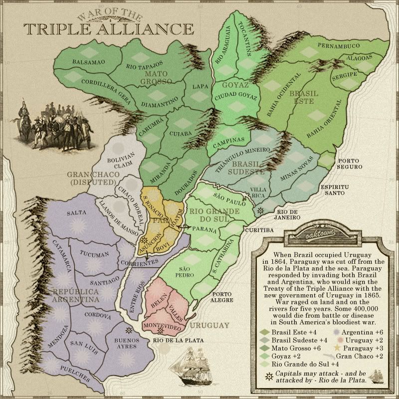
![]() by oaktown on Sun Nov 30, 2008 11:44 pm
by oaktown on Sun Nov 30, 2008 11:44 pm
- Click image to enlarge.

- Click image to enlarge.

As suggested above, I've spaced things out in Paraguay a bit more... XML coordinates will be updated momentarily.
-
oaktown
- Posts: 4451
- Joined: Sun Dec 03, 2006 9:24 pm
- Location: majorcommand
Re: War of the Triple Alliance; Corrientes pg. 12 [Final Forge]
![]() by oaktown on Mon Dec 01, 2008 12:06 am
by oaktown on Mon Dec 01, 2008 12:06 am
Coordinates changed, checked, and changed again. Direct links as follows...
code: http://www.fileden.com/files/2008/7/30/ ... liance.xml
Large: http://i141.photobucket.com/albums/r76/ ... ance28.jpg
Small: http://i141.photobucket.com/albums/r76/ ... 8SMALL.jpg
code: http://www.fileden.com/files/2008/7/30/ ... liance.xml
Large: http://i141.photobucket.com/albums/r76/ ... ance28.jpg
Small: http://i141.photobucket.com/albums/r76/ ... 8SMALL.jpg

-
oaktown
- Posts: 4451
- Joined: Sun Dec 03, 2006 9:24 pm
- Location: majorcommand
Re: War of the Triple Alliance; Paraguay pg. 12 [Final Forge]
![]() by MrBenn on Mon Dec 08, 2008 3:19 pm
by MrBenn on Mon Dec 08, 2008 3:19 pm

Onwards and waitwards...

PB: 2661 | He's blue... If he were green he would die | No mod would be stupid enough to do that
-

MrBenn
- Posts: 6880
- Joined: Wed Nov 21, 2007 9:32 am
- Location: Off Duty


Re: War of the Triple Alliance; Paraguay pg. 12 [Final Forge]
![]() by AndyDufresne on Sat Dec 27, 2008 4:25 pm
by AndyDufresne on Sat Dec 27, 2008 4:25 pm
- Quenching
---The Final Forge period has concluded for the War of the Triple Alliance Map. All objections have had their time. The Foundry and I hereby brand this map with the Foundry Brand. Let it be known that this map is now ready for live play (barring any Lack vetoes).
Conquer Club, enjoy!

--Andy
-

AndyDufresne
- Posts: 24919
- Joined: Fri Mar 03, 2006 8:22 pm
- Location: A Banana Palm in Zihuatanejo


Re: War of the Triple Alliance [Quenched]
![]() by cairnswk on Sat Dec 27, 2008 8:20 pm
by cairnswk on Sat Dec 27, 2008 8:20 pm
Congrats Oaktown 

* Pearl Harbour * Waterloo * Forbidden City * Jamaica * Pot Mosbi
-

cairnswk
- Posts: 11510
- Joined: Sat Feb 03, 2007 8:32 pm
- Location: Australia


Re: War of the Triple Alliance [Quenched]
![]() by Incandenza on Sun Dec 28, 2008 12:46 am
by Incandenza on Sun Dec 28, 2008 12:46 am
Huzzah!
THOTA: dingdingdingdingdingdingBOOM
Te Occidere Possunt Sed Te Edere Non Possunt Nefas Est
Te Occidere Possunt Sed Te Edere Non Possunt Nefas Est
-

Incandenza
- Posts: 4949
- Joined: Thu Oct 19, 2006 5:34 pm
- Location: Playing Eschaton with a bucket of old tennis balls


Re: War of the Triple Alliance [Quenched]
![]() by pamoa on Sun Dec 28, 2008 4:32 am
by pamoa on Sun Dec 28, 2008 4:32 am
well done
De gueules à la tour d'argent ouverte, crénelée de trois pièces, sommée d'un donjon ajouré, crénelé de deux pièces
Gules an open tower silver, crenellated three parts, topped by a apertured turret, crenellated two parts
Gules an open tower silver, crenellated three parts, topped by a apertured turret, crenellated two parts
-
pamoa
- Posts: 1242
- Joined: Sat Sep 01, 2007 3:18 am
- Location: Confederatio Helvetica
Re: War of the Triple Alliance [Quenched]
![]() by enterprize on Wed Jan 21, 2009 6:49 pm
by enterprize on Wed Jan 21, 2009 6:49 pm
love the map.
Igatim (spelling?) is a bit illegible though.
Igatim (spelling?) is a bit illegible though.
-
enterprize
- Posts: 1
- Joined: Sat Mar 29, 2008 5:58 pm

Jester's Review of WotTA
![]() by j35t3r.us on Thu Jan 29, 2009 4:07 pm
by j35t3r.us on Thu Jan 29, 2009 4:07 pm
My Review:
8/10
Pros:
Great map design.
Nice Tech w/ the Boat
Haven't played the same game twice.
Cons:
Couple balance issues.
Possible Fixes:
Drop Paraguay down to +2 bonus instead of +3?
Drop Argentina down to +5 bonus instead of +6?
Fun stuff!
8/10
Pros:
Great map design.
Nice Tech w/ the Boat
Haven't played the same game twice.
Cons:
Couple balance issues.
Possible Fixes:
Drop Paraguay down to +2 bonus instead of +3?
Drop Argentina down to +5 bonus instead of +6?
Fun stuff!
-
j35t3r.us
- Posts: 66
- Joined: Tue Nov 18, 2008 8:32 pm

Re: War of the Triple Alliance [Quenched]
![]() by Optimus Prime on Thu Jan 29, 2009 4:19 pm
by Optimus Prime on Thu Jan 29, 2009 4:19 pm
Love this map. Won my first game on it and gameplay was great!
-

Optimus Prime
- Posts: 9665
- Joined: Mon Mar 12, 2007 9:33 pm

Re: War of the Triple Alliance [Quenched]
![]() by Limey Lyons on Mon Feb 02, 2009 12:47 pm
by Limey Lyons on Mon Feb 02, 2009 12:47 pm
serious confusion with corrientes. what's with the impassable river running through it?
-

Limey Lyons
- Posts: 96
- Joined: Thu May 31, 2007 1:29 pm
- Location: Brooklyn
Re: War of the Triple Alliance [Quenched]
![]() by oaktown on Sun Feb 08, 2009 8:26 pm
by oaktown on Sun Feb 08, 2009 8:26 pm
- Click image to enlarge.

- Click image to enlarge.
I've fielded two concerns about playability... the first came in-game, and was that the horizontal arrow from Asuncion gives the impression that it can attack entre rios, not Corrientes. The second is related, but unspecific...
Limey Lyons wrote:serious confusion with corrientes. what's with the impassable river running through it?
What I've done is extended the coloring over the river to span the river between the two halves of Corrientes, which geographically does span the river (there's just no accounting for real life). I've also turned the arrow a bit to make it clear that Asuncion does, indeed, attack Corrientes.
Hmm??
-
oaktown
- Posts: 4451
- Joined: Sun Dec 03, 2006 9:24 pm
- Location: majorcommand
Re: War of the Triple Alliance: edit on p 14 [Quenched]
![]() by MrBenn on Mon Feb 09, 2009 7:35 am
by MrBenn on Mon Feb 09, 2009 7:35 am
This map is looking so good! The Corientes river is still a bit of an issue though... I can't remember if you've tried it without the black borders over the river through the territory? That might help make it a bit clearer, and would make the name more visible...
PB: 2661 | He's blue... If he were green he would die | No mod would be stupid enough to do that
-
MrBenn
- Posts: 6880
- Joined: Wed Nov 21, 2007 9:32 am
- Location: Off Duty
Re: War of the Triple Alliance: edit on p 14 [Quenched]
![]() by pamoa on Mon Feb 09, 2009 8:29 am
by pamoa on Mon Feb 09, 2009 8:29 am
I know it will hurt some geographically correct mind but why not remove one part of it and enlarge either Entre Rios or Tucuman
De gueules à la tour d'argent ouverte, crénelée de trois pièces, sommée d'un donjon ajouré, crénelé de deux pièces
Gules an open tower silver, crenellated three parts, topped by a apertured turret, crenellated two parts
Gules an open tower silver, crenellated three parts, topped by a apertured turret, crenellated two parts
-
pamoa
- Posts: 1242
- Joined: Sat Sep 01, 2007 3:18 am
- Location: Confederatio Helvetica
Re: War of the Triple Alliance: edit on p 14 [Quenched]
![]() by oaktown on Mon Feb 09, 2009 9:17 am
by oaktown on Mon Feb 09, 2009 9:17 am
pamoa wrote:I know it will hurt some geographically correct mind but why not remove one part of it and enlarge either Entre Rios or Tucuman
That would certainly be the easiest fix, but I'd like to make that a move of last resort. So far I've heard only two complaints so I'm hoping it's not huge issue.
MrBenn wrote:I can't remember if you've tried it without the black borders over the river through the territory? That might help make it a bit clearer, and would make the name more visible...
Tried it, people didn't like it. I can go back to it, however. Here it is, from version 23.
- Click image to enlarge.
-
oaktown
- Posts: 4451
- Joined: Sun Dec 03, 2006 9:24 pm
- Location: majorcommand
Who is online
Users browsing this forum: No registered users
|
|||||||
| Conquer Club is not associated with RISK online in any way. Copyright © 2006-2024 by Big Wham LLC | |||||||